Pages

Sunday, 30 January 2022

Bonus Edition: USS Valiant NCC-6089 (USS Defiant Concept)


If there was a concept model I always hoped for, it was this one.

Lost into the annals of the Deep Space Nine Technical Manual and teased way too often in conversations around the tough little USS Defiant, the USS Valiant Concept is perhaps even more thuggish than the craft it ultimately became.

The hallmarks of the Defiant are glaring; the almost modular warhead/nose, the curved central piece surrounding the bridge and to some degree the packed-in warp engines. Yet there are also many differences and you have to take this one with more leniency than usual since it never actually made it to the screen.

The weapons pods at the forward edge of the hull are more prominent and that warhead is even more integral to the ship than it would later become. The detail over all is pretty decent with the usual array of panelling lines evident. There are red edging strips around the drooping warp engines and a Starfleet pennant that runs front to back to finish that overall impression of what this might have looked like.

Where this wins over at least the Voyager concept is that this hasn't been tampered with from the images we've seen of this ship before. Sternbach's Voyager had been "updated" to what it might have eventually become for the show but wisely this hasn't been the case here.

What does seem odd on the Valiant (NCC-6089) is the choice to render some of the recessed sections - and the panelling around the ship name - in an off yellow. This colour makes it look as though the decals have faded and worn over time. When I saw the preview images I hoped that this would be changed for the end product but it wasn't a work in progress. Yuk.

Also, a little off from the concept art on which this is based, is the hull colouring. With an off-white base, the paintwork is flecked with a slightly grey tone. It's not azteced but more of a way to reduce what could have been a rather plain finishing coat.

 If you did line this up with the USS Defiant, the wider engine pods would be the most distinct change. While Defiant's were narrower, they also extended sideways rather than curving out and down. Perhaps a more menacing look, it does look a bit odd but that's more down to mental conditioning of seeing that tough little ship on screen for so many years.

Disappointingly the cover of the magazine makes the model out to look much better than it actually is. A lot of the panel lines just aren't as defined as they are on the CG art nor the faded yellow as subtle as the graphic illustrates. Certainly the bussard collectors aren't as bright nor a good portion of the radiator grille work painted as dark as it is on the cover. This latter piece is most evident either side of the warhead/nose section.

What is interesting from my perspective is the back end. The impulse engines are here podded to either side of the hull, almost looking like afterthoughts with them later being more integrated into the main body of the USS Defiant.  The rear of the screen-used design is also wider with the tapered design of the dorsal section more a feature rather than the full shape of the hull.

The underside retains the "speckled" finish of the dorsal plating as well as ship registry decals (and one very tiny one right at the back!) plus surface detail and more of that faded yellow detail. Strangely on the underside this does appear more golden. In all fairness this is the first time that I've seen the underside of the concept Valiant but it does seem to be in line with the design for the topside of the vessel.

The build is about 50/50 split metal to plastic with the to of the hull including the forward weapons pods, the top of the warp engines and the rear in the harder material. The joint line to the plastic piece on the underside is almost unnoticeable however at the edge of the warp engines where there is a rectangular section that rises up, the contact point feels rough. An unusual gripe for build quality but it sent a shiver down my spine a couple of times when my fingers grazed across it.

In the magazine we have a ton of further concepts for the Defiant/Valiant that, maybe, might see the light of day in the collection at some point. Some of these are truly off the wall and the mag does talk through the design process of what would become Deep Space Nine's warship. Taking up the other half of the accompanying literature are the Defiant's Top Ten Moments. I was a little taken back that we're starting to head into "Best Bits" territory but after the original issue, an XL and a Mirror Universe edition, there can only be so much to write up about the ship.

USS Valiant NCC-6089 is a great piece of Star Trek's unseen visual history. Certainly there's the chance now to whack this alongside Rick Sternbach's Voyager and the Phase II USS Enterprise plus a few of the other ships we've never seen for a great display of roads not taken. It could have done with being a little bigger but it does still manage to pack a lot of detail into a fairly small space and not make it seem overloaded.

I'm very happy that this one made it into the bonus editions. Eaglemoss continue to excel in this area especially because they are willing to make things that have never been done. Looking at the upcoming issues, this shows no sign of abating.

USS Valiant NCC-6089 is available now from Eaglemoss priced £19.99

Check out all our Online Starships posts HERE

You can find out more on the Star Trek Online Official Starships Collection by visiting the Hero Collector website HERE

Enjoyed this article? Why not like and share to spread the word!

Like our page on Facebook 
Follow us on Twitter

Sunday, 9 January 2022

SKoST in 2022


The question of where I want this site to be in 2022 has given me a lot to think about in recent months.

First of all, yes, the ship reviews will be continuing and for the next few weeks I'll be punching through some more XLs, bonus editions and the final few issues of the Online collection so stick around for those.

But overall I was looking at how I would tackle the year. My decision at the end of 2021 to stop with singular episode reviews was the right move and with the wavering quality of Discovery's fourth season (personal opinion), I now feel affirmed that a season review for each will be more than sufficient.

Of course there's the hotly anticipated Strange New Worlds, the continuation of Prodigy's first season and the return of Picard to fit in along the way. But, I want to explore more than just new episodes, book reviews and other assorted merch (although I guarantee something on Resurgence when it launches on PlayStation).

One of my goals is to connect with more fans online and at events in 2022. I have some plans lined up but as for the site, I will be intending to offer more opinion pieces, maybe some interviews if I'm lucky and snapshots of Trek elements that I love and enjoy.

I'll be honest, there are elements of fandom that have exhausted me and I've stepped away from some that have caused me more personal issues than I needed. This is allowing me to focus more on the writing and continuation of SKoST and has already seen stats improve - or at least return to levels I was happier with!

While this isn't perhaps the huge initial 2022 post you might have expected, it's a much better reflection of where I want to be in 2022. Not splattered across everywhere and running thin but focused on a core area and core readership who are interested in coming along. 

So if you've been around since Decemer 2012 (yes, that long), thank you. Equally, if this is the first time you've dropped on; thank you and I hope to hear from you and see you back in the future. SKoST has been a big love project for the last ten years. In some cases I've loved what I've written and in others I truly thought they were substandard. I suppose much like anything!

But anyway, here's to 2022, post 1000 and a decade of SKoST. Lots more to come!

Thursday, 6 January 2022

To The Last: USS Reliant NCC-1864 XL


Aaaaaaah Kirk my old friend, do y-

Sorry, getting all reminiscent for the most revered of Star Trek films by just being in the same room as the HeroCollector XL USS Reliant NCC-1864.

Now you're likely to be getting tired of these by now so I'll try not to repeat too many lyrical waxings while we cover off this classic.

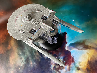
The big thing to recall here is that the original issue 11 Reliant was already an upgrade when it arrived on shelves back in 2014. Eaglemoss had made some steps to resolve the painting issues, thinned the paint out, tidied up the decals and even got that key aztec detailing right.

Move forward to today and the larger Miranda Class which is a brilliant celebration of everything great in the collection. It's frikkin' gorgeous from head to not-so-far-away tail and manages to avoid a lot of the criminal issues that the collection hit - bar one. 

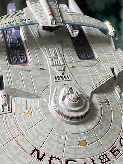
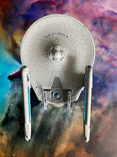
The aztecing is just stunning and with a larger hull canvas to display it, the Reliant blows away the competition with this precise and engrossing paint job. The phaser banks are painted in however the beam points are noticeably missing. Ship registry is particularly loud and proud but god, what the hell happened to the name? The lettering almost disappears into the paintwork and the pics here make it look better (slightly) than it actually is. Special mention here as well because the inner black characters sit bang in the middle of the red bordering. Got to be a rarity!

Eaglemoss have marked in the customary RCS thrusters and navigation lights plus they've avoided recessing the windows and instead have opted to paint them on the edges of the rear section. Even on the bridge module have Eaglemoss chosen to take this approach meaning the windows sit within the grey banding. Note too that the grey banding at the top of the bridge module present on the regular edition has now been removed.

The hull panelling on the XL has much tighter lines between each section and the new paintwork has the added benefit of taking the shine off the whiter finish of the issue 11 version. 

The larger hull also allows for the more precise painting of the exposed technical elements behind the bridge and behind each of the sensor units that are decalled with the Starfleet delta (either side of the bridge). Those latter recesses are much deeper here with the darker grey paint not blotting out the details.

The larger technical elements to the rear of the hull again benefit from the scale and thinner grey coating but for me one of the bigger forward steps is in the work on the sensor bar. Phaser points and photon torpedo tubes are far more recognisable as elements seen on the model in the second Trek movie with the panel work and raised elements looking far, far better and closer to their actual appearance. 

Taking the shine off the paint really has made a massive difference and this is not the first time we've mentioned the paint updates - Enterprise-D and Equinox being two recent ships we've examined from the XLs. 

Onto the underside and the curved striping decals have been thinned (as was done on the dorsal side) and the registry has much better, more screen accurate definition. On the smaller version the coloured borders are absent while here it's back in place as it should be. The RCS thruster detailing has been reined back in while there's been a lot of paintwork updating around the rear, darker grey sections. 

These have been more precisely coloured with the warp field generator getting a good deal of attention. This is now clearly segmented and painted in individually rather than the blanket blue. Nor does the dark grey seem to extend as much around the rear of the ship which does provide some more hull detailing to breath.

A huge reworking comes in the form of the warp engines. The thin oblong drive units feature translucent warp grilles as well as the standard aztec paint scheme. The fitting of the warp nacelles is much more exact. No horrid gaps or flaky edges on this version which has the units tipped off with the ship registry. Their fit into the pylons is seamless with the horizontal join line barely visible.

Construction on the XL USS Reliant has been altered with the whole of the underside of the saucer now a single plastic insert rather than there being an untidy seam halfway along the underside of the ship. This leaves the upper hull, front to back, as the only metal section with the engines, rollbar and already mentioned underside being plastic parts. 

That's not a bad thing because as the Reliant learned from earlier issues in the series, this XL has learnt again and shows the development forward for Eaglemoss. Different construction methods, refreshed decals, updated elements and more reflect that this, unlike the Enterprise-D, is not just a scale up of an existing model. The ship name front and centre does bug the cack out of me because of how it fades into the hull but all said and done that's the biggest gripe I have with the XL starship.

Honest. It's a work of art with the joins all perfectly in sync. From every angle it looks finished and with a lot more care to boot. For anyone who is a fan of The Wrath of Khan or the Miranda Class in one of its many iterations, this is a high class replica and one of the finest that Eaglemoss have produced within the XL line. USS Reliant is a must for anyone and I kick myself for having waited this long to get hold of her. 

Reliant's magazine sticks with Star Trek II and examines the return to the big screen of the classic crew following The Motion Picture as well as the creation of the unique and groundbreaking CG Genesis Device sequence. There's also a dive into the making of the plot-driving Ceti eels and how they were brought to life for The Wrath of Khan.

Easily one of the best all-round packages produced in the XL line and maybe in the collection as a whole. Definitely one for your shelf and one that is destined never to find herself back in a box. Keep an eye out for a price reduction or a sale because this is one you'll need to have in the basket.

Check out all our Online Starships posts HERE

You can find out more on the Star Trek Online Official Starships Collection by visiting the Hero Collector website HERE

Enjoyed this article? Why not like and share to spread the word!

Like our page on Facebook 
Follow us on Twitter

Monday, 3 January 2022

Special Edition: Son'a Battleship


The Son'a Battleship marks the final major vessel from Insurrection in the specials line.

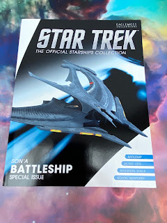
With its horseshow design origins, the craft is, in the most part, solid metal. With the "piano key" structure also present on the previous Son'a Command Ship, the Battleship ably continues the theme of the Insurrection aliens. 

The colour scheme remains simple grey with the occasional highlight on the surface although the plastic additional pieces do have darker grey elements.

Comparing to the movie is fairly difficult given the lighting. What you can make out are the thruster assemblies to the front and rear of the sweeping wing design in orange and yellow but that's as far as it goes for colour.

But the Battleship is much more about its design and the strength of the physical detail on the surface. There's not just that piano/rib motif across the hull but a surprising amount of low level weathering that ages the surface. This only really becomes obvious in close up while a step back blocks out the main coloured sections only.

In fact versus the cover of the magazine, the model has a much more slight finish to it and the big benefit has to be the almost total metal build. Only that top superstructure comes as the plastic add on and even that carries the "natural" wear and tear of its attached metal pieces.

Given its limited number of components (I'm counting two NOT including the stand), the Battleship is a big expense to complete your Son'a set and one I have unusually struggled to really go into any detail and depth with in the review. It ticks a box if nothing else to say it's been "done" but overall this is fairly uninspiring and, dare I say it, highly priced.

Give Eaglemoss their dues, they have done as much as physically possible to create something that represents how the ship looked in the movie. It's a decent reproduction and looks the part but some things just do look better on a cinema screen than in the flesh (or metal in this case).

The magazine reflects the small amount of time that the Battleship received in Insurrection, covering its role in the fleet all too briefly before turning attention to the always insightful designing article. Throw in some standard plan views to add a little something plus a piece on the creation of the Bak'u Village and you have a good little reference booklet on the ninth Star Trek movie. The writing in here is decent and the addition of the sketches and production work are always worth a look over. Even if the model isn't that amazing, the mag does help to round out the bundle in a decent manner.

As you can guess, this one's a tad underwhelming. Both the Collector and the Command Ship were much more interesting pieces and you can see why this one (possibly) ended up being the third wheel. A completist model if ever and certainly one of the toughest constructed given then solid metal frame!

Check out all our Online Starships posts HERE

You can find out more on the Star Trek Online Official Starships Collection by visiting the Hero Collector website HERE

Enjoyed this article? Why not like and share to spread the word!

Like our page on Facebook 
Follow us on Twitter

Sunday, 2 January 2022

STO Issue 15: USS Enterprise NCC-1701-F


Tracking back a few issues, we've located the USS Enterprise NCC-1701-F.

Already released in its original formation, the Enterprise-F here is the updated Yorktown Class variant modified after the Iconian War as featured in STO.

The basic formula for the flagship remains with primary and secondary hulls, a pair of warp engines and those twin necks. But there have been some updates to the design over time and it's a good one to compare against the bonus issue Eaglemoss released.

Most if not all of you will remember that the original Enterprise-F was released in two variants - the STO livery and also the "real universe" grey livery that fitted (apparently) with the rest of your collection if the much more striking colour palette wasn't to your liking.

But as usual lets take the refit as its own case.  This model is incredibly light and even when holding it I still wasn't sure if I was. The primary hull is metal but with it being so small and, strangely fragile, there's very little solid material there.

Putting her alongside the original version (Online livery), the differences in not just the level of detail but the quality improvement is significant. Lots more coloured panel section, better defined RCS thrusters and much sharper decals. The amount of windows painted in have increased tenfold. There are notable parallels in the black hull striping and the overall shape of the craft however this newer, refit version has a lot more going for it.

The impulse engines are more prominent and the three (black, white, grey) colours offer a more varied finish to the starship. One minor glitch is the alignment of the decals at the ends of the phaser banks which are sitting much higher than they should while on the original version they were spot on. So too are the decals for the heavily increased number of lifeboat hatches just that little bit out - but not as much as the phaser strips. Yet, given the increased level of detail, this is a minor blip on an otherwise great entry to the Online Collection.

The engine pylons feature a new flat-fronted and rear swept design with the warp nacelles themselves being of a far more intricate design and sadly painted in rather than having translucent bussard collectors and warp grilles. The paintwork on them though is superb with a little flick added to the back end that's a little similar to the Excelsior Class.

The has retained its unique double neck design which has received a decent level of window detailing before sweeping into the scooped Engineering hull. Even on her belly, the F has a great, precise level of painting applied with that decal quibble from the top still managing to slip in. The pennants both align on the port and starboard sides and the only real evidence of the combined model construction materials is the line running around the inner edge of the primary hull.

The detail really is striking on the Enterprise-F. The main deflector echoes the colouring of Voyager in its blue with gold framing as well as its shape. This is particularly well executed given the size of the dish and the model overall.

What I was really impressed with was the dagger sharp lines of the black painted sections of the hull. Underneath the edges are ramrod straight and culminate cleanly around the Enterprise's support craft docked right at the rear. This too has seen some detail improvement since the original F design with much more clarity on its hull features.

Taking this away from the model for a second, the refitted Enterprise-F is a great improvement on its first incarnation and shows the steps taken since it first emerged from its digital drydock. It is a little disappointing that the model has some decal issues however it's a good replica which could benefit from the XL treatment. Not one of my favourites but with the "confirmation" (use that loosely) thanks to Picard's prequel comic, we can assume that this is what the next Enterprise would be after the Sovereign Class. That comment should cause a few grumbles but I guess it's one of those things we have to accept in this new Trek era.

Within the pages of the magazine we get to grips with the story of the refit as well as become familiarised with the Enterprise-F captain, Shon and explore some of the features of the Federation's flagship. There are also two pages of customary plan views just in case looking at the model wasn't enough.

The Enterprise-F pack is one of the standouts from the 20 editions in the series. One; it's an Enterprise, Two; it's an improvement on the first version as a model not just as a design. The structure feels better and with the updated packaging it ticks a lot of boxes. To say it's a must is a no-brainer, even more essential if you've got the bonus version in either (or both) colour scheme.

Check out all our Online Starships posts HERE

You can find out more on the Star Trek Online Official Starships Collection by visiting the Hero Collector website HERE

Enjoyed this article? Why not like and share to spread the word!

Like our page on Facebook 
Follow us on Twitter