Pages

Tuesday, 26 January 2021

Has the Mandalorian Kept Discovery Honest?


Discovery's third season has closed and with it, the most experimental and riskiest season in over fifty years and certainly far from its best.

Before you start gulping raktajinos just to spit them out in sudden disgust, I’m not trashing Star Trek, nor am I making any sharp right turn and vowing never to watch another episode ever again. The rebooting of Discovery meant that season three effectively did the same as the ship and became "-A", beginning the universe building again that was evident back in The Vulcan Hello.
 
The other thing is that it's hard not to compare this year with the return of Disney's Star Wars offering in the form of The Mandalorian, season two. 

After a rather mixed sequel trilogy that started well with A New Hope reboot The Force Awakens, The Last Jedi turned it all on its head brilliantly. Tragically JJ Abrams, who did so well with kicking Star Trek back into life chose to play it super safe with The Rise of Skywalker. 

It looked like Star Trek could get a little cocky. The reboot movies, on the whole, were well received and Discovery, Picard and Lower Decks were opening the franchise to a whole new set of viewers and annoying loads of the older ones at the same time. Yet, it was going in the right direction and attracting a lot of attention.

It was flashy, it was edgy, the effects were incredible and there was clearly a lot of money sunk into the product. Discovery was complex, offering a new mystery each season - Lorca, the Red Angel, the Burn; something for us to follow week on week. Each episode gave a bit more and attempted to question something and tie itself in to modern day issues but it became reliant on you having to keep up each week. Picard might as well have been a political commentary on the state of the US at times which, if you think back, is sort of the lavish, want-for-nothing opposite that The Next Generation pitched up with in 1987.

Discovery and Picard are definitely not The Next Generation or Deep Space Nine just in the way that those shows weren’t the same as The Original Series. It’s ok to love one, maybe like another and perhaps just enjoy watching Enterprise (for example!). So-called Nu-Trek (ie post 2009) at the least continues the tradition of being controversial but may be burying its allegories a lot deeper than even Gene Roddenberry did. 

Discovery is pushing the boundaries, adding transgender characters, an alien captain, the focus on one main character, huge story arcs, that time jump. Perhaps its agenda in that way is more open than any Star Trek series ever before although it’s trying to appeal to everyone and by default may actually be trying that little bit too hard.

The Mandalorian meanwhile is demonstrating the old KISS principle; Keep It Simple Stupid. Set something up, show it, leave it, return and give a one line reminder. Job done. But more importantly you can dip into this series without worrying too much about what's gone before.  However, is that what fans would want from Star Trek or, as I expect, is there a higher bar to reach with its extensive back catalogue and experience? Rumour has it that the Trek franchise is even considering utilising that rather impressive AI wall technology that has given the Mandalorian a stunning visual look and a huge storytelling advantage.

There's no requirement for a deep and intimate knowledge of the story on The Mandalorian because nothing is over thought. As I saw one review state, it's exactly the story you would be telling if you were dreaming something up with your tub of action figures. But let's remember they are two very different franchises and however much I love The Mandalorian, Star Trek still has a firm grip on my affections but that doesn't mean it can avoid my disappointment.

I can honestly say that if I didn't follow each week of this season of Discovery religiously to find out the next bit of information about the Burn or the Emerald Chain, I would find it difficult to follow. It does limit its re-watch potential and that's something that the '66 - '01 era definitely wins at and should be rectified with the introduction of Strange New Worlds which will be more contained to a story per episode.

The age of the binge-watch does suit the arc nature of the show because you'll be in the loop right to the end. In this way, Star Trek is trying to cater to two types of audience within its framework but... with The Mandalorian a dip in and out or a full re-watch are easily possible and it may well be failing to capture the hearts of the established audience to build itself a new fanbase. Being brutal, for longevity this has to happen and Star Trek needs new fans to keep it alive. These new fans don't have the same mentality as the 1966 or 1987 audience and, love or hate it, they are the future.

With a basic set up, each episode of The Mandalorian still remains fairly self-contained with a specific event. Journeys to different planets are done in a screen wipe (something the spore drive in Discovery now helps with) and importantly it knows what it is, an action series set in space. Star Trek - no, specifically Discovery - is trying to be more. All encompassing and perhaps overstretching itself. Even in my reviews of the show I can feel a dissatisfaction in some of its elements. Burnham is over emotional, characters are under-developed and the genuine cool twist of dropping the viewer into the distant future hasn't created quite the buzz I expected.

There's an overreliance on nods to the past - Voyager, Spock (twice!) and instead of carving out that new, fresh path, the concern to bow to the older generation of fans may now be taking its toll and holding the show back. Homages and references are great but the back catalogue may now be proving to be more of an anchor-weight for Discovery than ever before. Season four has to go boldly where no-one has gone before and explore the 32nd Century as well as bringing the Federation back together. Rebuild and solidify the optimism for today. 

I'm enjoying Discovery as a show but the excitement is missing from a great deal of the episodes in what may well be remembered as Star Trek's most disappointing season ever. It came, it saw, it didn't deliver the thrills we were expecting. Osyraa turned out to be one of Trek's most multifaceted villains and is more than just a baddie toting a gun or wanting to recite poetry on every kill. Her plans are wider, her vision bigger however the plot for the Emerald Chain was lacking. It started the season as a sub-plot but grew to overtake the Burn as the priority of the year. Maybe the only thing lacking was a better way of having her switch from baddie to negotiator and back to baddie in the final pair of episodes.

The Mandalorian didn't go too far. While Discovery was revealing that an errant child was responsible for the downfall of the galaxy (sounds like a parallel to the Ewoks defeating the Empire), it remained focused on a simple rescue mission. It was exciting, it was different because the series had done away with any sub-text, attempts at making social comment or being that little bit too clever.

However, with an additional five episodes over the season length of The Mandalorian, Discovery has managed to do a lot more this year than perhaps it tried to do in years one and two. The bridge crew feel a little bit more fleshed out and recognisable. They're been given more to do this year than push a few buttons and arm the torpedoes or raise a hail. 

Even in the finale, That Hope is You, Part II there's a lot going on but we still have time for part of the episode to follow their narrative. Having that burgeoning cast has not been a friend to the show and if you look to The Mandalorian, the main cast is only a handful of characters each week which again declutters the script and the action. Being only 30 minutes long also has the effect of keeping it on the line from start to finish while Discovery's 50-60 minute run time allows for more expansion of character and story. 

I'm not suggesting that happens every week although I do think the jump to the future is a way for the series to up its game, show that the studio are putting decent money into the show and have enough faith in it that they were prepared to start again. It's been a testing year and the show has run against Star Wars directly on its release days which piles even more pressure. The limp few episodes towards the end of season three did Discovery no favours. Georgiou's send off did not need to be a two-parter and elements of the Book storyline with his home world and the Emerald Chain may have helped build a bigger picture of the thuggish organisation but even now I'm not sure if it was all worth it. 

Essentially though there had to be an episode here to fully introduce both Adira and Book to the viewer and to a greater extent it's been worth it when it's come to the later episodes around Gray and that final twist that Book can now work the spore drive. Give it this, Discovery has not in any way played it safe this season - the time, the place, the foes, the twists - all have gone against expectation. If I recall it was the fired previous producers who promised that optimism and it looks like their thoughts for the year were binned (but I can't substantiate that, it's a theory!). That's left us with this grimy, darker season that actually tried new things, went for new character options and did it all in the middle of a global pandemic.  

Finally though, perhaps we ourselves as viewers have come to expect too much from Discovery hence why The Mandalorian has been so refreshing. It has nothing to prove, the franchise's movies have been less than stellar of late and inversely there's nothing to lose from attempting a live action show. 

With that 800 episode total, fans expect perfection and "their" Star Trek. Nay, they demand it and want The Next Generation or for the next episode to be as if the franchise had continued on TV in 2006. But it won't be and y'know I can live with that because it's a new era and once again things change. No-one can be pleased all the time and I can count several DS9's or Voyager's that bombed in my eyes. Discovery is no different and ultimately while I can bemoan the dips in quality, it's unavoidable.

Who is to say that now The Mandalorian has closed off the Grogu storyline it'll be anywhere near as effective? We won't know for two years since Boba Fett is off on his own quest next year but everything has its day, its highs and lows so I'm sticking around with Trek - there are always...possibilities.

Like our page on Facebook 
Follow us on Twitter
Find us on Tumblr 

All images CBS All Access

Sunday, 24 January 2021

Delta Quadrant Fluxx


The seemingly unstoppable Fluxx has launched a fourth variant as part of the Star Trek universe.

Following on from TOS, TNG and DS9, Voyager was the only logical choice. The basics of the game remain the same as detailed in our earlier reviews with that journey home twist that formed the basis of the series. For newcomers, the core goal is to match a pair of cards you have out on the table with the items required to fulfil the Goal in play. As you'll discover, both this and the rules themselves can change as you play, meaning that every game is different.

Lining up as your Keepers this time are Janeway, Chakotay, Tuvok, Paris, Kim, Torres, the Doctor, Seven, Neelix, Kes and, unusually, Future Admiral Janeway. As for ships, Voyager is there alongside the Timeships Aeon and Relativity. As well as the standard equipment options, the Doctor's Mobile Emitter and Coffee also come into play. Interestingly the Emitter, Seven and Future Janeway can pose as Janeway, The Borg and the EMH as required which will open up play options.

On the Keepers, Looney Labs have added a little flourish to proceedings with players needing to "State the nature of the Medical Emergency" when playing the Doctor. The flexible Future Janeway can cancel a Surprise and Torres discards the Malfunction.

Posing as the Creepers we have the Borg (also appearing in the TNG set), the Kazon, the Krenim Timeship and Species 8472. As with all of the previous three packs, the artwork for all the characters, ships and items is impeccable with the sketchy imagery theme running right through all four packs.

Noticably absent from this version (and TOS) is the Meta Rule allowing you to trade five goal cards in at any time, leaving only the Basic Rule card in play at all times. Not that this will make a huge variation to play as I'd be hard pressed to remember an occasion where this has been utilised. Wisely the rather confusing UnGoal remains absent after appearing in only TOS and the TNG packs. 

Within the Actions, the new Caretaker card lets a player remove Janeway, Chakotay, Tuvok, Paris, Kim, the Doctor and Voyager from play and into your hand and then discarding down to five. As for Rules, the only change is the addition of Ancestors Eve (a reference to 11:59 and Gene Roddenberry on one card!!!) wherein players can refer to relatives born before them to take an additional card from the draw pile.

Each of the four versions of Star Trek Fluxx has had its individual spin on the franchise. The TOS and TNG packs are more flexible played together with the Bridge Expansion which leaves DS9 and Voyager there for a smaller, shorter game. The core of Fluxx never changes but players will find which nuances they prefer and probably end up sticking with that pack for the future. 

The Voyager pack certainly covers a lot of key points through its Keepers and Creepers; Caretaker, Year of Hell and 11;59 being three obvious picks. In turn this means that Voyager's set is perhaps most in tune with the show relating more to specific points than any of its predecessors. It makes it in a slight way less generic than you might find any of the packs singularly and isn't stepping near anything as oddball as the Darmok card from TNG.

The ability to use alternates instead of the "actual" Doctor, Janeway or Borg cards is another clever move by Looney Labs and something that only exists in the Voyager pack. I see this as a way to not only to speed things up but to add that moment of uncertainty if a goal requiring any of those cards is played. Does anyone have an alternative? If not where are they???

Looney Labs have refined the Star Trek licence over the four versions and from a production and implementation perspective, Voyager is the cleanest pack of the four with the unnecessary pieces removed, more relevance to the actual series and a couple of new card features trickled in to spice up the pack. This is Fluxx at its most Star Trek and its most complete and just just trounces the DS9 pack for its adherence to the show.

What's your pack of choice for Fluxx? 

Like our page on Facebook 
Follow us on Twitter
Find us on Tumblr 

Tuesday, 19 January 2021

Battlecruiser Heaven: The Online Official Starships Collection Issues 9 and 10


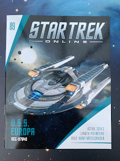
The redesigns from Discovery keep on coming with the latest being the Europa Class.

Based on the Nimitz Class USS Europa destroyed at the Battle of the Binary Stars, this leap forward had that distinct STO paint job contrasting the base white against the dark grey highlights. 

It works on screen and also in reality providing the Europa with a striking silhouette. The shape and form are very reminiscent of the Reliant and therefore the Miranda Class Take those two upper nacelles off and it's the spitting image if not updated. There's even a pair of numbered shuttlebays at the back of the hull if you're in any doubt.

What they have done is stretch the saucer out a little more elliptically to the front and set the bridge module back a little more. This in turn provides more surface space for escape pods and sensor emplacements. The hull itself is a lot more complex with more raised structures than the old Reliant again featuring more escape pods.

The classic rollbar/mission pod piece now sweeps backwards and is set a little more forward and almost over the bridge. The paint and decals around the ship and especially here are definitely one of the more precise results from Eaglemoss but there are a few spots where the paint doesn't quite line up the edge of its area most notably on this raised section.

The centrepiece there does contain a notable decal which is, so the magazine explains, the Structural Integrity Field (SIF) Linkage. This piece of cool Online tech means that the Europa can take away the damage inflicted by weapons fire on allied ships. Also there's a Starfleet pennant  which is almost too small to make out but is clearly indicated by two very fine stripes. The rollbar also features the "double neck" which is a distinguishing feature of the Enterprise-F providing additional support to the centre pod. Reliant could have definitely used that. 

The four warp engines are a real piece of digital design mastery. With notched warp vents across the tops (and bottoms!) of all four, there's a stunning impression of depth across the nacelles. Each nacelles is cleanly tipped with a translucent bussard collector and some lovely decalling along the sides. The pennants are sharp as ever with ship registries and also tiny, tiny United Federation of Planets legends. Look at how they're connected to the hull with each bolted on to an extra-wide pylon and that's not something you see on every Starfleet vessel.

The decalling right across this model is really impressive and straight where it matters - which is precisely everywhere. Even on the ventral surfaces the markings are crystal clear with even red trimming and the standard ship registries in place.

The underside of that single hull carries even more detail and a lot more colour even if it is grey, black, white and brown. There are a lot more lifeboat hatches for one but there's also differing surface levels, grilles and a quite impressive lower sensor dome. Inspection of this lower section does raise your awareness of the pixellated paint effect that crops up towards the rear and also on the notched warp engine surfaces. The engines appear to have the pattern mirrored but behind the sensor dome it's more unique and doesn't follow the centre-line repeat which is most unusual.

Construction on this model is excellent and its design represents the more military and robust style path chosen by the Online format. The bold colouring works beautifully for the game but as with all the previous entries it's quite jarring on a physical piece and does step a little way from the canon franchise.

The weight is all to the front although the stand sit is also surprisingly stable. What is becoming increasingly annoying is that the pegs don't seem to fit into the black bases unless you do a fair bit of sanding on the plastic.

The magazine does go a long way to explaining the special features of the Europa including the SIF and as to how the vessel and limited number of its class were designed to be vanguards and capital ships for Starfleet. This is very different to the science mission directive of the Miranda Class but I guess times change. It also recounts the link between this design and the "lost" ships of Yard 39 which is Online's way of building Discovery's vessels into the game. 

Fortunately the plan views do note the key technologies of the Europa including the grilled Command and Control Communications Suite (grey square front of saucer) as well as the location for the EM Phase Conditioner Intakes (end of the black strips, top of saucer). It means, for once, the model does show important into rather than it al being hidden away inside. 

The design section does lean towards how this ship differs from its Discovery predecessor and also from the Miranda Class as well as the reasoning for its existence. The Europa acts as a battle cruiser again revealing the more action-based nature of the online experience. The graphics here to accompany the visually journey are good to have and go even further to establish the fleet lineage.

Finally the issue explains and dissects the nature of Starfleet Operations from the 22nd Century through its evolution to the organisation as it stands in Online. Specifically the article pinpoints key events in the 2400's that have influenced its form.

Klingon fans won't be too upset to see the IKS Mogh make an appearance as our second ship of the Empire in this collection.

Just as deadly, chunky and heavy as the Bortasqu' the Mogh sits in parallel to the Europa as a Klingon battlecruiser. She, like that Starfleet ship, also bears the key distinctions of her race's history but with that Online spin.

A rather heavy, squat model, the Mogh ticks all the right boxes - long neck with command module, raised engine unit to the rear and drop down warp nacelles. It can ONLY be Klingon.

The detailing on her is crazy. The painting distinction between the grey raised panels and the base green coat is spot on. No bleed, no paint echo and it just looks glorious. 

The correct choice was made to paint the windows on around the mid-section of the Mogh with the yellow used sitting just right in alignment. From the nose to the back the battlescruiser has a fine network of panel lines that are visible on the base layer and on the raised hull pieces.

As notable features go, right at the front is a fin-like section sitting between the front forks. Painted and outlined, it clearly shows the main torpedo port from which the battlecruiser launches its innovative, protected projectile weapons.

That whole upper section and out to the wings is a single meta piece with a clip in bottom. Note too that the Mogh has metal nacelles - a major rarity in the starships line as these tend to be glued on plastic separates accommodating translucent grilles and collectors. 

The sharp, bladed nacelles here don’t have any inserts but do have bustard highlights along the tops and continued panel detail. The fact that they are part of that upper hull mould also means that there’s no join lines around the Mogh’s wing shoulders allowing for a smooth transition down to the engines. 

What Eaglemoss have done is build around that central metal element. The stepped-up housing to the back and also the forward bridge module are a separate plastic piece dropped onto the top of the ship. It’s almost indistinguishable from the metal hull apart from the sound it makes and also because there’s a negative space gap just behind the bridge module that would otherwise be impossible. 

Underneath you can make out the slotted in insert segment which is cleverly disguised by the placement of two smaller warp engines beneath the wings. These manage to conceal the gap at the nacelle edges and there’s no deterioration in quality. The panelling and element distinction is first class all the way here.

The speckling of white lights across the ventral surfaces bring a bit of life to the Mogh but the big winner is just how well the hull is defined and the precision of the colour blocks all the way round. Funny thing with both this AND the Europa is that the belly of both crafts have the most to look at!

In the issue 10 magazine the pictures truly make you appreciate the precision of the model to what was realised in the game. Covering the reasons behind its development ‘in universe’, the initial overview of the Mogh extrapolates on its groundbreaking Dynamic Defence Deployment System (DDDS) inspired by the Cardassian Dreadnought weapon. 

The plan views thereafter note this and other key elements of the ship including its significant armour plating plus the location of the impulse engines which all line up with the weighty diecast model.

Designed as a counterpart to the USS Avenger in Online, the Mogh story relates how it had to remain distinctly Klingon but still manage to push the design forward and includes photos to help visualise the process from page to pixels. This is a fascinating read that shows the care and attention given to the universe of Star Trek even online. 

Keeping on the theme, the final entry ahead of the usual ship stats block covers the rise of J’Mpok to power in the Empire along with the challenges he faced on that path. It also includes the reasoning behind the resumption of hostilities with the Federation as well as the threats posed to the Klingons during a pivotal time in their history. The path, as we discover, is not as clean cut as might be expected with differing pressures bringing about change. 

Two magnificent STO ships this month. I mean, the detail is mindblowing and both demonstrate the incredible detail available from the digital ship files. Construction and finishing quality on both is first class. A brilliant pair for the series.

Check out all our Online Starships posts HERE

You can find out more on the Star Trek Online Official Starships Collection by visiting the Hero Collector website HERE

Enjoyed this article? Why not like and share to spread the word!

Like our page on Facebook 
Follow us on Twitter
Find us on Tumblr 

Sunday, 17 January 2021

Grissom; This is Enterprise Calling: Attack Wing Card Expansion Wave 1


Short-lived in The Search for Spock, the USS Grissom was the first Oberth Class ship to grace the screen.

There is already one expansion including an Oberth Class in the shape of the USS Pegasus but gamers were left wondering where the classic Grissom was. It's also become somewhat scarce since its release meaning it's taken a bit of time to track this card expansion down.

The main difference with this slimmed down offering is the lack of the ship itself, no mission cards and relying on the player already having the piece. Nor is there a Maneuver Dial or any of the stand pieces. In fact with this one, even the push-out card tokens only stretch to one Captain, two reminders and the ship base plate.

Costing 14 points, the Grissom is one of those ships best supporting your main craft with an attack of two, defence of three, Hull of two and two Shields. A well-placed attack from anything sizeable could take it down in a shot or two but it still has a sting in the tail.

With two Tech and two Crew slots, Grissom comes ready with the Evade, Target Lock and Scan but no Battle Stations. That does however suit the more support-based role you would ideally play this ship in. Also fitting in with its short screen life is the Unique Action.

When Grissom is destroyed it forces the attacking ship to discard an upgrade and if none is available, to incur an Auxiliary Power Token. Either way, there's your sting which does make this both an easy target and a poisoned chalice.

The generic version loses the Action, a Crew slot and a Shield point to cost 12 points. 

There's only one Captain included and it's Grissom's own, J T Esteban and for a skill of three and a cost of only two points he's equally as generous as his own ship. Bizarrely it all seems to come into its own when the ship is totalled with Esteban able to move two Crew upgrades over to another friendly ship when his vessel is destroyed.

These can be moved even if they go over the benefitting vessel's limits. Esteban is one of the few Captains that can't field a choice of any Elite Actions. He's restricted to The Captain's Discretion which is, of course, in this expansion.

For three of the Crew included, this pack makes sense but for some inexplicable reason there's a four point William T Riker (first season TNG appearance). He does up the Captain Skill by three (Esteban becomes a six for example) and he also ensures that should the captain be incapacitated then the Skill remains at a five. But this one has multiple uses so I'd really consider how to use him best as Riker also allows you to turn a Communications Failure or Injured Captain card from Critical to Normal Damage, thereby ignoring its effects. Three uses for four points? Go on then.

David Marcus comes in at a cost of three points and also has a couple of abilities to utilise. Should another Crew upgrade be discarded then you can throw this one off the ship instead giving two uses for those more valuable options. He also adds an Evade to a defence roll but does have to be discarded himself after that.

Federation Helmsman - using the image of the Comms officer from Grissom - lets you perform a second manoeuvre as an Action but it must be a white straight, bank or sharp turn wth a speed of one. At least it'll give you an additional distance boost if you're wanting to get out of trouble but it will incur one of those pesky Auxilary Power Tokens.

Finally, the super cheap one point Saavik is a situational card as I call them, only working when the planets all align and it's a Tuesday. In this case IF the ship she's assigned to is within range of the Planet Token (1-2) then she allows you to convert one blank defence roll into an Evade. Probably one to use in specific games for that defensive advantage but not a card you'll be looking to use regularly!

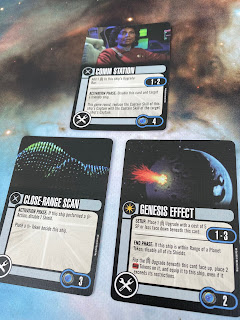
On the Tech front we have three new cards; Comm Station (4), Close-Range Scan (3) and Genesis Effect (2). Comm Station adds another Crew slot to your ship for one thing and then offers an in game advantage too. At range 1-2 this ability allows you to utilise the Captain Skill of a friendly, close-by ship during the Activation Phase which will likely give you a later move but an earlier Action/Attack. 

Close-Range Scan lets you add an extra Scan token if you've performed a Scan(!) and have to also disable a Shield to benefit. The "biggie" here should therefore be Genesis Effect and to some degree it is but I was perhaps expecting something more explosive.

Active at range 1-3, this again depends on being in close proximity to a planet.. Before the game starts you stick a Crew upgrade costing five points or less under this card and then during the End Phase you can disable Shields then place two Time Tokens onto the Crew card. It's then equipped to the ship no matter the restrictions. I would recommend picking something that would change the game at a later stage and preferably an ability that will impact the wider fleet.

Last up is the Elite Action, Captain's Discretion (4). It's a straight forward opportunity for a Free Action but you can only utilise a Crew card - which with the Federation faction should be fairly easy given the amount there are available in the whole game. Potentially this is one to swing into play alongside that Genesis Effect card and play them both as a combo late in the day. 

This is a nice little, cheaper expansion to provide some more options for the game with an existing piece. The shame is that these aren't more unique than ones we've had before. Having Grissom is pretty cool if you want to try and stay movie pure and field some classic events. Some of the Crew choices do offer multiple play options especially the out-of-place and out-of-time Riker who's the best of the bunch.

Most likely a completionist set and Federation purists!

Follow all our other game reviews including multiple expansions for Attack Wing HERE

Like our page on Facebook 
Follow us on Twitter
Find us on Tumblr 

Friday, 15 January 2021

Lockdown Ascendancy with the Borg


Attack Wing has been my game of choice for some time but with another UK lockdown underway, it's not really designed for a one player experience if you're looking for that tabletop Star Trek escapism.

I've tried to tweak it slightly but it's just not quite right somehow. Playing two fleets you've meticulously built against each other means you will subconsciously outthink yourself although it does help pinpoint weaknesses in your strategy and ships to avoid!

Besides that, there's only so many times you can run the Endgame, Pegasus or V'Ger scenarios once you've nailed them - let's not even consider the Solar Sailor one in this discussion.

So I've turned to Ascendancy to not only give me a bit of Star Trek gaming variety but also for the chance to dive into a more structured one player game.

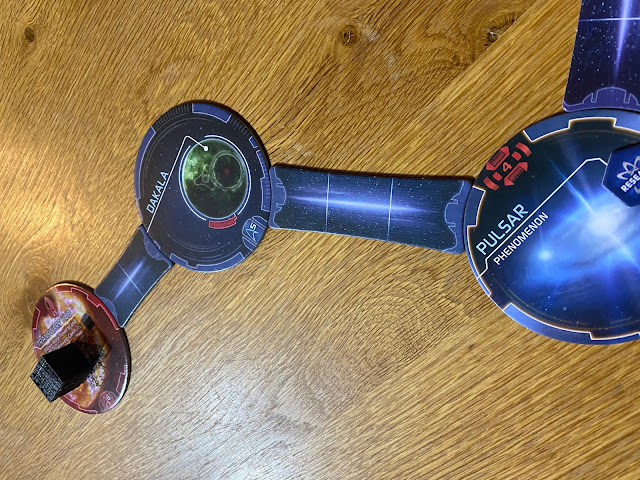
Ascendancy hasn't really expanded since the introduction of the Andorian, Vulcan, Ferengi and Cardassian factions and nor does it seem likely to. Each of those has added some more systems to the playing field (10 per box) as well as Exploration options. The biggest advancement however is Borg: Assimilation.

I'm a little behind when it comes to the game but when I spotted that this had a one player option it was a big draw. With the lockdown situation as it is, there's not much chance to be able to meet up with any form of group to battle it out across the galaxy. This on the other hand does allow for a healthy dose of Trek tabletop gaming.

The basics are the same as the original Ascendancy; Build, Execute Commands and then Verify your progress each round. I found that the initial set up could take an age but after a couple of refreshers I was getting the table ready in minutes rather than half an hour. Then you're into the game, building ships, sending out fleets to explore the galaxy, discover new worlds to colonise and engaging any enemy forces or hazards that might be out there. All of this is great if you have friends around in your social bubble to join in but otherwise it's a dead end.

The Borg: Assimilation pack includes an additional set of system discs, tokens as well as new Exploration cards. The Borg are non-playing and are controlled via their own Command deck of cards, one of which is drawn and used per Cube in play per round. Generally it'll move a Cube in the direction of your Home system (Earth for the Federation, Q'onoS for the Klingons...) in an attempt to assimilate developed worlds and ultimately your origin point.

The instructions direct you to place the Transwarp Hub (when playing solo) 18" away from a Home System but after three run throughs this is incredibly close. Each time I've found that the speed of play is incredibly quick and before you've started or even explored a world or two you've got the Collective on your doorstep. To make it "harder" there's even the suggestion to move the Hub closer but that's beyond overkill!

Pushing the Transwarp Hub a little further out offers you the chance to develop worlds and by default, the chance for the Collective to assimilate them and mix up the scenario a little bit as well as allowing you to explore and expand rather than just facing off an immediate attack on the first world you discover.

You can switch your faction to any of those available (Federation, Klingon and Romulan come with the base game) and each has its own characteristics. The Federation can't colonise anything pre-warp for example and the Klingons are not allowed to retreat from battle. So, once you're bored of playing one faction you can give another one a try and see how far you can get. 

On the downside, the rules aren't all that clear in some respects when it comes to battles, and specifics of movement. This can slow you down as you're flicking through two rulebooks to cross-check the rules on Borg warp abilities. Reaching the player goal of five Ascendancy is a bit of a pipe dream with the Borg playing since their attacks are so devastating. Again, try and lengthen the playing area to give yourself something of a chance.

But, Ascendancy does take a lot shorter time to set up than Attack Wing and the gameplay time versus that is well worth it. The latter is a marathon just to build a fleet and having a casual game is nothing short of impossible to do in an evening. The huge amount of cards can be overwhelming so I'd thoroughly recommend that you plan a fleet a few days early and then have a good couple of hours battling it out.

But don't write Attack Wing off completely because there's a vicious rumour that Alliances might actually be released in 2021. Even more surprising, it could be by the end of January!

Why so excited in relation to the near catatonic Attack Wing? Because all of the components of that WizKids game are compatible with the new updated Alliances spin. Now that's a clever move in order to keep your older lines alive and bring something different to the party.

It's also supposed to have a one player mode which means that it will be immensely more playable in your social bubble than trying to outthink your own tactics in a round of Federation versus Independents. Unless there's some official way of creating an "AI" experience on the Attack Wing mat then it will die out as soon as Alliances hits the shelves.

So for now I'm sticking with Ascendancy. I'll have to do some disc shuffling, expand the play area and give myself some new ways to explore in order to really understand the dirt under the nails of the game, but for ease in virtually all departments it's just that step ahead. 

What are your tips for Ascendancy?

Like our page on Facebook 
Follow us on Twitter
Find us on Tumblr 

Thursday, 14 January 2021

Episode Archive: Obsession


Aired as part of the second season of The Original Series, Obsession wasn't in the order when the 67-68 stories were chalked up.

Added after NBC requested an additional two episodes, Obsession would see a script suggested before the first season aired become a reality although Art Wallace's original plan would be passed through the hands of Gene Coon, John Meredith Lucas and ultimately Gene Roddenberry before it would be committed to film.

In simplistic terms, Obsession is Moby Dick before The Wrath of Khan with Kirk tunnel-visioned on destroying a creature he encountered aboard the USS Farragut as a lieutenant and caused the death of his captain. It is his singular goal to kill it with no apparent regard for anything else going on around him.

For four fifths of the episode it's a well-paced, dynamic story that deserves a lot more attention than it gets. It's perhaps not your City on the Edge of Forever or another Arena but Obsession provides a rare glimpse into the past of James T Kirk that is oft missing from the series bar the appearance of his brother in Operation: Annihilate

Kirk unusually allows his emotional core to run wild here in his quest for vengeance with McCoy being the more logical voice of reason trying to remind the captain of his duties and pairing with Spock in an attempt to put the brakes on Kirk's personal mission.

Now, it would work quite well solely if the narrative was focusing on Kirk looking to exact revenge on the killer cloud that might be the same one which attacked the Farragut years before but this is never made concrete fact. We do know that it goes back to the planet on which that initial affray occurred but this could be one of several; a part even of that original creature - Kirk plays it purely on a hunch and a memory.

The introduction of Ensign Garrovick, Kirk's former captain's son just at this time and that he's aboard the Enterprise is frankly too damn convenient in any and every sense. When you realise that Lieutenant Rizzo, who is killed off by the creature in the first half of the episode, was split in two to make this role, you can see why it doesn't quite work out.

Stephen Brooks gets landed with substandard material and a lack of development from the off, featuring as little more than guest character of the week who might or might not make it through to the credits. Aside from his parentage, the only redeeming part of his appearance is that he chocks Kirk in a selfless act to save his captain's life over his own.

I might say that this isn't the best guest appearance in Star Trek's three seasons but the blindness of Kirk to everything else around him multiplied by the proximity of his own deceased  captain's son only helps to raise the tension and perhaps for Kirk to prove himself and finish something for the memory of Garrovick Senior.


Yet throughout this whole episode there's some debate - and one that our viewing party a couple of weeks back - brought up. Over the course of Obsession there's the notion that the killer kloud is an intelligent lifeform however at no point does it show significant signs. It might be on the boundaries of becoming sentient but all it does is hunt down iron-based blood and then make a beeline for its apparent world of origin. Could this just be an inbuilt response? At no point is there any attempt at communication made or definable reasoning for the gas cloud's actions only that it must be eliminated.

For comparison it's worth diving into The Next Generation and something we will be doing in the near future is stepping into Silicon Avatar.

That's the hole that sinks Obsession more than any other because the final act is a complete whitewash. Kirk and Garrovick Jr take a bomb to the surface, play out a few hurried minutes of tauting the creature into taking it and head back to the Enterprise with only a slight malfunction in the transporter to offer a bit of tension in the final moments. Returning to the ship it's all over in seconds; Kirk offers to tell Garrovick about his dad, close transporter room doors and run titles. I'm sorry...what happened...?


Then there's the shoehorned in appearance of Nurse Chapel to challenge Garrovick and make him step back up to the plate. Written in, surprise surprise by Gene Roddenberry, it could have easily been taken by McCoy but that would have omitted the neat little twist to her conversation and the bluff that makes the ensign re-evaluate his situation.

The speed that Obsession wraps its story is so quick I had to use a fire extinguisher on the TV it goes that quickly. The bulk of the episode is a good piece of development for Kirk, a very out of character Spock (what's with that air vent bit?) and a more sensible and rational than ever McCoy make it even more essential Star Trek viewing. It's an episode that easily gets lost among the classics especially with that later second movie taking a lead or two from the story (or at least its source material). 

It's not a perfect Star Trek episode but for one with such a long time in the mix before being selected as something to fill the gap, there are a lot worse examples of episodes in the second season you could pick. This one at least focuses more on the characters, the unusual amount of conflict between the Big Three and an enemy that actually has very little screen time. The whole impact of the script comes from its Starfleet officers and the way in which the cloud creature thing makes them react rather than needing to display it at every occasion. 


Like our page on Facebook 
Follow us on Twitter
Find us on Tumblr 

All images copyright CBS

Wednesday, 13 January 2021

Predator: Nemesis' Scimitar; The Official Starships Collection Special 18


With one of the largest arsenals in the history of Star Trek, the Romulan/Reman Scimitar made a big impression even if the movie it featured in didn't.

Dwarfing the USS Enterprise-E, the vast Scimitar was the flagship for Picard's clone, Shinzon, as he took control of the Romulan Senate and looked to expand further afield.

Eaglemoss had a huge run on this model at its initial release meaning that I’ve had to wait a little over 9 months for its arrival and quite a bit has happened since then!

But there are a few concerns with this one. Those wings certainly give it some width but they are dangerously flimsy and bend at the slightest touch. As a major part of the design it's hard to get past holding them at some point. Both sides of the wings are heavily detailed with the unique panelling detail of the whole ship and that rolls back into the main hull. 

Everything about this ship screams aggression with the fang like weapon protrusion from the shoulders as well as the forked nose section. The central upper piece of the hull is the only part in metal which also means that the whole thing is surprisingly light. 

On screen the Scimitar looked a lot darker with the light blue highlights from its power sources glowing a lot stronger visually. The model itself is toned back down to the original design (as best is possible). Here those blue spots don't show up as well against the lighter grey and almost fade into the background. Initially it looks like they are only on the central section but check in a different light and you'll see that the whole model has this effect. It's the two extremely light colour tones that make it almost indistinguishable from the main hull.

Atop the main section there's a lot of that hull patterning and on the ventral side it's completely different. The line of symmetry runs front to back and there's something new to see from every angle. Even from the side you can catch the recessed centre line which is the best spot to see some of the very fine highlight blue detail perhaps thanks to the darker shadows.

The most impressive pieces though on the Scimitar are those touches around the nose and also to the rear beneath those overhanging engine pods.  To the front Eaglemoss have ensured all the weapon points are easy to see face on while at the back there's a lot of parts slotted together to complete the various extremities.

The winglets affixed to the top and those rear pods are good and sturdy additions onto the frame leaving only the wings - a huge bit - as the structural concern. Just don't be heavy handed. Scimitar has a lot of parts, possibly the most of any of the Specials and certainly over and above any of the regular issues. There are inserts for the main section, winglets top and bottom plus the pods to the rear and the build quality to bring all that together is very, very good. The seams and fittings are completely invisible and even checking the engine pods you have to look underneath to see how they are assembled. In this respect it's a masterclass on concealment to provide a polished and "flawfree" finish.

The stand fitting isn't too good with the Scimitar's weight pulling it to the front and also - oddly - slightly to one side meaning that the rear doesn't sit against the clear plastic grips. The plug into the black base might need a shade of filing down to get the sit right as there's a fair bit of movement.

The 20 page magazine is a treasure trove of sketches in the Design article that have probably rarely if ever been seen. The Scimitar hasn't received a lot of page time when it comes to exploring its background and this issue does a lot to address that. Scimitar, as you can find out here, was bristling with weapons at every point, backed up with an almost impenetrable cloaking device, Reman fighters, superior warp drive to the Enterprise and more.

Including a lot of screenshots from Nemesis, the issue details all the key features of the ship including a forward view of the ship with the wings open and closed. Those views are also included from its solo screen appearance and gives a bit more clarification to the deployment of the thalaron weapon that made it even more deadly.

This is a very, very special Special backed by the point that it sold out fast and took some time to restock (might also be due to a pandemic) but is one that fans need to have in the collection. It suits the larger size of these editions perfectly and the difficulty in bringing it to life only increases the desire to get hold of it. 

Getting the right information to build it has taken some time but it's meant the Scimitar has been made right and at the right time in the collection. Up to this point the only one available was the smaller Attack Wing miniature so don't wait to pick one up!

Read all our other reviews of The Official Starships Collection from issue ONE here.

Enjoyed this article? Why not like and share to spread the word!

Like our page on Facebook 
Follow us on Twitter
Find us on Tumblr