Kicking off with the USS Buran NCC-96400 we have a third ship in the series directly inspired by ships of yesteryear.
As with issue one’s
USS Gargarin, this one’s a hat-tip to the
Cardenas Class
Buran captained by one Gabriel Lorca prior to his appointment aboard the
Discovery. Based on one of the class found at the long-abandoned Yard 39, the
Buran sports a distinct quad-engine design firing back from the circular primary hull in a very familiar style.
For one, it’s an updated version of the 23rd Century Discovery-era design and unashamedly flaunts it while there’s also a hint of the Cheyenne Class seen just the once in the wreckage of Wolf 359.
Saying that, quad warp-engined ships aren’t the rarity they were through the years of The Next Generation with the USS Chimera in issue two alongside the USS Prometheus showing that this concept is very much alive and kicking in the early 25th Century and to good effect.

The detail on this one is fantastic once again. In fact each of the new Starfleet ships has been incredible to pour over even if there have been the occasional faux pas.
A familiar sight with this one and something that was introduced through the Discovery ships is the utilisation of a double registry on the port and starboard sides with a tiny name right on the recessed nose.
The Buran is alive with colour right from the front edge of the saucer. The off-white of the primary hull is accented with dark, mottled grey sections and red Starfleet decalling. The saucer itself looks very much like an axe with the central section almost appearing as the handle and giving a very distinct look to the craft. Not sure if the bridge being right at the front of the ship is such a good idea from a tactical perspective especially with this being classed as a Dreadnought...!
The fiddly little lifeboat hatch decals are slightly misaligned over the lighter grey squares. This only seems to be with the ones on the saucer though as the decals on the central spine for the same purpose are spot on. What I've also noticed is that some of the paint curves aren't lined up with the hull shapes either however I only saw this under a zoomed photo.
Bordered with Starfleet pennants, the central hull echoes the underside of the Sovereign Class with its arcs and colourings. The blue/grey/white ensemble is precisely painted although I do find myself comparing the model to the magazine pics and it seems much cleaner on the cover than it does in diecast form.
The central hull section is strikingly detailed, curving out into the four arms bearing the warp engines. The warp reactor is glaringly visible with the electric blue finish - definitely something that the Online ships have done is to utilise the wide colour palette of the game!
Out to the warp engines and again the detail is at a very high level with translucent bussard collectors on each nacelle and a continuation of the blue/grey/white colour scheme to the tips. It does lose a little on very close inspection where some of the paint hasn't quite made it into the gaps or ridges but as an overall experience, this is another beautiful ship. It's good to see the engines all lined up and firmly in place too (I'll refer you to the upcoming gold USS Enterprise model review) as it helps to set this model off perfectly.

The biggest differences on the ventral side of the Buran is the less excitable paint work with much less blue (aside from around the deflector) and the grey used more sparingly around key features. What you also see here is how the off-white paintwork actually raises the panelling details making the Buran look worked. That mottled grey is a very effective colour for the curves of the saucer and a hat tip to Eaglemoss here because the lifeboat hatch decals almost exactly line up with the hatches themselves.
The paintwork is a big factor in the impression of this ship. Its configuration has seen a lot of cosmetic changes since debuting in The Next Generation, being twisted for the USS Prometheus and numerous other ships along the line.
This one is incredibly sturdy and well built. The topside and top pylons here are metal with an inserted plastic bottom section that also includes the lower two engine pylons. The joins are barely visible and the fit of all the sections is incredibly flush. The stand fits tightly around the pylons and there's little movement or chance that it'll be going anywhere thanks to that.
Issue five's magazine (sorry I keep saying this...) makes for a good read exploring the nature of the Buran's design and its origins in Discovery but brought up to date for 25th Century duty. The mini-mag carries some great plan views of the ship plus the history of the namesake and the reason for this class of ships to exist. As to the elements of Online we have explored, issue five discusses the appearance of Ellen Landry (voiced by Rekha Sharma) in the game and her actions during the (pre) Discovery era missions.
There are a ton of excellent reference photos and sketches to visually express the journey of development for the Buran and Eaglemoss have wisely included the original design from the 23rd Century as a direct comparison.
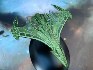
The RRW Vastam is the collection's first dabble into Romulan tech and specifically the Republic's latest warbird. While not their flagship, the Vastam has all the callbacks you need to know it's Romulan rather than Klingon; the pointed nose, the bird-like stance all give away to whom this belongs.
The three-shade green hull sweeps back from the "beak" at the front into two curved wing sections that curve out to the rear and to a central engineering section where some of the extremities seem to appear as plumage.
The darker green highlights panels while the mid-shade covers the remaining sections and the very lightest runs through the grooves on the Vastam across the hull. Along the sides of the neck you can also see Romulan script.
The significant thing about the ship only comes when you view it from the side though. It's super-thin and from certain angles clearly looks like a bird swooping down at speed to tackle its prey. It's a step on from the Warbird of The Next Generation and Nemesis, taking the avian concept to another point and creating a very distinct style with origins that aren't immediately obvious until you examine the ship from different angles.
The underside of the Vastam is a little less packed with structure with a continuation of the panel detail level that's visible on the top as well as the three-tier paint scheme. From every angle this ship looks deadly and compact. The shape appears much more functional than the warbirds of old with their expanses of negative space while channelling a more deadly profile that shouts speed and danger.

The Vastam is nowhere as intricate as the Buran when it comes to palette but the surface panelling is incredible. It's a web of channels across the whole surface and not just the segmented pieces with every inch covered. Being a sweeping curve as well means that this is a solid metal model. Only the central tail piece and the feather-like topside decoration have been added in plastic. While those extremities are quite clearly not metal, the rear tail piece is a good close fit and without a second look you can't tell it's not part of the main hull - the colour match is excellent across the two materials.
Issue six explains the split in the Romulan Empire which in turn led to the Republic and the design and build of the Vastam for a new fleet. There's lots of background detail including that this class carries its own wing of Scorpion Class fighters and how the Romulan navy operates.
Lots of good pics of the ship in here from the game as well as the standard plan views (which aren't as detailed as the ship itself) plus a meaty section about the design of the craft. Early iterations do bear a strange similarity to the Klingon Bird of Prey created for Into Darkness. This certainly evolved into the striking bird silhouette we have here and I have to say it was a wise move.The STO Lore section dives into the establishment and structure of the Romulan Republic and with our knowledge of the direction Picard chose to go in, it's a great "what if" article covering the rebuilding of a people.
This is another stunning pair of ships from the STO line that have translated amazingly well from the screen to the physical world. The designs, the evolutions here are inspired and while I absolutely adore the curves and detailing on the USS Buran I'd have to pick the Vastam as the gem of the pair - but again (this is getting familiar) only by a whisker. Personal opinion, the Online ships are incredible and getting better each month - almost feels like the original collection was just prepping for the brilliance of this series!!!
Check out all our Online Starships posts HERE
You can find out more on the Star Trek Online Official Starships Collection by visiting the Hero Collector website HERE
What's been your favourite so far? Is this collection what you expected? Drop a comment below!
Enjoyed this article? Why not like and share to spread the word!


