Sunday 19 December 2021

The Official Starships Collection: USS Enterprise NCC-1701-D XL


The second in the expanding XL line, the Enterprise-D needs a good sitting down and talking to.

This version it should be noted is delivered in the new magnetic clasp presentation box rather than the blue thin card version. Looks like this is one of several "upgrades" which are also costing a further £10 on top of the original price.

The criticisms that were laid at this XL's door were that, for all intents and purposes, it was just a copy and pate job up to a larger scale. Problem is, in most respects that's absolutely correct. One common theme on the XLs though is to change the base colour of the ship and here we have exactly that. The Issue One version carried a dour grey/beige finish with Eaglemoss upgrading the XL to the duck egg scheme as it should be. The aztec pattern is identical to it smaller predecessor and the slightly out of alignment registry is of a better quality but that's where it starts to fall apart a bit.

Neither the windows nor the lifeboat hatches line up with the raised and recessed sections of the ship with these being most blatant when you flip her over and take a look on the underside of the saucer. The square impressions are miles off...miles. Everywhere you look from bow to stern, the black and white lines just don't match to where they should be. Nor are the windows around the very edge of the primary hull marked in at all. At this stage of the series and with a couple of D versions under their hat, this should never have been an issue at this stage... but it still is.

Also the paintwork on the saucer's wraparound phaser bank is dreadful with a horrid feathered edge right the way round which should have been nailed off by now.

What has been added are the two transporter emitters either side of the bridge/shuttlebay central module so there has been some note of errors however just a few centimetres later we have the two "neck" shuttlebays unlabelled and also bay two is the wrong size and just a mirror of bay three. The windows again are a total mess even overlapping. At least the aztecing is on point huh...?

The warp engines bear the expected translucent bussard collectors and warp grilles. These are much less plasticky with running lights marked in and those red striped Starfleet pennants finishing the job.

On the first issue edition the Enterprise-D suffered from scale when it came to the main deflector. The orange and blue elements really mixed together with the XL allowing them both a bit more room and therefore the chance to see the dish detail as well as the surrounding shroud ridges. It's a lot clearer here and one of the things that does succeed when it comes to the sizing up of the Galaxy Class vessel.

Even on the underside, while the decals are spot on and much better than before, the placement of anything that resembles a window is atrocious and utterly ruins this model. Eaglemoss need to take another look at this one and get their printer in alignment. I mean the phaser banks are well integrated onto the model, the physical build is good and structurally sound. Even the weight reassures you that this isn't a cheap reproduction but the windows are such a downer and my apologies for repeating it a few times in here.

Into the magazine with the Enterprise-D and we have some more quite repetitive material around the origins of The Next Generation and casting of the main crew. It's decent reference work but the trouble once more is that these kind of articles are over repeated and have been since 1987.  Good content here but nothing spectacularly revelatory for experienced fans.

This is a great ship, period. The problem with its arrival in this line is that the bigger errors of the collection have not been addressed, leaving this one missing the mark and its potential straight away. This could have done the XLs a lot of damage and still needs working. 

Check out all our Starships posts HERE

You can find out more on the Star Trek: The Official Starships Collection by visiting the Hero Collector website HERE

Enjoyed this article? Why not like, share and spread the word!

Like our page on Facebook 
Follow us on Twitter

Sunday 12 December 2021

The Official Starships Collection: USS Equinox NCC-72381 XL Edition


First released back in early 2014, the USS Equinox has now made it into a larger scale in the Official Starships Collection.

As with several of its XL predecessors, the Equinox benefits massively from the scale upgrade and that wonderful benefit of eight years model-selling hindsight. 

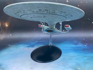
First up, the hull base colour is completely different and far lighter giving you the immediate notice that this has seen some MAJOR reworking in the last eight years. The lighter shade allows much more of the natural panel work detail to stand out as well as the darker grey printed panel etching to contrast the base coat. In a bit of a twist though, the panels here are not as glaring at their edges as they were and blend more into the model than being overly distinct.

Even down to the pointed primary hull front there are improvements with a more crisp finish to the decals and a brighter blue surrounding the secondary deflector. The open sensor work benefits from the upscale with more of the components "lit" and visible rather than being superficial pieces and over painted.

Window alignment is nigh on perfect thanks to the larger openings on the hull although the partition lines on the square groups of four on either side of the saucer are flat painted out blue. This should be a minor issue to resolve with a dab of grey paint. 

I've been made aware that the font for the ship registry is still incorrect and does seem to be squashed into a small space with only just bearable definition between the black and red. Add in that Eaglemoss have numbered each individual escape pod hatch and the model keeps on giving. On the smaller edition these were, shockingly, GREY!

The sunken bridge also carries a better colour range with the roof panel nicely split and the semi-circular defence grid again precisely split out. Reflect back on the original and there was no colouring on that bridge dome, the registry was simply thin black lettering and the windows were mainly blanked out. Yes, there's that much difference and we're only halfway along.

Moving down the spine, the upgraded details are fantastic with many of the features highlighted through black edging decals. Again, reflect back on the smaller original and there's a dark grey stripe along the spine and none of that finer detail. IN fact there's zero black edging on the collection issue 15 ship.

The impulse engine and the vertical section just behind it are now coloured although the former could have done with being in a different colour. However, this is still a massive improvement. Checking the joint lines by the engines it's clear that some construction has been scaled up but the engine build this time is a light year better.

Instead of the horrible joint lines across the top, the nacelles are joined along the horizontal centre line avoiding trashing the registry and pennant as they were on the original. It has retained the painted on bussard collectors with the wrap grilles in translucent blue. But what's a step up here is the patterning on the engines which was absent previously. There's an added depth to the Equinox XL which trumps both the original and, personal opinion, the "upgraded" USS Rhode Island completely. 

As with the top, the ventral side of the Equinox adds more black edge detail including the landing leg doors and better colour for the docked Waverider. Eaglemoss have changed out to a stronger, more electric blue for the backing of the main deflector. The size of the name and registry has also been corrected so the numbers are now smaller (and correct) versus the equally sized fonts from issue 15.

The selective panelling across that version is most evident when you're looking at the underside while the XL has full and corrected gridding as well as better positioned decals (check the alignment around the warp core ejection hatch). It's better in every single way (maybe with the exception of that main registry font) and a fantastic XL version. Changing up the colours has made a heck of a difference and brought out a lot of elements previously hidden or painted up in the limited selection that was used back in the day. Truthfully it just feels better, more solid and with a few minor adjustments to the build, has resulted in a more accurate depiction of the onscreen Nova Class from Voyager. Small is absolutely best whe it comes to the XLs as we've seen with the Runabout, Defiant and the Delta Flyer so you'll know how excited I am for the USS Pegasus which will be up on here shorty.

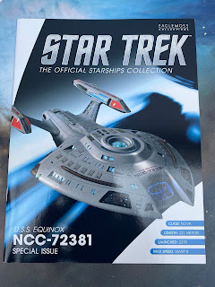
The enclosed magazine covers the basics of the Voyager two parter and the background of the ship before plunging into a fairly in depth view on the use of the Defiant pathfinder to become the Equinox. Interviews with John Savage (Ransom) and Titus Welliver (Burke) fill out the edition, making this a very Equinox centric volume as it rightly should be.

A great all round package that adds detail tp the background of the ship on screen and off. I would say purchase of this XL is a no-brainer if you love the ship. It's a massive step up from the standard collection (may have mentioned this a couple of times) with two tons of updated detail and structural strength. Good to see changes made with the model to only take things forward. Magnificent work with only a couple of minor quibbles.


Check out all our Starships posts HERE

You can find out more on the Star Trek: The Official Starships Collection by visiting the Hero Collector website HERE

Enjoyed this article? Why not like, share and spread the word!

Like our page on Facebook 
Follow us on Twitter

Tuesday 7 December 2021

Where's the Episode Reviews At?


For those of you who are regular followers/trolls/etc of this blog, you'll be familiar with my weekly episode updates.

But I've come to the realisation that everyone and anyone is doing them and, in all honesty, they're not the most widely read of posts. Even I've noted that I've reduced their length into more bitesize territory of late. With both Discovery and Prodigy now running at the same time it just isn't feasibly possible to write reviews and also do other discussions, opinions and those lovely item reviews plus a full time job.

So I'll be more or less covering a series of episodes and events within a piece on a more regular occasion and get away from being a) a pure episode review site and b) a pure ship review site that I fear I may have started to go down.

Let's move straight on though to a couple of things. One is of course the wonderful news that outside of the US and Canada, Discovery season four will be available on Pluto TV FOR FREE during what Paramount is describing as a "transitional period". Episodes one and two; Kobayashi Maru and Anomaly dropped last week if you happened to be off world at the time. Plus, yes, I was totally wrong that fan power would make a difference. It actually jolly well did.

It's going to be another slow burn (yes, intended pun) of a season. Burnham hasn't convinced everyone that she's amazing and the Federation president Laira Rillak even bypasses her for command of the Voyager-J. Burnham certainly has her issues in wanting to save everyone and saving no-one. For once we have a captain who isn't perfect and doesn't make the best decisions. I believe it's called "On the job learning".

But as we would suspect from an arc-based series, it's not all great news because the Discovery is called out to deal with a research station that is being affected by a gravitational wave. 

As an opening to a fourth season I was expecting something with a bit more weight to it and Kobayashi Maru didn't totally live up to its namesake. The Big Problem of the season is another huge threat to the galaxy that might be something we've seen before or it might not be. First thoughts were that it could be V'Ger and I swore I heard a few bars of it's ominous theme but it's got to be something else entirely.

Adira is still a great addition to the ship and has slipped into the "inexperienced" role which Tilly filled for seasons one and two with her storyline and the ever nearing rebirth of Gray providing one of the seasons standout narratives already. There's even a hat tip to the procedure's previous success with some Starfleet admiral named Picard.

David Ajala though is leaving me slightly cold. His relationship with Michael feels disjointed while it should be more endearing yet the time he spends working with Stamets to gather data on the anomaly turns out to be a great piece of writing.

Discovery has to be the most inconsistent of all Trek series. Whether that's down to the overriding arc structure or the very generic background bridge crew, it never seems to live up to its potential. There are a few too many sideways glances, odd humour moments (Tilly's funny voice one with Saru in Anomaly for instance) which feel jarring and totally out of place in this format and also at this far flung point in the future.

Episode three did ramp it up a bit into more action territory with the return of Burnham's mother, no tears from the captain and a rogue Quwat Milat nun. Of the three so far it's a step forward but once again the Gray/Adira story was far more interesting and even managed to reference a certain Starfleet admiral being reborn in the same synthetic manner.

Choose to Live got it right for once. The character moments weren't forced, Tilly's motivations seemed clearer with her wanting a challenge. Even Book and Stamets' partnership is developed and we seem to have a more defined heading for the season. Yes, the gravitational anomaly was still in the background but this time the main plot line came off a lot stronger. 

A society in stasis is nothing new (Dragon's Teeth) yet this was much more in line with Star Trek's basis of helping a people and not misunderstanding them. J'Vini's cause is true to her beliefs and although it's completed with the death of a Starfleet officer from the USS Credence, it remains close to the Needs of the Many. Wonder where we've heard that before?

But Discovery still misses a beat. In Choose to Live it's come very close to the origins and core nature of original Trek but there's a lacking of depth overall. The arc nature ay well be making it feel exhaustive but once more we are on a path towards a penultimate episode reveal which will, undoubtedly, reveal Burnham to be the saviour of the galaxy even if the Federation President doesn't rate her.

Then there's Prodigy. A series that has really taken me by surprise and is currently on a mid-mid-season break after five episodes. My word how this has come out of nowhere. I'm still not super thrilled with the animation but at present it's the best Trek out there. Exploration, new frontiers, a ship that actually looks stunning and a not over-complex arc that allows the show to breathe and dive into its characters. The Murder Planet does something similar to The Naked Time/Now in that it cuts into the core of these five aliens and gives us a hook into each of them.

Bet you can name all five already. Designed for the younger generation, it has a lot of merits from the Michael Giachinno title score through to the lickable planet vistas and all points in between. The reveal of the protowarp drive leaves a dramatic and jaw-dropping cliffhanger and I cannot wait to see where the show heads now.

I;m aware I've skimmed that in two paragraphs. Let me expand. This show actually has an ensemble that works. All of them have distinct personalities and, you might surmise, different agendas. Everything is new to all of them with the fulcrum of Holo-Janeway as their balancing point. I really think this series is working at a great pace and right out of the dockyard.

More thoughts on the way... but how are the two shows comparing for you?

Enjoyed this article? Why not like and share to spread the word!

Like our page on Facebook 
Follow us on Twitter