Tuesday, 8 August 2017

Starships Collection - The Vegas News


Along with the torrent of news around Discovery, another one of our favourite topics received an update with Ben Robinson revealing another batch of new starships for the official collection plus an added bonus.

As is now our tradition, here's the assessment on the latest additions to the ever increasing collection list...

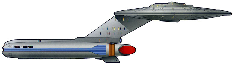
USS Curry 

Another kitbash. Definitely fits the list of every starship plus everything seen on a display graphic and all the variants in between. A combination of refit Constitution and Excelsior parts, the Curry Class made a singular appearance in Deep Space Nine's A Time to Stand on the retreat from the Dominion. One to stick alongside your Centaur and New Orleans Class ships. Not a must have but a nice inclusion for Niners.
Anticipation Level: 2.5/5


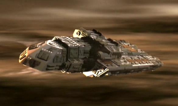
22nd Century Ferengi Ship

An easily forgotten ship from the mixed up early days of Enterprise. While the guest cast from the episode were top notch including Clint Howard and Ethan Phillips, the ship was less memorable. Given that it wasn't supposed to give the game away of the boarding party too early it doesn't have too many parallels to the later Marauder nor the Quark's Treasure (now there's a model we still haven't seen). Will probably have exceptional detail however!
Anticipation Level: 2/5

Freedom Class

Back to The Best of Both Worlds, The Next Generation and Wolf 359 for the second kitbash in quick succession. Now what does strike this apart from the Curry Class is that there has been clamouring demand for this one to sit alongside the other ships involved in the fateful Borg encounter. To this point we've had the New Orleans, Cheyenne, Springfield and Challenger classes which makes this the one to complete the set - and a set to stick alongside the First Contact fleet perhaps! The display stand for this one should be interesting...
Anticipation Level: 3/5

Hirogen Holoship 

Featured in the excellent seventh season Voyager two-parter Flesh and Blood, the holoship was part of the swan song for the dynamic Delta Quadrant hunters. Only their second appearance in the collection (likewise the Ferengi with their 22nd Century ship) and one in fairly excited about. Much more impressive design than the Federation Holoship. Enough said about that.
Anticipation Level: 3/5


USS Bozeman

This is one of those that will set the collection alight and will be a must have. The Soyuz Class might be just another skip variant of the Miranda Class but it's fame from The Next Generation's Cause and Effect has meant this one has been in demand for virtually as long as the collection has existed and  at least since issue 11's USS Reliant. Had to happen after the Saratoga and many would say it's been too long.
Anticipation Level: 4/5

Xhosa

And Finally. Kasidy Yates' freighter from Deep Space Nine joins the collection. Seen only a couple of times in the show it's one that I was only talking about the other day as being a noticeable absentee from the set. Likely to be a better result than Neelix's Baxial, the Xhosa does meant that Deep Space Nine is receiving a little more attention than usual in this new set of announcements. 
Anticipation Level: 3.5/5


What else did we learn from the session at Las Vegas? Well there were a couple of design shots of the upcoming Phase II USS Enterprise variant that Ben teased previously and there was a graphic of the Andy Probert design for the Enterprise-C also due in the coming months. News also that we will be getting the original Rick Sternbach concept for Voyager with those movie era drop nacelles.

Ben has also let go that there will be a set of shuttles from the Kelvin Timeline including Pike's shuttle, the one from the Kelvin and the shuttle that delivers Kirk and McCoy to the Enterprise plus one more. That will, I would think, be set four as set three has already been confirmed. 

The big news from Eaglemoss however was left to the big thing that Las Vegas was really all about - Discovery.

Ben announced that in 2018 they will be releasing a new line of starships from the series but these will not be part of the already running Starships Collection. It will be an entirely new line (and new subscription) with ships that are slightly larger in scale than the existing series. The ships will be die-cast and resin constructed and be made direct from the VFX blueprints used on the show. Each is planned to measure around 20-25cm in length. Planned for a one-per-month release schedule, the first two issues will be the USS Discovery and the USS Shenzhou and Ben provided a quick snap of the grey prototypes of the first two craft. 

So lots to come from the collection which will run to a confirmed minimum of 130 issues. So where's the Fesarius?

Too many kitbashes or covering all bases?

Live on YouTube
Like our page on Facebook 
Follow us on Twitter
+1 us on Google+
Add us on Tumblr 

Friday, 4 August 2017

Which Way Round? The Official Starships Collection Issues 102 and 103


Issue 103 of the Official Starships Collection feels like normal service has resumed with the return of the Klingons.

Perhaps one of their lesser known craft, the D5 popped up in prequel series Enterprise to no particular fanfare, appearing first as little more than a tanker. Subsequent appearances would lose those tanks and give way to a much more streamlined finish.

The D5 has all the hallmarks of the Enterprise era Klingon ships; a more pointed nose, more angular warp nacelles, a more fierce and deadly finish with more in common to a Romulan Warbird than a Klingon Bird of Prey perhaps.

As always the Enterprise ships are a fascinating addition to the collection because of their attention to detail - something which I think Discovery will easily rival and surpass in a matter of seconds. These ships have everything, surface texture differences, precise panelling and subtle variations in paint schemes which make them a diecast wonder to behold.

I'm not the biggest admirer of the D5 but you have to admire its lines at the least which are more than a little derived from the Raptor and aren't too dissimilar to the Augment ship as well. Let's strip it back and go into some detail.

That nose has all the signs of the Somraw with a sharp point and a bird-like appearance. It's a smooth finish which is unusual for a Klingon craft and in this respect the D5 is their most streamlined vessel. That nose looks to be heavily armoured and sweeps majestically back into the neck of the ship. There's a touch of aztecing on here but it's almost undetectable because of it being such an oddly sleek finish. The joining of this nose "helmet" into the remaining section of the ship is clearly marked out but it all fits together cleanly. The neck, which protrudes back towards the engineering section, is a mass of detail. 

There's the different layers of tech and mechanisms on the hull plus the distinct 22nd Century Klingon feature of exposed cabling which runs along either side of the connecting section. These are very cleanly moulded and attached to the model and while the paint scheme of green doesn't alter, it's important to have them there for continuity. a darker shade might have helped show them to be more heavy duty and less plasticy.

Down the neck and into the rear section once again there's a familiar Klingon feature in the red slatted/grille section facing to the front. It's evident on both the Augment ship and the Somraw and has translated across onto this craft too. There are even two distinct "hump" structures either side of it which scream out Bird of Prey in regards to its slatted mechanism for moving the wings. While these don't have that luxury, you can see where the design has been retroactively slotted into the design journey of the Klingon fleet.


Also move towards the rear even more and there's that impulse engine structure in the centre of the hull which seems to appear all over the ships of the period - the 22nd Century Bird of Prey as well as the Somraw et al.

Eaglemoss have also reproduced the feather-esque panelling detail on the wings creating a more organic and "natural" wing effect and you can see how this will be "developed" into the more notorious D7 craft of The Original Series. There is an evident kink in the wing and the way in which it has been formed to meet with the warp nacelle that shows it's evolution.

I think the wing design from Star Trek veteran John Eaves here is beautiful and nicely finished on the model as well, drawing your eye gradually down from the larger body to its narrower end and then onto the warp nacelles. It's an incredibly stylish ship for the Klingons with some very sharp angles in that wing structure but the nacelles are something else with their dagger-like poise and open detailing.

To the rear they open up in keeping with other Klingon ships of the era and to the front there's more exposed tech that is meant to echo the design features of the nacelles on the later D7's and K't'inga classes. This does seem the most sleek of Klingon designs from the whole of the franchise and oddly one of the more threatening at the same time. The sharp edges, the dagger-like appearance and the scything warp engines all work massively in its favour.

The metal structure in this one stretches from the nose and then onto the underside of the belly of the D5 via the connecting neck. That underside is extremely detailed including the addition of the double cannon. There's also more vent grille work on the underside of the ship and this section is the highest quality section. Lots of hull mechanics, panel detail and also impulse engine exhausts. 

It's a familiar placement for the stand on the D5 with it slipping around the rear of the ship giving the usual "flying" impression. It does look more at home alongside the 22nd Century Klingon ships as there's only a few similarities to this and the later D7s.

The magazine continues to emphasise the killer nature of the predatory D5 with reference back to its sporadic appearances in Enterprise. Lots of good tech detail in here about its armament and manoeuvrability as well as how it compared to the NX-01. From reading this I'd forgotten quite a bit about the D5s and seemed to remember the Somraw and the Bird of Prey from this era much more clearly. Must be time for a flashback and rewatch I think.

The magazine views of the ship do give the paintjob a dirtier finish with the feather wing detail really standing out against the lighter base coat. To be fair the model and images are very, very close to each other on detail here and I can see that it's only the aging of the ship that would have made a difference to the one on the page.

John Eaves' discussion around the designing of the D5 goes to show that the lineage of the ship is purposefully done with him drawing elements from the Somraw and the original Bird of Prey from The Search for Spock to create what could almost be described as a "missing link" to some degree. I firmly think this is the more gorgeous of the Enterprise Klingon designs with its swept lines and dagger-like engine housings.  Eaves also talks about how he suggested theft of Romulan ideas with the more exposed double neck section which starts to nod towards their potential co-operation during The Original Series as seen in The Enterprise Incident.

Finally there's six hurried pages covering Klingon history. I say hurried because there is no way on this planet you can cover the fineries of the Klingon people in a splatter of paragraphs covering everything from Broken Bow through to Errand of Mercy onto the explosion of Praxis and finishing with the ascension of Martok to Head of the High Council. It can't be done properly in this space but at least for newcomers - especially ahead of Discovery - it will give them a base upon which to build more knowledge of the key "baddies" in the new show.

Episode choices for the D5 here are the second season episode Judgement and the fourth season episode Divergence from Enterprise.

And now...

Goddamn it's the Vidiians!!!! Have we waited a long time for this one? Answer: Yes.

The Vidiians were one of Voyager's genius moments. The concept of the organ harvesters ravaged by the Phage worked on every level making them Voyager's creepiest and most unsettling foe, a position I think even the Borg struggled to challenge.

While their makeup was first class as was the backstory, their ships were something of an acquired taste. Admittedly I acquired one for Attack Wing and that seemed pretty big but the latest Eaglemoss version is far superior - as you would expect.

Filling out its packaging more than adequately, the Vidiian Warship is big. Easily as long as it is wide (to paraphrase the mag) you're getting your money's worth here. Now for note, the wider end is actually the front and just to reinforce that there's a very clear bridge module marked out. 

The colour scheme on this one is significantly less pink than I was expecting but there's still some hints of tonal differences plus some panelled highlights right across the surface of the Warship. These panel details are mirrored left to right and then there's the engine colouring which really lifts this ship out of the box.

At the front there's a reaching pincer-like maw which arcs out and around the bridge module. That two tone paint finish is even evident on these areas of the ship and there's even small panel colour differences as well as tiny porthole spots on the superstructure.

Along the metal spine there's raised grille detailing and further aztecing which stretches continuously to the almost-tapered rear that ends in another yellow engine housing. You do have to strain a little to see the shift in the paint scheme but it's definitely there. The Vidiian ship has a certain harshness to its finish with that very heavy frontal position. It's unusual for a Star Trek ship not to have a narrower front end or something that is distinctly a front end since you could think this flies either way round.


Out into the wings and these contrast materially to the upper hull being a central piece linked to the lower hull and totally plastic. Again they feature, as with the main hull, highlighted sections to give them a more 3D and realistic finish. I love the sharp edges here and the "killer" finish to the design. The overall design is very aggressive and looks ready to pounce with its forward sweeping wings and pincer maw. 

They have a slight kink in them, giving a slight inverted "V" shape as well as having cut-out segments toward the back and I think the choice of metal here might have been wiser given their width and flexibility. However, I don't think it's a massive problem more of an observation. 


The clip together top and bottom hull segments fit extremely snugly although it's not a straight centre-line crease rather it notches into the lower half around some of the side detailing. Again, a good choice to ensure those clean lines and markings aren't broken up with some lazy fixing.

In fact the top hull section, being metal fits into the lower plastic hull which spreads out to the wings. The panel lines are more striking on the metal upper section and the yellow engine field grilles plus the yellow highlights really do stand out proud against the dusty brown of the hull. The plastic sections - the wings and lower hull - actually appear to be a slightly lighter shade of brown by perhaps a shade which is a little odd. I also spotted that on the underside there is zero two-tone when it comes to the base brown coat. It's a solid shade on the belly with the segmented panels being in the lighter brown shade. 

Ok, back to it...and to finish we find ourselves tapering to the rear and what I can only assume is the impulse engine providing a wedge-like tail to the warship. Nicely the aztecing continues on this small section of the ship and on both sides even though the bottom of the ship is a single brown shade on the plastic.


As for detail on the flipside it is a virtual mirror of the top when it comes to the wings and the mechanical beige panelling sectioned out on both sides. The warp engine field grilles do have some slight variation with yellow highlights but are otherwise unchanged. Look close up and you'll spot that those beige sections are exactly identical to those on the topside.

Into the centre of the hull and as with above there is more window detail around the central section indicating the overall size of the Vidiian ship. It is perhaps less complex than the more often seen upper section yet we still have the evidence of panel detail and another yellow recessed section which I can only assume is the navigational deflector as opposed to the point between the pincers as indicated in the magazine. It would make more sense for this to be it although it could be an intake of some form.

As for the join lines here it's a bit obvious with quite large gaps at the edges of the plastic and metal sections. Interestingly the plastic bottom isn't just a flat piece as it cuts around the tips of warp engine field grilles on the wings as well as around some of the lower hull detail. In fact it seems on inspection that the two lower halves of the grilles are actually separate pieces to the wings.

Stand placement - ignore the magazine and go for the clip position as in the above pics. Going with the magazine position clips around the thinner wing sections and isn't very stable. Clipping to the central body gives a much firmer grip and stability.

The magazine (does make it look a lot more pink in every photo!) recants the numerous encounters with the Vidiians from The Phage in season one right through to the end of the second season. We get a good mix of images of CG ships, stills from episodes plus a few of the Vidiians themselves thrown in. The plan views do show off the hull-wide aztecing a lot more than the model and do make the contrasting panels a lot more distinct than on your diecast item. In fact it looks like a totally different finish.

The Designing the Vidiian Warship segment is somewhat sparce running at barely five short paragraphs and including only model photos of the final item. There's no development process, sketches or...anything here except a few words from Dan Curry who was tasked with its hurried creation. Bit disappointing given the wait on this one not to see the thought process behind it especially since the original ship used for The Phage was a reuse of the Merchantman freighter from The Search for Spock.

That said, it does allow six pages to be taken up with coverage of makeup extraordinaire Michael Westmore. Very fitting given the complexities of the Vidiians that this should be included here. True the Vidiians do take up a lot of the space in text and in photos and it does keep it relevant to the issue but we do also divert off into the realms of The Next Generation, the First Contact Borg, Jem'Hadar, the Hirogen and even the Xindi Reptilians. It's a good spread right across the last 30 years of the franchise even if, as with a lot of articles in the collection, it barely touches the surface.

Closing out we have the two episode choices of Resolutions and Coda both, obviously, from Voyager.  

Next month we are graced with a classic and one I have waited for since day one - the USS Jenolan from Relics and then we have the refurbishment of the Bajoran Freighter from issue 101 in the form of the Smugglers Ship also from The Next Generation but this time, Unification.

Might even have the Altamid Swarm Ship by then too....

What other Voyager villains are we missing from the collection?


Live on YouTube
Like our page on Facebook 
Follow us on Twitter
+1 us on Google+

Add us on Tumblr 

Thursday, 27 July 2017

The Original: The Official Starships Collection Issues 100 and 101


So we come to the 100th issue of the Starships Collection. A point many expected but one few have space to display. By mere coincidence this is the 600th Some Kind of Star Trek post!!!

Fittingly this centennial edition, just as the 50th did, takes us right back to the show's origins and perhaps even more so than NCC-1701.

Back in the day, Matt Jeffries designed the USS Enterprise but what first spewed forth onto the page wasn't the familiar shape we know today from The Original Series but this, what is now known as the Daedalus Class.

Jeffries original sketches suggested a more cylindrical secondary hull and a spherical primary hull to get away from the cliched 'flying saucer' however we know how that turned out!

What we have with issue 100 is an amalgamation - a fusion of Jefferies design, the enhancements Mike Okuda made for the colour and black and white editions of the Star Trek Chronology and updates included for this collection. 

Let's get down to it. You know this is one of those essential models. One that you have to have because of its place in franchise history and it will entice discussion since it's the first ship that hasn't really appeared on screen aside from a model in Sisko's office.

Labelled up as the USS Horizon, the ship firmly placed its links to The Original Series and specifically A Piece of the Action in which this craft was mentioned. At the front the spherical primary hull sits bold and proud emblazoned with the ships name - but it actually seems to be lacking in any finer detail. There's the grey colour scheme all over but when it comes to windows and definition that can be clearly seen on the magazine it's oddly devoid of such precision. The mould is a good quality finish with the metallic ball joining to the secondary hull through the spindly, horizontal neck section which seems better finished than the 'head'. Horribly - and most evident in the headline picture are the window alignments on the hull - they're a mile out and honestly, the deflector looks a bit cheap. Comparing it to the plan views it should be a more subtle colour shade of grey rather than an emblazoned blue.

Given that this is an interpretation of a classic design/sketch I'm going to go a little easy on this one but in some ways it does feel uncomfortably unfinished. The panel lines fee washed out and faint, almost over-simplistic which provides a very severe opposite to the back end.

Moving back to the cylindrical secondary hull the detailing does increase noticeably. Panel lines are more clearly etched in and form is given much more shape and finery. While you could probably push to say that the primary hull has nice impulse engines and no bad join lines, the rear section feels like a ship and looks like a ship. It's complete, worked and feels like they didn't give up halfway through. 

For example there is much more structure to the additional airlocks on either side and fortunately the registry decals are perfectly aligned unlike we saw on the early prototype. Oddly the back end looks like a crisp metal finish while the sphere feels like a half-assed plastic blob. 

What is really nice about the secondary hull is the way in which the rear is properly finished with ship registry and, significantly, a shuttle bay and navigation lights. It makes the Horizon a complete 'thing' from every angle and makes her functional. 

Now head out sideways from the barrel-shaped hull to the parallel warp nacelles. As with the secondary hull there is much more definition and the lines provide something of a primitive and industrial visualisation to the class. The rear exhausts are open as opposed to the grilles or 'balls' of the later Constitution Class and once more evoke a more basic sense of space exploration in the 22nd Century. 


The great thing with the Horizon (second ship in the collection with that name ladies and gents), is the percentage of metal over plastic. The whole of the sphere plus the neck, pylons and top half of the secondary hull is all metal. Yes, honestly, that's a lot of metal and a half. Only the lower half of the barrel-shaped engineering section plus the nacelles and the shuttlebay doors are plastic. Given the way that production has come on, the difference in surface quality is pretty good and at one point I couldn't tell if the whole of the secondary hull was metal or not.

What does seem over basic are the bussard collectors. The finish on the Mirror ISS Enterprise engines had smaller spikes to the front but here they are moulded into the caps and seem ridiculously out of place. Definitely oversized for the ship and certainly lacking in the subtlety that we saw on the ISS Enterprise

Stand fitting is straightforward slipping right over the warp pylons and holding the USS Horizon firmly in place. No movement today people and she's nice and level for display.

The magazine does offer some general background to the fictional class of starship including their introduction to the fleet as well as the influence of at least three of the class - Horizon, Essex and Archon on the galaxy and therefore a few episodes of the Star Trek franchise. Nicely though this issue does spread its coverage of The Return of the Archons, A Piece of the Action and The Next Generation's Power Play throughout rather than having a heavy focus on just one of the stories. 

The views of the ship are lovely and crisp although we still, one hundred issues in, still point out just the minimal basics. Have to admit that the renderings here are really good so at least they're not over labelled!!!

The Designing the Daedalus Class section misses a trick I think, choosing to focus more on the redesigning of the ship for the Chronology and this publication. Of course that's not something that will have been extensively documented but the omission of the original Matt Jefferies sketches in a piece about something he was ultimately responsible for envisioning is glaring.

Yet this still remains a good read as you get more of a grip on what was altered and how the class came to look as it does now in the Starships Collection. Particularly nice to understand how some of the smaller detail was incorporated such as the navigational deflector and impulse engines which weren't considered back in those original drawings.

As the collection has now surpassed another milestone the articles in the magazine are spreading the wings too with this issue covering The Star Trek History of Space Exploration. A fairly daunting title since that's effectively what the show - and the franchise - are about but Eaglemoss have managed to condense this down to exploration prior to Enterprise. This does allow the article to delve into First Contact and the Vulcans, the Botany Bay and Khan as well as diverting into other elements seen in the series such as the NASA ship from The Royale and early explorers such as the Ares IV from One Small Step in Voyager and the Mariposa DY-500 Class craft from The Next Generation's Up the Long Ladder. When you get into this piece you realise just how much the show managed to cover!

Issue 101 was a bloody good surprise. I genuinely lined myself up to give this one a bashing as I expected it to be just as 'brilliant' as the other Bajoran ships of which we have had three to daye including the magically unstable and home-movers nightmare, the Bajoran Solar Sailer. I mean, you can package this one till hell freezes and it'll still break. 

The Bajoran Antares Class freighter is a right chunky wedge of a starship and possibly the best offering from the nasally ridged humanoids. A ship of this shape may not immediately seem like the biggest draw but there's a good deal going for it here. 

The solid brown tone on the hull help to back the aged craft and make it feel fairly rustic. It is a very basic paint scheme with only a few sporadic grey panels to relieve the single shade. Right across the surface there are a considerable number of windows/portholes clearly visible although there does seem to be a discrepancy between the number on the ship and the number of the CG model in the magazine. 

What helps to set it apart is the external detail bolted onto the freighter's skin. There is trunking, machinery and general macguffins to help build up the detail and enhance the overall look of the craft. It might in essence be a single hulled slab but the finishing intricacies help pull it towards being something more interesting. The upper half of the ship is a chunk of metalwork with the exception of the dorsal sensor array while the underside is a single piece of plastic.

This is a really solidly constructed craft and there is a bit of weight behind it too because of that huge metal topside. The joins between metal and plastic are pretty smooth and the hull detail seems to be aligned pretty perfectly. It's not the most glamourous of ships by a long shot but Eaglemoss have managed to construct something decent from a very average model and one I'm oddly impressed with. 

The outer layers here make this ship something interesting because of the undulation and the surface intricacies both top and bottom. The machining for this one is fantastic and there's no mould bleed or fade from one raised element into the main hull of the ship. It feels like there's substance to this one and imagine if there had been a little more of the effort displayed here on the rather super-bland Federation Holoship then that release might have been a completely different story.

On the underside as well the model retains this superb attention to detail continuing the layered hull effect and multiple windows to give strength to the depth of the design. The differentiation in surface height provides a certain realistic impression to the cumbersome freighter. Perhaps my only negative observation is that the nose 'fan' does appear slightly washed over with its finishing detail more smoothly edged than the rest of the ship.  


Actually the underside (in plastic) is far more detailed than the top with a few outward protrusions at the mid-point and also to the back. At the rear where the two different materials meet there's no evident difference in the quality around the engines nor as your eye follows the hull around the horizontal join. It is a very clean, well finished ship with almost no variant quality. Ok, there are a few details missing such as on the support struts to the sensor array and in some of the fin-work just behind the polaron beam weapon yet it still is a great model.

To the all important stand fit and the wide-angle clip slides easily over the rear of the freighter. No movement, easy grip and a stable model all round. Just keep in mind that it is heavier than some others so I'll be keeping an eye on how the stand copes in the next few months.

The issue 102 magazine recounts the freighter's appearances and uses within Deep Space Nine's corner of the Alpha Quadrant and then turns itself onto the history of it just this ship but the model itself. Fascinatingly this is one of the franchise's most reused models appearing as eight craft from the third season of The Next Generation right though to the third year of Enterprise. In fact we will be seeing another of its incarnations - the Smugglers' Ship from Unification - in an upcoming issue. 

Nice plan views from all angles included with this one which means you can pick out all the errors at close range. Note for one that there are some panels in a lighter brown colour and that the greys have a hint of blue to them. The views do highlight some of the slighter details around the edge of the hull and the dorsal sensor array. I mean there is a lot fitted in already but there are one or two glaring omissions which have to be down to overloading the model.

This magazine also includes six pages on the creation of Deep Space Nine. It's not providing much, if any, new info because there have been a ton of books and previous works on the subject but as an overview this is more than fitting. In fact most of the section deals with the inclusion of Ro before being morphed into Major Kira once Michelle Forbes ruled herself out of the production. 

Closing out the mag are the On Screen appearances in Ensign Ro from The Next Generation and A Man Alone from the early part of Deep Space Nine's first season. Spot the pic of the Xhosa and try not to start thinking what issue number that's going to be...

OK, to the next two issues and we'll be discussing the Klingon D5 from Enterprise and the Vidiian Warship from the first couple of seasons of Voyager.

Pleased with issue 100? Impressed by the Bajoran Freighter?


Live on YouTube
Like our page on Facebook 
Follow us on Twitter
+1 us on Google+
Add us on Tumblr 

Wednesday, 26 July 2017

Discovery Trailer Two


How there can still be haters after the second Discovery trailer is beyond me. At the very least you have to agree that the show is going to have the most spectacular look of any of the Star Trek incarnations.

Unveiled at San Diego Comic Con, fans were treated to the second series trailer for the show which opened up a whole lot of new stuff from the first seconds.

We open up in the Netflix version to a glorious shot of the USS Shenzhou NCC-1227 showing off its purple navigational deflector and the unusual point that it has the registry on both left and right sides of the saucer. Very unusual but the shape of the ship is very much in keeping with established Starfleet design especially the Akira and Miranda Classes.

All life is born from chaos...the world doesn't always adhere to logic - Burnham

We open into further shots of Georgiou and Burnham on their desert walk as well as a visual of the alien that we've also seen in concept art at San Diego's Discovery gallery. 

There's more of Burnham flying through an asteroid field in her Starfleet spacesuit (more later on this) including a nice HUD that shows the Shenzhou before we get our first new and closer look at the Klingons. There also appears to be a shot of some sort of ambush or brawl slotted in here but it's out of focus and in the distance so I can't be sure if it's Klingons or not.

Sometimes down is up...and sometimes when you are lost you're found. - Burnham

Now the next piece has Burnham getting up from the floor from behind what is left of a forcefield and looking around her it seems that the ship (or starbase?) has taken severe damage. I'd link this shot into some of the later scenes where we do see the character incarcerated and actually hauled away at one point by Starfleet officers. If I was a betting man I'd say that this is the turning point for the character in the pilot. At some point I think something is going to go wrong in regards to contact with the Klingons, Burnham will be at the centre of it resulting in her moving to the Discovery under Captain Lorca rather than gaining her own command as we were informed in the first trailer.

Again paralleling the gallery that's been appearing right across the internet this weekend, we have a first, clear look at some of the monolithic Klingon ships. There is a much more Gothic look to these ships than every before. There's a danger to them, a spiky, sharpened threat that is obvious just from the look and is echoed down into the very costume design of the Klingon race themselves.

The Klingon Empire has been in disarray for generations. - Sarek

In keeping with Star Trek tradition we see Chris Obi leading a Klingon death howl as the sarcophagus is raised to the ceiling and he ensures that its occupant is deceased. Now could this be his predecessor leading to T'Kumva taking over the house and leading the Klingons to war? Could this death be caused by the Shenzhou and therefore lead to the ensuing conflict that I think we all know is coming (and I'm SO convinced now we're gonna get Axanar and Garth at some point in the next couple of seasons).

We've encountered them. - Burnham

There's more of Burnham communicating with a holographic Sarek. Is she relating events directly to him? Is he somehow manipulating or helping to mould events? Now this is one piece of tech that is definitely out of place in the timeline since this type of comm device only turned up a couple of times in Deep Space Nine and was ditched because it restricted the story. Here at least the technology looks in its infancy with the grainy image of the Vulcan ambassador. Interestingly the internet was flooded with the suggestion that Burnham was actually Amanda's (Sarek's wife's) daughter initially but now it's clearer that she's adopted. In fact there's a shot later in the trailer where Sarek (not holographic) comes close to a bloodied child whom I would say is a young Burnham. Thus the pilot - or at least some time in the first season will overview their relationship.

We have been waiting for someone worthy of our attention - T'Kumva

Follow that up with some more shots of the Shenzhou coming face to face with the Klingon "mothership" but then faced with an armada of hostiles which might be the starting point of the kicking it appears to get earlier in snap shots. There's more of Burnham - reaction shots plus one intriguing one of her standing in front of some sort of plant-life. Then it all goes fiery as the Klingons launch an attack. Now the ship that appears to go boom doesn't look like either the Shenzhou or the Discovery so it might be the USS Europa which we saw being torn to bits right in the first few seconds of this trailer. To be fair the trailer characterises the Klingons as a brutal warlike group who just seem out for a good fight and are something like the Klingons of old with their rituals. While T'Kumva makes an appearance, Mary Chieffo's L'Rell is notably absent...grrrr.

We do get to see the Shenzhou taking damage during a firefight and what impresses me is that every single frame that we get to see a starship or something borne out in space it looks cinematic in scale. Also there was a suggestion that we might be seeing the death of Georgiou during this sequence but I just think it's the usual Star Trek bridge pyrotechnics. Now take a look to this shot (right) and you'll spot a ton of escapepods leaving the Shenzhou. Now, this really does indicate that this ship will not last the whole of the pilot episode or perhaps last only a couple of stories to lead into Burnham's tenure on the Discovery. Whatever happens I think we can firmly say that the Shenzhou is not going to survive.

From all the props we've been teased with recently we know that the detail on set is spectacular but now we can really see how much has gone into the CG. I mean it's a million miles from the Discovery tease of 2016.

Continuing on the battle rages with injured personnel being moved around the ship accompanied by our first onscreen shot of the medical "white" uniform plus lots of explosions seeming to be aboard the Shenzhou and maybe from a Klingon attack.

Change is the essential process of all existence, Commander Burnham. You must challenge your preconceptions for they most certainly will challenge you. - Sarek

Burnham then takes control ("Go!") as we are greeted with a group of officers in the black armour (including Burnham) and then a shuttle or shuttlepod leaving through a baydoor forcefield - nice touch and well in keeping with the later series!

Then we get more ship combat and desert walking before...

What the hell is going on on this ship? - Burnham

Burnham watches some floating molecules which might indicate a new weapon or virus, maybe even that gravity on the ship has gone off. There are quick splices to members of the crew including Lieutenant Commander Saru who we now know is from a prey species called the Kelpien. The reason they can sense death is because they are hunted by another species on their homeworld hence they need to be more than aware what is around them!

Run! - Burnham

The sense of danger increases with Burnham in danger in a darkened ship corridor possibly after her escape from the brigand attempting to get off the crippled Shenzhou. Blink at this point and you might miss the fleeting glimpse of the Europa again as it shoots by but don't worry because then we get our first trailer look at the (back end of) Discovery herself. She's a lot flatter than ever seen before and immediately the title craft jumps to warp.

We are creating a new way to fly - Lorca

- says Captain Gabriel Lorca as the starship jumps to warp. Intercut with a fiery planet or weapon or something before Burnham takes to jumping around in space through a web or forcefields which links back to the early moments of the trailer and possibly into the later parts of her imprisoned. He's very studious and there's a level of thespianism to his delivery. I see Lorca as a strong, single-minded captain more in the image of Picard than a Kirk. Certainly more of a man to tow the line rather than act as a maverick and play havoc with the Prime Directive. I can see how the more hot-headed and active Burnham will be a counter to the captain of the Discovery right away but from the trailer I believe he will be peeling away her layers and helping explore her personality and maybe bringing more of the humanity out of the shell that has been affected by being raised by Vulcans.

Better hurry..we're getting very close to (insert vocal explosion noise!) - Mudd

Perhaps the biggest surprise in the trailer is the appearance of Rainn Wilson as Harry Mudd. Now I've been critical of the inclusion of this character since the day it was announced but y'know what? I'm actually really impressed with this performance. It's cynical, sarcastic and dark. I think I'm going to like my Mudd this way rather than comic relief. Still no sign of Lieutenant Stamets here which is disappointing seeing as Anthony Rapp is all over everywhere helping promote the show.

You're mad - Burnham

I'm Mudd - Mudd

And that says it all. This could be the standout character and his sparring with Burnham looks like it could be a high point for the show. I never thought that Harry Mudd appearing in Star Trek again would actually make me happy - to the point where I'm actually excited to see how he's developed.

You chose to do the right thing...even at great cost to yourself...you helped start a war; don't you want to help me end it. - Lorca

Do Burnham's actions lead to the destruction of both the Europa and the Shenzhou? Will some of the first season actually be flashback or is Michelle Yeoh destined to only be in the pilot episode? I think the answer to that is yes but her actions there might well have repercussions across the first season.

We close out the trailer with those scenes of Burnham being carted off to the brig which she will escape due to critical ship damage before Lorca confronts her to help him turn the situation around. More shot of a Klingon ship, Burnham crawling through a Jefferies tube(?), the Shenzhou bridge captained by Georgiou, the Europa (?) exploding again - is this ship sacrificing itself to save the Shenzhou perhaps? Then we get to see escape pods leaving the Shenzhou which solidifies my thinking this is a pilot-only starship. Is Burnham the responsible party for the loss of hundreds of lives at the hands of the Klingons?

Final shot - Burnham, unconscious spinning into an asteroid field in her broken spacesuit which could be around the same time she encounters the Klingon "torchbearer" as we have come to know him.

It's a trailer that offers just about everything up. Amazing CG, stunning detail, action, adventure - but there is one thing that does appear to be lacking and that's the optimistic look of the future. What we have seen has certainly impressed. It looks and sounds incredible especially when coupled with the pics coming out of San Diego but this looks to be an exceptionally bleak Star Trek with even the most colourful of characters (Mudd) being somewhat sinister. 

These two and half minutes of new footage do answer the question over Burnham's transfer (maybe) as well as indicating some form of contact situation that goes wrong between the Federation and the Klingons leading to war and probably a war that will encompass the first season.

Again this trailer shows how far Star Trek has had to move in the last decade and a bit. I think they have the visual feel nailed and the nods to the past in the starship design, the uniforms, the spacesuits, the weapons - are all excellent and true to the universe in which they are set. The challenge will be if there is enough substance under the gloss to make this a sustainable show. I don't see it being ditched after a year because of the mind-blowing investment that has been put into the show in front and behind the camera. So what if the Klingons look different, it's not like there was consistency back in the '60's and '70's either! In fact they had to retcon in the reason why during Enterprise

Still there are "fans" out there heaping disdain onto a show that hasn't even aired. I repeat once more - give it a chance to prove itself. This will be different and it has to be for the time we are in. It will have more in common with the Kelvin timeline purely because of how TV and film making has advanced since These Are the Voyages in 2005. A lot can happen in 12 years and just think about how scripting and making TV has been affected by shows such as Game of Thrones and Breaking Bad. It's a different landscape to the one which saw Sisko fight the Dominion or Picard live a life as Kamin of Kataan. 


No Star Trek has been the same as the previous one and we shouldn't expect this one to either. Grow up, give it a chance or move on. This is a new era for Star Trek, a new chance to meet a new audience who may never have experienced the original show and the franchise is in an era of media that is a million times more competitive than it was even in 2000. Star Trek has had to change and come up to date and while the trailer looks stunning in every shot it doesn't tell us much about the characters. It is what it is; a tease.

What impressed you most about the new Discovery trailer?


All images taken from Netflix trailer direct or via FilmSelect


Live on YouTube
Like our page on Facebook 
Follow us on Twitter
+1 us on Google+
Add us on Tumblr