Wednesday, 7 September 2022

Heavy Defence: Ty'Gokor Orbital Platform - The Official Starships Collection Special Issue


For some reason in my head I had it that Ty'Gokor was this station and not the planet beneath it.

But after a few decades the penny finally dropped when I got hold of this, the final platform to be released from the now defunct Eaglemoss Starships Collection.

Featured in the fifth season Deep Space Nine opener Apocalypse Rising, the platform acted as one of the defensive measures around what was announced as the most heavily protected piece of the Klingon Empire. 

The site for the presentation of the Order of the Bat'leth, Ty'Gokor's orbital platforms were a rare chance for viewers to see anything resembling a space station borne from the Klingons. While the Federation versions were high tech and clean-lined, there's something loveable about the harsher, grubbier construction here.

Probably the most striking parts of the platform are the four docking arms. All identical in structure, we actually only ever saw the top three because the fourth was hiding the structural arm to hold the model in shot for the camera.

But anyway, the finish imbues that traditional green/brown Klingon colour scheme which unusually here includes some form of aztecing which is most out of place on anything from this part of the galaxy. It does appear to have scorch markings around those docking bay openings although the interiors remain blank and the level of physical detail is a bit hit and miss. The edges of the panels and feature points all seem to be rounded off and smoothed across the upper and lower surfaces while the openings are a little jagged in places.

Each docking port also carries the instantly recognisable Klingon insignia but that can't draw away from the fact that some of the girder detail is completely lost in it transfer from the screen to the model. Most notably this is in the "baffle" structures either side of the docking ports that should not technically exist.

Tracing the arms back to the central structure, there is again a mixed level of detailing with some less than perfect seams. The alignment of the plastic is less than perfect and the masts on the top of the station seem to have chosen their own angles to point at - in some cases anything other than directly up. To be honest that entire antenna assembly is nothing as it appeared on the original model and this is dramatically backed up once you open the magazine. The CG on the cover is, in regards to this piece, also wholly inaccurate and "distracts" from the truth that it's nowhere near realistic. 

Traversing the structure only highlights more of the inaccuracies between this and the studio  model. While the triangle-forming supporting arms are fairly well implemented, the scaffolding-like structures around the platform's central core are only there thanks to some raised bumps on the surface of the plastic. It's very impressionist when you start looking and disappointing at worst.

But, the central, grilled element of the station is pretty spot on. The lattice is clean in its execution with a decent depth between each of the slats. The lower docking port which sit parallel to the grilled area again shares a lot of the issues of its three higher relatives - blocked scaffold piping, slim detailing, however the worst offence comes around the other side where it's noticeable that the two vertical sections are not quite lined up, leaving the panelling and the horizontal curved grille just out. What you also spot by this point is the near total lack f any metal components in the platform. All the way down to this point we've seen plastic alone and it's only when  we descend below the final docking port to the last piece of the core that we get that distinct cold touch.

Where? Right at the very bottom. In fact it's more or less just a weight to balance the structure and plug the hole in the base. Detail again is middling at best with some nice surface embossing and a few raised panel points. Problem is that everything here seems very indistinct given the strength of its features in the (errored) CG and also the model photographs. I would have expected that the scale would have allowed for some freedom but the more industrial nature of the Klingon orbital platform has worked against it.

Having so many pipe-like elements on the exterior of the model turns this from a very interesting structure into something much more blocky and average. Stick this alongside Spacedock or Regula One and they will easily blow it away. This is tragically an example where the final, original piece is just too much to be scaled precisely for the cost and size of these specials. To (literally) cap it all off the antenae at the base of the station are just as wayward as the ones at the top.

Stand fit is good and stable thanks to that metal base weight if nothing else with a unique clear plastic element to slot it all into above that familiar black stand. It does give that nice "floating" effect but doesn't make up for the other issues we've discussed here.

The magazine is pretty good and while the CG isn't 100% accurate it does offer a much better and more highly detailed render of the orbital platform. Passing through the details over the purpose of the platforms as well as details of the fifth season opener, the article is augmented with images from Apocalypse Rising as well as plan views of the station. Designing the unit only maxes out two pages of which over 50% is pictures - and not all of it of the item itself sadly. Then there's seven pages dedicated to episodes where crew have been disguised/altered into other races from the franchise. All in all that last piece is a bit underwhelming although you can see how they tied it in with the Klingon disguises given to Sisko, Odo and O'Brien to infiltrate Ty'Gokor.

As the very last (to date) special produced and shipped, Ty'Gokor leaves me a little cold. It's not the spectacular piece it could be however it is nice to have something more unusual recreated as part of the series. Tragedy is that this could have been sacrificed so we could have had the Caretaker array but alas that one may never see our shores.

This is one for the Klingon fans without doubt and would ideally go in the middle of that Empire display. For me though it's not one I'll be wanting out all too often but does help to complete this incomplete collection.

Enjoyed this article? Why not like and share to spread the word!

Like our page on Facebook 
Follow us on Twitter


Sunday, 4 September 2022

The Official Starships Collection: DS9 XL


The original Eaglemoss DS9 was big enough, right?

For the time, absolutely. It was after all the first of the special editions and by default the first in a run of starbases, space stations and outposts that would bulk up that run of the Official Starships Collection.

This also marks the first time I've ventured back into the Eaglemoss world since their rather unceremonious collapse. Why continue the reviews? One, because it's now verging on retro and secondly I suspect that these models will reappear on some website at some point even if they are just to be sold off. If they do, then this is one you'll need to snap up quickly. Also I kind of want to finish off a few bits. There's some Discovery stuff still to do plus the final two issues of the STO line... then we'll see. 

This edition is the third DS9 I've added to the collection, the other two being the original Eaglemoss special from 2013 and the excellent oversized Attack Wing version. That's a beast and only gets unboxed for gaming because while it's quite large it's not constructed as robustly as the Eaglemoss versions.

If you're in it for size then the Attack Wing version is a clear winner however its rarity now might set you back a substantial amount (that and their Borg Cube). Fingers crossed this one doesn't go the same way for some time.

One of the criticisms levelled against the XLs is that in some cases fans weren't sure why they were made. The Kelvin USS Enterprise which was originally a special and therefore larger than the regular line is a prime example. DS9 almost falls into this category since it too appeared in the specials line right back in the early days.

So does this version improve on the already excellent original Eaglemoss edition? Absolutely it does and at its most base level if only for the inclusion of the stand. Yes, if you recall the original it displayed by sitting on the lower pylons and over time these began to curve inward slightly due to the weight of the rest of the Cardassian monstrosity.

Eaglemoss made the wise choice here, taking all that weight off the base and sitting the station in a cradle that grips the bottom of the central core and leaves the three lower pylons hanging free. 

But we're not just here to talk about the plastic base because this is frikkin' DS9 people and we have loads to cover. 

From the start there's been a serious colour overall with the station losing its brown with brown highlights finish. Substituting a more grey/brown base with the sensor equipment and call outs on the outer docking ring in a more yellowed brown, there's immediately a stronger contrast in the shading which helps draw out the enlarged detail. Ok, it's not all individually painted as you might plan on for an AMT or Polar Lights kit, but the distinction between a hull plate and the mechanics of the station are more pronounced.

Look even more closely at the docking bays at the midpoint of each of the three curving arms and you'll spot that there's a ton more detail in the structure and plating at these points. Not much has changed in the markings up the pylons but around these three locations there is a significant improvement. Even the inside edges now have some form of panel definition which is a huge plus sign. Actually that's not totally accurate because there is a marked step up in the definition of the markings on the station even at this point in our look. One factor I can take in as well is that the pylons themselves are a much tighter fit on the XL and we're avoiding the gaps that could be spotted on the smaller version. In some cases, due to the weight, these could become a lot more prominent.

But then in some cases more is less because as we run inwards along the supporting arms from the outer docking ring to the inner, the markings here have actually been reduced and refined. On the original there is an intense amount of blocking along the sides of the arms but the XL has lowered the definition and made it a much less crowded surface where the top panel markings stand out more strongly.

These marked sections as well have benefitted from being that bit bigger with the surface indents now more separated and distinct rather than clustered blobs. But they still can't align a window because every single one on the station - on the rings and on the central core are noticeably out. My recommendation would have been to ignore making the windows a raised feature that then needed to be white painted in. It's utterly failed and, as usual, detracts from the spectacle of the overall station.

The contrast in colour tones also strikes out when you look at the inner ring with its more segmented style. The alternating yellow/brown to brown/grey makes for a sharper result. It also means that there's a third shade (gasp) in grey to add more defined hull sections as we get closer to the core. The inner, smaller, docking arms also have a sharper finish and paint job that matches up with their larger outer compatriots. 

Ok, the shots I took of the smaller DS9 were done on a horrible black background during my early playing days so it at least deserves some new shots on the lighter background. But even then when comparing a side by side overhead pic, the two stations are miles apart on the quality thanks to that expansion of size. In this case bigger is definitely better even if it's not by that much. 

I think the most significant point of size increase though comes in the layering of that all-important central core. The Promenade windows are that bit larger, the deck levels seem more evenly spread, especially the two above the station's civilian hub. Here on the XL, the lower of those two is nowhere near as compacted as before. Stepping up beyond that, the structure under Ops as well as the deflectors is another level. The original made this whole areas squashed and poorly rendered but the XL has 100% topped it and learned from the mistakes of its predecessor. This time there is even evidence of the comms array on top of Ops which was totally absent previously. Ok, they're minor "bumps" but it's a piece that wasn't included before.

At the other end of the central core is the main power generator. The red of the original model was fairly restricted by the size but now the core really glows. The power conduits around it have much stronger detailing and the inset colouring definitely pops more. It would have made a nice translucent insert but realistically it would have been incredibly fiddly to make it work on the budget.

This model is as though someone has more tightly focused the lens of a camera. Lines are more precise and defined. The structure itself is more ably constructed. There is still a small gap around the base of the Promenade but in the big scheme this is much smaller than before. If this ever becomes available again - and I hope it does - I cannot say how much you have to get hold of one. It was out of stock for a long time and luckily I managed to grab it on the second wave. Fingers crossed this will be the case again for anyone that didn't get hold of this excellent display piece.

Enjoyed this article? Why not like and share to spread the word!

Like our page on Facebook 
Follow us on Twitter

Monday, 1 August 2022

Nichelle


After the outpouring of affection over the last 24 hours, what more can be said?

Icon, trailblazer, actress, singer, symbol of empowerment, activist - Nichelle Nichols helped change the world into something more positive and far more respectful than we had seen before.

There's always going to be the story of that chance meeting with Dr Martin Luther King which helped keep her on the Enterprise following the first season, the nod from Whoopi Goldberg that Nichols inspired her in her career after seeing Uhura on Star Trek

Roddenberry's starship truly encompassed the globe but perhaps none of the characters or actors involved had the impact on civil rights that just the presence of Uhura did in the show.

Nichols onscreen time with the franchise started back with the first production episode, The Corbomite Maneuver and would remain with the series to its conclusion in 1969 before returning in the first six movies. The Undiscovered Country in 1991 would be her final canon appearance as Uhura although Nichols would play her legendary persona in the fan film Of Gods and Men. Sound clips from her appearances would be used even more recently for her animated appearance in Star Trek: Prodigy as part of a holodeck simulation drawing together some of the franchise's greatest crewmembers.

Portraying a character of responsibility (and not just a maid as Goldberg herself noted as a
child), Uhura and therefore Nichols presented a positive, optimistic role model which showed that at least (at that time) in the future everyone would be equal and have the same chances.

I was amazed at how just about every single post on my social media feeds was about Nichols and the impact she had on so many peoples' lives whether or not they met her. Pictures, autographs, memories are all there from fans who were touched by her role in Star Trek.

As a tribute to her memory, here are SKoST's Top Five Nichols Moments as Uhura

5. Mr Adventure

One of the more light-hearted moments from The Search for Spock shows Uhura on duty at a transporter station seemingly in the utter backwaters of Starfleet. Babysitting a junior officer who wants just a little bit of excitement, events soon come to pass. It's only when Admiral Kirk, McCoy and Sulu arrive that things start to hot up and he's forced at phaser-point to sit in the closet. This is a huge highlight for Uhura fans with more to do in one scene than she's had to do for the previous two movies. I'd recommend checking out the novelisation which adds even more to Uhura's narrative than we see on screen.


4. Taking Command

Often over-looked is this entry from TAS, the episode The Lorelei Signal. With the male members of the Enterprise crew subdued, Uhura takes command of the starship and the rescue mission.  Although "just" an animated episode this is a vital moment in the development of Lt Uhura from her position as communications officer into a full-blown commander of the ship and the mission. In later materials following The Undiscovered Country this wil go to the next step with Nyota gaining captaincy of the USS Leondegrance. More importantly it's another evolution of the ability of Star Trek to show the equality of all its characters in the ever-optimistic 23rd Century.


3. The Kiss 

How could any list of Uhura moments be complete without this? While the debate will continue ever-onwards as whether or not it was the first televised inter-racial kiss, it's an episode and a moment that lives on in near mythic status.
Perhaps Plato's Stepchildren as a whole hasn't aged that well and at points descends to a level somewhere near farce but it does have this one key scene. Forced to kiss by the Platonians, Kirk and Uhura made TV history if only because of the audience that saw it. The stories of ruining takes and angles have run around autobiographies and fan circuits for decades but once again Nichols was at the front and centre of a "risky" moment that networks were genuinely concerned about. It was banned in the UK for violent content, not for this watershed kiss.


2. The Gamesters of Triskelion

Maybe an odd one to include and I'm sure there will be debate as to whether there are others that I should have included. However I've dropped this second season episode in for the huge reason that Uhura is part of the unwilling away team alongside Kirk and Chekov.
The Gamesters of Triskelion is unusual precisely for the notion that it sidelines the usual Kirk/Spock/McCoy triumvirate in favour of something different and rarely seen in TOS.
Chekov might have been the new kid on the block in 1967 but to have Uhura as a key player here was massive. Check out the first season and pretty much everything to this point and Uhura is very much a background player - a fact that we know nearly led her to quit. But through perseverance things finally paid off and here she has a starring role. Fighting off unwanted advances from her drill Thall is a key scene with her character at no point becoming a damsel in distress.


1. Got to have a Tailpipe?

Star Trek VI: The Undiscovered Country
 provided each and every member of the original crew with standout moments throughout its running time. While the use of the Klingon dictionaries to create a "believable" dialogue with the border guards is fun to watch, Uhura's biggest moment here comes from her solution to the challenge of the cloaked Bird of Prey. Remembering that the Enterprise is carrying equipment to catalogue gaseous anomalies, she's the catalyst for Spock and McCoy to perform surgery on a torpedo. Uhura's actions ultimately cause the resolution of the movie, destroying Chang's ship and allowing the crew to save the day in the nick of time.

Nichelle Nichols

28 December 1932 - 31 July 2022

Tuesday, 12 July 2022

The End of the Eaglemoss Dream?


Drafts in process, pics taken and then today's news finally broke.

After a storming run of collectible items, the world of Eaglemoss came plummeting down when news finally broke that the business was going into administration.

My thoughts go out to all the people who will be directly affected possibly with the loss of jobs and also to those collectors and fans out there who may now not be able to complete their collections or even worse, their part-works including the USS Enterprise NCC-1701-D. 

Existing in some form or another since 1975, Eaglemoss in recent years has been synonymous with Star Trek replica ships, plaques, graphic novels and more as well as further licenced collections in properties such as Doctor Who, Battlestar Galactica and Marvel

My association with the brand has been since the arrival of the almost legendary The Official Star Trek Starships Collection that began back in 2013. I still remember getting that very first issue and then acquiring the whole series plus the XLs, specials, bonuses and a lot of other bits besides. We've had our gripes about the quality at times but the quantity delivered over the years has been second to none with some of the latest additions being among their best ever.

I've loved opening those brown boxes and discovering the intricacies of another ship from Star Trek and then sharing my thoughts through this site over the last nine years but for the time being I will be putting any further reviews on hold. Talking about products you can't actually get would seem, in my opinion, in extremely bad taste. In fact it's rare I post without some form of picture to accompany but this just isn't the time to show "what you could have won" if you pardon the expression.

The last couple of years have been very hard on a lot of businesses and examination of the financial records via Companies House up to 2021 do not make for fantastic reading. Piles of debt, reductions in repeat business, loss of customers; all of which make for some pretty torrid reading and signs of a company that's not having the best of times.

As you might expect, there's a lot of anger out there from customers waiting on pre-orders, those with unfinished part works and those even just waiting for some of the models that have been announced and delayed.

In some respects we should have seen this coming. The XL Stargazer was pushed back from September to November, the Expanse range went cold after not even a handful of issues, there were almost no new product announcements for several months. The last sale which ended on Sunday had some of the most mind-boggling discounts I have ever seen on the site and most certainly took advantage of. For me a red flag dropped when everything I ordered which was due for arrival on Monday turned up less than 18 hours after ordering on the Saturday morning.

Even worse was Monday when the shop went into "maintenance" right across the group and the customer services team went completely silent. If you check out the HeroCollector site their last article was published on the 6th June with Facebook and Twitter accounts equally falling silent.

I mused with friends that it might be some technical issue, maybe streamlining or a complete revamp but hours turned into a day and then two before the imminent administration was announced. The optimistic approach it became clear was not the one to go with.

I for one will be sad to see them go. At times the customer service was atrocious, the quality of the items barrel-scraping to hilarious but somehow they always managed to pull it back - apart from now. For many collectors this will leave a horrible hole in the heart and the wallet because there really was nothing much like it especially when it came to Star Trek replicas. 

We can but hope that there will be a buyer and that Eaglemoss will rise from this horrendous low to fulfil those items it has promised to its customers and in many cases taken money for. Rumour suggests that IF anyone did take over then all these part work series would have to be restarted from issue one leaving many with half built Enterprise-D's that will never be finished. Even more kicking is that those building ECTO-1 were but two months off finishing the whole thing.

There may be a future for the business, we may see those models and there could well be the mother of all clearance sales but at the moment there's certainly a bitter taste in anyone's mouth who has spent money with Eaglemoss on whatever franchise they love. 

For now though my thoughts genuinely go out to those people who will have lost out in some way - any way - by today's news. I do hope that there is a decent end to your final interactions with Eaglemoss in its current form. Could this be the writing on the all for such businesses given today's financial climate? People after all do not have the same disposable income they had five years ago when the collections were at their height. Maybe Eaglemoss will come back but a big part of me suspects that this won't be the Spock-like resurrection we all would desire.

Where are you at with the news? How have you been affected? What does the future hold for this type of business?

Like our page on Facebook 
Follow us on Twitter

Sunday, 10 July 2022

Picard S2: As Divisive as Before


Let’s get it out there to begin with. Picard season two was not perfect. Nor was season one but in many respects this second stint in the adventures of Admiral Jean-Luc marked a definite upturn - but in what precisely?

Choosing to utilise two of Trek's favourite things - time travel and Q, Picard jumped back into the 21st Century in a much more personal adventure than before.

It all started out with a bang and the return of the Borg, facing off against an assembled fleet of assorted Starfleet classes. This immediately made up for last season's copy-and-paste fleet of Inquiry Class vessels. Could season two actually be making headway and raise the fairly average height bar?

Setting up both this and Picard's family dilemma, the early part of the ten episode run took viewers into a parallel totalitarian Earth changed by a single event in the past. Certainly a new twist on the old Mirror Universe trope, the alternative path crammed a lot into its single hour of the show but it did bring us possibly the best Borg Queen to date.

Annie Wersching was perfectly cast in the role of a more speculative monarch and one torn from the collective by the galaxy conquering General Picard. A universe where the Borg were defeated and it's not good? An interesting concept if nothing else.  Wersching proved to be the perfect foil not for Patrick Stewart as we might have expected but for Alison Pill's Jurati. The use of the Borg Queen as a devil on her shoulder through the time in the 21st Century was rather chilling as she began to consume the doctor.

Jurati and the Borg Queen's relationship does take up a big swig of the ten episode run. The verbal sparring which leads to a standoff and unfortunate assimilation. Ok, it leads to what we would suspect is a break away Borg faction (lot of speculation in this season as to what things lead to...) and Pill leaving the main cast but it gives her an explosive and memorable arc in which to do so. Many will remember her for the red dress, singing Pat Benatar or being the Big Reveal but for me Jurati was the stand out character across the season, garnering the best screen time and perfectly partnered for a good chunk of it with Queen Wersching.

Tasked with investigating the 21st Century, Seven and Raffi continue some good hearted banter and relationship quibbles as they look for clues and also for Rios.

In a plotline that's been done over numerous times and certainly fits with Trek's choice to target current issues it's on the nose around illegal immigrants. For Star Trek though it used to be about subtlety and prodding these subjects in a much less conspicuous manner. Perhaps a sign of the times but it is quite heavy-handed in retrospect. Santiago Cabrera is great and at least Rios does have an arc this season  which isn't something that fits for Seven or Raffi. Bear with on this one.

While both the main story and the second line that follows Rios and his ultimate decision to remain in the 21st Century do have a clear path, the third line that traces Adam Soong's genetics work and "final" daughter, Kore does work on its own but it has zero payoff for the main threads. 

Yes, it manages to return Isa Briones to Picard as another Soong relative but it seems almost tacked in. None of the main characters interact with her and while the surprise cameo in the finale was more than welcome it doesn't quite make sense as to why the Watchers would choose to take her out of her time. Theoretically her disappearance would be realised by Adam Soong alone but I was surprised that it didn't play a more integral part to the story. Wil Wheaton's return did manage to raise an "Oh my f**king god" reaction because it was well worth including and seeing the being formally known as Wesley Crusher one more time.

So that's my issue in that this season has some really great, strong story threads but then when you combine them it all sort of falls apart a bit in terms of the bigger picture. The Rios story for one twists and turns with car chases, prison breaks, a more than inconspicuous nod to the US immigration policy and all the while you can't help but think this is just a way to take Santiago Cabrera out of the show. Spoiler; it's exactly that.

Of all the cast short-changed this season I did feel that Jeri Ryan got a short straw. Aside from losing the Borg implants following their sideways step into a universe where Annika was President, Ryan had very little to do until virtually the last scene of the season. Watch back when the crew are discussing Talinn's plan to jump into Picard's mind and Seven stands in the background and says not a single word for the whole of that piece. In some ways you can understand why there has been a slimming down of the cast ahead of the TNG reunion for season three.

Orla Brady's Tallinn and Laris roles are highlights of the season and bringing the actress more to the fore than she was allowed in season one. Tallinn is a bit of a plot device but does tie into the larger Trek mythology as does the brief return of another canon character almost at the very close of the season.

The big focus of the season though comes down to Q's fixation with Jean-Luc leading to the universe jump and then journey back to the 21st Century. Offering a chance for the admiral to get to know himself a little better, the concept that one of his relatives had to be on the mission to Europa does seem like a crucial moment in franchise timeline history but would she really have got this far in the programme with doubts this obvious?

Penelope Mitchell does a good job as the troubled astronaut and at least by the end there's the realisation that if she didn't complete the mission then Adam Soong's line of work would have taken precedent (for note there's a statue of him in the alternative 24th Century which is a massive clue in hindsight).

But there's more to this than a distant relative because Jean-Luc is obsessing over his own childhood at the chateau. This season chose to base itself around the Picard family estate and it uncovers a lot more than a few layers of dust. Why this only rears its head now when he's been back there for years is anyone's guess but the choice to cover mental health is hit and miss at best.

Played by Madeline Wise, the character of Yvette Picard initially scopes as a loving mother but there's mental fragility that the series explores but perhaps handles heavy-handedly on occasion, especially at its tragic end. Should there have been a warning of what was the season's most graphic piece of content? Maybe and I guess that depends on your perspective but it certainly shocked which you would hope it would given where it can lead if not handled carefully.

Now, knowing a little of Patrick Stewart's background, this mental health story may well have been borne from his mind although the father figure, played here by Battlestar Galactica's James Callis, is a more kindly figure than Stewart has described. His solution to Yvette's illness isn't what you would expect given the importance society places on such issues now let alone in the future.

It's also an odd season because there's no point I would say that there was a standout episode. I could rank all ten in order of preference but there's none that stand out more than the first and the last (maybe the alt-universe one too). Even in the middle there was a lot to like even if it was, on the other side, inconsistent and went from breakneck to dead stop at an odd rate.. There was a touch of humour, some great action  

Flashing back to an earlier piece I put together hurriedly at the beginning of the season, Picard has brought a real breath of fresh air to the franchise for me. I was missing the craziness of Lower Decks and the unexpected genius that is Prodigy. Discovery has tried to step up but each of the subsequent series have taken the lead and run with it. Even Discovery spin-off Strange New Worlds is a class unto itself and I can only see it becoming stronger.

Picard's second season did indeed feel like the intended homage to The Voyage Home but upped the ante. While that movie was played for a lot of laughs and lightness after the doom and gloom of The Wrath of Khan and The Search for Spock, this run of ten episodes hasn't shied away from both real world events and the darkness that previous generations have sprinkled into the timeline especially the 21st Century.

Season two does just have that bit of everything though. For the TOS fan we have the return of the Watchers first revealed in Assignment: Earth with Gary Seven, numerous Easter Eggs back to The City on the Edge of Forever in the set dressings. With TNG there's the well publicised return of Guinan played by both returning Whoopi Goldberg and newcomer to the franchise, Ito Aghayere who is superbly cast in the role. Importantly Guinan's return isn't stupidly overplayed with her only included at necessary points in the story rather than fully tagging along for the show.
OK, Picard worked for me at a "dark time" in my relationship with Star Trek and for a lot of people it just didn't and I can respect that just in the same way that I would hope others would respect my opinion that it was good enjoyable fun. One thing I would absolutely say that the season blew out of the park was Q's final scene with Picard. Season one's send off to Data was excellent after such an up-and-down year but with Q it went straight for the emotions and my god did it work. Best scene of the season, best scene of the show and possibly, maybe, the best scene of the Kurtzman era. What smarts is the fact it doesn't come from the best show of our present age. 

Picard always feels as though it's got a great idea but in the execution it just gets muddled in the middle. Season two starts strong with loads of prospects. There's the Borg, new ships, alternate times but then the 21st Century feels a bit bulked out. The Renee Picard story is high stakes but it never reaches the heights of tension and excitement that you would want. Guinan's role is inconsistent and we have almost a whole episode of interrogation by a "rogue" police officer that adds nothing to the plot and has no long lasting effect. Even the officer's flashback is pointless to the overall season.

But I still enjoyed it even though there were bloated moments of nonsense. At least it all came back round to the Borg arrival at the beginning. The problem there is that it makes you question the justification for Q to send Picard and co through time in the first place. What actually is the point to the adventure? What's the reasoning or sending them all over the place?

Maybe on a re-watch things will become clearer as they did when I sat down for a second viewing of the first ten episodes. With the knowledge of what is to come for season three, season two does come across as a hurried cut off for several of the show's characters to make way for the TNG cast. Is this a chance for a better send off than Nemesis or a cheap shot to grab at an audience that has, according to social media, had serous issues with where the show has gone so far?

The final batch will answer that definitively but for now Picard's second season lies in a pool of mediocrity that many hoped it wouldn't. I'll keep with my view that it was entertaining but there's a concrete fact it's not where fans would have wanted it.

Where's your head at after season two? Has it changed on a binge/rewatch?

Enjoyed this article? Why not like and share to spread the word!
Like our page on Facebook 
Follow us on Twitter


Sunday, 3 July 2022

The Official Starships Collection: USS Prometheus XL Edition


Originally surfacing as part of the first wave of the regular Starships Collection, the USS Prometheus was a highlight of those early issues.

Following the up-scaling of the USS Equinox it was therefore only a matter of time before the prototype vessel made its way into the XL line - does this mean that a USS Dauntless isn't far off?

Size might be the blatant difference here but there is more when you scratch the surface (metaphorically please!). 

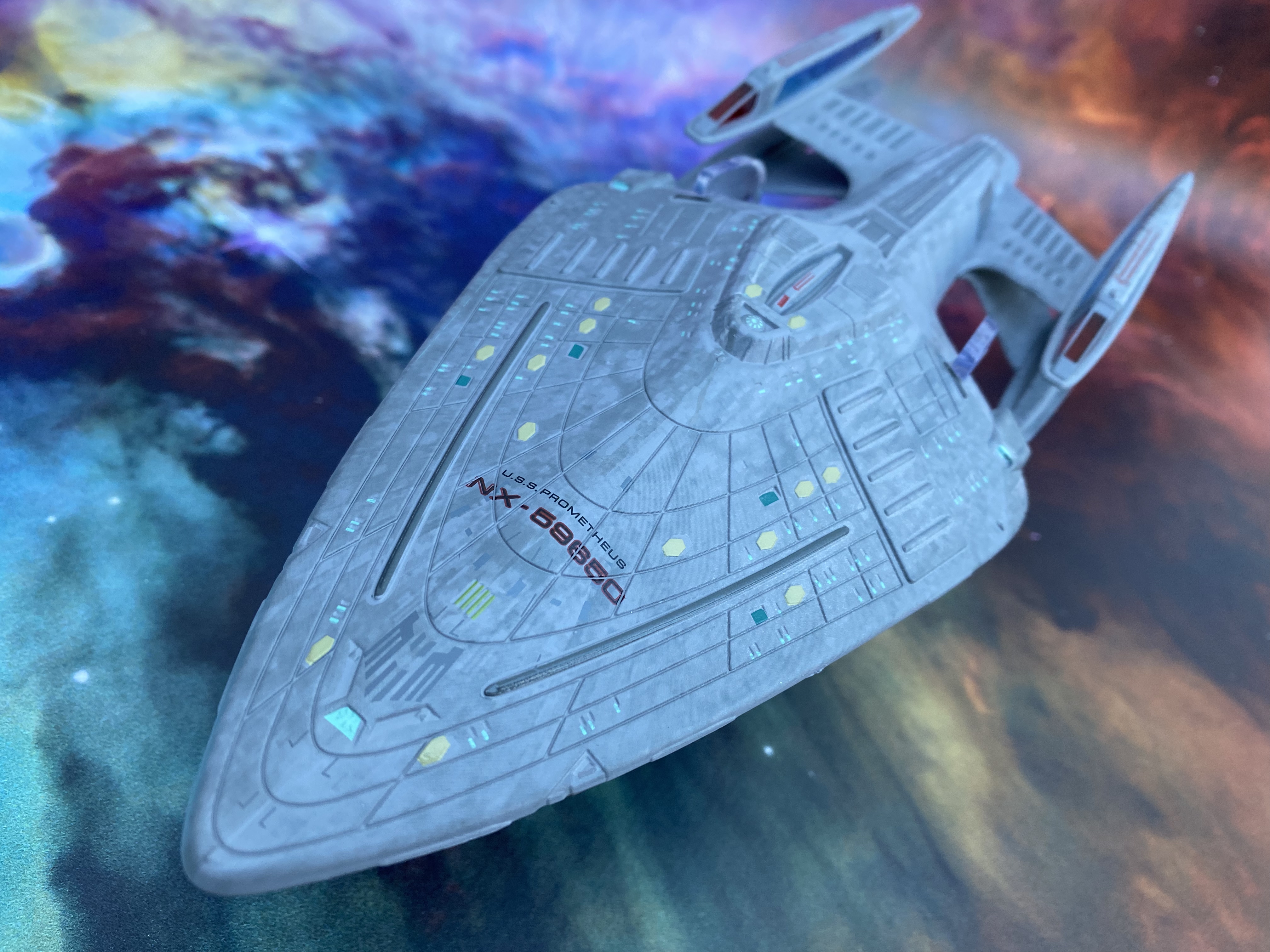
Just from a cursory glance it's more than apparent that Eaglemoss have completely reworked the paint scheme. Toned down from the dark grey with even darker highlights, the new Prometheus slips between a grey and a duck egg blue. The emboldened sections of the hull, most prominently the phaser strips and also some panelling towards the nose almost seem to have been tone shifted down to the colour of the smaller original edition's hull colour. On the nose we also have a blue-coloured deflector dish that was previously omitted. Another small detail picked up and corrected!

This is a huge improvement that means all of the highlight, differentiated panels, hull lines and aztec paint are more subtly worked in. The lifeboat hatches too have a more distinctive hexagonal shape which was unique to the Prometheus and on the XL they do stand out a lot more. On the smaller edition these hatches blended in with the darker paint job far too easily. 

Am I going to rat on the windows? Absolutely because it wouldn't be a ship review without mentioning all that horrid misalignment work. Now that was one thing the original did manage to get right since the window slits were just painted on rather than being lined up to certain hull recess markers. 

Talking of changes, to the sides of the top hull section there are four horizontal "road bumps" and on the new edition these have been matched into the hull colour rather than lightened. Again, great touch and it makes the XL feel much less of a patchy, blocky experiment and more as a single craft. 

Tonally you can see that there have been some reductions in tones, around the bridge for one, but also an increase with the spine of the Prometheus receiving a lot more attention both in colouring and detail. The registry too is much more legible with a sharper border and slimmer black centres.

There is some unforgiveable slippage when it comes to the colouring on the impulse engines to the rear of the primary hull which wasn't present all those years ago on its smaller predecessor and bizarrely the removal of the darker highlights near the shuttlebay also works against the finish. The second point there is understandable since there's the reduction in tone across the whole ship.

Only a couple of darker panels on either side of Engineering and also the shuttlebay door itself remain and its at this rear point that you can spot that this isn't just a copy and size-up but a new mould. Running under the front edge of the door is a new seam that shows the landing strip to be part of the plastic underside rather than the metal upper piece.

It is though, a huge step up from the regular version and any self-respecting fan needs to have this XL on the shelf. Even the engines - which do suffer from you seeing the fitting posts inside - just look great, tipped off with their glowing red bussard collectors. The deflector dish to the front is perhaps a little dull and lacks that hue you see on screen but that's acceptable given the impressive finish to the rest of the ship. 

Comparing the underside of the primary hull is a bit of a revelation. On this larger edition the subtle aztecing does stand out a lot more and it doesn't feel like an afterthought. Even those chiselled ends to the phaser bank just add to the enhancements here and are alluded to in the pocket size magazine also included in the box.

One huge, stupidly annoying gripe though to complete this one, the stand is terrible. Using the same fit as the original, the weight of the front of the Prometheus here is significantly more and it spends all of its time with the nose dipping to the floor. I suspect the stand was just scaled up with no real problems considered but I wish it had been redesigned.

The magazine covers through the standard design process work plus more information around some of those slight changes to the phaser strips ad lifeboat hatches that are actually present on the ship. It does however feel like a bit of a rerun of the original issue, covering Message in a Bottle once more. Fortunately this does spin off into the Voyage Home section detailing Voyager's contact with the Alpha Quadrant after the Prometheus' appearance.

This is a brilliant and deserved XL edition with a good weight to it and fantastic upgrades to the small first version. Cleaner, sleeker, better decalled and with a much more screen accurate finish, even down to the min-nacelle on the top, I'm a big fan. This one's going next to the Equinox right now.

Enjoyed this article? Why not like and share to spread the word!

Like our page on Facebook 
Follow us on Twitter

Tuesday, 14 June 2022

Official Starships Collection: XL Discovery x2


Why review one XL model when you can do two and get to compare before and after at the same time?

Yep, we're back with another Eaglemoss review and this time it's two for one. Not only are we looking at the XL USS Discovery NCC-1031 as seen in Discovery seasons one, two and a bit of three but the refit Discovery NCC-1031-A from the 32nd Century.

Amazingly there are a ton and more differences between the two and not just down to those questionable detached nacelles. Let's plough straight in to this double dose of Disco dissection.

SImplicity is definitely the word when it comes to the original design of the Crossfield Class with a hint of aztecing from the paintwork but overall a very flat, composed and subtle finish to the hull. That allows for much better panel definition on the ship with some tonal changes front to back but also providing a steady consistency of look. In the show space is, obviously, a lot darker and the model allows an appreciation of the lighter tones used for the brown-tinted colour scheme.

It's also a very blocky ship. The hull is a sharp triangular shape, the primary hull a duo of crisp circles while the engines are two overly long sticks. There's nothing glamourous about the Discovery. The shape is basic, functional but Eaglemoss have still managed to shoehorn in some decent detailing.

But what is noticable here is the prominence of the windows and some of the more distinct stripes that adorn the secondary hull. It's a very, very clean recreation of the lead ship with even the bridge portholes marked out. The saucer is pretty strong as well, supported only by the neck piece and the four small struts from the outer to the inner ring. 

Incredibly this thing looks more gorgeous in the flesh than it does on the TV with a great attention to the striking lines and angular body shape. She's also light on decals with only registries on the saucer top and bottom to the front with two more even smaller (only spotted on the photos!) to the port and starboard as they were on the original Enterprise.

Discovery also carries some lovely edging detail along the sides of the engineering hull. Both the impulse engines as well as the grilles on the leading edge are distinctly marked out with Eaglemoss even managing a slight recess in the bodywork which a smaller scale doesn't account for. 

To the front the deflector dish is a bit hotch-potch. It's absolutely stuck on to the frame and sticks out with the antennae then protruding even further. If the edging benefits from the size up, the deflector dish hasn't faired any better with the probes looking way thicker than they should.

Stretching into the mid-distance from either side of the triangular body are the two lengthy warp nacelles. Discovery certainly emphasises these in comparison to the side of the other hull sections. They retain the same minimalistic panelling but even with the slim design both length and width-wise, Eaglemoss have crammed in a set of translucent blue elements along the edges and also the blue bussard collectors to the front. These could have been a paint on job as we've seen on a few other occasions over the years but the move to actually combine pieces here speaks of a push for a more premium product..

The stretched nacelles do have a lot of flexibility towards the tips which is to be expected since they are 100% plastic but they are finished well. As for the construction, the Discovery is a well-built piece carried by that solid metallic secondary hull and neck which links all the extremities together. You do of course need a ridiculously deep shelf to sit her on!

The magazine chooses a safe path reflecting on the design of the Crossfield class as does the edition included with the -A refit. 

Now for that comparison against the season three upgrade.

A more recent release, Discovery-A marked the first of Eaglemoss' attempts at mastering the detached nacelles issue and they're probably hit it in the only way they could - by adding in more transparent plastic elements. More on that, of course, in a bit but let's start at that saucer section.

For anyone with even a hint of OCD, the Discovery-A, especially when lined up beside it's previous version is a visual overload. The flattened surface of the original is replaced with a textured surface with a dulled paint finish completely changing the look of the starship. It's also wonderfully finished with a slightly worn feel which manages to capture the metallic nature of the beast. 

Worse perhaps is that the decals for the registry are almost indistinguishable from the hull patterning. Gone also are the four smaller struts securing the inner ring to the larger outer and also replaced is the squared off nek section leading from the bridge down to the secondary hull. This is a massive design revision in which only the basic shapes of Discovery have been retained. Those leading edges on the secondary hull are less blocky but still keep their blue grilled segments. 

It's very easy to get drawn into the changes here and not look at the model in perspective. Eaglemoss have got this one down to a tee and lining the before and after up, the two are almost identical in size.

I love the recessed deflector dish of the -A, the cutaway sections from the rear of the secondary hull and the more sweeping majesty of the upgrade that marks the leap of 1000 years in technology. The impulse engines are now slightly reshaped and the shuttlebay appears to have narrowed but this remains instantly recognisable as the series' lead ship.

When boxed in the newer style collectors case, Discovery-A is a rare kit form. Coming in three separate pieces along with connectors and stand, the ship only really comes together once you've pulled everything out. The two engine clasps fit perfectly to a set point on the nacelles which means you don't have one poking out back more than the other and that they also line up identically with the main hull. Further note; the engines are very, very light and flexible - but not too much!

That section again as with the original is metal with the two engines in plastic as well as the rings of the primary hull. As you can also see from the pictures, the -A has a much smoother look to its underside and loses the angular pod look behind the deflector dish  while also seeing the bussard collectors on the warp engines enclosed. 

Here there are no translucent elements just paint striping in a very light blue. Gone too are all the window ports that were raised on the hull of the original and painted in where required. This version eliminates that as well as those distinctive light grey hull stripes and adds weathering to the hull plating that lifts this beyond the flat scale of its 22nd Century overcoat. 

I'll be honest, I wasn't expecting a great deal to come from this one because of the notoriety of the plastic engine clips if nothing else. However I've been pleasantly surprised by a ship which has some incredibly intricate surface patterning and easily an increased amount of attention to the fineries. Adapting the design cannot have been easy - as we see from the magazine - but the result is far more spectacular than you might expect.

The visual differences between the two are considerable and so it's well worth getting hold of both. Having them on the same scale is also a plus point. Of the two, the -A is by fat the most interesting to look at - but definitely don't discount the original.

Enjoyed this article? Why not like and share to spread the word!

Like our page on Facebook 
Follow us on Twitter