The arrival of Starfleet in Picard's season one finale could have been incredible.
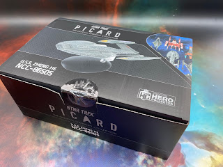
The Inquiry Class USS Zheng He is allegedly Starfleet's most advanced ship at the end of the 24th Century and it takes its place as the second issue of the Picard starships collection. Issue one was the "regular" sized La Sirena but we've already covered that as part of the XLs where it has much more going for it.
Boxed up in the new black and silver packaging for the series, the starship is...ok. It's not a hugely inspiring design nor is it a departure from the familiar with the distinguishable saucer, engineering and engines assembly. The forward landing bay does make it look as though the ship has a bottom lip stuck out in a sulk but it makes sense to have a "fly through" design by this point. Also you can see in the "shoulders" either side of the primary hull a design lineage right back to the NX-01.
The mottled grey paint gives it a more realistic feel than a flat solid colour and takes away that plasticky feel that some of the models from this production house can give off from time to time. Note too how simplistic the panelling is. If it wasn't super necessary it didn't get done it appears although they did manage to put some windows in to add an element of life to the final creation.
The panelling detail on the Zheng He is nice. There is definition and easily identifiable sections that look different to the main, flat hull surface. The warp engines themselves are another matter. The pylons are not the most durable and do bend easily while disappointingly the bussard collectors are painted on and the warp grilles are grey/blue and lifeless. Perhaps this is the model's greatest weakness because it loses some of its onscreen magic without those translucent elements. In fact, on another look just now I've noticed even the bridge dome is unpainted. I was also the unlucky one to end up with two warp engines that were out of sync when viewed from the front with one pointing above the primary hull and the other below.
As it goes it's faithful to the screen but the lack of life in the warp engines and also in the impulse units at the rear of the primary hull take something away from the already very average result. This should have been an exciting issue release and the first of a few from that climactic battle sequence in Picard but instead the Zheng He feels like a bit of an apology in a box. There is also another variant out there for series subscribers - the USS Toussaint - which has slightly longer nacelles and a different colour scheme but not much else different.
For now though, HeroCollector have produced a decent ship but it's one of the ultimate Marmite Starfleet ships. It's appearance in Picard was certainly a talking point but for the wrong reasons. Perhaps in that sense it's worth collecting up a piece of Star Trek history that might not see the screen again...?
Check out all our Starships posts HERE
You can find out more on the Star Trek: The Official Starships Collection by visiting the Hero Collector website HERE


https://startreknude.blogspot.com/
ReplyDelete