
Blurring the line between bonus and regular editions, issue 158's Excelsior concept might well be seen as a pathfinder rather than an abandoned idea.
 Conceived in 1983 for the third Star Trek movie, this second Nilo Rodis-Jamero design retains a few of the hallmarks of the first version seen in issue 152 while also being different enough to warrant an edition all to itself.
Opening up with the expected saucer section, the USS Excelsior Concept II steers more in the direction of the USS Prometheus than the Enterprise with a slender secondary hull and four spiky warp nacelles to power her on.
The length of this one is considerably shorter than the Concept I with the large saucer section sweeping straight into the engineering section which is a feature that would be recognised more some 12 years later with Voyager and then the Enterprise-E.
The saucer itself is well detailed with a light grey given more depth with a two darker greys used to raise hull panels against the paler base colour. It also has a more familiar pair of red decals curving around the primary hull as they would on the later, final version, broken by the black lettered and red bordered ship registry (see Assimilated Voyager you can have red letter edging...).
 The increased number of phaser banks (three up to five) for the Excelsior Class are also marked prominently in yellow as are the reaction control thrusters at the saucer rim.
The metal saucer deflector grid isn't lost under the triple colour paintwork and is pretty clear all the way across. One thing that does appear a little different to the final version is the width of the central island including the bridge module. It's a lot wider with a less defined blue/grey paint scheme around the edge.
The increased number of phaser banks (three up to five) for the Excelsior Class are also marked prominently in yellow as are the reaction control thrusters at the saucer rim.
The metal saucer deflector grid isn't lost under the triple colour paintwork and is pretty clear all the way across. One thing that does appear a little different to the final version is the width of the central island including the bridge module. It's a lot wider with a less defined blue/grey paint scheme around the edge.
The bridge itself appears much larger and there are a good amount of subtle hull mechanics around it and back along the spine-like centre piece equally defined by a pair of red stripes. Now while the final Excelsior and the Enterprise would have their impulse engines mounted at the back of the saucer, the Concept II has a huge oven-shaped quad-exhaust port unit dominating the rear third of the top of the ship. It's a big lump of tech and very noticeable with its fiery red slots one of the first things you seem to notice.
 The detail of the metal work and painting are great with the definition of the engine section to the hull marked out with a darker grey and with the impulse engine sweeping up and out from the back of the ship.
Stabbing out from the hull and more like wings than pylons, the metal gives way to four inserted plastic warp nacelles. Their blue insets for the warp grilles gives them some form of design lineage to the movie refit USS Enterprise but the form is quite different with a more rounded finish to the front and then sweeping to pointed rear points. Also take a look at the pennants on the warp engines here - a stylised and never used Starfleet design that has so far only turned up on this model.
The detail of the metal work and painting are great with the definition of the engine section to the hull marked out with a darker grey and with the impulse engine sweeping up and out from the back of the ship.
Stabbing out from the hull and more like wings than pylons, the metal gives way to four inserted plastic warp nacelles. Their blue insets for the warp grilles gives them some form of design lineage to the movie refit USS Enterprise but the form is quite different with a more rounded finish to the front and then sweeping to pointed rear points. Also take a look at the pennants on the warp engines here - a stylised and never used Starfleet design that has so far only turned up on this model.
On the underside the most significant link to the final design is the drop away hull with the segmented blue panelling in front of the "outboard" deflector dish rather than behind it. Actually the bottom of the Concept II has a lot of the look of the underside of the final Excelsior with the dual torpedo launcher and the rear hull design swung round to face forward.
 Again its this detail which makes these rarities well worth the punt and I'm loving how the secondary hull has a familiar feel of the NX-2000 yet manages to still be incredibly unique. Eaglemoss have included docking ports and a range of windows on this droopy engineering section which is capped to the rear with the largest shuttlebay door ever. It's absolutely massive stretching the whole height of the secondary hull and bearing the serrated edges to indicate the clamshell opening akin to the Enterprise.
Both this and the underside of the saucer continue the multi-shade colour scheme from the top with the primary hull also carrying a prim and proper two-tone blue ring recessed into the bodywork. This is one more feature that made it into the onscreen Excelsior, completing the design alongside the standard striping and registry. The build quality of the ship is superb. Join lines are barely visible and there's a lot of surface detail at every point. It feels like a complete design and for your money you do get a decent sized ship that fills out the packaging.
 The mix of plastic and metal works well and even that odd little outslung deflector dish on the bottom of the secondary hull is secured well.
In the magazine you'll be strapped to find much to go on with the first few pages skipping any kind of information on the ship and dealing solely with new CG images before turning to focus on the work of Nilo Rodis-Jamero across the franchise from The Search for Spock, The Voyage Home and The Final Frontier. It's split into two pieces - one dealing with Rodis-Jamero's background and then a second, larger article looking more closely at his work, sketches and influence on the Star Trek universe. A strangely sparce read for this one however the model is definitely the star of the edition much more than the background material.
The mix of plastic and metal works well and even that odd little outslung deflector dish on the bottom of the secondary hull is secured well.
In the magazine you'll be strapped to find much to go on with the first few pages skipping any kind of information on the ship and dealing solely with new CG images before turning to focus on the work of Nilo Rodis-Jamero across the franchise from The Search for Spock, The Voyage Home and The Final Frontier. It's split into two pieces - one dealing with Rodis-Jamero's background and then a second, larger article looking more closely at his work, sketches and influence on the Star Trek universe. A strangely sparce read for this one however the model is definitely the star of the edition much more than the background material.
Next - and from one classic to another with a flashback to 1988 and the Batris freighter from The Next Generation's first proper Klingon story, Heart of Glory.
The Batris doesn’t have the same flair as the Excelsior Concept II bearing a much more singular and basic design. More rectangular, the Batris is much more functional with a series of cargo pods slung underneath the main hull for easy loading and unloading.
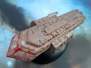 The most exciting part of the design might well be the pointed nose before it develops into a series of straight lines but what the Batris lacks in design inspiration it makes up for in its detail. The brown hull is tipped with a striking red stripe to the front also bearing a series of alien markings at the lower edge and then windows on the second, upper half of the marking.
The brown base coat is broken and scuffed right across the hull which provides a sense of age to the ship as well as a feeling that it’s been battered about in space hauling cargo from here to there. Even the brown coat has a second tone to it emphasising that well worn impression. On top of that we then have a series of greyed call outs across the upper hull which are themselves weathered to match the fading hull colour.
 There’s a lot going on with the hull of the Batris beyond just an impressively aged paint job. The detail in the mechanics attached to the surface are really rather good from grilles to piping to panelling, it’s all here and perfectly displayed. There’s no real definition between the cargo pods and the main hull but that paint job is such a wow you do sidestep it a bit.
In fact that worn hull wraps right around the hull and into every crevice and there's a lot to take in even on the bottom. This is one of those models which feels complete from every angle and doesn't have a straight, uniform finish along the central axis. Even to the rear the three large engine units look like they've taken a battering over the years - ok, at least on the hull-coloured sections - the middle exhaust rods do look fairly clean!
 There's some real character to the Batris and the multitude of surface depths, colouring and combination of materials works exceptionally well for such a bland design. Admittedly there is some slight misalignment of the windows and striping on the nose however it's not as glaring as we've seen on many a Federation starship over the years of the collection.
It's odd but I am quite drawn to this one and the fact that the hull is so delicately executed. The stand grip too is one of the more functional, gripping the hull at the rear of the underslung cargo pods and providing solid balance to the Batris for display.
The issue 159 magazine recounts the brief onscreen lifespan of the Talarian freighter but what does become clear even from the first few pages is how different the model looks to the CG of the magazine.
 On the page the Batris is a lot cleaner, crisper in its finish and has lost a lot of that characteristic weathering but it has picked up a lot of surface detail. It is very apparent once you line the two up that there is some definition missing from a considerable amount of the surface technology but the sheer amount of it that's crammed in probably works against making that detail well executed and distinguishable through the paint scheme.
The nose detail especially seems lost with the panel definition washed out against the precision CG and the plan views reiterate just how much has been lost under what could be some fairly uneven paintwork...
The magazine does cover off Heart of Glory and the role in which the errant Klingons play. Turning the page actually reveals a whole section dedicated to discussing why and how these foes of Kirk and the original USS Enterprise were brought back to The Next Generation when originally there was no intention to see them again.
An interview with the late Maurice Hurley fills the back six pages for the issue detailing his work on the first two seasons (mainly season one and the Borg) and the stresses and strains of running The Next Generation as well as writing several scripts for it during those early years.
It's a good read to understand the control that Gene Roddenberry had on the show and how things developed under Hurley and would later take massive steps under Berman, Piller and the rest.
Loving the Excelsior concepts? Want more freighters and service vehicles? Let us know below!
The saucer itself is well detailed with a light grey given more depth with a two darker greys used to raise hull panels against the paler base colour. It also has a more familiar pair of red decals curving around the primary hull as they would on the later, final version, broken by the black lettered and red bordered ship registry (see Assimilated Voyager you can have red letter edging...).
 The increased number of phaser banks (three up to five) for the Excelsior Class are also marked prominently in yellow as are the reaction control thrusters at the saucer rim.
The metal saucer deflector grid isn't lost under the triple colour paintwork and is pretty clear all the way across. One thing that does appear a little different to the final version is the width of the central island including the bridge module. It's a lot wider with a less defined blue/grey paint scheme around the edge.
The increased number of phaser banks (three up to five) for the Excelsior Class are also marked prominently in yellow as are the reaction control thrusters at the saucer rim.
The metal saucer deflector grid isn't lost under the triple colour paintwork and is pretty clear all the way across. One thing that does appear a little different to the final version is the width of the central island including the bridge module. It's a lot wider with a less defined blue/grey paint scheme around the edge. The bridge itself appears much larger and there are a good amount of subtle hull mechanics around it and back along the spine-like centre piece equally defined by a pair of red stripes. Now while the final Excelsior and the Enterprise would have their impulse engines mounted at the back of the saucer, the Concept II has a huge oven-shaped quad-exhaust port unit dominating the rear third of the top of the ship. It's a big lump of tech and very noticeable with its fiery red slots one of the first things you seem to notice.
 The detail of the metal work and painting are great with the definition of the engine section to the hull marked out with a darker grey and with the impulse engine sweeping up and out from the back of the ship.
Stabbing out from the hull and more like wings than pylons, the metal gives way to four inserted plastic warp nacelles. Their blue insets for the warp grilles gives them some form of design lineage to the movie refit USS Enterprise but the form is quite different with a more rounded finish to the front and then sweeping to pointed rear points. Also take a look at the pennants on the warp engines here - a stylised and never used Starfleet design that has so far only turned up on this model.
The detail of the metal work and painting are great with the definition of the engine section to the hull marked out with a darker grey and with the impulse engine sweeping up and out from the back of the ship.
Stabbing out from the hull and more like wings than pylons, the metal gives way to four inserted plastic warp nacelles. Their blue insets for the warp grilles gives them some form of design lineage to the movie refit USS Enterprise but the form is quite different with a more rounded finish to the front and then sweeping to pointed rear points. Also take a look at the pennants on the warp engines here - a stylised and never used Starfleet design that has so far only turned up on this model. On the underside the most significant link to the final design is the drop away hull with the segmented blue panelling in front of the "outboard" deflector dish rather than behind it. Actually the bottom of the Concept II has a lot of the look of the underside of the final Excelsior with the dual torpedo launcher and the rear hull design swung round to face forward.

Both this and the underside of the saucer continue the multi-shade colour scheme from the top with the primary hull also carrying a prim and proper two-tone blue ring recessed into the bodywork. This is one more feature that made it into the onscreen Excelsior, completing the design alongside the standard striping and registry. The build quality of the ship is superb. Join lines are barely visible and there's a lot of surface detail at every point. It feels like a complete design and for your money you do get a decent sized ship that fills out the packaging.
 The mix of plastic and metal works well and even that odd little outslung deflector dish on the bottom of the secondary hull is secured well.
In the magazine you'll be strapped to find much to go on with the first few pages skipping any kind of information on the ship and dealing solely with new CG images before turning to focus on the work of Nilo Rodis-Jamero across the franchise from The Search for Spock, The Voyage Home and The Final Frontier. It's split into two pieces - one dealing with Rodis-Jamero's background and then a second, larger article looking more closely at his work, sketches and influence on the Star Trek universe. A strangely sparce read for this one however the model is definitely the star of the edition much more than the background material.
The mix of plastic and metal works well and even that odd little outslung deflector dish on the bottom of the secondary hull is secured well.
In the magazine you'll be strapped to find much to go on with the first few pages skipping any kind of information on the ship and dealing solely with new CG images before turning to focus on the work of Nilo Rodis-Jamero across the franchise from The Search for Spock, The Voyage Home and The Final Frontier. It's split into two pieces - one dealing with Rodis-Jamero's background and then a second, larger article looking more closely at his work, sketches and influence on the Star Trek universe. A strangely sparce read for this one however the model is definitely the star of the edition much more than the background material. Next - and from one classic to another with a flashback to 1988 and the Batris freighter from The Next Generation's first proper Klingon story, Heart of Glory.
The Batris doesn’t have the same flair as the Excelsior Concept II bearing a much more singular and basic design. More rectangular, the Batris is much more functional with a series of cargo pods slung underneath the main hull for easy loading and unloading.

The brown base coat is broken and scuffed right across the hull which provides a sense of age to the ship as well as a feeling that it’s been battered about in space hauling cargo from here to there. Even the brown coat has a second tone to it emphasising that well worn impression. On top of that we then have a series of greyed call outs across the upper hull which are themselves weathered to match the fading hull colour.
 There’s a lot going on with the hull of the Batris beyond just an impressively aged paint job. The detail in the mechanics attached to the surface are really rather good from grilles to piping to panelling, it’s all here and perfectly displayed. There’s no real definition between the cargo pods and the main hull but that paint job is such a wow you do sidestep it a bit.
 In fact that worn hull wraps right around the hull and into every crevice and there's a lot to take in even on the bottom. This is one of those models which feels complete from every angle and doesn't have a straight, uniform finish along the central axis. Even to the rear the three large engine units look like they've taken a battering over the years - ok, at least on the hull-coloured sections - the middle exhaust rods do look fairly clean!
 There's some real character to the Batris and the multitude of surface depths, colouring and combination of materials works exceptionally well for such a bland design. Admittedly there is some slight misalignment of the windows and striping on the nose however it's not as glaring as we've seen on many a Federation starship over the years of the collection.
It's odd but I am quite drawn to this one and the fact that the hull is so delicately executed. The stand grip too is one of the more functional, gripping the hull at the rear of the underslung cargo pods and providing solid balance to the Batris for display.
The issue 159 magazine recounts the brief onscreen lifespan of the Talarian freighter but what does become clear even from the first few pages is how different the model looks to the CG of the magazine.
 On the page the Batris is a lot cleaner, crisper in its finish and has lost a lot of that characteristic weathering but it has picked up a lot of surface detail. It is very apparent once you line the two up that there is some definition missing from a considerable amount of the surface technology but the sheer amount of it that's crammed in probably works against making that detail well executed and distinguishable through the paint scheme.
 The nose detail especially seems lost with the panel definition washed out against the precision CG and the plan views reiterate just how much has been lost under what could be some fairly uneven paintwork...
The magazine does cover off Heart of Glory and the role in which the errant Klingons play. Turning the page actually reveals a whole section dedicated to discussing why and how these foes of Kirk and the original USS Enterprise were brought back to The Next Generation when originally there was no intention to see them again.
An interview with the late Maurice Hurley fills the back six pages for the issue detailing his work on the first two seasons (mainly season one and the Borg) and the stresses and strains of running The Next Generation as well as writing several scripts for it during those early years.
It's a good read to understand the control that Gene Roddenberry had on the show and how things developed under Hurley and would later take massive steps under Berman, Piller and the rest.
Loving the Excelsior concepts? Want more freighters and service vehicles? Let us know below!
Enjoyed this article? Why not like and share to spread the word!
Like our page on Facebook
Follow us on Twitter
Find us on Tumblr


