
Showing posts with label Shuttle box. Show all posts

Monday, 18 April 2022

Shuttles 8: It Ain't Starfleet


After seven set of Starfleet auxiliary craft, Shuttles Eight takes us into other territories.

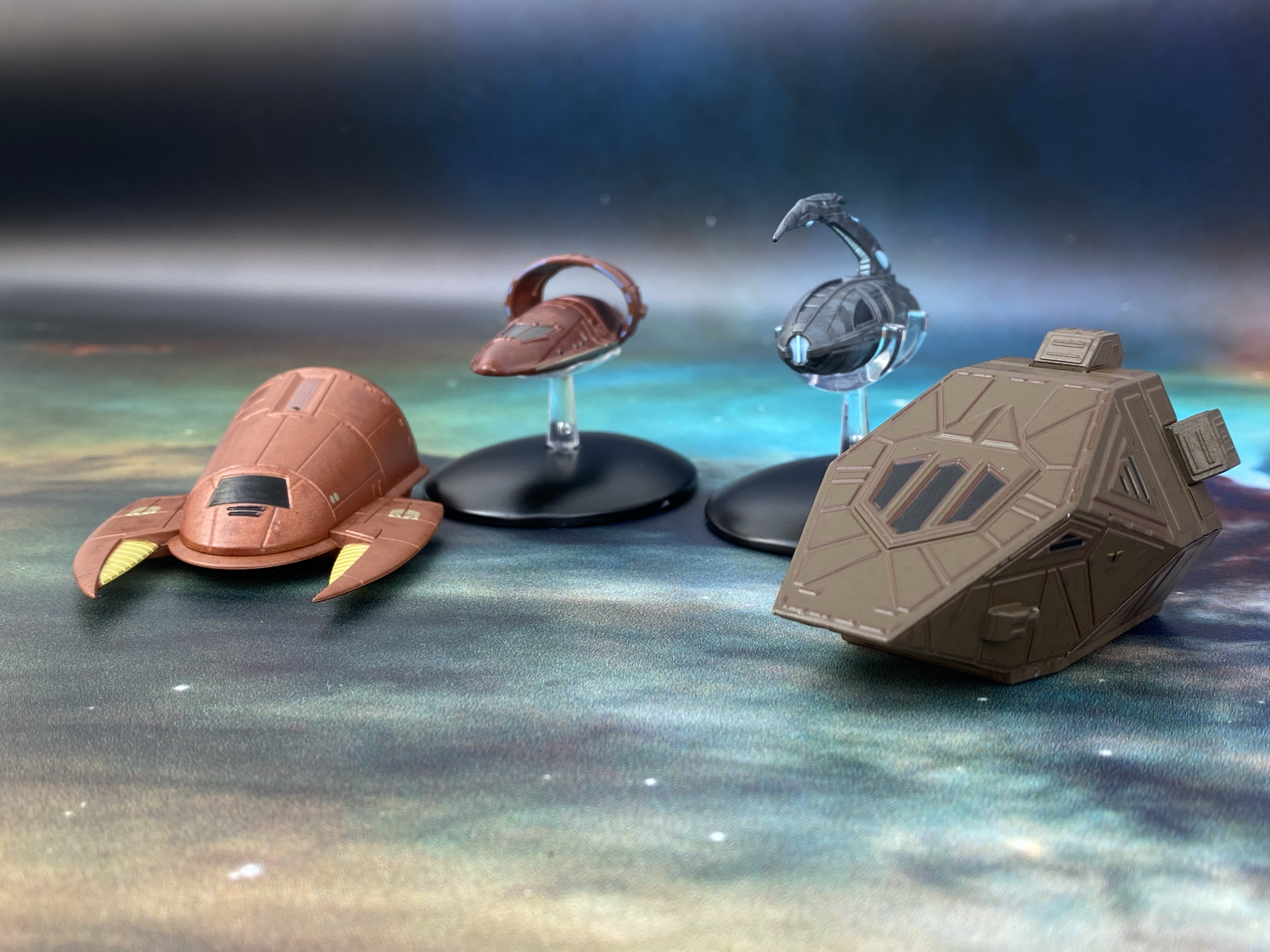
Bringing together four ships from the Klingons, Ferengi, Xindi and Vulcans, this mixed set covers ENT, TNG and DS9 with something of a soup of appearances.

Each of the shuttles comes in its own package within the larger set box and includes a mini-stand, wafer-thin A5 magazine and lithograph print. The stands usually seem a bit of a waste but in the case of both the Vulcan and Xindi ships they are essential for display.

So let's tackle these in issue order. This set covers 29 - 32 which sort of adheres to the timeline of appearances. First up therefore is the Vulcan Shuttle as seen in ENT, more often than not docked with a Suurok Class vessel. It's the most streamlined of the four with some marvellous panel work and spotted detail on the hull. For a ship that was most often seen as part of another it's great to see it up close.

Of course it bears the marks of the Vulcan ships from the NX-01 era in its brown paint scheme and the hoop warp engine. What puts this and the Xindi Assault Shuttle apart from the Klingon and Ferengi options is that these two were CG creations. This shows through in the amount of surface detail they have in comparison to the ships introduced in TNG

The Vulcan Shuttle is by no means a very big craft, probably slightly smaller than some of the Kelvin Timeline (set four) Shuttles but with a more distinct finish. The stand also holds the craft in a certain way so watch out here the "kinks" are and line them up with the indents of the shuttle.

I do like this one even given its small stature because you can still make out the surface detail and the painting actually lines up to what it needs to represent - even down to the light blue of the warp engines on the ring. 

Number two up in this pack is the Xindi Assault Shuttle seen exclusively in the third season of ENT. Used by Degra and later Archer on an infiltration mission, the Assault Shuttle is insanely well detailed with extensive panelling from bow to stern. The metal finish is given a two-shade contrast to help distinguish the hull markings and it works more than adequately. 

The blue and darker grey elements are precisely painted in and assist in finishing off the industrial look of the vessel. The upper weapon spike is the main metal element here and ties the parts of the ship together. Visually you'd be hard pushed to tell what was plastic and what wasn't.

Seriously, the panel work is top class as is the colouring of the blue inset segments particularly up and along the edge of the upper weapons spike which protrudes from the rear. Again, it requires the stand and slots firmly in once you line it up with the half-circle grips. Sadly given its shape it just won't stand on its own.

Even the back end is well-worked with fantastic precision in the shell-like hull pieces leading back to the exhaust port. It is, like the Vulcan Shuttle, stupidly small for the price when you work out the individual price for each shuttle but it is well crafted.

Third, we have the Ferengi Shuttle. Most notably appearing in TNG's The Price and DS9's Little Green Men, the distinctive support craft is one that fans will have been waiting for in these sets.

Retaining the sandy Ferengi paintjob as well as the pincers which echo the larger Marauders, the shuttle is the highlight of the pack. With a two-tone hull colouring, the panelling remains simple but the grid lines are fairly distinct. Given the scale this s pretty nice to see and personally, the craft looks better here than it did on TV.

It's the little details here - the yellow of the warp engines and the Ferengi emblems being just two. The tonal shift on the surface doesn't even make it onto the cover of the magazine and definitely adds to the depth of this little ship. The top segment also includes blue engine exhausts to the rear and also the entry port, both of which are once more very crisply added to the model.

Last in here is the Klingon Toron Class Shuttle. Ok, this one is a bit of a love/hate model. Utilised as several other one-man craft over the course of TNG including Rasmussen's pod from A Matter of Time and the Nenebek from Final Mission, this version is as seen in season seven's Gambit.

Simple, blocky and if nothing else, functional, the shuttle bears zero similarities to any Klingon ships - but then you have to consider that the TNG production team were shaving costs wherever they could.

The pint on this one does seem a little heavy with the sharp panel lines we see on the magazine and on screen somewhat softened on the final product. With only two main colours - brown and black - there's little that can go wrong. Do note that there are some signs of wear on the surface especially around what I suspect are the engine units blocked to the sides and above the rear entry hatch. It's also quite weighty given its size but then the majority of the upper hull is full metal. 

Against the other ships in this pack, the Klingon shuttle sticks out a mile with its plain finish and blocky shape. It's also one that we would expect to turn up in this series but would it have been better as the Nenebek? I guess keeping it themed to different races took priority here.

As noted at the start, each shuttle also comes with a LCARS lithograph print. This was absolutely perfect for the Starfleet/Federation ships but with this selection it might have been more logical to use each of the different races own graphics as part of the illustrations. The LCARS images are also on the last pages of the individual magazines.

Unfortunately and in keeping with the previous 28 magazines, the CG in each of them is first class but there's almost no substance, no background and no design processes covered. I think with these fans would have appreciated a ton more detail on how they all came to be - and just how many redressed that Klingon shuttle had over time.

Shuttles Seven included the first non-Starfleet ship with Cyrano Jones' Spacematic so it was then only a matter of time until we have a series of alien race craft. These don't disappoint for the most part even if the Vulcan and Xindi versions could do with being a little bit bigger. Worth a look, especially if there are some decent Eaglemoss offers on the board.

Check out all our Starships (and shuttles!) posts HERE

You can find out more on the Star Trek: The Official Starships Collection by visiting the Hero Collector website HERE

Enjoyed this article? Why not like and share to spread the word!

Like our page on Facebook 
Follow us on Twitter

Wednesday, 15 September 2021

Shuttles 7: Heavy Duty


To date this is the last batch of shuttle released and has to be the most diverse quartet of mini-ships produced in the series.

Bringing in the Enterprise-D's Captain's Yacht Calypso, a Docking Shuttle, Cyrano Jones' Spacematic and the TNG Type 9A Cargo Shuttle, there's a bit of every style in here.

The 25th Shuttle entry is its most simplistic in the oval shape of the yacht. Seen in every episode but yet not seen in every episode, the Calypso spent seven years docked in the saucer of the Enterprise only to end up absolutely scuffed to hell when it acted as a brake during the Veridian III crash.

You can see why this wasn't a standalone issue since it's fairly plain (however there were some full entries to the collection that it could have easily replaced) with the highlight perhaps being the undercarriage and entry hatchway. What confuses me a little is how the Insurrection Captain's Yacht and the Voyager Aeroshuttle both got main collection editions but this didn't when it was the original "hidden in plain sight" craft.

Anyhow, the decalling and paint scheme on this flying pebble. All the windows are lined up to their recesses and the decals are nicely placed and aligned. In all honesty it's a good job although there's very little to go wrong here!

The best bit though IS the undercarriage because it's that instantly recognisable circular structure that sat in the centre of the D's primary hull. The way Eaglemoss have chosen to model it though does put the previous version - included as two pieces in the AMT model kit - to shame. IN that instance there were no decals for it nor any real surface detail on the top. It could be displayed just as a piece separate if you chose to have the ship in two pieces but was otherwise non-descript.

On this, larger, version we have the landing legs and docking platforms extended meaning
that it really does show off its most unique feature and doesn't need the stand at all.

The Docking Shuttle is classic Star Trek, looking very much as though it's a huge kitbash exercise. 

We've already had the Starfleet Tug in issue 140 which followed a similar take but this is a little more squat and unusual in its form. Featured in TNG's 11001001, Coming of Age, Remember Me and Starship Mine, the Docking Shuttle isn’t something we got to see very often but plays a big part in Starfleet operations. It’s also the most basically detailed ship in the set and one that I actually struggled to remember when listing down what the four craft were in Shuttles Seven.

It’s just a bit…meh. There’s a one colour paint job, some interesting shapes cobbled together but the overall effect is somewhat bland. Ok, on the screen it might have been great spotting one chugging around in the background reversing in an Excelsior Class or moving some cargo but as part of the Shuttles series it feels like a barrel scraping. What the magazine fails to admit but is in print over on Memory Alpha is that this model was a rough and ready construct built from a robot foot with Gillette disposable razors for engines. Perhaps the most disposable ship ever? The addition of the pennants and striping does help build the illusion but the singular paint work doesn't help.

The inclusion of Cyrano Jones’ ship suggests that Seven was a set that didn’t quite have enough Starfleet options to pack it out but surely there was something with a bit more excitement than the Docking Shuttle?

There is, admittedly a lot to the Docking Shuttle when you look at the various components but all that does in turn is reassure you that it could have been subbed out for something else; even a Ferengi shuttle would have been an improvement (maybe that'll be Set Eight).

Third in here is that Spacematic. Forgive the name because of the four it’s the most interesting. On the rebuilt K-7 for Trials and Tribble-ations it was parked in the station’s shuttle bay and by that became part of canon instantly. 

What makes this so exciting is that it’s the first non-Starfleet shuttle included in this series and it makes you wonder why it’s taken so long to get to this point. The design is completely different to the other 27 ships that we’ve seen and there’s genuine joy in these words as I look over it.

It reminds me of the camper in Spaceballs and Eaglemoss have really captured the travelling trader nature of Jones in the form of his own ship. It too is a little shabby with some wonderful finishing touches such as the pearl blue side pods and landing gear and the mass of engine equipment strapped to the top and rear. It's lovably makeshift and something that we didn't really see in the series. The painting of the main window is flayed at the edges but overall this is a minor glitch in what is a great little craft. The worn out look cascades across the hull and into the mechanics on the roof which are well defined - certainly more so than the instrumentation strapped to the sloped front which is lost under the blue.

I think this one works so well as part of the set because of its unique look and entry as a non-Starfleet ship. There's more colour to it and variety in the styling which, again, Eaglemoss have done a great job with. Note too that this is technically the first shuttle taken from the remastered TOS and only the second shuttle (after the Galileo in Shuttles One) to come from that show.

Finally there's an old familiar in Set Seven with the 9A Cargo Shuttle. It's a beast of a ship and almost limousine in length compared to the other shuttles stored on the Enterprise-D. When I say that, it's in the loosest terms because after some research to refresh my memory of shuttles, it only appeared in the TNG Technical Manual from the 1990's and the Enterprise Owners' Workshop Manual from Haynes. I have scoured the internet and aside from that book, the only other place it seems to have been mentioned is in the USS Titan novel Sight Unseen but that's your lot.

The design itself is taken straight off the black and white page from the classic Okuda and Sternbach work that was on every self-respecting Trekkie's bookshelf during that golden era. The pointed nose, darkened windscreen and off-white bodywork are all hallmarks of the '90's vision edged with that distinct red trim and Starfleet emblems. The surface detail isn't overwhelming; kept to a few panels, call outs and thruster points, the 9A demonstrates its purpose through the stretched body and overlong hexagonal nacelles. No bussard collectors here but there are phaser points showing this heavy hauler was ready to defend itself although you can imagine it being a fairly slow, large and stoppable target.

It's not Eaglemoss' most elegant recreation given its form but it does make this the first model of its type and certainly mirrors the thought processes behind its design in "real life".

The mix here is sot on and the introduction of the Cyrano Jones ship heralds a new turn for the Shuttles series. As we now know, Set Eight will be out later in the year and features support craft for the Ferengi, Klingons, Xindi and Vulcans, all of which have been much requested. A good set of ships here and certainly exhaustive of the Starfleet options.

Check out all our Starships (and shuttles!) posts HERE

You can find out more on the Star Trek: The Official Starships Collection by visiting the Hero Collector website HERE

Enjoyed this article? Why not like and share to spread the word!

Like our page on Facebook 
Follow us on Twitter

Monday, 16 August 2021

Shuttles 4: Small Time Kelvin


Although it's taken a while to get to them, I've been bowled over at some of the wonders contained within Eaglemoss' Shuttles sets. 

Perhaps with the exception of Set Four. This is what you might call the odd one out, comprising of support craft featured in the three Kelvin Timeline movies. In a bizarre twist, while the hero ships from that trilogy were all large Special Editions, the shuttles have gone the opposite way. Inexplicably they're smaller than the Prime Universe ones.

Each does once again come complete with a stand (three of the four here don't need it) as well as a lithograph print of each vessel which is also included on the back two inner pages of the accompanying mini magazines.

Featuring in the 2009 reboot, the Transport shuttle is one you need to keep an eye on. If you sneeze there’s a good chance it’ll vanish. The smallest of the small quartet, it still carries a good level of detail but could have done with being ever so slightly bigger. It’s not as if the box is filled out and it’s also very off scale with the other three more conventional craft. 

With the standard blacked out windows, the Transport Shuttle has a fantastic weathered finish with worn paint, scuffs and colour variance. Given it should have been afforded a slightly bigger scale, the finish is impressively carried off. There’s also a fair amount of decals applied to the ship with warning arrows, the registry and hatches wing panels all added. 

The weathered look manages to cover up some of the less defined panelling as well as the loss of size versus its peers but what you do feel is that the more realistic finish contrasting to the more sci-fi (and cheaper) elements of the TV shows actually doesn't weigh into its favour.

The second up is the Passenger Shuttle seen in both the 2009 reboot and also Into Darkness, the craft is on a much better scale. Once more featuring the weathered finish, the Passenger Shuttle is more recognisable thanks to its underslung engines.

Assigned to the USS Enterprise, this craft has brushed up well with the same worn effect as the Transport Shuttle. It also benefits when it comes to the registry decals which are much easier to read due to the letter spacing and can even afford to add in the black edging. On the Transport Shuttle all that finery just becomes a bit of a blob. 

The panelling too is more defined with distinct ridges on the shuttle surface rather than a series of undulations that gave the smaller Transport vessel a little of its character. It does have a much more industrious look to it as well as that more blocky shuttle silhouette that is distinctive in the Prime Universe sets. Where the Passenger Shuttle does excel is in the retro nacelles which include recessed buzzard collectors and also exhaust points that are a distinct homage to the back end of either/both the original 1960's Enterprise and/or the Galileo shuttle.

It’s a lovely design and well executed. Possibly a tad on the small size but packing a lot of good finishing detail and a more realistic, used appearance than we’ve seen in other sets.

Famed birthplace of one Kelvin Timeline James Tiberius Kirk, the Medical Shuttle from NCC-514 is another little gen in this box. With a similar form to the Passenger Shuttle, the boxy Medical variant has a lot more in common to a classic shuttle than any others especially with that wide pointed nose. 

I love the surface detail on this one even more than the Passenger Shuttle because of the speckled, patchy effect that gives a spectacular uneven and realistic finish. Featuring three distinct entry points, the Medical Shuttle is also the most visual attractive of the four thanks to the boatload of red markings that scream out loud it’s role. 

Along with the medics markings striped across the hill, the shuttle also has some general use warnings around there being No Step to the side door off the nacelles. These little touches, which are evident right across the pack, might not seem significant thanks to the scale disappointment yet they make the Kelvin Quartet a more tangible group with warnings and labels that you would hope for and expect to be used on such a craft if it were real.

The Warrant shuttle from Into Darkness got double duty both involved with the initial Nibiru mission and then used when McCoy and Carol Marcus need to access one of Admiral Marcus’ top secret torpedoes. 

Of the four, it’s the only one that doesn’t sit flat hence all of the pictures include the stand. It also seems to bear a strong resemblance to the Kelvin Medical Shuttle with some minor body modifications including the repositioning of he warp engines. Again there's a lot of strong and crisp decaling on this one set against that angled, weather bodywork with the name, starship registry and pennants all crystal clear. A little more rugged than the Medical Shuttle, the Warrant's detailing is potentially the best of the four but that's not a gold star in any book. The panel lines are prominent and the black window blocking sits perfectly into its assigned recesses but you still feel it's (yawn) undersized and missing an opportunity. 

I can't emphasise how good the weathering on all four is and it really does make all of them look a lot more solid as replicas. The retro engine design too, which is present in the cowlings and collectors of the Warrant are equally impressive but Eaglemoss seem to have really let themselves down with this group especially when compared to those Kelvin Timeline specials we received many moons ago.

Each of the magazines is an incredibly brief resume of the shuttles' appearances in each of the Kelvin trilogy just to jog your memory as well as screencaps and new CG to fill out the background but don't expect too much as each will take you moments to flick through. The best bit is probably the tech spec at the back.

Comparing directly against the other six sets available, this one falls far short of the standard that fans have come to expect from Eaglemoss. Yes, all the elements are here and work but that size issue has really ground my gears this time since that disappointment has seeped in since I opened the box on its arrival.

Check out all our Starships (and shuttles!) posts HERE

You can find out more on the Star Trek: The Official Starships Collection by visiting the Hero Collector website HERE

Enjoyed this article? Why not like and share to spread the word!

Like our page on Facebook 
Follow us on Twitter

Friday, 23 July 2021

Shuttles 6: Pick n' Mix


 The sixth instalment of the shuttles series from Eaglemoss covers TNG, DS9 and VGR.

Probably one of the more unusual pieces to enter the fray is the Sphinx Workpod. Bright yellow, the model is one of only two I can think of within the shuttles series that has taken the risk of a transparent passenger cover meaning that here we get to see the pilot seats within. 

It's got a weighty metal base too onto which the plastic "bug eyed" section sits and although rarely seen in the show, Eaglemoss have again managed to succeed in portraying the "lived in" look they achieved on the Starfleet Tug for example.

The blocky yellow patterning covers the work unit from tip to toe and it does have some of the cleanest decals I've seen in this sub series with identification numbers extremely visible on the front and sides of the base and Starfleet pennants along the tops of them. The base has some nice detailing with the lights to the front marked out distinctly and, for once, the engine exhausts avoiding any paint bleed from red to grey.

With its very visible paint scheme, the Workpod makes a big impression in this set but when you spin it round to view the flatbed it's even better. There appears to be "genuine" wear and tear on the rear platform which would be applicable from moving items on and off the craft. It's a brilliant and well executed touch that finishes off this unique craft near perfectly. Everything here just sits right - the inclusion of an interior, the fantastic paintjob and the added realism of a working existence. Great piece, well constructed and very solid. An unexpected highlight from the off!

Then there's the Fiat Multipla of shuttles with the USS Defiant's Shuttlepod 01. Seen in a few episodes including (firstly) The Search, Part II, the odd looking craft found itself later usurped by the more streamlined Chaffee which was included with Shuttles One.

Yet there's something very endearing about this out of the box design. The wide base tapering up into the passenger compartment is very specific to this ship and it's recreated well here. The colours, the panel lines and the finer hull detail all work well and align nicely but there are a few niggles with the edging alignment on the decals which has continued in the main ships lines and the shuttles as we've seen in sets two and five.

The 74205 registry on the sides and rear is perfectly fine but the one on the nose is blurred thanks to the off-centre edging and while just legible it plays havoc on the eyes!

A rare addition to this craft too is the translucent blue piece attached to the topside unit on the Pod. Taking a look to the rear it's continued in the mechanics which are exposed there. The mould of the hull is respectable yet the painting isn't up to par with a few frayed edges. The grilles and thruster units are cleanly painted in but the blue elements visible just don't match especially on the straight lines.

The front 5/6ths of the Pod are cleanly recreated but there's a lot going on right across the back end. Within the shuttles there have only been a couple with any significant amount of exposed workings and while they got away with it due to single paint coats, the Pod doesn't because of the multiple shades involved.

Number three in the box is the Hawking Type-6 shuttle featured at the end of Generations retrieving Picard from the Veridian III mountainside. What I'd immediately do is grab the Type-6 from Set One along with the Galileo from Set Five and line the three of them up - because they're all versions of the one from The Final Frontier. The Galileo is of course the original but you'll spot the striking similarities immediately.

The Hawking, in its own right, is a good model with a lot of familiar pieces. The addition of side windows for the pilot for instance or the changing of the engine venting from black to blue; the updating of the pennant and name but at it's heart we've been here before!

It's a good model if repetitive with good detailing and a simple paint job that can't go wrong. Once more the edging on the "1701-D" lettering is disgustingly misaligned to the black centres and that continues to irritate. There is an update to the engine blocks either side of the rear bay door featuring a grille effect rather than a flat slab of colour but overall this is one that you can't help but feel a little disappointed with considering it's already - 90% at least - been done with the better looking Galileo.

Last up for Set Six is Janeway's Armoured Shuttle as featured in Voyager's finale, Endgame. We've had an armoured Voyager in the main 180 issue collection so this was more than a logical choice to include at some point in this addition. Plus it's totally unique and looks like no other shuttle as it's covered in a grey protective shell.

The armadillo effect of the plating looks fantastic on what is the smallest of the four ships from the set and the defensive cover goes right down to the bussard collectors and warp grilles with their red and blue colours poking through slats. 

Noticeable only when you're very close is the speckled effect of the "metal" finish accentuated with the occasional light blue panel for exhausts. The whole of this piece is a work of art on a small scale given how many panel lines have had to remain distinct across the full 360 degrees of the shuttle hull. Indeed, the underside might even be more detailed than the top where the plate appear to stack up behind each other from bow to stern.

Each of the ships has its own lithograph print with stand bases for display and an individual magazine. They all cover only screen appearances of the shuttles with screencaps and CG with the back double page of the miniature publication including a more easy to read LCARS print.

This set of four is a real mix of quality. I'm a fan of the unusual Defiant Shuttlepod but the standout in this set is the highly detailed Sphinx Workpod that ticks every box from paintwork down to final touches. 

Check out all our Starships (and shuttles!) posts HERE

You can find out more on the Star Trek: The Official Starships Collection by visiting the Hero Collector website HERE

Enjoyed this article? Why not like and share to spread the word!

Like our page on Facebook 
Follow us on Twitter

Tuesday, 20 July 2021

Shuttles 5: Movie Dominance


It's a bit of a shuttle bonanza this month from SKoST with sets two, five and six all getting featured over the next week.

While there was a more TV themed selection in set two which we looked at recently, set five turns much more towards the big screen.

Classed as instalment 17, the Air Tram is a product of The Motion Picture, delivering Admiral Kirk to Starfleet Command. While that introduction is impressive, the model less so.

A combined two pieces of plastic form the shape of this oblong transport. The aztec paint job, the blacked out windows and the decaled registry and UFP logos do help it stand out but tragically its 1970's design is the ultimate let down. OK, it's better it turned up in this set than as a standalone (or is it?) but this is probably the most uninspiring shuttle from the whole seven sets produced to this point in time (still sets four and seven to add to the collection but we'll get to them I'm sure...). 

Its onscreen likeness is captured perfectly well with the resultant model showing off the sleek shape and bisected with that red horizontal stripe also concealing the join. The red edging on the numerical decals too isn't very precise when it's sitting next to the Starfleet Tug and the Galileo. It's just ok if truth be told and yes, the nav lights and thruster points are all in the right place but the Air Tram is totally outclassed by the other three craft contained in the pack.

In contrast the Starfleet Tug is a weathered, slightly battered affair that immediately indicates its working nature. There's a bit of a sheen to the curved viewscreen at the front but the rest of this little craft is modelling excellence. It also shows up all the problems that face the 100% plastic Air Tram. Once more combining metal and plastic, the Tug paintwork has a mottled and uneven effect all the way across its distinct panelling. The "5" decals on top and sides also have a near perfect red edging effect that's evenly spaced to the central number PLUS the cross hatch pattern lies precisely along that rear edge. 

Even to the rear, the worn paint work comes through and on closer inspection of the hatch tape you'll spot that even that is showing slight signs of wear and tear. The black decals to the top are a little too clean as are the darker grey curve sections at the back but Eaglemoss have achieved a good recreation of such an often (in the movies) seen piece of Starfleet tech.

Applauding the Tug is one thing however the Voyager Type-8 shuttle is a mixed bag of all that is good and bad with this set. The recreation of the physical item is pretty decent. The panelling isn't perhaps defined enough for me but there's a good balance on the colours and attention to detail when it comes to the placement of the decals and the choice to go with the translucent blue plastic for the warp engines. Some of the venting detail on the sides and the RCS thrusters are marked in well BUT...

The paint and quality of the decals on this one is almost shocking. The window black is chipped in places and doesn't completely fill the frames, the red of the impulse engine intakes has bled out of its shape and most disappointing is the legibility of the decals. Ok, the Starfleet pennants are in the right place and crisp but everywhere else the markings are horrid. Borders are misaligned, blurred  and in the case of the blue script under the side windows it's even impossible to make out the letters. Yuk. 

To a degree even the paintwork feels a slight bit dirty and rushed on this one. I like the design here but its the finishing touches which don't add up to something better than the individual parts. Second dip of the pack - can we at least draw a 50/50 result with the final one of the set?

Keep everything crossed because this one's a favourite of mine; the Galileo from The Final Frontier. Let's get the jokes out of the way first. The film isn't Trek's finest hour but the shuttles (Galileo and Copernicus) are among some of its sprinkled highlights. Indeed, these shuttles would have an impact that can be seen in both TNG and in Generations where the original full-sized versions were hacked about to be used for other ships.

The horrid bit of the Galileo is that central, horizontal join line that screams at you every time you turn her sideways. On the port side it's also wider than starboard but that's my biggest criticism of a ship we haven't seen in model form other than as part of the AMT USS Enterprise refit for The Final Frontier and The Undiscovered Country. There's also a sprue point that's not been sanded out enough but I only spotted that in a super closeup check. This scale work better for the shuttle too with a decent single colour paint job providing that matte finish. The blacked window is properly coloured in and the RCS thruster ports are also painted in perfectly along the central lip of the ship.

The decals themselves from the pennant along the side to the "5" numbering is also spot on and evenly printed so you can actually read it. What I also do love are those blocky movie style engines hanging out to the sides. The support struts are a lot stronger than on the original TV Galileo model from set one although the painting of the grilles to the front and sides is patchy. 

The Galileo here has a distinct shape to her and one we would, of course, see again in several chopped up forms so it's good to get up close with the original version. I'm a little saddened that the lights underneath aren't painted in but it's a step up from the quality of the Air Tram and the rushed nature of the Type-8's paintwork. This one does have a super smooth finish that's not tarnished with lumps and bumps. It's also annoying that the Tug probably trounces this one for top dog in the set if only down to its build quality which doesn't give too much away.

As with all previous sets, each shuttle comes with its own lithograph LCARS print to display with it and a small mini (MINI) magazine. Each details purely the in universe appearance of the craft in question with some nice images from screen appearances and new CG created specially for this release. As with all of the sets I'll again note that some form of designing articles wouldn't have gone amiss with these!

Check out all our Starships (and shuttles!) posts HERE

You can find out more on the Star Trek: The Official Starships Collection by visiting the Hero Collector website HERE

Enjoyed this article? Why not like and share to spread the word!

Like our page on Facebook 
Follow us on Twitter

Saturday, 17 July 2021

Shuttles 2: Four Small and Several Years Ago


Continuing our step back and move for completion, the second set of shuttles produced waaaaaaay back in 2015 have now been added to the collecton.

Packed up in one box, the four small units come with their own mini-mags plus a lithograph LCARS print for display. I have however chosen to keep the prints in their wrapping and fortunately away from my own greasy fingerprints(!)

In Pack 2 there is the Spacedock Shuttle from The Undiscovered Country, the larger Type-7 and the Type 15 from TNG plus the Pod 1 craft from Enterprise.

As with boxes one and three which we've covered previously, there is the option to display the ships on their own individual mini-stands but aside from the odd one, they look far better standing on the ground - as they naturally would in the "real" world.

Tackling these in numerical magazine order, we have the NAR-25820 Spacedock Shuttle up first. More recognisable if you flipped it over and stuck some warp engines on as the USS Jenolan from Relics, the Spacedock Shuttle is the most distinctive of the four. Showing off a more sleek design there is a good amount of hull detail although the painting doesn't line up exactly with the hull lines that indicate where it should be - especially along the side windows. 

What is good here is the application of the decals and some of the smaller thruster detail. That pennant on the side doesn't quite line up with the text which is horribly noticeable on this scale - just as much as the occasional paint bleed. The marking out for the entry doors is nice and clean but the grey misaligned paint just knocks it from being a good 9/10 to a steady 7.

The underside is more filled with greebles and also two very recognisable borrowed warp engines from the Galaxy Class Enterprise-D. Certainly a franchise that likes to reuse items. it's one of the most obvious I've seen on a replica for a while and is nowhere to be seen by the time it's refitted out as the Jenolan

Some of the joint lines are gaping around those engines and at the rear however the curving nature of the hull sides seems to be hiding a multitude of building sins and works in favour of the finished article.

Second in here it's the gorgeous Type-7 from early days TNG. When I sat this on screen it looked cumbersome, ugly and just terrible but I've clearly matured over time with the model from Eaglemoss looking stunning. The curves and lines of this one are so heavily '80's it almost hurts but importantly and in contrast to the Spacedock Shuttle, the paint all lines up!!!

The decalling is at A+ levels on the Hawking right down to the tiny registry on the sides and the alignment of the sharp Starfleet pennant. The joint lines from the main hull to the pylons and then to the nacelles aren't ll that clean but the fact that we have translucent bussard collectors and translucent warp field grilles more than makes up for it. The shape of this thing is just stunning and Eaglemoss have done it more justice than I ever expected even down to the tiny RCS thrusters and impulse engines to the rear. Magnificent.

The third is also an early TNG shuttle, the rather TV budget friendly shuttlepod that cropped up a lot in season two. Named here as the Aldrin, the pod was a boxy sprite that this scale suits perfectly.

Allowing for not just clear decalling, the surface features here are distinctive and easy to make out with hatch lines and particularly to the rear where there is a single porthole and some shaded surface greebling. The join line are stealthily hidden under that black central stripe but again, what's not to like with this result. Upping the scale for these shuttles has nailed the quality that can drop off on some of the larger-made-very-small models we've seen so many times. Ok, the windows are blacked out but creating the interiors would be a mammoth and expensive task on a £75 asking price (at time of writing £60 on sale). 

Finally and the only one of the four not to be in a shade of white, we have Pod 1 from the NX-01. Bullet-shaped and more in line with the design lineage of 20th Century space shuttles, the shuttlecraft from the Enterprise is a mix of eras combining the winged atmospheric capabilities of a chunky plane with the need to operate in space.

The work on this one again is excellent with that paintwork being spot on the mark. More impressive than the other three is the fact that the more metallic finish also has lines criss-crossing the hull in a lighter shade plus a lot more distinct panel lines. The hatch for example is a much more intricate (and timeline basic) design with multiple divisions in a fairly small space. Somehow it works.

The black paint around the engine block to the rear is a tad scruffy on the edges and sadly there's no good way of covering up the hull section lines with the central horizontal one very evident when viewed from the back and behind the wings. It's cleverly (slightly) concealed forward of this thanks to the alignment with the bottom of the passenger hatch so hats off to Eaglemoss for that clever positioning.

I do prefer the Type-7 just based on its look and design especially when it comes to the translucent sections on the engines which even the Aldrin pod doesn't manage but on detail you can't get better here than the NX-01 Pod 1. As a pack though these are among the best released together with four blindingly good and "realistic" replicas from the franchise. Could we get a few XL versions in the future perhaps?

Check out all our Starships (and shuttles!) posts HERE

You can find out more on the Star Trek: The Official Starships Collection by visiting the Hero Collector website HERE

Enjoyed this article? Why not like and share to spread the word!

Like our page on Facebook 
Follow us on Twitter

Sunday, 3 June 2018

Shuttles 3 (Updated 24/04/22)


Just before Christmas, Eaglemoss brought us another four compact bundles of joy in the rectangular shape of Shuttle Pack Three.

While they may not have the most dynamic of titles, the third set of small auxiliary craft threw up three curve balls in the set that fans might not have expected.

Let’s pick out these four in time order so we’ll start with the Travel Pod first seen back in The Motion Picture as well as The Wrath of Khan and Star Trek IV

A full metal shell, the Travel Pod is one of the most compact craft in the whole franchise and Eaglemoss have done it real justice. The hull finish is a light grey coat overlaid with two deeper shades of grey on some of the hull panels across all sides and then some further white strips to highlight the light panels around the central line of the craft.

There’s some very fine red lining around the top and bottom edges of the pod and although there are a few slight wobbles in keeping the strips straight all the way round but the level of colour and decals is fantastic on this one, topped off with the ‘05’ numbering including red edging around each numeral.

The large viewport on the front is sadly blanked out otherwise there would need to be a whole interior built. It does the job but does take away some of the final overall effect because it doesn't replicate the original model precisely.

To the back is another great feature of this craft to behold in the circular shape of the airlock. Detailed down to the panelling and the locking mechanism in the docking ring, this is a very well designed and replicated part of the Travel Pod, even more because of the scale in which this mas been worked.

Second in the pack and turning up at random throughout the franchise's history is the cute little Workbee. Now this is a real game changer when it comes to the collection because it's the first time that Eaglemoss have detailed the interior of a ship.

In this case the clear plastic windows on three sides of the cockpit allow you to see the single seat and controls within. It's very unusual to get this much on a model and less expected on something like the Workbee. 

Again the whole frame is diecast which provides a much more realistic and varied surface. The one man craft really is a neat replica with a striking yellow paint job head to toe accented with some mustard yellow detail on the forward prongs plus around the rear. At the back end there are a series of greyed technical pieces where the craft can be accessed for maintenance or connect to other units. 

Quite prominent in the design is the thin stripe of black and yellow hatching that borders the windows of the craft. Judged against the lies on the Travel Pod these are nicely aligned to the bodywork and probably benefit from not sitting right on a panel line.

Third up and moving to Insurrection, we have the Type-11 Shuttle which featured heavily in
the chase scene with Data's Federation Mission Scoutship. Now that's already been released as part of the regular issues and turned out to be a cracking entry to the series with it's metallic finish and unusual body shape. Here the shuttle that was flown by Picard and Worf takes a more familiar form with the long body flanked by the drop-down warp nacelles.


The main body and engine pylons here are metal with the engines themselves made from plastic which allows them to benefit from the inclusion of translucent warp field grilles and bussard collectors as with the larger starships.

The crisp white paint gets accentuated on the Type-11 through the marking up of two tone grey panelling at strategic points across the ship which is not dissimilar to the way in which the Travel Pod is finished. This shuttle also carries the Enterprise ship registry on its nose and along its flanks where the text is part of the Starfleet pennant stripe.  That stripe and the delta shield also adorn the top of the hull where it is only broken by the inclusion of an airlock.

Now that's a feature that Eaglemoss had to make sure was on since it's a key feature at the climax of the attempt to recover Data in Insurrection. The detail on it is very good and is mirrored with a similar hatch on the bottom. Now that underside isn't as interesting to look at as the top but the panel lining is fantastic with the grey highlights following the grooved indentations of the hull.

Sadly once again the main windows are blacked out to reduce costs and avoid modelling those interiors - which in this case would be strangely identical to a Runabout from Deep Space Nine if you know what I mean!

Now here’s where it gets a bit interesting because the warp engines at the end of those shaped white metal pylons are in grey. I’ve checked a fair few images and even gone back to the source material of Insurrection itself but can’t quite fathom if there is a shade variation from main hull to engine. What I can say is that the difference is not as striking as it is on this model. 

The actual build of the engines themselves is decent enough and incorporates those translucent sections as noted above. The panelling is fairly simple and on the underside we have the ship registry of NCC-1701-E. Of the set I know a few people who absolutely adore this one but in my eyes it’s... ok. I honesty must prefer the Travel Pod for its stubby lines and chunky Classic Era detailing. 

Finally and one that raised a few eyebrows is the Argo. I had expected this craft to come as a regular issue given that it’s more Runabout size than shuttle size and well, if the Captain’s Yacht and the Aero Shuttle got their own issues why not this one?

But alas and fortunately for all those who have a strong dislike for Nemesis it’s the fourth and final craft in Shuttlepack Three.

Oddly it wasn’t the inclusion of the Argo that seemed to be the main sticking point with this one but rather the bronzed metallic paint finish. I have to take it that this is what was envisaged when the ship was created but didn’t quite translate as expected onto the big screen. From memory and the pics in the pamphlet/magazine, it looks a lot more grey in the movie.

Anyway, to details and the Argo is, annoyingly, a lot better than Nemesis itself. The unique design with the foldout wings (deployed) and that sweeping nose make it immediately distinguishable from every other shuttle there’s been. It looks much heavier, chunkier and purposeful. For once there’s a post-The Next Generation shuttle that goes against the standard format rules and does something completely different in form and colour. 

The panelling is much simpler too with the bronze cost stretching around almost every point from bow to stern and leaving only a few brown hatches to bring dimension to the ship.

Aside from those minor coloured sections we also have two Starfleet pennants running down the sides of the hull including the delta shield and the Enterprise starship registry. Just above that we have the shuttle name in case you’d forgotten it.

To the rear we find the entry hatch - again in the singular bronze colour and still immediately discernible  while the engines are painted onto the exhaust points very simply in a light blue. 

As it goes with the Argo it is very plain given it’s striking and individual appearance. However looking at it another way, subduing the colours does mean that it isn’t too overpowering or cartoony in appearance and I think it’s turned out really well even if the movie it was in wasn’t up to expectations. 

For each of the shuttles in pack three we have a lithograph print with stand which is reproduced in the centre pages of the wafer thin magazine which covers design and appearance in the Star Trek universe in the most fleeting of ways. These mags are a huge disappointment given the cost of the shuttle packs and four pages doesn't do any of them - even the Argo - justice. But to be fair, are you buying this for the mags or the superb shuttles?

The Official Starships Collection Shuttle Pack 3 is available now from the Eaglemoss website.

Like our page on Facebook 
Follow us on Twitter