
The latest offerings from Eaglemoss highlight two great traits of the designers from Star Trek; the ability to keep it simple and the brains to think outside the box - or several model boxes in this case.

Following in in the wake of the Borg Sphere (issue 10) and the Borg Tactical Cube (issue 58), the hexagonally shaped craft seems somewhere between a space skip and a large gaming dice with all the grace of a brick.
It's certainly as repetitively patterned as the two geometric Borg craft from previous issues but it's not a shade as exciting. The individual panel lines are well marked and very distinctive here but there's no real substance.
Envisaged as a single occupant craft with some impressive technological capabilities, the Cell Ship might actually work best on display with another two or three formed into some sort of display with them interconnected to provide a vision of the Suliban helix being formed.
The previews, even with their slight colour retouching and very forgiving lighting, didn't manage to make this look much more interesting and it does come across much better in the flesh.
 The colour - mainly due to John Eaves having some left over from Ghosts of Mars - isn't too far off the reds of the Vulcan fleet and gives it a used and worn feel emphasised with the "blotchy" effect finished off on the larger, square panels but isn't carried through into the smaller observation window sections which are placed at the corners.
Tragically these sections are left in the same colour as the rest of the ship meaning there is some definition and differentiation between features that is utterly lost with this one. Could have done with being translucent or a different colour at the least but I would think that fiddly angles and tight shapes have restricted the flexibilty to make that happen here. It just ends up being incredibly flat even with the best intents and purposes. The Borg Tactical Cube and the Sphere were different from a number of angles but whichever way you look at this one - and that's by design - it's identical. Clearly a decent bit of worksmanship to build but from a photographic and reviewing perspective this is hell on Earth.
For note there are two points additionally worth calling out. Here both halves of the ship are plastic with the central connecting ring being metal. This is the only thing on the whole ship that defines exactly which way is "up". Secondly the stand fitting is a literal "drop on" this time and fits comfortably around one of the square panels.Could be a toppler though since there's no proper securing clip. Best stick her on a lower shelf although with no protrusions anywhere this might well be in the top three most durable models in the collection but unfortunately at the same time it's probably one of the most boring and simplistic to come out.
 The Suliban ship is an unavoidable entry into the series and I'm surprised it's taken until issue 95 to slot it in. Countering that though I'm not shocked because I can imagine the conversations over how to make something this basic more exciting must have been a nightmare.
The cover pic on the magazine do the model a lot more justice because those transparent viewing ports are called out and there's a little more depth to the detail on the hull. The ship overview provides a potted history of the NX-01's encounters with the Suliban while covering off some of the key details of the boxy craft. The ship info is a bit sketchy with the magazine relying more on the stories to fill space this time. Had to laugh at the views of this one since they are all nigh on identical except when viewed from the top. Well played on space filling, Eaglemoss, well played.
For those of us who like to find out what went into making these ships come to life, there's a staggering eight pages dedicated to the designing of this cell ship. Yes, amazingly for a ship with such a basic, plain design there are eight pages handed over to discussing its creation and a ton of drawings that chart its development. While I can't say I'm it's number one fan, the originality factor here is top-notch with John Eaves steering away from a traditional hull and engines/wings design for something more unusual. It certainly works on the screen although in the flesh it's not as impressive!
Now the next one up has been long awaiting and hotly demanded by collectors. When the First Contact fleet was ticked off and completed there could only be one other way to go and that was to resurrect the classes featured in the Battle of Wolf 359.
 A lot of those ships were seen only for a few seconds passing the Enterprise or drifting across her viewscreen but their inclusion in the show and the background of their creation is legendary in franchise circles. They were onscreen therefore they are canon. Period.
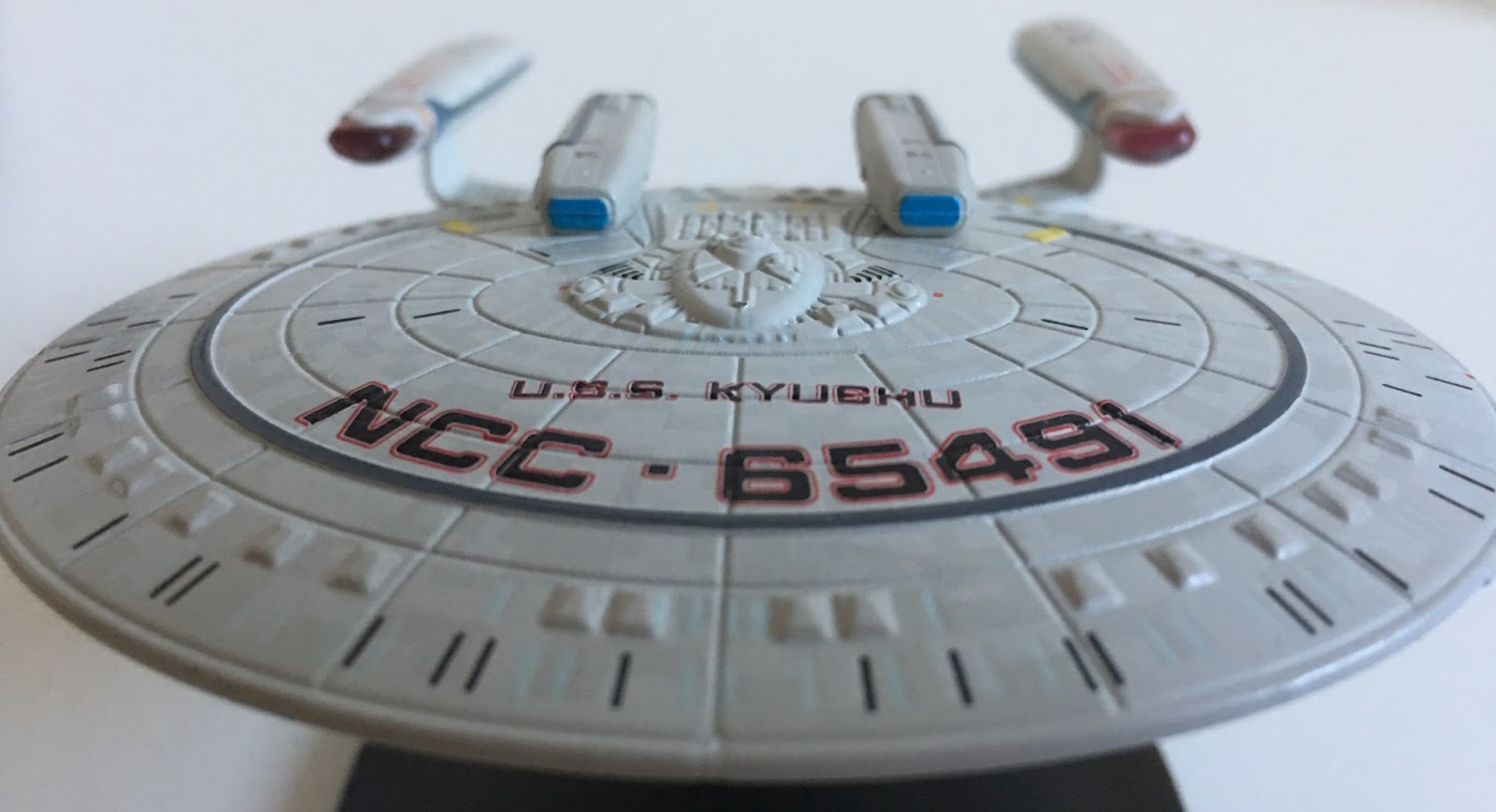
So the first of those graveyard ships comes out of the box and it's the New Orleans Class USS Kyushu NCC-65491. A blatant Galaxy Class kitbash, the Kyushu has the same distinct saucer and secondary hull shape as the Enterprise-D but that's where the similarities end as there are a significant number of modifications.
According to the stats the Kyushu is half the size of the Galaxy Class which, technically, means we get to see everything a little bit larger(!). The most immediate difference when comparing the two is the significantly smaller number of windows on the saucer. While the Enterprise-D has three rows between the lifeboat hatches and the outer edge, the Kyushu has just one. Impressively those windows are perfectly aligned with the saucer grooves as they should be but not, as collectors will know, as they always are. The larger scale will definitely be a help in ensuring this fine tuning and if this is an indication of the quality here it's going to be a great ship to review. Keep that in mind because when you flip her over the recessed windows on the underside are totally misaligned, sinking towards the centre of the saucer rather than sitting in their respective slots.
 Moving back there's a single row of lifeboat hatches which circles the primary hull. Again larger than the Enterprise-D versions they are very pronounced against the flush saucer surface and draw your eye ever inwards to the dark grey phaser strip and then the massive ship registry. Sadly though the colour difference of hull versus lifeboats that we see on the magazine cover isn't carried across but at least you can make out their locations.
With such defined hull lines, the ship name and number do sit into the panel edges which at a couple of points has meant that the decal has split due to the slight variation in level. Nothing that a fine line marker won't sort I'm sure but it was a little disappointing.
The increased surface detail on this Galaxy Class kitbash is at its best right at the centre of the primary hull and the bridge/shuttlebay complex. Here Eaglemoss have really gone to town with different surface structures and definitions which make it easy to navigate to the bridge dome and break up the smooth surface with some bobbly greebling. We also have the ship registry number planted firmly to the rear on the shuttlebay landing pad. Must be a tricky landing because...a tour of the primary hull of the New Orleans Class wouldn't be complete without noting the two distinctive dorsal pods.
 Fans will know these are, in reality, two highlighter pens glued on and coloured but somehow they just, well, work. Not only do they create a very individual silhouette for the starship but clearly they have a very effective and highly scientific purpose as well...
Moving every rearwards the stubby cobra neck (again clearly halved in size from a kit of the Galaxy Class) opens out onto the oval secondary hull. Interestingly the New Orleans Class retains three impulse engines - two at the rear of the saucer and the third in the neck however there doesn't seem to be a need for it since there's no indication of a saucer sep feature.
The lower hull again has some very precise window alignment in play as well as some minor yellow venting detail evident at multiple points on the ship as a whole. The scale opens up the chance to get much clearer hull panel definition once again plus even the spine running along the back of the secondary hull has variations in the detail packed onto it. It also seem quite long with two phaser strips lying across the underside with a third "highlighter pen" ventral pod slotted between them and protruding down from the hull.
 To the front is the eye-shaped deflector dish once more atypical of the larger Galaxy Class but here much easier to see with at least a bit of the edged/ribbed detail marked in for effect. Again comparing this to the "D" it does add more depth and realism to the model even though it's fairly well hidden under the saucer.
What isn't too evident is the subtle aztec paint scheme. Since issue one this has been refined, refined and refined more to the point now where the two shades are almost impossible to tell apart and the only way to really see it is to get the right lighting angle. I think this is a strong move that doesn't make the starships look too basic or toy-like and reflects the development of the series furthermore. Notably the scheme is fluid right across the metal saucer and down into the plastic secondary hull. There are a couple of very obvious join lines under the saucer but it moulds together nicely even around that fiddly neck section.
While I keep coming back to the Enterprise-D here, the construction of the pylons and warp engines have a very unique look. Sweeping back from the neck section rather than the rear of the secondary hull as in so many other cases, the wings actually end up placing the nacelles in exactly the same place if they were hung from the back of the hull. On both sets of wings you'll find the ship registry which is a tiny but cool touch as is the panelling detail which covers their whole length. While these could have been forgotten they carry on the two-tone aztec colour scheme but in a more blocked out form. Very nice to see this distinction in such a small part.
 It's a striking design feature with the engines actually appearing slim and long emphasised by the twin sets of (what I can best describe as) vertical holes. The engines do feature the usual translucent bussard collectors and blue warp coils as well as the fine finishing details of the Starfleet pennant. Only grumble here is that one of my engines is a little bit gappy at the front end. A slight fitting issue but nothing that affects the build of the vessel.
The Kyushu is a cracking little ship to display. Aside from the larger decals and markings, the small finishing touches around the ends of the phaser banks and the markings behind the saucer impulse engines add a touch of flair to the result. It is certainly not bland and counters the disappointing (but necessary) Suliban ship it accompanies for subscribers.
Over in the pages of the magazine and the CG shots are just magnificent showing off the best angles of the New Orleans Class. Noting the stats for the stumpy kitbash, the opening Ship Profile also reminds readers that the class was "featured" in Conspiracy as well as it's more famous appearance in the wreckage at Wolf 359.
 We do get to see the ship both in pristine condition thanks to an efficient Rich Sternbach taking some "before" shots plus we have the "after" pics as the class took to the screen for its fleeting appearance. I did note that the aztec scheme seems a lot stronger on the page than it does on the model while in contrast the bright blue of the pod ends is totally against what we have in the magazine at every angle and on every reference photo.
Unsurprisingly the issue is rounded out with a huge article on the writing of The Best of Both Worlds. I mean, how could it not be? The real tragedy here is that Michael Piller is no longer with us, robbing fans of his current take on the classic two-parter which cemented The Next Generation as a hit and a show no longer overshadowed by its 1960's predecessor.
Again there's a real big gap between the two issues this month. On the one hand we have the essential Suliban Cell Ship which, while super-bland has to be included and is, for all intents and purposes, a well-finished and nicely presented...box. It will however always play lesser fiddle this month to the USS Kyushu. It may only be a screen filler for a second but its reputation and very existence as a Federation starship are sure to drive fans wild. It's this month's clear winner because of the detail and maybe solely because it's rare to get this close to such a cracking kitbash.
 Slight niggle mind that there are a few cartoony features on the Kyushu which make it look a little odd and therefore the Cell Ship the more screen accurate but a good Federation replica will always pull at the heart strings more. Remember we still have the Springfield, Cheyenne and Challenger classes to make an appearance over the next 18 months if the leaked list is to be believed.
Little bit of news too is that cgreactor.com has now been updated with the Phase II USS Enterprise (as above). I'm over-excited for this one. It's a fine piece of lost Star Trek history and an essential. A critical essential to any collection. Check out the views of this stunner and try and resist buying when it's released...!
Next month we have another remastered starship, this time with the Orions making an appearance in their ship from The Original Series' Journey to Babel and then it's the upgraded Nova Class USS Rhode Island featured in the Voyager finale Endgame.
Looking forward to the other Wolf 359 ships or is this the best of the lot?
For note there are two points additionally worth calling out. Here both halves of the ship are plastic with the central connecting ring being metal. This is the only thing on the whole ship that defines exactly which way is "up". Secondly the stand fitting is a literal "drop on" this time and fits comfortably around one of the square panels.Could be a toppler though since there's no proper securing clip. Best stick her on a lower shelf although with no protrusions anywhere this might well be in the top three most durable models in the collection but unfortunately at the same time it's probably one of the most boring and simplistic to come out.

The cover pic on the magazine do the model a lot more justice because those transparent viewing ports are called out and there's a little more depth to the detail on the hull. The ship overview provides a potted history of the NX-01's encounters with the Suliban while covering off some of the key details of the boxy craft. The ship info is a bit sketchy with the magazine relying more on the stories to fill space this time. Had to laugh at the views of this one since they are all nigh on identical except when viewed from the top. Well played on space filling, Eaglemoss, well played.
For those of us who like to find out what went into making these ships come to life, there's a staggering eight pages dedicated to the designing of this cell ship. Yes, amazingly for a ship with such a basic, plain design there are eight pages handed over to discussing its creation and a ton of drawings that chart its development. While I can't say I'm it's number one fan, the originality factor here is top-notch with John Eaves steering away from a traditional hull and engines/wings design for something more unusual. It certainly works on the screen although in the flesh it's not as impressive!
Now the next one up has been long awaiting and hotly demanded by collectors. When the First Contact fleet was ticked off and completed there could only be one other way to go and that was to resurrect the classes featured in the Battle of Wolf 359.

So the first of those graveyard ships comes out of the box and it's the New Orleans Class USS Kyushu NCC-65491. A blatant Galaxy Class kitbash, the Kyushu has the same distinct saucer and secondary hull shape as the Enterprise-D but that's where the similarities end as there are a significant number of modifications.
According to the stats the Kyushu is half the size of the Galaxy Class which, technically, means we get to see everything a little bit larger(!). The most immediate difference when comparing the two is the significantly smaller number of windows on the saucer. While the Enterprise-D has three rows between the lifeboat hatches and the outer edge, the Kyushu has just one. Impressively those windows are perfectly aligned with the saucer grooves as they should be but not, as collectors will know, as they always are. The larger scale will definitely be a help in ensuring this fine tuning and if this is an indication of the quality here it's going to be a great ship to review. Keep that in mind because when you flip her over the recessed windows on the underside are totally misaligned, sinking towards the centre of the saucer rather than sitting in their respective slots.
 Moving back there's a single row of lifeboat hatches which circles the primary hull. Again larger than the Enterprise-D versions they are very pronounced against the flush saucer surface and draw your eye ever inwards to the dark grey phaser strip and then the massive ship registry. Sadly though the colour difference of hull versus lifeboats that we see on the magazine cover isn't carried across but at least you can make out their locations.
With such defined hull lines, the ship name and number do sit into the panel edges which at a couple of points has meant that the decal has split due to the slight variation in level. Nothing that a fine line marker won't sort I'm sure but it was a little disappointing.
The increased surface detail on this Galaxy Class kitbash is at its best right at the centre of the primary hull and the bridge/shuttlebay complex. Here Eaglemoss have really gone to town with different surface structures and definitions which make it easy to navigate to the bridge dome and break up the smooth surface with some bobbly greebling. We also have the ship registry number planted firmly to the rear on the shuttlebay landing pad. Must be a tricky landing because...a tour of the primary hull of the New Orleans Class wouldn't be complete without noting the two distinctive dorsal pods.
 Fans will know these are, in reality, two highlighter pens glued on and coloured but somehow they just, well, work. Not only do they create a very individual silhouette for the starship but clearly they have a very effective and highly scientific purpose as well...
Moving every rearwards the stubby cobra neck (again clearly halved in size from a kit of the Galaxy Class) opens out onto the oval secondary hull. Interestingly the New Orleans Class retains three impulse engines - two at the rear of the saucer and the third in the neck however there doesn't seem to be a need for it since there's no indication of a saucer sep feature.
The lower hull again has some very precise window alignment in play as well as some minor yellow venting detail evident at multiple points on the ship as a whole. The scale opens up the chance to get much clearer hull panel definition once again plus even the spine running along the back of the secondary hull has variations in the detail packed onto it. It also seem quite long with two phaser strips lying across the underside with a third "highlighter pen" ventral pod slotted between them and protruding down from the hull.

What isn't too evident is the subtle aztec paint scheme. Since issue one this has been refined, refined and refined more to the point now where the two shades are almost impossible to tell apart and the only way to really see it is to get the right lighting angle. I think this is a strong move that doesn't make the starships look too basic or toy-like and reflects the development of the series furthermore. Notably the scheme is fluid right across the metal saucer and down into the plastic secondary hull. There are a couple of very obvious join lines under the saucer but it moulds together nicely even around that fiddly neck section.
While I keep coming back to the Enterprise-D here, the construction of the pylons and warp engines have a very unique look. Sweeping back from the neck section rather than the rear of the secondary hull as in so many other cases, the wings actually end up placing the nacelles in exactly the same place if they were hung from the back of the hull. On both sets of wings you'll find the ship registry which is a tiny but cool touch as is the panelling detail which covers their whole length. While these could have been forgotten they carry on the two-tone aztec colour scheme but in a more blocked out form. Very nice to see this distinction in such a small part.
 It's a striking design feature with the engines actually appearing slim and long emphasised by the twin sets of (what I can best describe as) vertical holes. The engines do feature the usual translucent bussard collectors and blue warp coils as well as the fine finishing details of the Starfleet pennant. Only grumble here is that one of my engines is a little bit gappy at the front end. A slight fitting issue but nothing that affects the build of the vessel.
The Kyushu is a cracking little ship to display. Aside from the larger decals and markings, the small finishing touches around the ends of the phaser banks and the markings behind the saucer impulse engines add a touch of flair to the result. It is certainly not bland and counters the disappointing (but necessary) Suliban ship it accompanies for subscribers.
Over in the pages of the magazine and the CG shots are just magnificent showing off the best angles of the New Orleans Class. Noting the stats for the stumpy kitbash, the opening Ship Profile also reminds readers that the class was "featured" in Conspiracy as well as it's more famous appearance in the wreckage at Wolf 359.

Unsurprisingly the issue is rounded out with a huge article on the writing of The Best of Both Worlds. I mean, how could it not be? The real tragedy here is that Michael Piller is no longer with us, robbing fans of his current take on the classic two-parter which cemented The Next Generation as a hit and a show no longer overshadowed by its 1960's predecessor.
Again there's a real big gap between the two issues this month. On the one hand we have the essential Suliban Cell Ship which, while super-bland has to be included and is, for all intents and purposes, a well-finished and nicely presented...box. It will however always play lesser fiddle this month to the USS Kyushu. It may only be a screen filler for a second but its reputation and very existence as a Federation starship are sure to drive fans wild. It's this month's clear winner because of the detail and maybe solely because it's rare to get this close to such a cracking kitbash.

Little bit of news too is that cgreactor.com has now been updated with the Phase II USS Enterprise (as above). I'm over-excited for this one. It's a fine piece of lost Star Trek history and an essential. A critical essential to any collection. Check out the views of this stunner and try and resist buying when it's released...!
Next month we have another remastered starship, this time with the Orions making an appearance in their ship from The Original Series' Journey to Babel and then it's the upgraded Nova Class USS Rhode Island featured in the Voyager finale Endgame.
Looking forward to the other Wolf 359 ships or is this the best of the lot?
No comments:
Post a Comment