Tuesday 29 March 2022

Bonus Edition: Talarian Observation Craft

Alas this is going to be a disappointment.

Even from just seeing this one in the box I was fairly convinced that the Talarian Observation Craft was going to be collection "filler" material. This is more relevant with the point that we've already had this ship in its more recognisable (later) form as the Tamarian ship from Darmok.

It's also very, very small. I guess that the vertical and horizontal dimensions forced it to be a certain size in line with the box but hey, it is what it is. In fact it's even packaged on its side.

At only just over the size of the black stand, the Observation Craft must clock in as one of the smallest (and probably most expensive) models released. 

Screentime for this ship wasn't extensive so comparisons have to be made more versus the CG images in the magazine. That said, the Talarian craft has a subtle two tone paint scheme that you can just catch in the light with some of its panels in a slightly more glossy finish. 

To be fair, surface detail is a little lacking here on both the metal and plastic sections of the main hull. The grilled portions of the two small rectangular wings are pretty clear but the mechanics that trim along the edges of the hull are barely raised. The scale utterly works against this ship with the differing levels of the hull surface blending a little too easily into each other. This in turn means that the darker brown paint detailing along the hull is patchy at best with the CG of the magazine showing up a lot of the challenges on this small scale ship.

At least the markings on the two vertical sail sections are spot on. At least. It also seems that the underside plastic insert has a degree more definition to some of its elements than the topside. Look in particular at the two pairs of circular elements two-thirds of the way along the hull and see how their shape seems that bit sharper in the plastic.

The same I think can be said for the grille work towards the nose. Now it's not that I don't like this ship. It's one of those I was surprised didn't show up in the 180 issues of the series instead of other multiples we endured that could have been left as bonuses. However, for the price Eaglemoss is asking (£19.99) it's a lot for something this small (also looking at you, Shuttles...)

The magazine recounts the events of TNG's Suddenly Human while also covering off the background of the Talarians and their various spacecraft. The designing section is awfully underwhelming and feels like it cuts off halfway through the story as you turn over after two pages into a piece on redresses of the model. Now I always love to see what else these things turn up as and this is no exception since it did the rounds quite impressively over the years.

Finally there's a much belated article on exec producer and writer Jeri Taylor who forged a good deal of Voyager's identity as well as key episodes from TNG such as Suddenly Human, Final Mission and the seminal Unification.

One hundred percent this is a completist ship that will leave a lot of collectors disappointed. It could have and should have been bigger to truly realise some of the detail but I guess this is all we're going to get. You're probably better digging out its incarnation from Darmok to appreciate the detail.

Check out all our Online Starships posts HERE

You can find out more on the Star Trek Online Official Starships Collection by visiting the Hero Collector website HERE

Enjoyed this article? Why not like and share to spread the word!

Like our page on Facebook 
Follow us on Twitter


Monday 28 March 2022

XL Romulan Warbird


Debuting in TNG's first season closer, The Neutral Zone, the Romulan Warbird is easily one of the most recognisable starships in the whole of the Star Trek universe.

The big green cloaking machine has the notoriety in the original collection of being scarily unstable when docked on its stand. This one isn't much different so just be cautious where this is displayed and if in doubt, blu-tac/superglue/nail it into place.

As for the step up to XL, it's a positive move. The mould is a simple enlargement when it comes to the physical sections and Eaglemoss have made some improvements to ensure that it's not just a matter of cut and paste.

A common feature with the XLs has been the attention to paint schemes and the Warbird continues this trend. Coated in a lighter tone of green than the original, the darker sections then contrast more strongly against the base colour. That combined with an overall dirt wash do enhance the final visual effect of the model.

Right from the front the definition of the hull sections is a marked improvement. The windows on the nose section are raised and well painted on with, for the most part, colour and dot lining up. The plethora of porthole-shaped windows across the rest of the forward hull section seem sharper and more precisely applied. Right up on that nose there's also a much more detailed Romulan insignia. It's not 100% sharp but again, it's a step up.

Ok, so it's not quite the day-glo green of the TV show - and thank god it's not - but this seems more representative of the original craft and filming model not how it cleaned up for TV. The more apt paint scheme is definitely a major contributing factor but so is the panel lining. The inner surfaces of the neck and oval wing sections were neglected on the smaller issue four model but here there's no way to avoid those surfaces. Join lines are much cleaner with even more razor sharp panelling to be seen that helps bring the Romulan capital ship to life beyond the screen. Those inside surfaces are heavily panelled and just as well marked as the outer hull with Eaglemoss paying attention to add in the windows at the rear curve.

What you do notice is the asymmetrical panel patterning on both upper and lower surfaces. There are silver patches right across the ship dulled off through the dirt wash. That curved hull is very, very strong with every single centimetre of the hull seemingly packed with mechanical detail or some form of internal light.  The choice to dirty the Warbird up was a good one and what you do see more here is the unevenness of that hull finish. Plus it raises the detail to a more visible level. 

One consideration I was surprised didn't make it here are translucent elements in the front of the warp engines which leaves them a little "dead". The inner sides of them also have that lighter green warp grille and would have benefitted with a more energising finish than a coat of paint. 

But that's a minor gripe on what is an exceptional piece of modelling. The build quality of the Warbird is very solid and supported. The metal head and upper wing offer a good level of structure and effectively holds the thing together, also weighing it down slightly to the nose. 

The Warbird magazine offers a standard set of views of the classic starship before diving into the prolific work of its designer, Andy Probert.  Definitely worth the admission alone here complete with sketches and background material on his work. Just hope we get the concept Warbird sometime soon!

Check out all our Online Starships posts HERE

You can find out more on the Star Trek Online Official Starships Collection by visiting the Hero Collector website HERE

Enjoyed this article? Why not like and share to spread the word!

Like our page on Facebook 
Follow us on Twitter

Sunday 27 March 2022

NCC-1701 XL


The classic. The original...and bigger.

The USS Enterprise from TOS was the very first XL produced by Eaglemoss. That also makes it the sixth (I think!) time that this version of the iconic starship class has been made available by this company.

Admittedly the other five were the regular size editions so it's going to be interesting to see how this one sizes up against the reviews I fielded for each of those (with the exception of the Yorktown convention edition which was purely a decal change).

SIzing up has worked a treat for the classic design. Retaining the grey paint scheme from previous incarnations, the smooth hull carries a much cleaner and crisper set of registry decals and finer details such as the port and starboard red/green lights and the four white rectangular panels. Noticeably the bridge dome is more strongly painted here. The striping details here and the red edging trim also suits this size more adequately. I did notice that the registry on the top of the saucer isn't too well applied with some speckling of the black on the last "1". 

Topside there's not much difference apart from the upscaling but under the saucer there's some instantly noticeable differences. The whole of the underside is now an inserted section rather than just the central sensor module and its surrounding windows. Again the dome itself is much more opaque having received a decent coat of paint. That being said, the actual finish is pretty spot on both colourwise and in respect to the decals. 

But while Eaglemoss have chosen to change the way in which the saucer is moulded, they have retained the horrible construction of the engineering hull. The gaping seam that marred the original is now XL'd two-thirds of the way down the side of the ship. There is more definition to the stepped hull around the deflector dish to the front though and also the addition of some side detail just ahead of the Starfleet pennants that run down the sides. 

Now don't get me wrong, this is a definite step up from the regular issue but, as with the Enterprise-D, there are those little quibbles that could have been resolved which are still painfully evident. Eaglemoss have, in their defence, fixed the shoddy warp engine attachment to the pylons. This has removed a glaring gap and meant that the two engines sit seamlessly against the grips on the ends of said pylons.

The secondary hull is nicely finished for the most part. The hanger doors are in a slightly different shade of grey and the stripe along her back is perfectly aligned. I was however blessed with a bent deflector dish aerial that looks a tad droopy at the best of times. It's a minor point that can be easily rectified but looked annoying as hell coming out of the box.

In terms of the warp engines, the metallic extremities such as the radiator grilles are moulded as part of the twin cylindrical structures. That doesn't mean that they aren't painted up and lose definition against the hull. In comparison to the original version, there is again very little difference apart from size. That does allow for more prominent bolt locations yet because of the ship's fairly basic design there is nothing to add once the Enterprise is scaled up.

Stand positioning is also identical and only goes to reinforce that aside from a rejigging of the metal/plastic makeup of the underside of the saucer and repositioning of the warp engines versus the pylons, this is a larger carbon copy of the smaller original. 

Nothing wrong with that though because while it doesn't add a ton of detail, the scale is the big winner and you can appreciate the ship more when there's more of it so to speak! Plus - y'know - it's a classic and an XL version was always going to be the way forward. Fortunately both this and the Enterprise-D that we've already covered provided lots of learnings for the XLs.

Eaglemoss' magazine washes out a bit since the waters of NCC-1701 have been rinsed more times than anyone can remember. There's some recounting of ship details before a journey through the making of The Cage and the recasting for Where No Man Has Gone Before. It's standard fayre with nothing really new that isn't covered in the recent and rather superb Star Trek: A Celebration book among numerous others (and that one was published by HeroCollector).

With the slight improvements though, the USS Enterprise XL we have here is something that no fan would be able to resist. It's definitely a step up when it comes to scale(!) and is an ideal desk companion in the workplace (makes a good talking point). The updates on colours thanks to the increase in size work well especially around the engine detail and shuttle bay. What would be a good move in the future is to XL the Pike TOS Enterprise and actually make it screen accurate. 

Check out all our Online Starships posts HERE

You can find out more on the Star Trek Online Official Starships Collection by visiting the Hero Collector website HERE

Enjoyed this article? Why not like and share to spread the word!

Like our page on Facebook 
Follow us on Twitter

Monday 21 March 2022

Restoring the Faith


The last few months have been some of my most trying when it comes to the Star Trek franchise.

Personal issues plus some challenges within the fan community brought my love for Trek into serious scrutiny. A change in jobs has meant a lot more travel time but provides the benefit of added family time at weekends.

Yes, that's meant less time to write for SKoST and so reviews have been a little difficult to keep up with. Fear not, normal service will resume but possibly at a reduced rate. 

Anyhow, I really, really struggled to get excited about Star Trek. Perhaps personal overkill, maybe just way too heavy immersion and effort on related projects but I had to stop. So I did and fairly abruptly which likely pissed a lot of people off. If it did and you were one of those, I apologise but it had to happen and while I won't lay my soul open here I hope you can understand my decisions.

So I did walk away for a while. There were a couple of reviews sprinkled in but the effort and the will just weren't behind them. For that, my apologies. Even the wonderful Prodigy didn't seem to lift my Trek spirits and the current season of Discovery felt as though it was dragging by the midpoint. Was I bothered about the 10-C? Did it feel like another Anomaly of the Season? Totally did. At least with the animated Prodigy it felt as though there was some form of closure to the first ten episodes. 

Prodigy was better than I expected. The plot, the characters; I actually connected with the show and it's links into Voyager were a big win. A Moral Star was a brilliant closer with everything you could want - except for it being live action. For a kids show the ending wasn't 100% positive

So what has changed? What's reignited my flame? 

Picard.

While Strange New Worlds' trailer might have shot the series in the foot before its even off the ground, Picard's trailers have teased something... spectacular. A supposed homage to The Voyage Home combined with more modern Star Trek elements, season two offered hope for the future of the franchise.

Only two episodes in (The Star Gazer and Penance) and it has delivered in blazing fashion. I would even go as far as to say that this is already building up to be the best season of Kurtzman-era Star Trek to date.

But why?

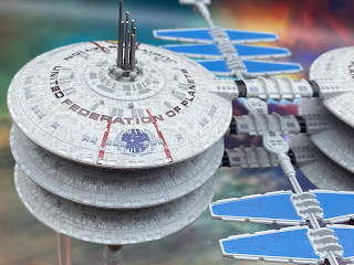
The anticipation was certainly a factor as was the chance to see Q and Guinan back on the screen after almost two decades but Picard's second season has importantly learned from the fan reaction to season one. Now that's something that does actually bear up better on a binge watch and aside from space flowers I can't pick too many faults. But let's hold that debate for another time.

Season two feels more tightly written. The choice to skip 18 months has brought Starfleet back into the picture more and that initially seems to have helped the show regain more of its Star Trek qualities. Maybe that's a very superficial change yet having the USS Stargazer, that expanded fleet of multiple ship types, Raffi and Rios back in uniform - it all makes a massive difference to the ambience of the series. No more copy and paste Inquiry Class fleet and the images we've seen off the back of it are simply gorgeous and make rather superb PC wallpapers.

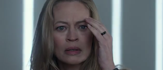
I digress. Admittedly there's an anomaly in episode one and I did kind of start to apply the brakes however get past that and this season is clearly about the characters, Picard's choices in life, the drama of a changed historic event and Annie Wersching's amazing portrayal of the silenced, lonely Borg Queen. 

Robo-Picard doesn't feel as angry this year. Demons seem to have been exercised and he's at peace at least until a beautifully unhinged Q turns up. Picard never hit him but the boot is on the other foot this time. This is probably De Lancie's best performance as the omnipotent creation since Death Wish and to see this darker side of Q is addictive to relish.

Not since Q Who have the Borg and Q appeared in the same episode nor has the latter been as devilish in any way since that encounter back in TNG's second season.

An alternative take on reality is always going to be a winner and whatever Q's motivation s behind changing the past might be, the journey to see this adventure though looks to be touting itself as one of Star Trek's finest...possibly ever.  There's a familiarity here, a warmth to the series and a great sense of drama that Discovery just doesn't seem to be carrying at the moment. 

A significant win for Picard in relation to its characters is that their "wokeness" is not the selling point. There's no "Look at Me I'm X, Y or Z" and instead the characters exist in their own right not because of a certain thing and might, in turn by X, Y or Z. Picard is dealing with situations and allowing its characters to evolve because of the things they encounter not in spite of them. Discovery might take a look and learn a few things - and it's not all down to one person winning the day. Looking at you, Michael.

But I don't want to dwell on that since it gets into all sorts of discussions and to be fair I have nothing against Discovery, but it's just not satisfying my Star Trek cravings at the moment. 

The Star Gazer truly felt cinematic at points - the arrival at the rift, the attack on the bridge and also managed to max out on suspense with the return of those classic canon characters. Season two feels right. There's action and adventure but at the centre is a recognisable cast  facing a new challenge. Even Penance stepped up the game with its transition into the new take on the timeline and the return of the Borg Queen. There is a conspicuous absence of Isa Briones (Soji) after her turn in episode one and dare I say it the series benefits from that slight reduction in cast size with Seven effectively taking her place in the ensemble.

I have a renewed sense of anticipation for the next episode of Picard and what it will hold. The trailers tell us it will be in the 21st Century (2024) and already there are some more humorous tones that have helped shape the season. Even the suggestion of a potential romance between Picard and Laris proved to be a highlight and we know that Orla Brady will be back.

Picard has stepped up to the plate in rather impressive style in just two episodes and I for one am very happy to see the change in tone. Just a shame we know it's only going to last three seasons in total.

For now Jean-Luc and his associates have lifted the bar of standards and expectations for the franchise in its latest incarnation. Looks like there's strong hope for it still and at least 18 more episodes of PIcard to keep us entertained.

Enjoyed this article? Why not like and share to spread the word!

Like our page on Facebook 
Follow us on Twitter

Sunday 20 March 2022

Bonus Edition: Nomad


The Eaglemoss Starships Collection expanded into stations, satellites, weapons platforms and now there's a classic twist to the tale.

Returning to the 1967 episode, The Changeling, the ongoing series of replicas from the Star Trek universe has tackled Nomad.

A combination of a lost Earth space probe and an alien device, the sentient creation was unfortunate to cross paths with computer-confuser James Kirk and face defeat in under 60 televised minutes.

Probably one of the most basic of editions produced for the line, Nomad is...well, it just is. It's not quite to the level of Fesarius when it comes to finding words to review it but it's nor is it overly complex. Of course, this also says something about the era in which the original Nomad model was built and the string (not even shoestring) budget responsible for its look.

So to the model itself sitting vertically on its stand. The centre section here is the only part shaped in metal with the "head" and "tail" pieces in plastic. The hexagonal base is plain grey with some grille pieces equidistant around the sides, leading to an octagonal disc, again grey. 

The central block is the largest element on the probe. All four sides are identical with matching red, yellow and green dotted sections. For note the recessed dots do actually match with the paint so this one gets a tick at least for one thing. There is some evidence of wiring between that body piece and the "head" element of Nomad but these do not have that much definition. They are more an extension of the plastic mould and raise a few lumps and bumps to break up the surface. Comparing to images from the episode, these were of a more shiny metallic colour. Sadly here this looks to have proved too fiddly to achieve.

However on the "head" section there are three silver antennae that break up the singular grey tone and keep in line with the model from the original episode. Even to the top there are recessed silver touchup elements but these aren't as small as the ones at the top of the main body element. It seems size does matter when it comes to attempting accuracy.

Nomad is a nice one to have - just as with the Weapons Platform and Friendship One but it's not super inspiring. Definitely a good idea to try it in the line yet ti also carries a little of the disappointment that was unavoidable with the Fesarius. The simplistic nature of the model means that visually, whether it wants to or not, it will lose some impact when compared to ships from TNG, DS9 and later.

Into the magazine and we're at least kept close to the episode with a retelling of Nomad's origins and just how Kirk won the battle against the sentient probe - and many other computerised enemies. 

One to add to your Oddball Shelf for sure and I do look forward to seeing what other bizarre options Eaglemoss can spin out of the franchise’s earlier decades.

Check out all our Online Starships posts HERE

You can find out more on the Star Trek Online Official Starships Collection by visiting the Hero Collector website HERE

Enjoyed this article? Why not like and share to spread the word!

Like our page on Facebook 
Follow us on Twitter


SNW and Captain Kirk


It was only a matter of time?

In terms of Star Trek that’s one of those phrases that can be taken several ways. However the latest from the Kurtzman stable seems to have provided something of a severe look of confusion from Trekkies including myself. (note that the above pic is a photoshopped image of Anson Mount)

Paramount Plus’ hand was forced this week by some set photos to announce that Vampire Diaries’ Paul Wesley will be appearing in SNW’s second season as the legendary James T Kirk. Great news and something that fans were indeed hoping for with the new, episodic series.

But. According to all those fixed points in the Star Trek PRIME timeline, Kirk should not be a captain as is suggested by his sleeve stripes but still a lieutenant on the USS Farragut (see TOS’ Obsession for further details). Might we be looking at a flash forward? A full skip to Kirk era after season one? Time travel? Note also that there's no actual reference anywhere from Paramount that he's Captain Kirk.

As we know, season one of the hotly anticipated SNW takes place a short time after season two of Discovery and the recent trailer reveals Pike has retreated to Mojave and grown himself a fine beard. Kirk only becomes captain when he joins the Enterprise and that doesn’t happen for another 6/7 years. 

So what is going on? Kirk’s emblem on his uniform does look different to the standard delta so that could be an indicator but still… to have him at the rank of captain? Might there be some element of photoshop in the works or have they genuinely cocked this one right up?

There seems to be a lot more people leaning to the second but hey, let’s see what happens. You have to admit that the publicity from a couple of stills and the casting announcement will have done wonders for the PR machine ahead of SNW launching in May.

Might this also be a way of Kurtzman finally admitting that the whole of his Star Trek journey is indeed part of another timeline? I would hate for that to be the case but logically it’s the only way to explain Kirk’s apparent rank unless there’s time travel or that physical jump in the series chronology.

I will admit though that with all of the ongoing storylines there will inevitably be some errors because of the amount of characters and narratives running but the Kirk rank issue would just be too glaring and obvious. Lazy writing? Hope not. 

Enjoyed this article? Why not like and share to spread the word!

Like our page on Facebook 
Follow us on Twitter

Saturday 19 March 2022

Special Edition: Jupiter Station


The starbase from Voyager's Alpha Quadrant episode Life Line marks a first for the Starships Collection - it needs two bases.

It's also one of the best packaged models I've seen from Eaglemoss in ten years of covering their products. Dropped into lighter foam packaging rather than polystyrene, the station then has its solar panels protected before sitting down into the base of the box. It's well protected but trying to put it back in is a bit fiddly since you have to put the item in upside down to put on the inserts. Then flipping it over to put into the deep base piece can be a delicate moment.

You see, while the two central habitat units are solid, the two solar panel arms that extend out from between them are very, very, very flexible. This makes resting the model on a surface while you sort of the base stands an impossibility as they will just bend and most likely snap due to the weight. The stands themselves are also well embedded into the box so be warned as it's a tight fit.

Once you do have all the elements out and your Jupiter Station carefully balanced across the double stand, you can't help but be impressed with it.

It's not the largest of the space station models but it does the business nevertheless. Spacedock and Regula One are probably the more well-known structures but this one is still a striking design if only seen for one episode. Also I only need to talk about one set of the towers because the other is identical. That's lucky!

At distance, the melding of lifeboat hatches, windows and the base grey work well. The hatches stand out in the darker grey however the windows are horribly misaligned to the point where the error actually affects the station and Federation emblems. The red outline for the large lettering is also slightly out.

The size of this station does overwhelm you on first inspection but it's actually a very clever copy and paste with the six discs being near identical except for a few decals on the upper levels. The aerials at the top of the towers are plastic inserts and on mine, one of them needed a little bit of glue to secure it in place.

The larger structures are very sturdily built while the centrally-extending solar panel arms are at the other end o the scale. This pair of thinner elements do show a slight bend even on the pictures here. Prepping for the stand, it's well worth leaving this in the box until you've constructed the supports because there's nothing to safely rest it on.

The lower spiked elements are fairly intricate and form the generator structures of the station. These are well constructed with individual tank elements and discs. Both elements here are fairly strong, with the pieces attached to a central pole. The paintwork on these pieces is probably the most accurate on the station plus it's great to see numerous pieces grouped together into making the power units.

In the magazine we have a rough overview of the station plus the customary section highlighting the design of the base (which does echo my thoughts on saucer sections!). This is pretty interesting as to how Jupiter Station grew and duplicated to its eventual onscreen form.

Plus we have behind the scenes of the story development from Voyager’s Life Line - the only episode to date to be co-written by a member of the franchise cast. With this in here, the in box magazine is definitely worth the time to read even if just for Robert Picardo’s take on the writing!

A good release here. As with 99% of recent models, it’s unusual but impressively done. One of the largest and perhaps more unstable designs to grace the collection and the twin stand just adds that little twist we’ve not seen before. Tragically it does feature a huge amount of cut and paste but you get lost in the scale and scope of this one rather than looking for all the easy wins.

Check out all our Online Starships posts HERE

You can find out more on the Star Trek Online Official Starships Collection by visiting the Hero Collector website HERE

Enjoyed this article? Why not like and share to spread the word!

Like our page on Facebook 

Follow us on Twitter