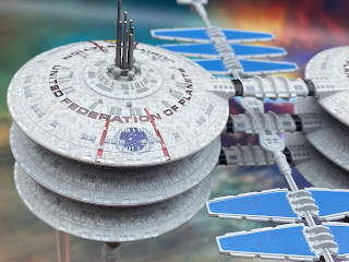
The starbase from Voyager's Alpha Quadrant episode Life Line marks a first for the Starships Collection - it needs two bases.
It's also one of the best packaged models I've seen from Eaglemoss in ten years of covering their products. Dropped into lighter foam packaging rather than polystyrene, the station then has its solar panels protected before sitting down into the base of the box. It's well protected but trying to put it back in is a bit fiddly since you have to put the item in upside down to put on the inserts. Then flipping it over to put into the deep base piece can be a delicate moment.
You see, while the two central habitat units are solid, the two solar panel arms that extend out from between them are very, very, very flexible. This makes resting the model on a surface while you sort of the base stands an impossibility as they will just bend and most likely snap due to the weight. The stands themselves are also well embedded into the box so be warned as it's a tight fit.
Once you do have all the elements out and your Jupiter Station carefully balanced across the double stand, you can't help but be impressed with it.
It's not the largest of the space station models but it does the business nevertheless. Spacedock and Regula One are probably the more well-known structures but this one is still a striking design if only seen for one episode. Also I only need to talk about one set of the towers because the other is identical. That's lucky!
At distance, the melding of lifeboat hatches, windows and the base grey work well. The hatches stand out in the darker grey however the windows are horribly misaligned to the point where the error actually affects the station and Federation emblems. The red outline for the large lettering is also slightly out.The size of this station does overwhelm you on first inspection but it's actually a very clever copy and paste with the six discs being near identical except for a few decals on the upper levels. The aerials at the top of the towers are plastic inserts and on mine, one of them needed a little bit of glue to secure it in place.
The larger structures are very sturdily built while the centrally-extending solar panel arms are at the other end o the scale. This pair of thinner elements do show a slight bend even on the pictures here. Prepping for the stand, it's well worth leaving this in the box until you've constructed the supports because there's nothing to safely rest it on.
The lower spiked elements are fairly intricate and form the generator structures of the station. These are well constructed with individual tank elements and discs. Both elements here are fairly strong, with the pieces attached to a central pole. The paintwork on these pieces is probably the most accurate on the station plus it's great to see numerous pieces grouped together into making the power units.
In the magazine we have a rough overview of the station plus the customary section highlighting the design of the base (which does echo my thoughts on saucer sections!). This is pretty interesting as to how Jupiter Station grew and duplicated to its eventual onscreen form.
Plus we have behind the scenes of the story development from Voyager’s Life Line - the only episode to date to be co-written by a member of the franchise cast. With this in here, the in box magazine is definitely worth the time to read even if just for Robert Picardo’s take on the writing!
A good release here. As with 99% of recent models, it’s unusual but impressively done. One of the largest and perhaps more unstable designs to grace the collection and the twin stand just adds that little twist we’ve not seen before. Tragically it does feature a huge amount of cut and paste but you get lost in the scale and scope of this one rather than looking for all the easy wins.
Check out all our Online Starships posts HERE
You can find out more on the Star Trek Online Official Starships Collection by visiting the Hero Collector website HERE


No comments:
Post a Comment