Wednesday 28 March 2018

Rounding Up: The Graphic Novel Collection Issues 24 - 27


Bringing us more up to date with the Graphic Novel Collection, here are the next four in our recap sessions...

The Newspaper Strips Vol 2 is another of those that I find hard to digest in anything less than a handful of reading sessions. The content itself though is way above that of The Classic UK Comic Strips using the source material much more closely and drawing on the past of the franchise to really fill out the action.


Set after the events of The Motion Picture and using the rather bland range of unitard uniforms, Kirk and crew are depicted returning to the unknown in some truly beautifully illustrated stories. 

Given their nature of being a newspaper comic strip each bite of the tale is punchy and leaves you on a pretty abrupt cliffhanging moment each time. The stories aren't too deep either with Klingon and alien attacks plus a par-for-the-course virus and the return of the mustachioed Harcourt Fenton Mudd to round out the adventures.

Honestly though, for me the artwork in this volume is just standout gorgeous flicking between colour and black and white but for something produced at such a pivotal time in Star Trek history, the way in which the artists have captured the likenesses of the crew and the ship is truly striking. It's also a lovely precursor to the more visually accurate material of the 80's and beyond and goes to show that Star Trek was being taken much more seriously as a product. It was finally getting the proper treatment it deserved on the page rather than being just a jaded knock off from 50's serials that had nothing to do with Roddenberry's vision. I'm not saying that these strips are perfect, far from it because they do still tend to lean towards the fantastical rather than the human condition (but then would you really want something that deep in a daily newspaper strip?) but they are at least heading in a familiar and grounded direction.

Star Trek After Darkness offers a chance to see what happened in the years between the end of the second JJ movie and Beyond. Including Carol Marcus, the Enterprise crew take on a series of new adventures as they, finally, go where no one has gone before.

Choosing not only to look into the future (as they thought then), After Darkness also flips back in time to give us the origin stories for both Chekov and Scotty which led them to their appearances in the 2009 reboot. As always the writing and artwork in these fairly recent offerings are magnificent and thoroughly engrossing giving much more depth to the JJ-verse which is sorely needed since its novel line was cancelled and there is a minimal amount of screentime to refer back to.

The third of these stories might cause a bit of controversy since it chooses to tackle Vulcan Ponn Farr and therefore effectively rewrite the events of Amok Time. This one heads into a lot darker corridors than Spock taking chunks out of Kirk with a giant cotton bud on Vulcan, pushing him right to the edge of sanity and back again. It's a brave choice to tackle such a reverred point in The Original Series but then these volumes have never shied away from a challenge as we've seen in reworkings of other classics such as Where No Man Has Gone Before and The Galileo Seven. Here though it's a big leap and I believe it pays off because it is such a different spin on events.

I continue to be a fan of these Kelvin Timeline stories because of their risk taking with recognised events and the different ways they have faced the change in circumstances following the arrival of Nero and his converted mining ship. Looking forward to the next one of these already!

Khan - Ruling in Hell is just a graphic novel masterpiece without question and one of the highlights of the whole damn series.

Storywise this covers everything from the moment Kirk and the Enterprise dropped the Botany Bay at Ceti Alpha V right up to the very end of The Wrath of Khan.  The artwork is brilliant, encapsulating the dangers and adventures that befall the genetic superhumans before the neighbouring sixth planet explodes and alters the orbit of their enforced home.

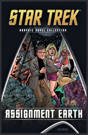
As with Assignment: Earth it also takes us ostensibly away from the Enterprise and her mission to something very, very different. We see Khan endure the highs of the challenge to colonise his new world through to the crushing death of his wife as well as internal attempts from his own people to overthrow him. 

The recreation of The Wrath of Khan is another classic comic strip that condenses the landmark Star Trek movie into a great read. The characterisation of Khan, Joachim and even McGivers is tremendous with some fantastic and very accurate artwork to back it all up. 

It took me about seven pages before I realised that I’d actually read issue one of the TNG: Beginnings collection back in c.1989 just when The Next Generation has launched on UK TV. In fact the back of the comic had been filled with a plot synopsis and pics from the upcoming episode, Datalore.

How did I remember? Because of the bloody annoying Bickering Bickleys. One of the worst things to ever grace any part of the franchise...so pretty fortunate that while they do turn up with more frightening regularity than I would like, they aren’t prominently featured in any of the tales contained therein. 

Beginnings is as odd a beast to the Star Trek graphic novels as the Divided We Fall crossover that was only released a few months ago in that it offers a perspective on familiar characters if things had developed a different way. To be honest things would have had to develop in a rather severe manner for these interpretations of the Enterprise-D crew to manifest so count yourselves lucky.

The stories here are somewhat fantastical with giant killer robots, festive adventures with baddies that look like the Grinch and the return of the Q Continuum. All in all these stories seem only a couple of steps away from some of the tales scripted by Gold Key!

You can tell how early in the development of The Next Generation this series came about because of the way that some of the crew are portrayed. Notably Data uses contractions all over the place, gets emotional and even starts a fight. Deanna seems to have varying abilities given the needs of the story from latent telepathy to full blown psychic waves. As for Wesley he’s even more super annoying than he ever was in the first season on TV, ranging from being a super nerd through to a precocious best at the other extreme.

Beginnings does have some bits right with Riker more in charge of away missions and Picard remaining on the Enterprise although everyone seems to have had an incredible workout regime looking like stars from a body building magazine including the captain. 

In all fairness some of the stories do drone on a bit but because of the inconsistencies between page and screen I did find this difficult to get into 30 years after I read the first issue. The artwork is far too stylised for me when it comes to the portrayal of the cast and their physiques plus the likenesses are far from accurate especially Data and Q is virtually unrecognisable. Actually on that count he’s unrecognisable in both form and character and while this story does parallel events from Deja Q I never recall De Lancie ever becoming this obnoxious even at Q’s worst moments.

What a lot of these graphic novel installments show are the various directions Star Trek could have gone in if onscreen events had transpired in a different manner. It also illustrates what the opinion of these writers was as to what the franchise stood for and what they understood it should be. Each of the stories is incredibly individualistic and Beginnings especially offers a perspective that we never even got slightly close to in the TV series of The Next Generation. These stories are as prolific as they are conceptual and getting into this batch really offers something new - perhaps not great - but definitely new to the Star Trek universe.

As ever these issues wouldn't be half the fun without the wonders of the Gold Key universe and its gradual - very gradual - work towards looking something like Star Trek. With these editions we can engage with the fantastical universe once again in The Mummies of Heitius VII, Siege in Superspace and Child's Play. For note, the Newspaper Strips volume does not contain a Gold Key story (phew - a break!). Utter escapism every time and none to serious. It's almost as if Gold Key realised it was in fact parodying itself through its own writing...

Next up we have issues 28 - 31 which brings us (almost) bang up to date. 


Live on YouTube
Like our page on Facebook 
Follow us on Twitter
+1 us on Google+
Add us on Tumblr

Thursday 22 March 2018

Over and Over...: The Official Starships Collection Issues 120 and 121


The USS Bozeman NCC-1941 is possibly one of the most famous starships in Star Trek history outside of craft called Enterprise.

Going back four odd years the conversations suggested that because this was just a variant on a Miranda Class theme it might never see the light of day. However, due to overwhelming popularity and the continued success of the series itself we finally have the Soyuz Class science vessel. 

The second model to be produced in the series based on the USS Reliant (the first being the USS Saratoga), the Bozeman has the most alterations to its physical form. Indeed the shape of the ship with its single saucer hull and two underslung warp nacelles is immediately identifiable but there's lots of new bits to explore.

The topside of the hull has a wonderful aztec paint scheme that is punctuated with some very precise detailing touches. The panelling is very clear with crisp lines running across the semi-circular front section and also the rear rectangular engineering area. The triple phaser banks are painted in accurately and even the ship registry is almost perfect except for a tiny misalignment of the red bordering to the black lettering - but it's annoyingly close. It's also missing the RCS thruster points that are evident on the Reliant saucer. Right around the edge of the saucer though is an unusual piece of decalling in the form of the ship name and numbers.

The striking inclusion on the top though are the red edging strips which run around the base of the bridge module and also bordering the registry itself. The numbers are a little out of alignment with the strips but the overall effect is very good. The bridge module at the centre of the hull has another strip around its base with a darker ring of grey at its base. There's some minor window detail and the dome has another of those distinct red strips at its centre plus turbolift "Mickey Mouse" ears. Admittedly in the episode we didn't get too clear a glance at the top of the bridge module but against the Reliant and Saratoga there's a difference of detail between all three dependant on what refit we look at. 

Very impressed that Eaglemoss have managed to add in the tiny Starfleet deltas on top of the two weapon units either side of the bridge.

Both the Saratoga and the Bozeman are missing the signature rollbar over the flat rear of the hull which means we get a clearer view of the mechanics in the darker grey banks that run to the back of the craft. There's some good raised engineering works in these two areas although on screen there seemed to be more definition to the height of the components but the scale here isn't conducive to these more fiddly elements.

The biggest addition to the hull is the rear block that connects the deck to two of the outlying sensor pods. That's sensor pods and not guns even though they look like the latter. More great hull detail here with the top arm holding the sensor pod in metal with the pod itself plastic. Also at the back of that block there's a third

On the bottom of the Bozeman the plastic sections carry on with the aztec patterning and has a second set of striping either side of the smaller NCC-1941 registry. These strips line up with the numbers a lot better than the ones on the top and even the red outer of the script is tighter to the black. 

This lighter paint finish really does enhance the detail on the surface of the Bozeman and the underside benefits from this with even more lining all the way round. At the middle of the saucer this time isn't a standard sensor dome but what looks like some heavy-duty gun emplacement. Once more it's a sensor platform bristling with antennae and the number of fine aerials sticking out is not a regular occurence in the collection. 

The plastic inlay sits very well on the ship feeding right to the back with the rear block pod splitting horizontally for the two sections to join with very little impact on the surface finish. 

At the back of the vessel there is a large dark grey section which bears more mechanical gubbins than the two banks on the top. At the middle of this technical section we have the lower warp field generator which is a hold over from the earlier Reliant

Attached under the port and starboard sensor pods are the warp nacelles are fully plastic without even a trace of translucent plastic to brighten them up. The warp field grilles are all painted on and not very tidily at the very ends with some signs of gaps in the curves.The nacelles are two clips together halves and what I have noticed here is that some of the points on that join line are quite jagged on the starboard engine. At the back of both of the units there is the ship name and registry while the connecting pylons carry the Starfleet pennant.

In the magazine we have some good CG images of the Soyuz Class ship plus a bit more on its operational life including a couple of "Easter Egg" mentions it received in Generations and First Contact. The design section revolves around how the production team could make this look different with some alterations to the original Reliant model and the purpose of these added extras. 

Finally - and in keeping with the recent choice of articles in the magazines we have a section devoted to the fifth season of The Next Generation touching on key episodes such as Redemption II, The Game, The First Duty, The Inner Light and of course, Cause and Effect.

The Xhosa from issue 121 is a strange one. A ship that was mentioned multiple times in the latter half of Deep Space Nine's run but seen less than a handful of times - in fact twice in The Way of the Warrior and For the Cause from the following fifth season.

Given that its appearances were few (very few) and far between, I can't really get an idea of the true accuracy of the piece in relation to its onscreen counterpart. It also weighs a flippin' ton and must be about the heaviest starship produced for the collection. Is there a lump of concrete in each one?!

First impression here - this isn’t very exciting. It’s fairly rectangular although there is a high density of surface detail from bow to stern. The forward command/bridge section has a raked nose which is covered in multiple raised panels and callouts of some description. 

At the base of it, the Xhosa has a plain grey coat with two shades of darker greys to show off the protrusions and hatches. Some of the detail to either side of the bridge unit does seem washed out and not as prominent which looks due to a machining choice rather than overpainting. There are also a few green ventilation points on that forward section once more breaking up the uniform hull colour. 

Things get a lot more interesting as we get onto the rear section which opens up with a larger, blockier built up unit that also shows off lots of conduits and panelling plus a subspace antenna that sticks forward and is a plastic insert piece into the large metal top section. 

Moving to the main cargo section and the more rectangular slab, the detailhere seems to get better even though it's the same metal as the forward piece. The panelling is particularly crisp with the brown slatted cargo hatches standing out against the hull and surrounded by more light grey highlights. The callouts on the back end are really nice and clear on the Xhosa although the panel details on the slanted sides that drop away to the bottom don't have the definition of the top section. The panel lines are a lot smoother and seem to mould into the hull without a sharp edge in sight. 

At the back we have the triple engines and there's a unique paint effect here with the exhausts appearing to be burnt with an orange/red tone lightly sprayed into each of the units.

Now, to the underside and from the over abundance of detail on the hull, the bottom is terribly underwhelming. First off this piece is a plastic insert that runs from the nose right to the back (just in front of the engines) and it's super, super bland. The detail is not in keeping with the feel of the topside with only a couple of distinguishing features evident in the two darker shades of grey to contrast against the base coat. Problem is that the lack of details means that it looks awfully fake and flat. I would have expected more to be on there but, I suppose, since it's not going to be seen that much it doesn't matter too much.

As for the stand fitting, the clear grip piece fits smoothly over the engines and above and below the rear section but there's still a lot of weight in there all resting back on the slim neck fitted into the black base so just be aware that there could be a balancing act here.

The magazine takes us through the appearances of the Xhosa in the fourth season of Deep Space Nine plus some of its more basic features plus some of the best CG images of any ship I've seen in the collection. Honestly, some of the shots produced for this issue are class and give the ship a lot more wear and depth to its features than you can see on the model.

The placing of the detail on the metal craft is very precise and compares favourably with the plan views contained in the magazine. What the lack of portholes or windows does mean is that you lose a sense of scale against other ships in the collection. Even putting her besides something like the Defiant doesn't real help because the hull is only covered with hatches and access panel-like features.

What I did appreciate after reading this issue is how many times this ship has been used and reused again and again with a nip here and a tuck there, all starting back with the Batris from The Next Generation's Heart of Glory. Whether, as with the Bajoran Freighter, we will ever see some of these variants is open to debate but since we have the Smugglers Ship and also the various modded versions of the Reliant I can't see why one or two of these wouldn't end up as future releases. Indeed, I think the Batris would make quite a popular addition to the series.

Now while some elements of the model are disappointing with the Xhosa, the mag is a different kettle of fish, with six pages dedicated to the work of John Eaves on updating the armaments of Deep Space Nine for The Way of the Warrior. The illustrations are amazing to pour over with both the phaser and torpedo pods examined as well as the reasons behind their positioning and concealment. A great section and makes up for some of the seeming sloppy ventral detail on the Xhosa's hull.

Ok, I love the Bozeman and for the most part the Xhosa is a good model even if lacking in those underside finishing touches. A good pairing that have appeared in other guises over the course of nearly 40 years of the franchise. While my Deep Space Nine love should make me lean more towards Kasidy Yates' freighter I have to say I'm more impressed with the classic lines of Captain Bateson's starship. With previous experience of freighters - Horizon, Fortunate and even the Malon, there have been mixed to brilliant results with these auxiliary vessels. Of the Miranda variants I really do love the Bozeman to the point where it might be my favourite of the three, even over the original version from The Wrath of Khan.

Next month we have the kitbash of all kitbashes with the Yeager Class and another ship which started out in a slightly different form with the Romulan Science Vessel. Refreshing my mind in regards to my anticipation levels, this might not be an especially exciting duo...!

Liking the Bozeman? Fan of the Xhosa?


Live on YouTube
Like our page on Facebook 
Follow us on Twitter
+1 us on Google+
Add us on Tumblr

Thursday 15 March 2018

Rounding Up: The Graphic Novel Collection Issues 20 - 23


Next up in the ever growing Graphic Novel Collection comes the Classic UK Comics with more retro ‘50’s style shenanigans. Clive and Ian take a look...


I'll be straight up with this one, the UK Comics can be a bit of a drag to get through and while the Kelvin timeline and The Next Generation stories can be a one-sit-and-done these require a more dedicated span of attention due to the smaller story panels and even smaller text. 

What you also find with these is that they tend to lean towards less that Star Trek relevant stories choosing to head into generic sci-fi story territory rather than pushing that envelope and doing something unique and different. It does make for some interesting dipping in and out on occasion,reading a story then dropping into something more recent for a rest. The illustrations are very similar to those in Flash Gordon and other more 50's sci-fi themed outings but they do seem to toe the line on tech and the sets a lot more than Gold Key ever attempted - at least the bridge looks like the bridge and the characters have at least more than a passing passing resemblance to their onscreen counterparts. Some great things to watch out for as you're reading through - lizard aliens, classical Rome and the most bizarre planet-fall landing of a Star Trek starship ever; I kid you not.

Second up in issue 21 is the first trip out to the depths of the Delta Quadrant and aboard Voyager. This collection is set during the third season of the show and prior to the Doctor receiving the holo-emitter meaning we get him confined to sickbay and the holodeck as well as the young Ocampan Kes.   

The stories seem to try and keep in line with the televised episodes, returning both the Talaxians and the Kazon to the story as the former attempt to secure Voyager for the Trabe in what is a very fast-paced tale to open this volume. Graphically the stories do the ships some justice but their visual interpretations of the crew are sketchy at best. Fortunately the stories are compelling and do try and follow some sort of canonical references keeping them firmly placed within the Voyager timeline. While the artwork can be hit and miss at times with these stories they're as good a read as any and once I'd dived into a few pages I found myself easily swayed and totally hooked into some very well crafted adventures.

The Voyager stories are a little more gung-ho than you might have expected but they are all high on action and low (for once) on the technobabble which means you get a much better fill of story and can follow every line. It's not as overdramatic as the recent reprints of the Marvel and UK comic series but it's not as clean cut and crisply written as you would find in one of the Kelvin universe or The Next Generation volumes from the last decade.

Oddly this volume has a fascination with the Kazon/Trabe fracture in the Delta Quadrant with a good four fifths of the stories using this as its centrepoint. It definitely makes for an action packed narrative but maybe it overplays the phaser shooting and fist-fighting that Star Trek didn’t need to rely on to tell a story. These tales do keep with the nicey-nice Maquis/Starfleet unity and tow the line but it does feel a touch lifeless
.
Issue 22 slips us into the realms of Deep Space Nine and The Next Generation with Divided We Fall. Once again there's some tight storytelling, a mix of characters all thrown together and some little signs that mean you can place the time this was written precisely - Riker is clean shaven and there's a Trill officer at the Conn; yes, this was produced just after Insurrection was released and as such the events of Nemesis have no recrimination here.


It's a brilliant story, planned well and offering up one might-have-been moment in Star Trek lore. I love these kind of stories where what actually happened and what was envisaged are completely different because of the perspectives involved. The choice to use Verad from Invasive Procedures as the antagonist here might initially seem a bad idea since that's once of Deep Space Nine's weaker season two installments but it does actually work and by an even further twist we manage to pull in the first onscreen Trill, Odan from The Host. Not just that but Elias Vaughn and Thirishar ch’Thane from the Literary Universe are also pulled into the unfolding events making this one hell of a multi-format crossover spectacular. It really is a story that pulls out all the stops when it comes to both character and action with storyboards that are crisply executed with a decent likeness for the established roster of crew. Great from start to finish this is one of the greats of the collection so far however...


Issue 23 and Assignment Earth. Now this is our first real diversion away from the mainstream Star Trek content, taking us back to the final episode of the second season of The Original Series and the appearance of one Gary Seven, a transmorphic cat called Isis and his secretary Roberta Lincoln.


Now it does have a couple of cute crossover moments in here which ping us back again into Tomorrow is Yesterday to see it from a perspective not unlike that we experienced with Trials and Tribble-ations but on the whole these are a whole new set of adventures which revolve around this unique investigator. This volume gives a voice to a what could have been in much the same way that Divided We Fall offers a divergence into a Star Trek had Nemesis never happened. It's a lot more fun, more colourful and fast-paced than regular Star Trek adventures as it's not enforced to work to the same set of rules or formula even though it's set within the same universe. Could this be someone who could turn up in Discovery? I don't see why not but I would imagine Aaron Harberts and Ted Sullivan would want to tone him down and make his ethics and drives a lot darker than we get here.


Of the whole selection we're covering off here this was easily my favourite. It offered a new dynamic to the Star Trek universe through a series of quite un-Star Trek like tales set in the 1960's USA. These do feel a little more cartoonish in style but there's a lot of life and a lot to love about their content. An odd inclusion but a great one to get hold of and experience a series that never actually was!


On the flip side however my colleague Ian found this a little bit dull and pedestrian -which he has found to occur in previous works by the Tipton brothers. Also in this volume we have A World Gone Mad from Gold Key It has its usual wackiness that you would expect and you get Spock uttering the immortal line “That's no way for a sister to be acting”;I wonder why that one didn’t catch on!!


Backing up the latter three of the four editions is our old faithful Gold Key stories from the early 1970's. This time we have the joys of The Hijacked Planet, The Haunted Asteroid and A World Gone Mad, all of which take us into more Star Trek-foundation (and pretty much everything else) ignoring all the way. They do have a lot in common with the UK Comics editions more than anything although as we do get further into the back catalogue there are occasional signs that the writers and illustrators were starting to consider actually getting a shade nearer canon even if its just in uniform colours. Also a note from Ian on this one around The Haunted Asteroid in that it introduces Doctor Krisp who will turn up again in future stories - a first in the form of a recurring character created for the Gold Key series.


Right then - that's our first of three round robin catchups for the Graphic Novel series. Our next will cover issues 24 - 27...

Any of these floating your boat? What's been the highlight of the collection so far?

Live on YouTube
Like our page on Facebook 
Follow us on Twitter
+1 us on Google+
Add us on Tumblr

Sunday 11 March 2018

The (170)1 That Got Away: The Official Starships Collection Bonus Edition: USS Enterprise Phase II Concept


One of the most fascinating periods of Star Trek history has to be the late 1970's. 

A time when the wonders of Star Wars were a major factor in changing the course of Star Trek and pushing it into the cinema and away from the medium of TV until 1986.

But what if.... what if Star Trek has followed through with its initial plan to return to the small screen and what if the vehicle for those continuing adventures had been updated for TV and not for the more discriminate movie theatre?

Eaglemoss now presents the USS Enterprise that almost, nearly but ultimately never was as part of their bonus editions range from The Official Starships Collection.

Now, who isn’t a sucker for an Enterprise huh? Precisely and with this one it’s a real mish-mash of the classic TV craft and it’s refitted movie version but let’s start at the top and take this one a step at a time.

Overall the distinctive shape of the Constitution Class remains the same - saucer, secondary hull and warp engines but it’s the tweaks that Matt Jefferies put into the ship that make it all the more interesting especially when you compare it to what was in the series and what would be in The Motion Picture.

For starters, the saucer panel lines make their first appearance after the smooth finish of the TV series model however the registry remains in the classic font of the show rather than adding the block font and red edging. Nor are the phaser bank emplacements blocked in as they would be for the film. At the centre, the bridge module is instantly recognisable but finally has a second turbo lift tube added, giving the unit those Mickey Mouse ears. Aside from that though, the bridge piece is identical to its previous incarnation.

Also added is a double red stripe that runs from the rear of the bridge module to the back of the saucer and then down the length of the secondary hull to the top of the shuttlebay. It’s actually something that appears on neither the movie or TV series version - and there are a couple more bits like that to come. 

The saucer is of course metal for the most part with the central underside section in plastic and connected to the neck and then the Engineering hull. 

At the back of the saucer we have the impulse engine coloured red but the warp core unit that sits in front of it on the movie refit is yet to be conceived. The issue I found here is that the neck and the saucer of my model don’t appear to be connected very well and with a little pressure to the front of the saucer it tips forward and lifts off the rear of the neck piece. Echoing back to the original version, the central, large registry is missing, instead there are the twin ship numbers on either side of the lower dome and the two large, curved triangular markings also still present. 

Ok. The neck itself is standard refit movie fayre however instead of the double torpedo tune just above the main deflector we have just a single outlet for the powered projectiles. Nor is it painted up, leaving us with an uncoloured weapon port. In fact the neck piece disappoints further with some horribly misaligned windows on both sides. Surprise, surprise.

Down onto the secondary hull and there is a major change in the way in which this has been put together. You will recall from the A and the movie refit editions that the front of the ship had a gaping curved join line from top to bottom. This time that’s been avoided with the top and bottom halves of the hull coming together along a clean and well concealed central point. 

The colour scheme across the whole ship is more in line with the single tone grey of the underwhelming movie refit model from issue two and there’s not even a slight hint of our favourite aztecing to take the edge off. Luckily though the Engineering section is emblazoned with not just the Starfleet pennant on either side but a larger than life ship registry. This is highly irregular and I can’t think of another ship where this happens. 

To the front we have an obvious hark back to the classic style of the Enterprise with the golden coloured external deflector dish. It looks rather odd given the other upgrades across the ship especially alongside those more oblong nacelles thrusting our at the back. It does however seem to be better finished and painted than the one on The Original Series’ model which was a touch more orange.

On the underside of the hull the red and yellow detailing is very similar to that on the movie starship and adds more to breakup the standard grey colour tone. It really has no practical purpose and acts more to ease the eye across the plain hull.

Stepping back along the grey Phase II hull, we find ourselves at the most significant of the physical changes to the Enterprise with the straight, right-angle to body pylons replaced by two sweeping arms that give the ship a go-faster feel. Not as detailed as those on the movie version - most likely because TV is a more forgiving platform than a massive cinema screen - they are topped by the reshaped, more rectangular warp engines. 

In these however there are no translucent warp field grilles but the bussard collectors are the interesting part here because they still carry the red hue from the domes of the original variant of the ship. They look quite odd on the end of this type of engine but in the same breath manage to hold on to the essence of the warp engines as seen in The Original Series.

They aren't quite as cleanly detailed as the engines on the movie version with the warp field grilles cutting off well before the end of the nacelles which also don't have the fins on the outboard sides to reduce the severity of the tapered ends.

As with multiple other starships, the stand is very firm in its grip on the ship, holding the secondary hull in place and then gripping the rear of the saucer - and not too tightly either. Shame is that the clear plastic holder has a terrible fit into the black base.

The magazine with this one is a treasure trove of information and trounces the last edition which was produced for the Concept Enterprise-C and barely discussed the ship. Here we get to talk in-universe about the changes that "would" have taken place before stepping into the design process from Matt Jefferies who did it as a favour for Roddenberry. This is accompanied by some cool sketches of the ship and even parts of the Enterprise that were updated.

Then there's a section dedicated to the construction of the model which was found to be lacking when it came to upgrading it to The Motion Picture big screen standards and was binned off. Some good photos but a bit disappointing that the proof reader didn't spot the chunks of text left in from the Enterprise-B magazine. Duh.

Last up is the story behind the proposed pilot for Phase II entitled In Thy Image which would have returned the franchise to TV. It's a first because this talks of an appearance that never happened! Knowing about what was to come after this, I'm gutted it never went further but then might its existence have changed the course of Star Trek and meant we didn't get The Next Generation and beyond...?

This is one of the must-haves from the collection and a damn fine model even with some minor issues along the way. As a big fan of Phase II and it’s non-existence this was a no-brainer when it dropped and I don’t think you will be disappointed. The build is decent and the joins are satisfactorily lined up in logical places. Not great that the warp engines miss out on translucent grilles but it doesn’t ruin the finished product. A great opportunity to take a closer look at what could well have been if it hadn’t been for ‘mitigating’ circumstances. Now to just try and fit it in with all the other Enterprise models on that shelf...

The USS Enterprise NCC-1701 Phase II Concept is out now from Eaglemoss.

What do you think to this lost link from Star Trek?


Live on YouTube
Like our page on Facebook 
Follow us on Twitter
+1 us on Google+
Add us on Tumblr

Friday 2 March 2018

Lord of the Rings: The Official Starships Collection Special Nine: USS Enterprise XCV-330


The specials are always a little larger than life, they're the big boys of the collection, the jewels in the crown - but this one really is, well...BIG.

One of the most desirable and yet most maligned and almost forgotten ships from any point in the Star Trek timeline(s), the striking ring ship has made only one - yes, ONE - speedy appearance in the franchise back at the beginning of the journey into the movies. The XCV-330 is a graceful animal, a huge special unlike anything else that has come from the collection. It's a pretty simple design and a direct homage back to the original concept drawings that Matt Jefferies did for the original Star Trek series. Indeed, this was what the Enterprise could have looked like in another world. Measuring a ridiculous xxcm in diameter, the Enterprise is spectacular in many ways but underwhelming in others. I shall explain.

The prominent double rings of the ship are plastic and therefore very lightweight. On the outside of both of them we have a decalled panel detail that is replicated across the whole blue/grey circumference of the craft.  The strips on the decal are all aligned to each other but there are a couple if you follow it round where you will spot them not running quite parallel to the set to their left or right - but then there are a lot of these stripes to get on on two rings, multiplied by the number of ships made...

The rings are very solid with very little flex in their form. They also have a very clean finish at the edges but the tragedy is that the interior of these surfaces are utterly empty of any hull detail. Both carry parts of the ship name and number in nice big, crisp print so at least you can’t miss that but there's not even the carry over of the small silver squares from one side onto the other which is shown in the magazine.

The stand clips to the bottom of the rear ring, hanging the ship in its (nearly) invisible grip to give the flying effect. Only concern for me here is that the weight of that central section might take a toll on the rings at some point.

Now, this beautifully simple craft is finished off with a central metallic section which hangs from the top of the midpoint between the two rings and gives the ship most of its weight in one lump. 

The panelled neck drops diagonally forward with very blocky colouring and red striping marking out the hull on the descent to the tubular neck. Well worth a look at that chunky engine to the rear which has some very nice edging detail worked into it and has depth around the fins and onto the engine exhaust rather than being a simple, flat unit.  Really loving how the coverings work in sections around that central piece and even have different coloured ends.

Moving forward of the engine there is some more slated, dark grey detail and what I think are the emblems for the Earth fleet running this craft. When you compare this to any of the CG work in the magazine (which I kinda take with a pinch of salt), it's evident that the disparity between the grey and the dark grey is nowhere near as severe as it comes across on the model.

Running forward we have a straight grey painted neck section which, as with the hanging metal body section has no tonal variations to it leaving the whole central section looking very bland indeed. Comparing to the magazine there's again a variation between the two versions of the ship with the model seemingly missing a longer grey callout section that runs almost the length of the neck section as well as the grey slats that are present halfway along. How this was missed or added I can't say but it is an odd omission if the CG is being taken as the reference.

OK, then we get to the head/command section and this, for me is where it falls apart. It's a bummer because the XCV-330 is damn gorgeous and will hold a prime position in my collection however the detail on this forward section is hopeless.

My main gripe is that this ship seems to have been made without the CG designer and the model maker ever managing to link up properly because there are so many little inconsistencies between the two and none more evident than on the front piece. The window alignment to the grooves is, yes, there once again but they don't then match up to the number of windows on the accompanying images. 

The only two areas of the grey hull plating sections that are apparently correctly aligned are the grey stripe to the bottom front and the grey indented circle on the port side. The others appear to be way off the mark. The model also seems to have gained a more dramatic red circle around the side of the module than on the mag pictures. In fact all of the red line detailing appears a lot thicker on the model than elsewhere.

However, the biggest grimaces are left for the front ends of the two cylindrical sections of the forward module. The top one is utterly blank without even the hint of a window, sensor assembly or anything to be honest and the lower one omits that the aerial which protrudes from its end is actually recessed into the structure. I would have thought both of these issues would have been easy enough to correct on such a big ship and the fact it looks unfinished makes for a a lot of dissatisfaction.

Into the magazine and the ship profile is the most minimal ever. Five lines which basically explain...nothing because that's all we know. The following eight pages provide original sketches and screen shots of the process which brought the ring ship to The Motion Picture and also later on Admiral Marcus' desk in Into Darkness. But the story of the design process also covers off how this ship wormed its way back into the Star Trek lore in licenced books such as the Star Trek Chronology and how its physical appearance was used as inspiration for the Vulcan ships in Enterprise.

Through its omission we also get the pics of the Enterprise lineage that hung in Archer's ready room on the NX-01 and Eaglemoss have included the image used on the Ships of the Line calendar as well as a painting that was used in the background of Enterprise.


Now this one is finished off with a real treat in the form of six pages covering the little known and very rarely discussed alien mix from The Motion Picture. These images and explanations give a great deal of background to these one-time-seen races and might answer a lot of fans' questions as to who all those individuals were that turned up, were never discussed and then vanished forever more into the Star Trek ether. Some terrible makeup effects in there from the test shots but give it some leniency since it was the late 1970's! 

Damn this is a Marmite model for me. I absolutely love and adore the fact that Eaglemoss have gone to the effort of producing this as a ship in the collection even though it was only ever seen for a fraction of a scene. The size is perfect, the choice of build materials for the different sections is perfect and the overall simplicity has to be admired but because the accompanying material and the ship do not line up when it comes to the finer details.

Fans will definitely want to get their mitts on this one but it will leave a slightly sour taste that it's not finished off to the top standard you would expect.

How did you get on with the XCV-330? Winner or sloppily executed?


Live on YouTube
Like our page on Facebook 
Follow us on Twitter
+1 us on Google+
Add us on Tumblr