Showing posts with label USS Enterprise. Show all posts

Tuesday, 13 August 2024

You're Indestructible...GOLD


Ten years? Seriously? A decade of Attack Wing?

Two starter sets, 30 waves of individual ships, prize events, faction packs, a total rehacking of the points system... and that's just the scant surface moments I can recall from those times.

Now to commemorate the event we have These are the Voyages. Fortunately not a pack that focuses on the final episode of Enterprise but instead one that honours the legendary starship name.

Containing five golden models, this new pack includes the NX, Constitution refit, Excelsior, Galaxy and Sovereign Classes plus 115 new and updated options to outfit them.

Each of the classes can either be fielded as the Enterprise in its different registry guises or an alternative ship from including the NX-02 Columbia, USS Excelsior, USS Atlas or USS Galaxy. It also marks the first retail appearance of the USS Enterprise NCC-1701-A.

Some of the ships, such as the Enterprise-D have seen modifications to their existing cards and a significant number are now superseded by the contents of These are the Voyages.

As ship models go, there are no real surprises since these are repaints of the existing craft from older waves. My Constitution refit though does have horribly wonky nacelles which will require a bit of work to straighten out. That and the saucer is bent. 


Captain options are extensive with all possibilities including Styles, Harriman and Jellico included, each with their own neat twists to add. Crew options are exhaustive too with every canonical crew represented in almost every single way and that includes Porthos.

The pack also continues the new updates of Lower Decks, First Officer and Night Shift although the latter of those three only appears on a couple of cards.


That 115 card stack is something that might never make its way into your main card haul though because nestled into the bottom of the box is a brand new campaign that pits Enterprises of all generations against thew Q Continuum and some equally obnoxious foes. Taking it in turns to select a ship, captain and upgrades, players take on the Crystalline Entity, the Borg Queen's ship or the hard-as-nails Doomsday Machine in a battle for survival and bragging rights.

There are some "obvious" choices to go for such as the E or the D but the A, B, refit and NX-01 aren't without their advantages since a smaller ship score allows for more upgrades and a thoroughly packed out starship. 


These Are the Voyages
is a very unique set though and one that players/collectors may not want to directly add into their big box of cards. The Q scenario actually turns this more into a set to have available for  one off game occasionally “stealing” cards from it to supplement an existing fleet.  It also shows that there is still life in the game after a decade. New features abound, there is still some expansive thinking as to how to keep the game alive and with Into the Unknown requiring a re-mortgage or the sale of a kidney you can understand why players are choosing to remain firmly in the Attack Wing stable.

Enjoyed this article? Why not like and share to spread the word!

Like our page on Facebook 


Friday, 18 August 2023

Path Not Travelled: USS Enterprise NCC-1701-D All Good Things Future Version


There was a ton of excitement when the subscriber gifts for the Official Starships Collection were announced. Along with the binders, Enterprise-D plaque and infamous light up Borg Cube, perhaps the most eagerly awaited was the USS Enterprise NCC-1701-D as seen in the alternative future of All Good Things....

While this version would never come to pass in the Prime Timeline due to the destruction of the Enterprise in Generations, it proved to be an unforgettable arrival into the Star Trek starships canon.

The subscribers version was made on the same scale as the 180 issue "regular" collection but once Eaglemoss expanded into the XL line it was only a matter of time before it joined the series. Indeed, the second of the XLs had been the NCC-1701-D. 

In essence this is the XL-D with its future alterations so for the most part this is an absolutely identical finish to the model we've already reviewed. Indeed, lining them up it's very easy to see that the two are - at a basic level - identical.

The aztecing, the decals, the window alignment is bang on a copy but where we get exciting is in the extra parts that were attached for The Next Generation's seventh season finale.

On the top of the saucer we have the least updates to the design with the probe-like guns added either side of the bridge module and then what seems to be an additional torpedo launcher just behind it. The larger scale shows up the slight misalignment in the registry decals with the red border a few millimetres out to the right but aside from that there's nothing major to note here... unless we want to cover those pesky windows once more.

The three structures added to the dorsal side of the saucer might just be bolt-ons but they do mesh perfectly with the green/blue (duck egg) colour scheme of the ship overall. Following just how the original studio model was updated for the series, the All Good Things... Enterprise has the glue on third nacelle structure.

Stretching from the new impulse engine at the rear of the saucer, this element traverses the spine of the ship down the neck connection and along the Engineering hull before rising up to bear that prominent third nacelle. There is a good level of new detailing on here including what seem to be additional transporter emitters along the sides and a raft of new windows as well as continuations of the Starfleet pennant stripes.

Flip her over and the most evident addition is the huge phaser weapon slapped right down the centre line of the saucer. Ok, it does mean saucer separation is out of the question but for pure "wow" factor it nails it. Detail on this has been scaled up and comparing to screenshots of the episode, the colours and patterning appear to be aligned. What is good with the XL is that there's much more definition to the panelling on these extra pieces. Certainly with the cannon the muzzle area has had some nice upgrading and recessed areas although the fit to the hull on the saucer curvature is a little patchy.

All three nacelles feature the additional top "lumps" indicating a new, larger mould to accommodate those elements which add in new phaser placements and modified decals. The engines do retain their translucent blue and red inserts although on close inspection the joint lines are a bit gappy.

Moving just a little further back and the last of the mods to the ship is evident with the two wings dropping away from the curves of the pylons. This has to indicate the upper half of the Engineering hull is actually a different mould to the original since these are definitely part of the structure and not add ons as with the other All Good Things... upgrades.

The finish overall with the future Enterprise-D is superb and actually enhanced with all the clip on parts. The Eaglemoss model carries the original paint scheme on too with the third engine pylon and raised areas of the secondary hull actually blending seamlessly in regards to colour matching.

The magazine gives some brief coverage to the episode and the ship's appearance but the majority is dedicated to the development of All Good Things... as a story. Lining up after that is a short article on the new ships for the finale in the form of the Klingon starship that would become the Negh'Var and the USS Pasteur medical frigate.

Admittedly this is a bit of a "take it or leave it" XL given that the "real" Enterprise-D returned as seen in The Next Generation for Picard's final season. This might in turn just twist collectors to re-label the secondary hull of their XL to match its onscreen swansong. Good finish, lovely design and well executed. 

Enjoyed this article? Why not like and share to spread the word!

Like our page on Facebook 
Follow us on Twitter

Sunday, 12 June 2022

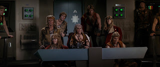
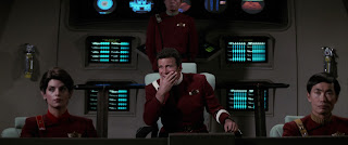
The Wrath of Khan at 40: The Classic Lives On


I was far, far too young to watch The Wrath of Khan when I first saw it.

My first experience of the movie doesn't come from 1982 when I was *cough* just two *cough* but from about three years later on a videotaped version from one of the (at the time) four terrestrial channels we could enjoy in the UK. 

It was the first Star Trek movie I ever saw and for a six year old it blew my mind. Honestly, I didn't realise that I was probably far too young for this movie as I just lapped up every scene with relentless excitement and awe. It was incredible, proper space battle stuff, phasers and explosions; Amazing! What more could you want from a sci-fi film? Apart from being slightly terrified by those ceti eels in a very much edited-for-Saturday-afternoon version.


This video was watched and re-watched with frightening regularity because it was and still probably is my favourite film of all time. If I'm right I wore the tape out because it was viewed that often and now I know the film, as many, many fans do, line by line. Each word is subconsciously pre-empted, every nuance and action anticipated but loved all the same.

I mean, The Wrath of Khan's brilliance has endured for four decades and - in fact when I originally started drafting this - I even introduced it to my wife who took it a lot more positively than I expected.

Melissa is in no way (read: any way at all) a Star Trek fan and would be happy if the s**t was removed from the house this instant and burned. But she has allowed it for many years and knows it's a part of who I am. Anyway, cutting back to the point, she watched it and enjoyed it. I might have even heard the comment of 'good film' in there somewhere. Mel has been more akin to the general movie-goer friendly JJ reboots and after watching those she dropped in during my in-sequence movie watch with The Search for Spock coming to realise that the more recent blockbusters merely touch the surface and offer a line into the wider franchise.

Going back and watching The Wrath of Khan was a great experience to see her drawn in by the story, the action, the subtle undertones and admit that it was easily the best of the movies. It was pretty much as I did back in the mid-80's watching Ricardo Montalban chew the scenery for the umpteenth time and eye roll at the recognition of Chekov which is the stuff of Star Trek legend.

Khan
is in no way a hard movie to say why it's so good and even the franchise itself has attempted to copy its brilliance with varying levels of success - First Contact and Into Darkness being those polar opposite examples. Indeed it's influence reaches into the writing of The Voyage Home, the writing and directing of The Undiscovered Country and ultimately to the direction of Discovery with the inclusion of Nicholas Meyer into the show's writers room. Heck, there's still that rumour that a Khan mini-series will happen and even in the last episode of Picard's second season there was an ominous reference to Project Khan in the hands of Adam Soong. It's influence cannot be underestimated which isn't bad for a movie that had a fraction of the budget of its predecessor. Think about it for a moment and just how much is reused. The Klingon K'tingas, Enterprise in spacedock, the crew uniforms are dyed rehashes of the ones from The Motion Picture and the two main sets - the bridges of the Reliant and the Enterprise are the same set

Even just with those you would be laughing and mocking a movie if it were made now and rehacked a substantial amount of its forebear but in that respect The Wrath of Khan is unique. The story is a huge upgrade, the stakes are unequivocally raised and slot in one of the most gut-punching final acts in cinema history and the sedentary plod through V'Ger is easily banished from the mind. 

People ask if you can single out moments from the movie which are classics but I find it hard to pull apart what is the perfect Star Trek movie. There is true heart, character and loss in every cell of the film from the opening "In the 22nd Century" right to Nimoy's one and only time recital of "Space; the final frontier...". No other Star Trek movie packs so much into its running time and effortlessly feels like every minute is finely balanced, every line just necessary; no more no less (more on that in a sec).

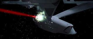
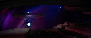
The legendary six day Meyer rewrite may have given The Wrath of Khan the kick that the franchise needed after the pedestrian nature of The Motion Picture it was a vibrant visual spectacular with those monster maroon uniforms, phaser battles, a submarine-like hunt in the Mutara Nebula and the Kirk/Khaaaaaaaaan exchanges but how come it's endured for so long and how come I still find it my go-to Star Trek movie more than any other?

It has matured exceptionally well with my younger self enwrapped in the action, the explosions and the burning starships but as I've grown older each viewing has brought something new to light and a new angle to view it from; life and death, winning and losing; vengeance and perhaps interestingly, growing older itself.  Like Kirk, I tried the desk job and it wasn't for me and I went back to something that I enjoyed before it was too late (!) and still after all that it still resonates. I might not be watching it with the regularity I managed in the late 80's but there are at least a couple of re-watches a year, even if it's just to enjoy the adventurous James Horner soundtrack.

Each scene delivers and provides almost a mini-cliffhanger as we bounce between the Enterprise, Reliant and Regula One with themes explored at the beginning re-emerging later in the movie without feeling forced. It's an action adventure that carries more weight than you think and barely has the two main protagonists speaking to each other let alone ever physically meet.


The Wrath of Khan really affected my views on Star Trek from something that I watched on a Wednesday night into something that I absolutely loved. I can remember recreating the final battle with my Ertl USS Enterprise which had been adorned with phaser and torpedo damage just as the ship had been in the Mutara Nebula - it was on the TV version of the ship however but my young mind could easily make the jump as the Enterprise rose up behind the Reliant/over the bedside.

Believe it or not this is actually going somewhere because June 4th 2018 marked 36 years since the movie was originally released and it still looks great in every frame and with every spoken line. It has everything you could possibly want from Star Trek and I firmly believe that without the success of this movie there would be no franchise today. The Wrath of Khan is one of those moments where Star Trek actually got it right in the right way at the right time. All the elements needed were where they needed to be and it pounced on the move to the cinema with veracity and energy rather than treading a similar line to The Motion Picture. 

Without the renewed vigour and dynamism of The Wrath of Khan, Star Trek may well have become a sci-fi footnote of 79 episodes and two so so movies whereas instead it breathes life into the show which still exists today. If you were to encapsulate the effect of this story in one word it would have to be ‘monumental’. A moment that is off-referred to, imitated both outside and within the franchise and still as fresh today as it was in June 1982.

Indeed, just think how many references to Augments, Ceti Eels, Ceti Alpha V, Khan himself,
great fictional works, the needs of the many or even the Kobayashi Maru have pervaded the franchise since this point - how many times has it perhaps attempted to regain that moment of "perfection"? Maybe the other way of looking at it is that The Wrath of Khan spawned the greatest period of Star Trek's history but was it also the most polluting factor at the same time with everything being rated against the second movie in every sense meaning that future writers and directors were consciously or unconsciously using it as a base?


Now in 2022 I can add another few paragraphs to my love of this movie because I've finally watched the Director's Cut. The differences are subtle; the nod to Scotty's nephew, slight extensions to a few of the scenes that add a little more depth to the narrative (and an odd one or to that actually remove a touch of the dynamic) but as a whole it still proves that this is a classic. Polished up and with some great extras it's a must to any collection and will more than likely be pressed up against the inevitable 4k Blu-Ray render of The Motion Picture that's recently arrived.

Perhaps back in 1982 there was even more riding on the success of a sequel than there was from The Motion Picture. That had proved the franchise could work on the big screen and attract a good size audience and takings but The Wrath of Khan had to do more for less. This one had to prove that there was longevity to this direction and it did that in spades. Even today there is no other film I have watched or quote more than this one, there is no other movie I have seen more times than this nor one that I enjoy as much on each viewing.

Star Trek II The Wrath of Khan has been revered and imitated within its own franchise walls for 40 years and that love does not look set to dissipate any time soon. Maybe though there is one more thing for me to do with it and that's to see it up on the cinema screen itself as along with The Motion Picture and The Search for Spock it's one of only three Star Trek features I've not experienced in that environment. Fingers crossed it doesn't take another 40 years for me to make that happen. 

Enjoyed this article? Why not like and share to spread the word!

Like our page on Facebook 
Follow us on Twitter

Sunday, 24 April 2022

XL USS Enterprise NCC-1701-E


Re-released in a shiny, magnetically shutting display box, the USS Enterprise NCC-1701-E is still a very sought after XL edition.

Now comfortably packed in a black box with black foam and the standard mini-magazine, the Enterprise-E XL is probably one of those Eaglemoss models that has the most to prove alongside the XL Excelsior Class editions.

Why? Because the original regular issues were frankly poor. The box size restricted the ship, the detail was horrendous and everything just seemed to go against them. In the larger scale there's a lot of room to make the necessary updates and kick those smaller ships out of the way.

In the case of the Enterprise-B this was exactly what happened and I was blown away by the quality of the XL, easily becoming one of my favourite display items. In the case of the Sovereign Class Enterprise-E I have mixed feelings.

Larger in every sense, this is still a mix of three different films, taking elements from First Contact, Insurrection and Nemesis to bring her to life. 

Lets start at the top. The first thing to get a handle on is that the surface is no longer as cluttered as its smaller predecessor. That had so much packed onto the small model that everything was falling over itself and the ship was lost underneath. Here there's more space for the ship to breathe and for the details to stand out for themselves. Lifeboat hatches (wisely decalled on) and markings are a lot more identifiable and the windows aren't crammed in with the aztec paint scheme.

That spacing means you can appreciate the scale and detail of the model itself much more easily. Yes, you know I'm going to touch on the point that window alignment is all over the place versus the recessed markers for them and annoyingly the RCS thrusters are a few millimetres out of sync with the hull. Those are fairly big disappointments but because of the issues with the small version your mind is willing you to really, really like it and ignore the flaws.

That aztec paint scheme on the ship is nowhere near as subtle as the magazine cover or the onscreen version might make you think with the contrast pattern dramatically blocked out across the hull. In contrast, the gold and gey patterning behind the bridge and over the main shuttlebay absolutely benefits from the scale increase as you can see the lining more clearly and again it's not clustered together.  There is a dip in the structure around this point which looks like a badly disguised join but at least the shuttle bay is recessed under the dock shuttlebay control box.

So too the plating detail along the top of the secondary hull. This does seem very cluttered but nowhere near as bad as before. The scale again allows this to appear more as a speckled finish than a blob. 

What I can't get my head around is how the more brown finish there and also on the underside of the E hull can be accurate. Everything else you see - including the magazine in the box - portrays this as a more grey colouring in keeping with the saucer patterning. However, on the model it's in a mottled beige/grey that just looks odd and this runs right the length of the ship. Bizarrely the top speckling/aztecing is the same colour but when it's condensed into such a small area there's no doubt it's giving off brown tones.

At the front of the secondary hull we do have the deflector dish, here rendered gold rather than a yellow that was seen on screen. I'm also questioning the colouring of the Captain's Yacht in its under-saucer dock because it's definitely in contrast to the regular edition version.

Onto the warp engines. These are more a replica of the versions that appeared on the E in Insurrection and Nemesis when they were slightly extended hence part of the reason this is something of a "cobbled together" final product.  The design of these pieces is excellent while the finish is a bit more questionnable.

For one, the striping on the pylons is slightly sloppy with the edges of the grey and black lines frayed in places. The bussard collectors are strongly featured and Eaglemoss have utilised their translucent plastics to open up the warp grilles along the top of each nacelle. To the rear there is some nice greyed inset detailing and of course the ship registries at the tips.

Tragically though, collectors will get to see just how those blue elements atop the warp engines are connected since they are pegged from the top in four distinct points. Rarely do we get to actually and obviously see build issues on these craft yet this is one that does stick out in a very glaring position.

In the magazine we focus heavily on First Contact with both the work that went into creating a design for the upgraded Borg and the introduction of the Borg Queen taking centre stage. It's a good read and completes the package by keeping close to the focus of the product which always gets thumbs up from me.

Overall construction on the Enterprise-E is pretty decent and there's a lot of weight to the front. The saucer and the upper "spine" section of the engineering hull are metal here with the remainder in plastic. I was actually surprised just how heavy this one is. Genuinely I want to love this model and also the E itself but the more I look at it, the more I'm not convinced by the design. In turn this might be affected by the paint job that makes it more brown than grey. That warp grille issue also bugs me to be honest and I'm not sure I can see past it.

The details on the A actually worry me less than they do here and while Eaglemoss definitely have stepped their game up from the regular mini version, it still feels a long way off an accurate edition of the Sovereign Class from any angle or movie.

Fans will want this one in their collection because of its screentime and significance but beware disappointment.

Check out all our Online Starships posts HERE

You can find out more on the Star Trek Online Official Starships Collection by visiting the Hero Collector website HERE

Enjoyed this article? Why not like and share to spread the word!

Like our page on Facebook 
Follow us on Twitter

Saturday, 16 April 2022

XL USS Enterprise NCC-1701 (2009)


Of all the XLs this is the one where we see the least upgrades from the original. 

Not only that but it's a rare XL where the original was already larger than the regular editions. This was, if you recall, the second special edition and as such there's not a lot that's been achieved by making this ship slightly bigger.

Comparing this back to both the special edition and its screen ancestor, the Kelvin Timeline USS Enterprise, this version is pretty close to the original. The paint scheme picks out the aztec patterning and the grey panel highlights mirror the smaller version. One thing to notice immediately is that these grey elements are slightly lighter on the XL and the white a shade more crisp too. Admittedly my photography skills back in the day weren't the best but this newer edition does feel at least cleaned up.

Most significant are the joint lines on the engine and between the neck and saucer section. On the former the two halves meet much more cleanly at the top and along the length of the two warp nacelles. The grey detailing is now more prominent on the warp engines with even the rear exhaust ports gaining some much needed detailing. 

The secondary hull is now cleverly sectioned up with the sectioning changed from two hull left and right halves into a top and bottom section with an addition double section forming the neck. It is more complex but adds a great deal of structure to the ship and strength to the finish. Plus the horrid join line across the top of the secondary hull is now erased providing a cleaner curve. Underneath you can see how the new combination works with the bottom element extending front to back and slotting in to the upper piece.

Around the base of the pylons there's also been a tweak to the thickness of the grey striping which now goes all the way round rather than just underneath. Also just under the strikingly blue bussard collectors there are new grey cutouts adding to the colouring of the starship. Onde thing that is still missing however is the striping around the sides of the saucer but here that curve is just too tight to mark up. The collectors themselves also gain the white lining omitted before and look ten times better just with this screen accurate touch.

As for the secondary hull; on the special edition the joint line was gaping with the saucer only loosely fitting onto the secondary hull. The line from that point along the front of the neck is now a lot better aligned with the torpedo tube and element just below it now coloured - something that the slight size increase does afford. 

Docking ports on the side of the Engineering hull and also on the neck are now more prominent as are the RCS thrusters on the edge of the saucer. Ok, so this isn't a big rework but rather a refining of the first version released just under eight years ago and it does work. However I would be pushed to justify getting this if you've already forked out for the special edition. There isn't a huge amount different. Yes, the windows are slightly better aligned but the decals are just as good - except this version does now have the registry on the underside of the hull that was missing previously.

The upgrades of structure, painting and formerly omitted decals are the biggest things here and do add to the overall feel that this is more complete but anyone who already has a version will be disappointed. I am looking forward to lining this up with both the TOS version and DSC editions as a mini trio.

As for the magazine, the content barely touches the USS Enterprise and instead swings off on another direction linked to the 2009 Kelvin Timeline movie. Focusing heavily on the design and build of both the Enterprise and Nero's mammoth Narada, Eaglemoss makes it even more conspicuous that the antagonist's ship will never see its arrival in the collection. Lots of concept drawings and the standard array of background info is packed in here to cover the Romulans' mining starship from every angle.

Check out all our Online Starships posts HERE

You can find out more on the Star Trek Online Official Starships Collection by visiting the Hero Collector website HERE

Enjoyed this article? Why not like and share to spread the word!

Like our page on Facebook 
Follow us on Twitter

Sunday, 27 March 2022

NCC-1701 XL


The classic. The original...and bigger.

The USS Enterprise from TOS was the very first XL produced by Eaglemoss. That also makes it the sixth (I think!) time that this version of the iconic starship class has been made available by this company.

Admittedly the other five were the regular size editions so it's going to be interesting to see how this one sizes up against the reviews I fielded for each of those (with the exception of the Yorktown convention edition which was purely a decal change).

SIzing up has worked a treat for the classic design. Retaining the grey paint scheme from previous incarnations, the smooth hull carries a much cleaner and crisper set of registry decals and finer details such as the port and starboard red/green lights and the four white rectangular panels. Noticeably the bridge dome is more strongly painted here. The striping details here and the red edging trim also suits this size more adequately. I did notice that the registry on the top of the saucer isn't too well applied with some speckling of the black on the last "1". 

Topside there's not much difference apart from the upscaling but under the saucer there's some instantly noticeable differences. The whole of the underside is now an inserted section rather than just the central sensor module and its surrounding windows. Again the dome itself is much more opaque having received a decent coat of paint. That being said, the actual finish is pretty spot on both colourwise and in respect to the decals. 

But while Eaglemoss have chosen to change the way in which the saucer is moulded, they have retained the horrible construction of the engineering hull. The gaping seam that marred the original is now XL'd two-thirds of the way down the side of the ship. There is more definition to the stepped hull around the deflector dish to the front though and also the addition of some side detail just ahead of the Starfleet pennants that run down the sides. 

Now don't get me wrong, this is a definite step up from the regular issue but, as with the Enterprise-D, there are those little quibbles that could have been resolved which are still painfully evident. Eaglemoss have, in their defence, fixed the shoddy warp engine attachment to the pylons. This has removed a glaring gap and meant that the two engines sit seamlessly against the grips on the ends of said pylons.

The secondary hull is nicely finished for the most part. The hanger doors are in a slightly different shade of grey and the stripe along her back is perfectly aligned. I was however blessed with a bent deflector dish aerial that looks a tad droopy at the best of times. It's a minor point that can be easily rectified but looked annoying as hell coming out of the box.

In terms of the warp engines, the metallic extremities such as the radiator grilles are moulded as part of the twin cylindrical structures. That doesn't mean that they aren't painted up and lose definition against the hull. In comparison to the original version, there is again very little difference apart from size. That does allow for more prominent bolt locations yet because of the ship's fairly basic design there is nothing to add once the Enterprise is scaled up.

Stand positioning is also identical and only goes to reinforce that aside from a rejigging of the metal/plastic makeup of the underside of the saucer and repositioning of the warp engines versus the pylons, this is a larger carbon copy of the smaller original. 

Nothing wrong with that though because while it doesn't add a ton of detail, the scale is the big winner and you can appreciate the ship more when there's more of it so to speak! Plus - y'know - it's a classic and an XL version was always going to be the way forward. Fortunately both this and the Enterprise-D that we've already covered provided lots of learnings for the XLs.

Eaglemoss' magazine washes out a bit since the waters of NCC-1701 have been rinsed more times than anyone can remember. There's some recounting of ship details before a journey through the making of The Cage and the recasting for Where No Man Has Gone Before. It's standard fayre with nothing really new that isn't covered in the recent and rather superb Star Trek: A Celebration book among numerous others (and that one was published by HeroCollector).

With the slight improvements though, the USS Enterprise XL we have here is something that no fan would be able to resist. It's definitely a step up when it comes to scale(!) and is an ideal desk companion in the workplace (makes a good talking point). The updates on colours thanks to the increase in size work well especially around the engine detail and shuttle bay. What would be a good move in the future is to XL the Pike TOS Enterprise and actually make it screen accurate. 

Check out all our Online Starships posts HERE

You can find out more on the Star Trek Online Official Starships Collection by visiting the Hero Collector website HERE

Enjoyed this article? Why not like and share to spread the word!

Like our page on Facebook 
Follow us on Twitter

Sunday, 2 January 2022

STO Issue 15: USS Enterprise NCC-1701-F


Tracking back a few issues, we've located the USS Enterprise NCC-1701-F.

Already released in its original formation, the Enterprise-F here is the updated Yorktown Class variant modified after the Iconian War as featured in STO.

The basic formula for the flagship remains with primary and secondary hulls, a pair of warp engines and those twin necks. But there have been some updates to the design over time and it's a good one to compare against the bonus issue Eaglemoss released.

Most if not all of you will remember that the original Enterprise-F was released in two variants - the STO livery and also the "real universe" grey livery that fitted (apparently) with the rest of your collection if the much more striking colour palette wasn't to your liking.

But as usual lets take the refit as its own case.  This model is incredibly light and even when holding it I still wasn't sure if I was. The primary hull is metal but with it being so small and, strangely fragile, there's very little solid material there.

Putting her alongside the original version (Online livery), the differences in not just the level of detail but the quality improvement is significant. Lots more coloured panel section, better defined RCS thrusters and much sharper decals. The amount of windows painted in have increased tenfold. There are notable parallels in the black hull striping and the overall shape of the craft however this newer, refit version has a lot more going for it.

The impulse engines are more prominent and the three (black, white, grey) colours offer a more varied finish to the starship. One minor glitch is the alignment of the decals at the ends of the phaser banks which are sitting much higher than they should while on the original version they were spot on. So too are the decals for the heavily increased number of lifeboat hatches just that little bit out - but not as much as the phaser strips. Yet, given the increased level of detail, this is a minor blip on an otherwise great entry to the Online Collection.

The engine pylons feature a new flat-fronted and rear swept design with the warp nacelles themselves being of a far more intricate design and sadly painted in rather than having translucent bussard collectors and warp grilles. The paintwork on them though is superb with a little flick added to the back end that's a little similar to the Excelsior Class.

The has retained its unique double neck design which has received a decent level of window detailing before sweeping into the scooped Engineering hull. Even on her belly, the F has a great, precise level of painting applied with that decal quibble from the top still managing to slip in. The pennants both align on the port and starboard sides and the only real evidence of the combined model construction materials is the line running around the inner edge of the primary hull.

The detail really is striking on the Enterprise-F. The main deflector echoes the colouring of Voyager in its blue with gold framing as well as its shape. This is particularly well executed given the size of the dish and the model overall.

What I was really impressed with was the dagger sharp lines of the black painted sections of the hull. Underneath the edges are ramrod straight and culminate cleanly around the Enterprise's support craft docked right at the rear. This too has seen some detail improvement since the original F design with much more clarity on its hull features.

Taking this away from the model for a second, the refitted Enterprise-F is a great improvement on its first incarnation and shows the steps taken since it first emerged from its digital drydock. It is a little disappointing that the model has some decal issues however it's a good replica which could benefit from the XL treatment. Not one of my favourites but with the "confirmation" (use that loosely) thanks to Picard's prequel comic, we can assume that this is what the next Enterprise would be after the Sovereign Class. That comment should cause a few grumbles but I guess it's one of those things we have to accept in this new Trek era.

Within the pages of the magazine we get to grips with the story of the refit as well as become familiarised with the Enterprise-F captain, Shon and explore some of the features of the Federation's flagship. There are also two pages of customary plan views just in case looking at the model wasn't enough.

The Enterprise-F pack is one of the standouts from the 20 editions in the series. One; it's an Enterprise, Two; it's an improvement on the first version as a model not just as a design. The structure feels better and with the updated packaging it ticks a lot of boxes. To say it's a must is a no-brainer, even more essential if you've got the bonus version in either (or both) colour scheme.

Check out all our Online Starships posts HERE

You can find out more on the Star Trek Online Official Starships Collection by visiting the Hero Collector website HERE

Enjoyed this article? Why not like and share to spread the word!

Like our page on Facebook 
Follow us on Twitter