Showing posts with label USS Reliant. Show all posts

Sunday, 12 June 2022

The Wrath of Khan at 40: The Classic Lives On


I was far, far too young to watch The Wrath of Khan when I first saw it.

My first experience of the movie doesn't come from 1982 when I was *cough* just two *cough* but from about three years later on a videotaped version from one of the (at the time) four terrestrial channels we could enjoy in the UK. 

It was the first Star Trek movie I ever saw and for a six year old it blew my mind. Honestly, I didn't realise that I was probably far too young for this movie as I just lapped up every scene with relentless excitement and awe. It was incredible, proper space battle stuff, phasers and explosions; Amazing! What more could you want from a sci-fi film? Apart from being slightly terrified by those ceti eels in a very much edited-for-Saturday-afternoon version.


This video was watched and re-watched with frightening regularity because it was and still probably is my favourite film of all time. If I'm right I wore the tape out because it was viewed that often and now I know the film, as many, many fans do, line by line. Each word is subconsciously pre-empted, every nuance and action anticipated but loved all the same.

I mean, The Wrath of Khan's brilliance has endured for four decades and - in fact when I originally started drafting this - I even introduced it to my wife who took it a lot more positively than I expected.

Melissa is in no way (read: any way at all) a Star Trek fan and would be happy if the s**t was removed from the house this instant and burned. But she has allowed it for many years and knows it's a part of who I am. Anyway, cutting back to the point, she watched it and enjoyed it. I might have even heard the comment of 'good film' in there somewhere. Mel has been more akin to the general movie-goer friendly JJ reboots and after watching those she dropped in during my in-sequence movie watch with The Search for Spock coming to realise that the more recent blockbusters merely touch the surface and offer a line into the wider franchise.

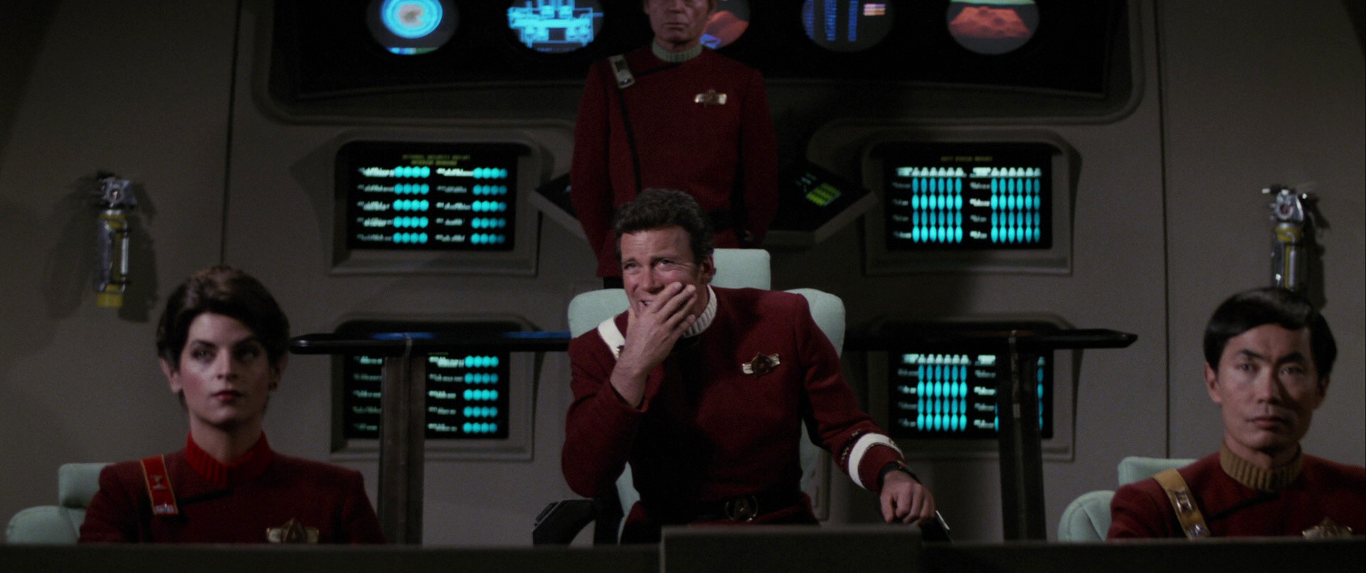
Going back and watching The Wrath of Khan was a great experience to see her drawn in by the story, the action, the subtle undertones and admit that it was easily the best of the movies. It was pretty much as I did back in the mid-80's watching Ricardo Montalban chew the scenery for the umpteenth time and eye roll at the recognition of Chekov which is the stuff of Star Trek legend.
Khan
is in no way a hard movie to say why it's so good and even the franchise itself has attempted to copy its brilliance with varying levels of success - First Contact and Into Darkness being those polar opposite examples. Indeed it's influence reaches into the writing of The Voyage Home, the writing and directing of The Undiscovered Country and ultimately to the direction of Discovery with the inclusion of Nicholas Meyer into the show's writers room. Heck, there's still that rumour that a Khan mini-series will happen and even in the last episode of Picard's second season there was an ominous reference to Project Khan in the hands of Adam Soong. It's influence cannot be underestimated which isn't bad for a movie that had a fraction of the budget of its predecessor. Think about it for a moment and just how much is reused. The Klingon K'tingas, Enterprise in spacedock, the crew uniforms are dyed rehashes of the ones from The Motion Picture and the two main sets - the bridges of the Reliant and the Enterprise are the same set

Even just with those you would be laughing and mocking a movie if it were made now and rehacked a substantial amount of its forebear but in that respect The Wrath of Khan is unique. The story is a huge upgrade, the stakes are unequivocally raised and slot in one of the most gut-punching final acts in cinema history and the sedentary plod through V'Ger is easily banished from the mind. 

People ask if you can single out moments from the movie which are classics but I find it hard to pull apart what is the perfect Star Trek movie. There is true heart, character and loss in every cell of the film from the opening "In the 22nd Century" right to Nimoy's one and only time recital of "Space; the final frontier...". No other Star Trek movie packs so much into its running time and effortlessly feels like every minute is finely balanced, every line just necessary; no more no less (more on that in a sec).

The legendary six day Meyer rewrite may have given The Wrath of Khan the kick that the franchise needed after the pedestrian nature of The Motion Picture it was a vibrant visual spectacular with those monster maroon uniforms, phaser battles, a submarine-like hunt in the Mutara Nebula and the Kirk/Khaaaaaaaaan exchanges but how come it's endured for so long and how come I still find it my go-to Star Trek movie more than any other?

It has matured exceptionally well with my younger self enwrapped in the action, the explosions and the burning starships but as I've grown older each viewing has brought something new to light and a new angle to view it from; life and death, winning and losing; vengeance and perhaps interestingly, growing older itself.  Like Kirk, I tried the desk job and it wasn't for me and I went back to something that I enjoyed before it was too late (!) and still after all that it still resonates. I might not be watching it with the regularity I managed in the late 80's but there are at least a couple of re-watches a year, even if it's just to enjoy the adventurous James Horner soundtrack.

Each scene delivers and provides almost a mini-cliffhanger as we bounce between the Enterprise, Reliant and Regula One with themes explored at the beginning re-emerging later in the movie without feeling forced. It's an action adventure that carries more weight than you think and barely has the two main protagonists speaking to each other let alone ever physically meet.


The Wrath of Khan really affected my views on Star Trek from something that I watched on a Wednesday night into something that I absolutely loved. I can remember recreating the final battle with my Ertl USS Enterprise which had been adorned with phaser and torpedo damage just as the ship had been in the Mutara Nebula - it was on the TV version of the ship however but my young mind could easily make the jump as the Enterprise rose up behind the Reliant/over the bedside.
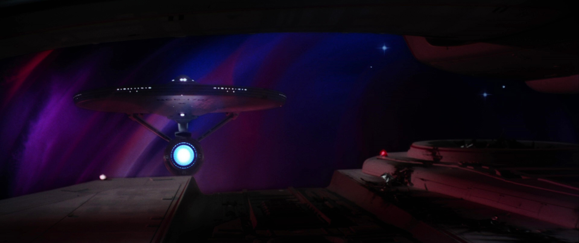
Believe it or not this is actually going somewhere because June 4th 2018 marked 36 years since the movie was originally released and it still looks great in every frame and with every spoken line. It has everything you could possibly want from Star Trek and I firmly believe that without the success of this movie there would be no franchise today. The Wrath of Khan is one of those moments where Star Trek actually got it right in the right way at the right time. All the elements needed were where they needed to be and it pounced on the move to the cinema with veracity and energy rather than treading a similar line to The Motion Picture. 

Without the renewed vigour and dynamism of The Wrath of Khan, Star Trek may well have become a sci-fi footnote of 79 episodes and two so so movies whereas instead it breathes life into the show which still exists today. If you were to encapsulate the effect of this story in one word it would have to be ‘monumental’. A moment that is off-referred to, imitated both outside and within the franchise and still as fresh today as it was in June 1982.

Indeed, just think how many references to Augments, Ceti Eels, Ceti Alpha V, Khan himself,
great fictional works, the needs of the many or even the Kobayashi Maru have pervaded the franchise since this point - how many times has it perhaps attempted to regain that moment of "perfection"? Maybe the other way of looking at it is that The Wrath of Khan spawned the greatest period of Star Trek's history but was it also the most polluting factor at the same time with everything being rated against the second movie in every sense meaning that future writers and directors were consciously or unconsciously using it as a base?


Now in 2022 I can add another few paragraphs to my love of this movie because I've finally watched the Director's Cut. The differences are subtle; the nod to Scotty's nephew, slight extensions to a few of the scenes that add a little more depth to the narrative (and an odd one or to that actually remove a touch of the dynamic) but as a whole it still proves that this is a classic. Polished up and with some great extras it's a must to any collection and will more than likely be pressed up against the inevitable 4k Blu-Ray render of The Motion Picture that's recently arrived.

Perhaps back in 1982 there was even more riding on the success of a sequel than there was from The Motion Picture. That had proved the franchise could work on the big screen and attract a good size audience and takings but The Wrath of Khan had to do more for less. This one had to prove that there was longevity to this direction and it did that in spades. Even today there is no other film I have watched or quote more than this one, there is no other movie I have seen more times than this nor one that I enjoy as much on each viewing.

Star Trek II The Wrath of Khan has been revered and imitated within its own franchise walls for 40 years and that love does not look set to dissipate any time soon. Maybe though there is one more thing for me to do with it and that's to see it up on the cinema screen itself as along with The Motion Picture and The Search for Spock it's one of only three Star Trek features I've not experienced in that environment. Fingers crossed it doesn't take another 40 years for me to make that happen. 

Enjoyed this article? Why not like and share to spread the word!

Like our page on Facebook 
Follow us on Twitter

Thursday, 6 January 2022

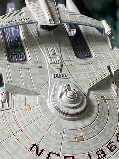
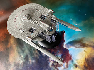
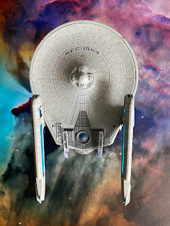
To The Last: USS Reliant NCC-1864 XL


Aaaaaaah Kirk my old friend, do y-

Sorry, getting all reminiscent for the most revered of Star Trek films by just being in the same room as the HeroCollector XL USS Reliant NCC-1864.

Now you're likely to be getting tired of these by now so I'll try not to repeat too many lyrical waxings while we cover off this classic.

The big thing to recall here is that the original issue 11 Reliant was already an upgrade when it arrived on shelves back in 2014. Eaglemoss had made some steps to resolve the painting issues, thinned the paint out, tidied up the decals and even got that key aztec detailing right.

Move forward to today and the larger Miranda Class which is a brilliant celebration of everything great in the collection. It's frikkin' gorgeous from head to not-so-far-away tail and manages to avoid a lot of the criminal issues that the collection hit - bar one. 

The aztecing is just stunning and with a larger hull canvas to display it, the Reliant blows away the competition with this precise and engrossing paint job. The phaser banks are painted in however the beam points are noticeably missing. Ship registry is particularly loud and proud but god, what the hell happened to the name? The lettering almost disappears into the paintwork and the pics here make it look better (slightly) than it actually is. Special mention here as well because the inner black characters sit bang in the middle of the red bordering. Got to be a rarity!

Eaglemoss have marked in the customary RCS thrusters and navigation lights plus they've avoided recessing the windows and instead have opted to paint them on the edges of the rear section. Even on the bridge module have Eaglemoss chosen to take this approach meaning the windows sit within the grey banding. Note too that the grey banding at the top of the bridge module present on the regular edition has now been removed.

The hull panelling on the XL has much tighter lines between each section and the new paintwork has the added benefit of taking the shine off the whiter finish of the issue 11 version. 

The larger hull also allows for the more precise painting of the exposed technical elements behind the bridge and behind each of the sensor units that are decalled with the Starfleet delta (either side of the bridge). Those latter recesses are much deeper here with the darker grey paint not blotting out the details.

The larger technical elements to the rear of the hull again benefit from the scale and thinner grey coating but for me one of the bigger forward steps is in the work on the sensor bar. Phaser points and photon torpedo tubes are far more recognisable as elements seen on the model in the second Trek movie with the panel work and raised elements looking far, far better and closer to their actual appearance. 

Taking the shine off the paint really has made a massive difference and this is not the first time we've mentioned the paint updates - Enterprise-D and Equinox being two recent ships we've examined from the XLs. 

Onto the underside and the curved striping decals have been thinned (as was done on the dorsal side) and the registry has much better, more screen accurate definition. On the smaller version the coloured borders are absent while here it's back in place as it should be. The RCS thruster detailing has been reined back in while there's been a lot of paintwork updating around the rear, darker grey sections. 

These have been more precisely coloured with the warp field generator getting a good deal of attention. This is now clearly segmented and painted in individually rather than the blanket blue. Nor does the dark grey seem to extend as much around the rear of the ship which does provide some more hull detailing to breath.

A huge reworking comes in the form of the warp engines. The thin oblong drive units feature translucent warp grilles as well as the standard aztec paint scheme. The fitting of the warp nacelles is much more exact. No horrid gaps or flaky edges on this version which has the units tipped off with the ship registry. Their fit into the pylons is seamless with the horizontal join line barely visible.

Construction on the XL USS Reliant has been altered with the whole of the underside of the saucer now a single plastic insert rather than there being an untidy seam halfway along the underside of the ship. This leaves the upper hull, front to back, as the only metal section with the engines, rollbar and already mentioned underside being plastic parts. 

That's not a bad thing because as the Reliant learned from earlier issues in the series, this XL has learnt again and shows the development forward for Eaglemoss. Different construction methods, refreshed decals, updated elements and more reflect that this, unlike the Enterprise-D, is not just a scale up of an existing model. The ship name front and centre does bug the cack out of me because of how it fades into the hull but all said and done that's the biggest gripe I have with the XL starship.

Honest. It's a work of art with the joins all perfectly in sync. From every angle it looks finished and with a lot more care to boot. For anyone who is a fan of The Wrath of Khan or the Miranda Class in one of its many iterations, this is a high class replica and one of the finest that Eaglemoss have produced within the XL line. USS Reliant is a must for anyone and I kick myself for having waited this long to get hold of her. 

Reliant's magazine sticks with Star Trek II and examines the return to the big screen of the classic crew following The Motion Picture as well as the creation of the unique and groundbreaking CG Genesis Device sequence. There's also a dive into the making of the plot-driving Ceti eels and how they were brought to life for The Wrath of Khan.

Easily one of the best all-round packages produced in the XL line and maybe in the collection as a whole. Definitely one for your shelf and one that is destined never to find herself back in a box. Keep an eye out for a price reduction or a sale because this is one you'll need to have in the basket.

Check out all our Online Starships posts HERE

You can find out more on the Star Trek Online Official Starships Collection by visiting the Hero Collector website HERE

Enjoyed this article? Why not like and share to spread the word!

Like our page on Facebook 
Follow us on Twitter

Saturday, 25 April 2020

What’s the Bonus? USS Reliant Concept and Pike’s USS Enterprise


Another two bonus editions with no more confirmed as The Official Starships Collection nears its end. 

What a pairing we have to look over as well with two classic designs given that out-of-the-main-collection spin which allows anything to go.  

Stepping up to the plate first we have something that kind of got off the drawing board but not quite as we have it presented here. Effectively a Miranda Class variant, this was the original proposal for the Reliant but the orientation of a signature on a design document flipped her over and the rest is cinematic and Star Trek history. 

The main collection has stuffed us full of the numerous configurations of this design and now Eaglemoss have dropped in the original plan. I was cautious to say the least at having another one of these on the shelf however I have repented, seen the light and have to say this is a stunning starship model. Beautifully finished with a striking aztec paint job, the USS Reliant is covered in detail and provides the first solid look at another of those what could have been elements of the franchise. The overall build is a spin off the issue 11 original with the topside of the saucer and add-on Engineering section metal with a slot in underside, warp engines and torpedo pods added in as the plastic elements. 

Lets start at the front and work back as we have a better look at this concept. The topside of the saucer carries the distinct paint pattern plus the registry and do take a good note of the precision achieved with the red bordering on the letters and numbers - it's spot on for once! The red striping around the saucer runs parallel to the registry and over the phaser ports we have two of the Starfleet deltas - all of which is in keeping with the screen-approved version we all know.

Massive screwup though along the side with the ship having something of an identity crisis in the form of the USS Antares name emblazoned around the side - heard a few of those "typical Eaglemoss" chuckles to this one but it's dead small so don't be too put off.


The red edging stripes are excellently placed with the Reliant even down to the ones around the perimeter of the engineering works to the rear. They are precisely aligned to the edge of the recesses; brilliant.

Panel lines are also well presented with a good paint finish still allowing them to be visible and not swallowed by the greys. It helps to show off the raised works around the warp core and the red impulse engines just over the rear lip.

One other niggle with this one - those very well constructed warp engines just aren't level. The port one on mine is definitely tail down but again the detail on the drive units is sublime with distinct panel lines ship registry and customary translucent warp grilles along their centres. As a model that never actually happened it's come out rather well. 

Having those warp nacelles over rather than under means you do get to see all those mechanical gubbins at the back without a rollbar hanging over them and it means that we have two torpedo launchers where you would expect the underslung engines to appear.

The underside, as with the top is a work of model art with the ship name and registry centrally placed and the yellow phaser bank emplacements also clearly marked. The detail is a carbon copy of the "official" USS Reliant so you would expect it to be up to scratch since that was the model where Eaglemoss finally seemed to be hitting winning runs every time following a series of early blunders on paint jobs, odd scales and badly copied decals.

So yes, we can talk about the well placed and perfectly "lit" windows on the bottom of the saucer, the fact that the hull fits together like a hand in a glove with the RCS thrusters and those red/green running lights also perfectly painted in - but we need to give a good mention to those funny little pods.


Now these two are correctly labelled up as the Reliant and not the Antares which is a good start. You can clearly make out the grille and panel lining on these two small additions even down to a glimmer of twin launch tubes on the black front surface. I love that Eaglemoss have even gone to this length to detail a barely visible item - but more on that kind of thing when we come to Pike's USS Enterprise in just a moment. 

As this is a concept you can't really compare like for like even though a good solid 90% of what it was is on screen in The Wrath of Khan. Even if you gave it just a tiny margin for error over those stupid Antares decals it can be forgiven because this is yet another great bonus edition bringing never before seen items out for the fanbase to enjoy.

This is what makes the collection exciting as I've said before and fingers crossed that we can get the Romulan Warbird concept version very soon! 

In the magazine this time the first four pages are dominated with CG plan views and beauty shots of the concept starship before another quartet of pages handed over to the design process with suitable emphasis laid onto the original engines-up Reliant as well as how it turned out the other way.

Last up there's coverage of Nicholas Meyer's process of turning the script around in a matter of 12 days in an uncredited rewrite which brought together a series of great ideas from other screenplays to be moulded into the Star Trek classic we have today - plus there are a few notes in there on things that didn't make it to the final cut...


If I was silly enough to have a swear jar, I would have triple-filled it after analysing the USS Enterprise; The Cage special edition (bonus edition actually...). 

On first hearing of this one I was overjoyed that we would be able to add this one to the collection and stand her alongside Kirk’s version, the ISS Enterprise and if you got one, the SS Yorktown. All of these had subtle differences (Yorktown was just a set of decals to be fair) but this promised a lot of changes to reflect how the original model came off the production line for the first, cerebral, pilot episode. As you would expect from the model, on first impression it’s identical to the issue 50 NCC-1701 but you would be wrong. 

This one has the translucent bussard collectors last seen on the ISS Enterprise, the engine cap grilles also from that same version and a slightly oversized deflector dish at the front of the secondary hull... BUT THAT’S IT.

As for the build there is one minor structural change on the underside of the saucer where the dorsal pylon connects (as shown on the ventral view) but honestly, that's it. There's a lot that's incorrect here and Eaglemoss should be kicking themselves that they are charging £19.99 for a ship they have released three times previously and couldn't be that bothered to "de-age" back to its roots.


Even the magazine covers the differences - the lack of detail on the inside edge of the warp nacelles, the smoother finish to the shuttlebay doors, the wooden, solid red-painted bussard collectors, the lack of grilles on the warp engine pylons - all details that are identical to the issue 50 USS Enterprise and most hideous of all, the bridge module is the same height when it should be taller here!

You can feel the rage burning ever more fierce with each look because all of these could have been avoided. This is effectively the ISS Enterprise with a new set of stickers and a big deflector dish and that my friends, does not cut the mustard in any sense. The biggest raising of a mid-digit to collectors is the magazine because it highlights how crap the model is - my god it even has exactly the same windows lit as the issue 50 version so I can imagine this was fairly cheap to turn out.


You can't fault the build and for once I'm not going over it because there is so much else here that disappoints and takes away from what could have been a real winner with some serious visual differences which would have excited fans and made this a worthwhile addition to the set.

But it doesn't, it isn't, it won't ever be and this is one despondent fan who feels that it's money that could have gone elsewhere. Christ am I angry.

So to the magazine and once you've rolled past a few pages of reminding you how unworthy the model actually is, it does manage to whip up some decent interest with coverage of what work went into the creation of the Enterprise interiors and some of the changes that occurred between the pilots and the series. Oh - another bugger up is that the contents page here shows the contents for the USS Voyager Concept model - thanks for the proofreading.


This could have been amazing and even the cover of the magazine shows what should have been in the box but goddamn you Eaglemoss, this isn't what we signed up for. It's a cheap shot that with a few amendments could have been easily saved. 

The Reliant is an easy head-and-shoulders winner here and it's incredible that we can have two slightly altered versions of two well known and well loved ships that can end up bringing about two so vehemently opposed views on their execution. While one has truly hit the mark and is fully in keeping with the style of the movies and most significantly the model it would become, the other just, well, isn't in any way shape or form. Good magazine though...but that's not the main reason we come to this collection is it?

So that's all we have for bonus editions at the moment - there are no announcements for more and that might mean this is the last one off the presses. I do hope not however as ending the run with a fairly disappointing halfway attempt is a souring of the good work that Eaglemoss have put into the bulk of the collection over the last seven years.


Read all our other reviews of The Official Starships Collection from issue ONE here.

Enjoyed this article? Why not like and share to spread the word!

Like our page on Facebook 
Follow us on Twitter
Find us on Tumblr 

Sunday, 9 June 2019

On Patrol: The Official Starships Collection Issues 150 and 151


There's an overpowering sense of deja vu once more with issue 150 of the Official Starships Collection.

That's because we're back in Miranda Class territory again with the fourth (fifth if you count the Bozeman) variant following the Reliant, Saratoga and Lantree.

While choosing to use the Reliant issue 11 model as its basis, the USS Antares featured incredibly briefly in the background in one episode of Deep Space Nine - but somehow constitutes getting a whole issue dedicated to it.

As with the Reliant, the paintwork is brilliant and reflects the changes that the Eaglemoss team decided to make following the USS Enterprise refit disaster from issue two. The aztec work is seamless right across the hull but even at the start there are a few bits that really grind. For one, the name and ship number decals are shoddy - the red outline around the black typeface is all out of alignment and this is something which continues into the positioning of the red striping over the sensor nodes at either side of the half -saucer.

The windows themselves are painted in where applicable so there's no need to line up with any surface detail and while the physical mold is great for the ship it's apparent there's a little bit of half-arsed finishing here. One thing you do spot is the plethora of Starfleet deltas when looking down from the top and again in a couple of instances you can see that the backing red circle is well out of sync with the arrowhead. 

Y'see with the Antares the basics are done very well and there's clear learnings from the four other times this basic configuration was used in the collection but even on the rear pod there's signs of sloppy decal application at the corners with mine displaying red splashes and bugging me to hell and back.

Also, I was disappointed that this one turned up in partial kit form with one of the nacelles and pylon detached. Luckily it was a simple glue job to rectify but it seems this isn't a one off with issue 150 reading a few comments online. That said the detail again on the nacelle is spot on with the grilles and vents all precisely painted in and the registry decals located correctly against the "expected" places on a Miranda Class. With this one you have to take a little bit of leniency since it wasn't exactly seen front and centre so you have to take things as correct to a point. One further point on the nacelles - the central joint lines are painfully obvious and almost gaping. Just offsets the paint and decal work unfortunately that does look ace.

However I suspect that the rear pod wasn't wonky as the one I received was. Classic kitbashing here from back in the day since the top unit replacing the rollbar is nothing more than a repainted and up-turned stand from the AMT USS Excelsior kit, one of which is currently residing in my loft. 

Before I go all 90's nostalgia, let's move on. The sides of the Antares are finished with dotted windows plus ship registries which line up with the shape of the ship. To the rear, there are the obligatory numbers to indicate the two shuttlebays plus a cleanly decorated impulse engine which matches back to that original Reliant model.

Flipping her over that misalignment continues with the blue warp core field generator. The second imprinted colour is grimacingly off-centre with the mold - which would be understandable if everything else around it was out of kilter but the darker grey senor machinery and gubbins surrounding it all line up even if the colour is blotchy...and has bled into the light grey azteced hull in places...but...y'know...

The aztec paint is great, non-symmetrical on the plastic inserted underside and is a perfect covering for the Antares but AGAIN the damn registry decals have their red border totally misaligned to the black letters and numbers. 

I wish I could get to grips with the errors on this one but every single one just goes against the great work on the basics. At this stage in a collection I would have thought these challenges would have been resolved, never to return but nope, not here.

Issue 150's magazine offers scant detail on the Antares aside from its operational duties in the Dominion War coupled with the brief summary of the features well known to the Miranda Class that we have encountered several times before. The issue is laden with images from Deep Space Nine's battle scenes although the Antares is a tad hard to find...!

Whether anyone is just not willing to admit they created this kitbash may be the reason why it has remained a "design mystery" but at least Eaglemoss have attempted to cover the story behind its creation and while they don't come to an answer there are some decent shots of the altered model plus a rare one of the USS Jupp kitbash which never made it to screen.

Finally there's six pages dedicated to Chase Masterson aka Leeta and her role within Deep Space Nine. Originally conceived as a bit part, Leeta became one of the integral recurring characters within the show and here we get the actress' take on her time with the show. Overall a good and varied magazine which is something of an achievement considering the teeny amount of time we got to see this one on the TV.

Over to issue 151 and here's one I had to look up to remember. Seems that the B'omar patrol ship turned up in Voyager's fourth season episode The Raven - and that was it. They probably received more screentime than the blurry background filling USS Antares but it's not one that every fan will be clamouring for to fill that shelf gap. 

But, as always with these oddball entries into the hallowed halls of the Official Starships Collection it looks fantastic. It's become something of a running joke that these guest ships that were almost instantly forgettable actually turn out to be some of the best replicas that Eaglemoss produce - step forward ECS Fortunate, Promellian Battlecruiser, Merchantman... you can complete your own list.

So what works on this one so well? Very evidently the multi-coloured base pattern of cream, grey and beige is a series of decals and being a lot larger than the standard ship registry ones that adorn the Antares, these blocks fit snugly into the gaps on the hull with the additional "upper" coat of the grey/purple panelling at points from the front to back of the ship. These pieces combine the colours not in aztec-style blocks but rather in a mottled pattern that acts to age the ship through its application.

For the most part the geometric pattern is identical left to right but there are one or two exceptions on the nose where its a little bit more uneven around the cockpit. Effectively detailed and a good choice to go with panelled decals rather than trying to colour segments.

As we move front to back the patrol ship has recessed areas of the ship utilised by more add-on pieces such as black quarter-circle inserts and bolt ons. This theme of circle parts echoes on in the sides of the hull curving up to the top of the cockpit. 

Behind that cockpit there is a wealth of lumps and bumps in the shape of the craft appearing to be the coverings for the engine sections or weapons of the craft. Out on the starboard wing there's a probe element which breaks up the symmetry once more and is pretty sturdy since it's made as part of the metal upper hull. There are some gaps between the decals and the paintwork on the topside but they are fairly minor and the painted sections be they purple-toned, black or green, all stay within the specified pieces of the hull and an immaculate look from above.

With the central "bulge" Eaglemoss have toned down the green engine hue you can see in the magazine on the CG and model and gone for a very light expression in the curved venting. It's barely noticable and I only really appreciated what these slits were supposed to be after reading through the accompanying literature.

Flipping it over, the patterning is limited to the outer edges of the hull with the purple mottled panels dominating the mainly metal underside section. These raised pieces do have some paint bleed with a small element of misalignment when the coat has been applied especially if you look towards the back. It's relatively minor but looks like there is more area covered than there needs to be rather than the colour slipping sideways.

The two blocky rectangular elements line up roughly with the pair on the top suggesting some form of weapon since the two topside are labelled in the magazine as torpedo launchers and are incredibly well finished off. There's no bleed and a good mix of colours in only a few centimetres of space. 

I love the little black elements that sit to the sides and rear of the patrol ship and add bits of negative space into quite a flat design. It's not something we've seen a lot of but the finish is clean as are the lines of the ship as a whole. I think this is definitely an underappreciated ship that screentime didn't allow us to get to know enough. It's very 80's spaceship styling and retains a distinct original feel - even more so since this wasn't recycled into anything else during the latter years of Voyager or four years of Enterprise thereafter. 

Again the stand positioning gives the flight impression with the clip fitting over the rear of the patrol ship. The lean to the back means there's no issue of a nose dive but Eaglemoss do need to look at how they are sizing up the plug piece that fits into the black curved base as I'm getting more and more which need a little persuasion to sit properly.


Into the magazine for this one and there's - unsurprisingly - not a great deal to go on. A brief summary of the ship and the episode it featured gives way to potentially the most minimalist call outs on the plan views ever.  Rolling into the designing section I was a little surprised to see that there were similarities between this and the Romulan scoutship which might have indicated that it would have been reused. It's all to brief a piece but it's followed by a bit of an unexpected gem in the form of an interview with Discovery co-creator Bryan Fuller about his time on Voyager back in the 90's. 

As a piece of Star Trek history this interview is a good read and you can see that it's way before there's ever a hint of Discovery in the air. Given this is slotted in to a "one ep" ship magazine it's not what I would have expected and some more casual collectors could well miss these words from an influential member of the writing and production team.

May's editions couldn't be more varied but the B'omar patrol ship is an easy winner in my eyes thanks to its nifty paint and decal finish plus the fact it's not a Miranda Class variant makes a huge impact. Great replica and another fine oddball pitched into the collection. Next month's USS Excelsior concept and Devore warship (from Voyager's magnificent Counterpoint) could offer a similar diversity in quality although both suffered a fate of minimal appearances but for different reasons...

Had enough of Miranda Class ships? Wanting more of those single episode ships? What's your take on these two starships?


Live on YouTube
Like our page on Facebook 
Follow us on Twitter
Add us on Tumblr

Tuesday, 17 January 2017

Scouting Around: The Official Starships Collection Issues 90 and 91


Monday 16th, apparently, is the most depressing day of the year but how can that be when you have a delivery from Eaglemoss?!

Especially this month as the first box of 2017 contains two amazing models (and I do emphasise the AMAZING part) which - let's be fair - has been a bit of a rarity recently.T o actually get two in the same delivery that are this spot on hasn't happened since the Saber Class and the Romulan Bird-of-Prey in my opinion but this couple have reminded us of just what the collection can deliver every fortnight when it gets it right.

To issue 90 and a true classic from The Next Generation. Only the third Romulan design to be introduced to the Star Trek universe (seventh issue to feature Romulans in the collection mind), the Scout Ship debuted in season three's The Defector and popped up in various guises over the years; not all of them green or Romulan for that matter.

Just taking her out of the box you can't help but be impressed. She looks stunning and I think that's down to the simplicity of the Rick Sternbach design. There are no silly curves, recesses or tricky niches to work into the model; just plain and simple shapes that make an effective and immediately recognisable design. It is a true beauty. That distinctive green tone and style harks to the Warbird which had appeared almost two years previous and paved the way for Romulan design forever more. The curves of that monster are evident here in the wings and nose and while there's no large open gap in the middle the venting and shape betray the family genetics.

The surface finish is exemplary with multiple panel lines, exposed machinery and a fantastic, simple, two shades of green paint scheme that makes this just a joy to look at. The wings (top plus front and back edges are the metal element here) curve out strikingly from the central "neck" section with the panelling giving that bird-like feather appearance and even the plastic bottom insert matches precisely in detail making this a really fine piece of work. Remember also this is one of the few early The Next Generation ships we've had in the series so far.

The forward "head" section is cleverly attached to the plastic underside which might have meant that the detailing has come out that little bit better than if it were in metal. Again, as with the rest of the hull, it's a masterpiece of panelling and precision. The tones of green are exact in their placement; the blackened windows are aligned perfectly with their marked ports and the lines are super-clean. That nose shape is such a distinctive sweep and the fitting of the parts around it are suitably clean meaning the bottom detail finishes nicely to meet the vertical lines from the front section.

This has to be one of the most accurate and best finished ships to date - I simply can't find anything that has been slightly misplaced - remember all those out of place windows on the earlier ships?!

Out at the end of the lovely curved wings are the two warp engines which are probably the most plain sections of the whole craft. There is a slight bit of panel "fanning" to the rear but there are translucent green segments inserted for the warp coils and the bussard collectors. Challenge here is that the longer segments don't really benefit from being see through since they are slapped right across the end of the wing. Bit of a bummer however I think that if they were painted it would cheapen the end result (more on translucence with the Saratoga so bear with me). Minor note too that my warp engines have a slight kink to them if you check her alignment out head on. It's microscopic and virtually unnoticeable until you scour every inch and angle.

The Romulan Scout Ship is a cracking ship presented perfectly on this scale. Ben Robinson and the Eaglemoss team really have produced a corking ship that delivers at every point and every level of expectation. Honestly this has to be in my top ten at this point. It looks great, it feels good and solid and displays marvellously on its rear grip stand - just a note with this though that the fit is very snug so watch out for some possible paint wear around the back of the wings.

Here's a bizarre thing too, the image on the front cover of the magazine doesn't look anywhere near as good as the finished model in any way. I'd go so far to say it actually look stoo clean and clinical. Weird because you open the mag and the pic on page four and five has a slightly weathered finish to it and looks the part. You then get to the plan views and that waxed and polished look is back again!!!

The Ship Profile section here covers not just the appearance of the craft in The Defector but also its suggested presence (in bits) in The Enemy. There are a few titbits of information on the Scout Ship class and Romulans in general here tucked amongst the standard episode recap material. Two pages cover the designing of the craft by Rick Sternbach and the line drawings relate just how accurate the model is to the plan - outstanding that we have something here that is that precise. Also interesting to see that the model was used not just as the basis for the Romulan Science Vessel but also for a ship in Voyager!

This time's feature piece is all about Ronald D Moore. Purely examining his time on The Next Generation from his hiring to write The Bonding in season three through to All Good Things... and many points in between. Certainly a great article to have in your archive since Moore is one of the most influential members of the team on that show and helped forge its identity. Six pages is a good chunk here but I would push for a part two for films, Deep Space Nine and Voyager.

Issue 91 marks a rare return to familiar territory. It's been rare to see variants within the main sequence of the collection with only the Enterprise refit and Enterprise-A and Voyager and Armoured Voyager springing to mind. Of course there have been the Mirror Universe "M" editions and the subscribers future Enterprise-D but now there's another.

Welcome to the USS Saratoga, a variation on the Miranda Class most familiar to viewers as the USS Reliant in The Wrath of Khan and later as the Brattain and Lantree in The Next Generation and others beyond. What is important to note about the Saratoga is that this isn't just a reuse of the excellent Reliant mould from issue 11 but a totally new product. 

Fans will recall that this ship appeared in the pilot of Deep Space Nine with Ben Sisko as its first officer and a Vulcan captain (who would later be better known as Martok!). While she lasted only a few minutes of screentime in the Wolf 359 pre-credits sequence a lot of the episode would be based around the tragic events that took place there and formed the person Sisko became. While you might grumble about getting a variant of a ship we already have, this one is well worth it given its importance to the show. It will also mean fans will be begging for a USS Bozeman very soon.

The Saratoga is a larger, more complex ship than the original from issue 11 and the loss of that rollbar is nothing when you take a look at what's been done here. For starters the stand is a much better, tighter and more secure fit than with the Reliant; mine has a tendancy to be a little slippy at times.

Eaglemoss have painted the base layers of the Saratoga with the distinctive Federation grey aztec scheme which is magnificently asymmetrical front to back, top to bottom. The fractional upping of the scale has meant that the craft benefits from a lot more finishing touches than were evident on the Reliant

OK it's not a huge size increase but it does mean that the RCS thrusters look a bit more accurately placed and the detail towards the rear of the ship seems to be more defined than on the Reliant. Point for point though the livery is the same with the Starfleet emblems on both of the phaser ports, the red striping around the saucer and even the "1" and "2" numbering still there on the rear-facing shuttlebays. If you will, this slightly larger scale has meant that Eaglemoss have been able to make subtle improvements on what was an early classic in the collection. Anyone else notice that the recessed pieces just behind the phaser ports aren't as deep as they are on the Reliant?

When you look to the rear and the greebling around the warp core you can see how the panelling now stands out that little bit more prominently and is ever so slightly more defined. There are also little blips on the hull upper surface that I can only assume are either lifeboat hatches or access ports - something that isn't present on the original. 

As we've stated the biggest difference between the pair is the removal of the rollbar and the addition of the two distractedly orange sensor pods on little winglets. The definition again on these is wonderful with the surface a patchwork of difference levels and elements to really bring it to life. A second change from the Reliant is that the Saratoga's warp engines don't include any translucent segments. Given this is larger you would have expected those to be here but on NCC-31911 we simply have the warp coils painted out in a shade of blue. Not sure why this would be the case since they are (slightly) larger units and would therefore have been easier to build?

The underside of the Saratoga is however virtually indistinguishable from the Reliant. Something that does become clear though is that the paint scheme on this new version is not as tonally different. On Reliant the two shades of grey are markedly apart while now there is only a slight tonal difference. It's a more subtle play on the paintwork and I personally feel that it's a benefit and also demonstrates how much the team producing these have learnt over the years. 

The rear darker "mechanical" area colour is still just as dark a grey as previously with the detail being a carbon copy but look at the precision of the paintwork and you can see that this is a much higher standard. Things are more pin-point accurate and there's not even a hint of bleed onto the hull colour. Also the underside construction now has the whole of the bottom of the saucer being a plastic clip-in rather than just the middle piece.

Just an amazing job on this one and I wasn't (as usual) expecting it to be this impressive but just with making some subtle changes, Eaglemoss have produced a winner and one that I'm very happy with. 

The magazine for issue 91 has some great new CG images of the Saratoga although the pennant in there has the words "United Federation of Planets" included on the nacelle pylons alongside the ship name so I do have a challenge on which is correct. For size I might surmise it was left off the model. As you might expect this profile section does cover off the differences across the Miranda Class plus the potted history of the ship.

In respect to filming the Saratoga this section briefly discusses the changes made to the model over the years between The Wrath of Khan and Emissary. Not a lot of detail and it actually discusses the requirements of filming the mock-ups from the original moulds which were used to create the destruction of the craft.

Ahead of the key appearances piece we get six pages dedicated to my favourite captain, Ben Sisko and the way in which he changed across the course of the show. Certainly one of the most fleshed out characters in the history of the franchise and one that received the most evolution it's not all just about shaving your head and growing a goatee apparently...

The USS Saratoga package is certainly a nice one that manages to bring the focus back to Deep Space Nine which I do feel sometimes gets a bit of a poor deal in the collection. There aren't a vast amount of ships that can be covered from that show but when we do get them the model and the magazine do the show justice and explore the wider universe. 

A great month for the collection with two amazing, top quality entries I can't get enough of. Also the month to pre-order your second shuttle collection (£75) and your Enterprise-A plaque if you so desire.

On collection news it also seems that due to legalities the Planet of the Titans USS Enterprise is being delayed BUT we will be getting the Phase II version and the Andy Probert USS Enterprise-C versions (as revealed via the Facebook collection fan group) so good news there. Oh and in case you missed it, here's a blatantly exploitative picture of the upcoming USS Kyushu that Ben Robinson posted on Twitter yesterday. Grrr!!!! Need this!!!! It looks so good!!!

Next month we'll have the Medusan Starship from the remastered The Original Series and the Suliban Cell Ship from Enterprise. Not a pairing that I'm particularly fanatical about and I'm not sure how it could even come close to the level of this month's duo...

Were these two worth the wait? Let us know below!!!

Live on YouTube
Like our page on Facebook 
Follow us on Twitter
+1 us on Google+
Add us on Tumblr
Join the conversation on Star Trek: Risa