

One of the ships featured in the Battle at the Binary Stars, the class was hidden from view with many others when the repair base was lost in a dangerous region of space only to be relocated once the radiation had died down in the 25th Century.
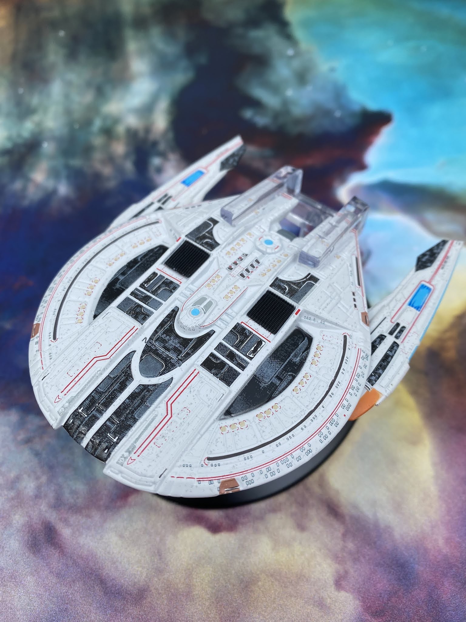
Continuing the theme of Starfleet ships, HeroCollector have base-coated the Edison with that pixelated white then layered her up with a series of greys through to black which accentuate the stepped hull levels and panels. There is a whole range of colours going off across the hull here and the windows are added as a decal rather than being painted in or recessed and marked up. As always, this coy move makes a huge difference since the decals for the lifeboat hatches and the "brackets" for the phaser strip ends don't line up quite correctly. Nor do the black marks for the RCS thrusters which means that, tragically a lot of this ship seems to have decal shifted about 3mm to the left.
Yet all of the painted sections are spot on. The domes for the warp field coil and the bridge are aligned, for the most part so are the darker hull patches but what is frikkin' terrible is the ship registry.

While the engines don't contain translucent bussard collectors, they do have blue warp field grilles set into the plastic and again carry that pixelated paint job and dark grey feature panels. The painting here is much better and the decals are far straighter than elsewhere on the Edison.
But turning her over reveals a ton more. The ship might be one of the slimmest designs to have made its way into the game and onscreen in Discovery, but those wonderful people have maxed out on the visual upgrades when it comes to the underside. For one you can get a much better look at the engines and a second set of translucent warp grilles and even more of that rather excellent dark panel finish.

Even at the front we have those legible registry details and there's a much more finished and uniform feel about the whole setup here.
The magazine for issue 17 offers up a good level of depth to the in-game starship class and not just in reference to the Yard 39 spin that came off the back of Discovery airing. aligned with that is an article detailing the upgrades to that original 22nd Century design as well as images showing the changes made. Interestingly and actually in line with my own thoughts, the secondary/Engineering hull was the main piece that attracted the most design work. Flick back to the ship and review here and it's clear that the effort was a success.
Finally the STO Lore section expands on the Allied Cooperative Starship Development Board which saw the combined efforts of the Federation, Klingons, Romulans and Jem'Hadar to take the next steps in their navies. Resulting in some instantly recognisable designs (such as the Enterprise-C concept, Narendra Class), the ACSDB article covers how the big powers in the quadrant came together and the progress they are making to utilise the technology of each.

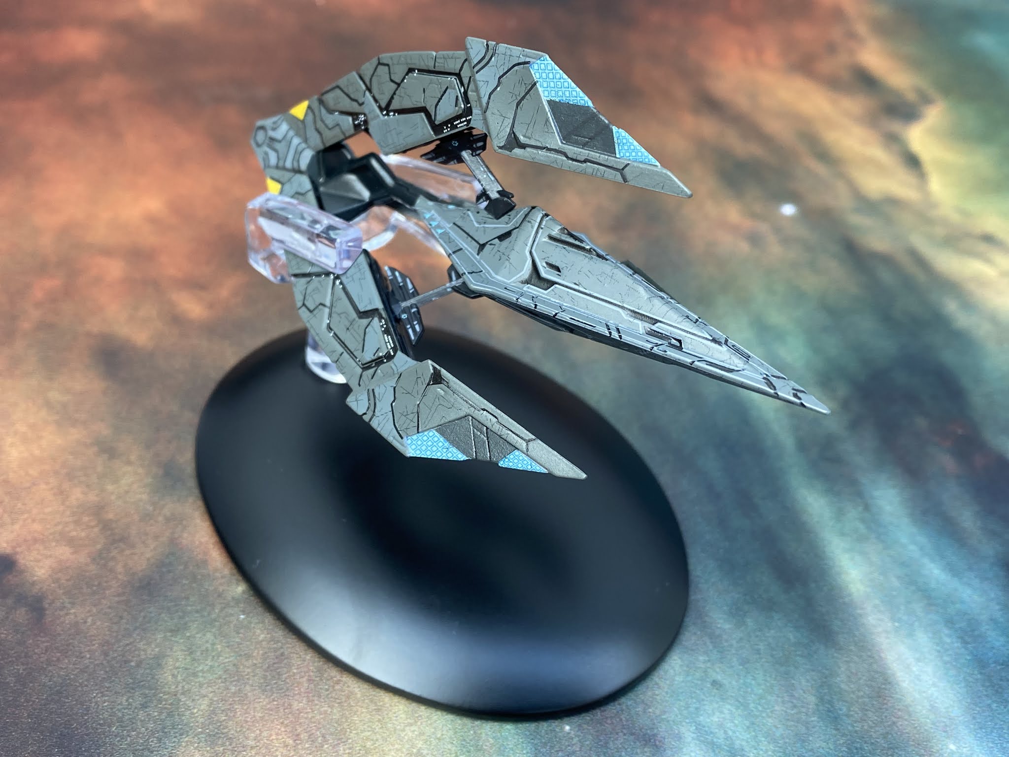
The Recluse is a Tholian webspinner on drugs. Pumped up and taken to another level, this makes for a terrifying adversary. Arched forward with a triple-pronged formation, the ship oozes aggression and is one of the most impressive craft to be included in this limited run.
The build work on the Recluse is amazing. The central section is held in place with struts running from the three outer forks and seem to gel back into that larger piece of the ship. The struts themselves have small window detailing and markings which was unexpected. The black blends smoothly into the rest of the hull, adding a valleyed effect to the surface and breaking up the grey overcoat. There's a lot of surface changes on the Recluse and it genuinely looks and feels unique amongst the 20 issues.

Check out that there are some further lighter sections on the ship and how nicely the engines to the rear are painted up. With all the differences in hull levels I was thinking there would be a ton of paint errors on this one but it's quite the opposite with one of HeroCollector's most impeccable finishes for several years. This does look the part, right down to the lighter blue weapon emitters at the tips of the arms.
This issue is a cracking read because the section covering the designing of the Recluse also includes the work done to update the Tholians themselves as an Online adversary. It explains how the levels of the Assembly were devised and ultimately how the ships and Tholians themselves aligned. As you would hope, issue 17 rounds out with a more in depth look at the Tholians themselves with more CG images and concept work to flesh out their story from their rare episodic appearances.

Check out all our Online Starships posts HERE
You can find out more on the Star Trek Online Official Starships Collection by visiting the Hero Collector website HERE
No comments:
Post a Comment