Showing posts with label USS Voyager. Show all posts

Saturday, 8 June 2024

Set a Course...For Home: Lost in the Delta Quadrant


With the arrival of the Delta Quadrant's Adversaries there had to be a pack designed to take them on.

Lost in the Delta Quadrant provides just those ingredients. New versions of USS Voyager, USS Equinox, Delta Flyer  and a brand new Raven. The latter is the first time this ship has been available in the main catalogue believe it or not!

What we didn't mention in the review for Adversaries... was that a lot of the cards included with both of these expansions do effectively retire a chunk of older Attack Wing content. The costs of cards have dropped, the new features make these a lot more appealing to select and being in a set means there's some form of theme running through the options.

Unusually here there are two Voyager card options as well as USS Nova and the Delta Flyer II but let's not get bogged down in the names because there's a lot packed into this set that needs unpicking.

Aside from the cost changes which make Voyager an extremely appealing ship choice, the range of captains is certainly an eye opener with most of them also having the ability to double up as crew. Chakotay - in much the same way as with Turanj in the Adversaries... pack can be flipped to take command if the captain is lost. Big bonus there which keeps your ship with some form of command skill if things do go a bit pear shaped.

But the biggest newcomers here are the Lower Decks and Night Shift cards in terms of crew and the revamping of craft with a hull value of two or less becoming Auxiliary Ships. These ships can only be part of a fleet if there is at least one ship in the party that has a hull value of four or more.

But yes, Lower Decks and Night Shift. The former means that two cards bearing that text can take up a single Crew slot on your ship roster as long as they are from the same faction. With Night Shift, the text on the card listed under that heading is in play when your opponent has the Initiative Token. There are six of the Lower Decks cards in this pack offering the chance to disable opponent upgrades, take Time Tokens when another upgrade would be hit and even providing Free Actions. Night Shift seems to be limited to two cards in the form of Harry Kim as a Captain and the Elite Action, Coffee, Black.

Personal thoughts on both of these new abilities is that it does provide the Federation faction with even more advantages with no hint that these new inclusions will be available for other factions in the future.  It also seems these new features have really split the fanbase for the game with several notes that it's changed the dynamics completely. I guess sometimes you do need to stir things up and hey, it's not as if you HAVE to use these new packs or their additional spins. My thoughts would be to run this and the Adversaries pack as a campaign combo using the Delta Quadrant missions included. Then the new rules are kept enclosed to these ships. IF Wizkids do produce some more sets and further the Lower Decks and Night Shift rules into those then all the better.

If new players are coming to the game with just a starter set and these packs then it's an even better deal to keep the game alive but that's just my own thoughts right now.

Some of the other cards in here are well worth a punt too. Seven of Nine allows use of the singular Borg upgrade buried in the set. The XO, pilot and CMO from Caretaker are all discards (well played once again, Wizkids). You can upgrade your ships defences with Ablative Armour, add weapons in the form of Transphasic or Gravametric Torpedoes. Changing speed can be made through Variable Geometry Pylons.  The Nova Class can benefit from Rechargeable Shield Emitters and even the Delta Flyer can pop some added Photonic Missiles.

The Raven does seem under represented here with nothing "anti-Borg" or able to slip past the odd Cube. Perhaps a missed opportunity not to double-side Magnus Hansen as a Borg drone? Nor are there any references to the creatures the Equinox used to speed up their voyage home. Erin Hansen interestingly can only be equipped to the Raven - which I also feel should apply to her husband!

Another point is that the symbol for the Luna Class turns up AGAIN on the Bio-Neural Circuitry card... surely this has to be a sign that the Titan is on the way? Otherwise, frankly what's the point.

Saturday, 2 September 2023

J-Ride: The Official Starships Collection USS Voyager NCC-74656-J


One of those ships that we only glimpsed, the Voyager-J was an instant hit with Discovery fans.

Cutting straight into the Discovery line, the Intrepid Class successor employed the distinct features of the 32nd Century while managing to retain that instant recognition as a descendant of the original USS Voyager.

A mid-size model, this is comparable in size to the recently reviewed USS Titan and USS Cerritos. Coming in the standard Eaglemoss box, the Voyager-J also comes in bits. Now it's not because Royal Mail can't look after anything, it's due to the fact that the ship has that wonderful detached nacelles arrangement that pervades the 32nd Century and drives fans into the love or hate camp.

One thing that's immediately obvious from the start is that this iteration of its namesake is a lot sharper than before. The first Voyager wore some sweeping curves that matched the title music but here the J is all points and acute angles.

To say that the design has been simplified for the distant future would be an understatement and near insane. The hull is now almost a flat surface broken only with defence/panel lines. Even the bridge is part of the sweeping primary hull, tapering the near triangle back to the almost invisible neck piece.

The black striping around the hull now represents the windows and indicates just how big the J must be versus the classic edition. Aside from markings for a few sensor platforms and the burgundy RCS thrusters, the surface is incredibly plain and belies the jump in technology for Discovery's third season onwards.

You can but only surmise that the grey stripe behind the bridge is for the shuttlebay as there are very few indications of what anything might be. Not too much of a shock since the ship was barely seen in the show aside from the hull registry.

Build wise, the top of the primary hull only is in metal with the lower insert and the rest of the ship in plastic which does give it more weight to the front and at least feels fairly stable when she's slotted onto the classic Eaglemoss grip and black base.

There is something of a connection to the secondary hull although that's more to make it work as a display item than actually used onscreen since the two hulls are distinctly separated. That secondary hull is just as smooth and streamlined as the saucer with it's distinct "bottle opener" rear. That angular feel also continues and is especially strong if you do slide the original and the J side by side. The deflector here is much more deeply recessed and the hull almost comes to a point at its bottom. One might even suggest that the grey block right at the back is another shuttlebay. 

The overall issue is that there is little to shout about because of the minimalistic nature of the Voyager-J. It's clean, basic and certainly no nonsense. Even the registry under the primary hull has a no frills feel in small and inconspicuous lettering. 

The interesting bit comes in the form of the clear sling which slides over the main body of the ship and then allows the two warp engines to be slotted into holders providing the detached nacelles effect. As on Discovery-A, it's not the cleverest of arrangements but there isn't a lot of choice as to how these can be positioned given the 32nd Century evolution of warp drive.

The engines themselves do feature a nice quartet of cutout sections to the rear as well as some silver detailing to the front with the bussard collectors also painted in silver. The warp grilles on the exterior edges are just painted in here given the slimline construction of the engines. They also feature the 32nd Century Starfleet pennants top and bottom with the registry only on the lower surface.

What else can you say?

Ok, I was not that positive about this model when I knew it was on the way but I've been more than pleasantly surprised with the quality and look. It's a nice piece best displayed alongside that XL USS Voyager NCC-74656 and y'know I think it's one that will be out on the shelves for a while.

The magazine (which actually DID come with this one!) is exceptionally brief on the career of the J but does go into a decent bit of depth around the redesign of the iconic starship alongside some great concept art. Just for a kick there's also the "Coming Soon" featuring the never-released (maybe next year FanHome) 32nd Century Constitution Class. 

Definitely a keeper here although it's now as scarce as dilithium in the 32nd Century and some of the eBay prices are going crazy. Well revamped, well made and well, one you'll be oddly impressed with.

Enjoyed this article? Why not like and share to spread the word!

Like our page on Facebook 
Follow us on Twitter

Saturday, 2 January 2021

Move Along Voyager: Star Trek Online Starships Collection Issues 7 and 8


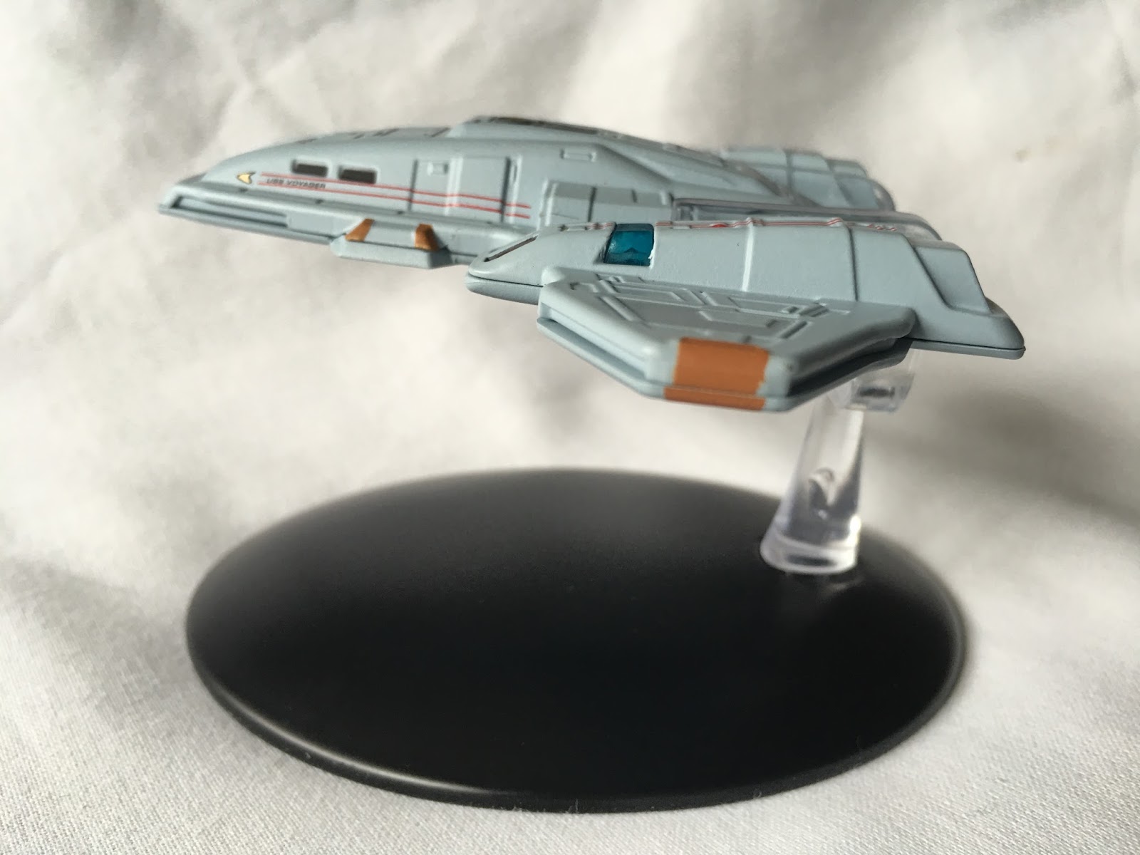
Perfectly timed it would seem to coincide with Discovery's reunion with Starfleet, the Online Ships Collection presents the USS Pathfinder.

Issue seven's revamped Intrepid Class style starship is a clear successor to Voyager with even the class name deriving from the project to find the lost vessel.

Much less bulky than previous issues, the Pathfinder contains a lot of the traits of its illustrious predecessor but with a lot more surface detail. 

I mean, it's covered from nose to tail with sensor arrays and lifeboat hatches filling every space and that distinct, furious Online paint scheme is key to making the ship look incredible. The updates for the shape work in keeping the design align with the other 25th Century tweaks we've seen in the collection - the Andromeda  Class spin on the Galaxy for example.

The sensor arrays at the tip of the saucer are now panelled away, the bridge is recessed and a lot less open a target than it was in Voyager. Some of the decalling is a little grainy especially the grey patterning in front of the bridge and down to the just-legible registry.  The  mould is also a good build but the scale does lose some definition to the sensor grid and also to the immense amount of decals. It's rare to find one perfectly aligned because there are just so many.

The sweeping hull curves back to the shuttlebay which is painted in although not cleanly. What I found as I did examine more towards the back is that the weathered hull effect seems to be more pixellated decalling that looks as disjointed as the decals. 

Dropping down and away from the main hull are the warp engines and echo one of the design features from the original design for Voyager in that they arched away from the ship in a similar manner to the refit NCC-1701. That grubby detailing is evident here again but the black striping makes an effective contrast to the rest of the ship, encasing translucent bussard collectors and accented with Starfleet pennants along the sides and across the warp field grilles.

Oddly the underside of the Pathfinder is more defined than the top. There is still some mottling of the paint adding to an aging effect that we see elsewhere but the blues of the grilles and the inset hatches strike a visual chord. It's much less packed with features too meaning that the segmented hull sees more solid blocks and less hatches to fill space.

Take note too of a couple of interesting "upgrades" from Voyager such as the placement of the aeroshuttle to the front of the saucer section and the slimmer, almost concealed deflector dish hiding behind the quantum slipstream drive.

The magazine details the reason for the development of a new long-range science vessel in the form of the Pathfinder Class. Integrating the quantum slipstream drive, the new ship is well ahead of Voyager with exploration of the Delta Quadrant more in mind than ever. This magazine also covers the increased versatility of the class before moving on to the design.

Wisely the article explains how, in the real world, the design was progressed from the Intrepid Class and took into account some of the concepts that were abandoned on that original path.

Closing out the issue is a thorough section dedicated to expanding the story of the galaxy in Online and just how the four quadrants became a lot closer in the game. but also spreads Starfleet over a greater area than ever with a significantly increased threat level on all sides. 

Issue 8 brings in a fourth major power to the collection with the Jem'Hadar Vanguard Carrier.

A big step up from the cruisers and battleships DS9 fans will be familiar with from the series, the Carrier is Odo's command craft and isn't just a base to launch wave upon wave of fighters but also contains a larger cruiser docked at the rear.

Continuing the strong Dominion purple and grey colour scheme, the vast Carrier is impossibly scaled down. The model itself is surprisingly light even with the top section being wholly metal. Eaglemoss have done well to replicate the hull patterning that resembles the rhino hide synonymous with the Jem'Hadar. It has all the hallmarks of a Dominion ship too, with the engines slung to the rear and forward a la the cruiser or battleship. The upper engine pods of the docked cruiser also add to the familiar silhouette.

The carrier actually looks far better in model form than the version pictured on the mini-magazine. The minimal number of windows also plays well with this Dominion ship since everything seems to line up well. The red decal striping is incredibly fine both top and bottom with it marking out key openings and partitions on the hull. The definition of the panelling is quite subtle nor does the paint scheme overpower it.

One thing that does impress even more are the clear lines marking the docked Heavy Attack Craft from the forward section. There is no doubt which are the lines of the model pieces against the stowed craft.

The front of the carrier is fairly simplistic while to the rear there is use of negative space and more unusual shapes not generally seen on Dominion craft. The underside has a noticeable bulge for the docking of the fighters and if you look in closely you can make out the entry and exit ports to the front and rear of that element.

For another thing, remove the stand from the equation and the ship is oddly well balanced, resting on the furthest rear point of the carrier bulge and remains perfectly level. 

In the magazine, as noted, the CG images make this look a lot more simplistic and cleaner than the diecast replica. At least it does explain how it exists and the state of the Dominion following their surrender at the end of DS9. Initially created for the Victory is Life campaign to mark 25 years of the show, the Carrier needed to show the development of the Dominion for a new age of Star Trek.

The design piece here explores that journey and how the inclusion of that Heavy Attack Craft came to pass. The magazine also covers the future history of the empire and how it came under serious threat from the Hur'q. 

This is an impressive piece that only suffers from the severe reduction in scale afforded it. Upping this into an XL or special would have been a huge advantage to it but I can't think that sales would be that popular given it would only really appeal to Star Trek Online players.

The Pathfinder model is a real delight to hold against Voyager but its cluttered surface detailing is a bit overwhelming. The inclusion of early concepts plus logical developments make it a cool ship but I am slightly more impressed with the "massive" Vanguard Carrier and its place in the Dominion. The model is one of the best weighted and technically finished, benefitting beyond belief for having pockets of windows rather than strips almost not at all (!) lined up with the raised hull points.

Check out all our Online Starships posts HERE

You can find out more on the Star Trek Online Official Starships Collection by visiting the Hero Collector website HERE

Enjoyed this article? Why not like and share to spread the word!

Like our page on Facebook 
Follow us on Twitter
Find us on Tumblr 

Sunday, 11 August 2019

What If Voyager - The Official Starships Collection Bonus Edition USS Altair


Alongside the Enterprise-J this has to be one of the thinnest, most fragile craft to come out of the Starships Collection.


If nothing else, the USS Altair offers a revolutionary design and unique backstory which might leave you wanting more from this distinctive starship.

The slender Altair is also incredibly light with the main swept wing underside and forward upper section being one piece of metal which pulls the weight of the ship to the nose when she's slipped into the thin plastic stand grip. More on that later by the way.

What the ship lacks in surface area it certainly makes up for in detail and fortunately the magazine includes the Ships of the Line image that this craft first properly appeared in. It's origins do go back to the mid-90's and Voyager concepts however tit's become more than that.

Led by that unusually prominent bridge dome right at the front, the Altair bodywork is crammed with panels, grates and recesses right across the depth and slightly more breadth of the wing. The painting finish is immaculate with the darker grey shading of the raised sections playing well to enhance the lighter dipped sections of the hull.

It's surprisingly light on decals too with no registry or ship name emblazoned across the hull at any point nor are there any visible Federation pennants streaked across the tail or engines as you might expect. In fact the only discernible decal on the whole thing appears to be the cargo hatch just behind the bridge dome. The plastic rear edge of the swept wing (before it steps down to the tail section) also has a series of windows carefully painted against the edge adding some sense of scale to the ship where the decals might.

On the top section only the port/starboard red/green lights mark out any visible differences before the hull sweeps back into an almost Cardassian tail piece. Here the raised upper tail section does have a dog-ugly join to raise the pincer ends up above the flat tail before diving back into a unique aztec-ish two tone grey/beige colour combo that darkens towards the back. Nice fade in with this and what you appreciate is that the metal of the swept wing actually curves back to provide extra stability to the back of the tail meaning there's zero bend. The upper "pincer" piece merely adds decoration not support.

Now to the engines. Mine arrived with the starboard nacelle at an awful rake to it's sister on the other side. The connecting plastic is very malleable allowing me to tease it back into place and perfect alignment but I would be worried if this ever gets dropped because the pylons are horribly fragile. 

The warp nacelles are evidently the inspiration for the Enterprise-J's propulsion units, possibly aspiring to be even more spindly and delicate. Each is adorned by its respective port/starboard light to the rear which also continuing what I would term as a speckled grey two tone pattern to the very tip. The tiny bussard collectors are well formed but not translucent with Eaglemoss instead opting to paint them in a solid burnt orange and then stick the warp grilles as small tubes to their backs. These will be just as unforgiving as the engine tops so be aware!

Flip the Altair over and the finish is very reminiscent of a hammerhead shark with a distinct black arrow marking across the front of the wing and then forking down into the centre tail section. In the middle of this there is space for a shaded deflector with a hint of blue fading to white - quite a cool little touch adding depth to what is actually quite a shallow indent in the underside of the metal hull. 

Aside from the distinct stripe, the excellent level of panelling detail continues with the two shades of grey highlighting the recessed and level metalwork. Even along the edge of the hull Eaglemoss have managed to paint in the very tiny windows which curve around the surface. It's a tiny area of detail you could very well miss and indeed choose to miss out but it's in there on the Altair and duplicated on the model. 

Underneath you can also appreciate the flimsy nature of the nacelles with a better look at the warp grilles which stand proud of the upper casing. The Altair surely couldn't have been produced in the early years of the collection given the delicate nature of some of its parts especially around the engines and it's been well worth the wait.


The stand positioning displayed in the magazine shows that the Altair should just balance on top of the plastic vertical grip however it does actually slip into the claws which gives it a decent midriff position. Even with the slimline body and thin shape, the stand isn't intrusive into the design and allows for it to be fully viewed when displayed.

The magazine offers bumper info on the Altair and it's in-universe details on size and technical specifications are fascinating especially concerning its revolutionary temporal core. The plan views allow a good comparison to the model and are - thanks to a full double spread dedicated to them - larger than the included ship. 

The section dealing with designing the Altair focuses on the process to create Voyager which saw this unusual concept first come to light. The work of Mike Okuda and Doug Drexler is deservedly recognised for their efforts to bring Voyager to life and thereby accidentally creating the ship we're discussing here. Lots of sketches and 30 year old CG as well as spin offs into the Congo and the Universe classes that were inspired from the basics of this concept. Add in the Ships of the Line image that finally unveiled the final design of the Altair and this is a killer issue. This once more allows for a decent comparison with the finished version/image and the model. Here I might note the hull colouring does seem darker and the lighting adds a lot to the feel of the starship. In the case of the latter there's no way this is possible without doing exactly that and there's physically no space to do so. That does detract from the effect although it's still a great recreation.

Closing out the issue we have Drexler's Voyager concepts which reveals that some of the ideas within the "throwaway" nature of these renders actually turned up in the final onscreen Intrepid Class starship; take a good look at the shape of that primary hull for one...

Unexpectedly better than I thought even if this is one of the smallest, thinnest starships to grace a plastic and cardboard box this side of Vulcan. I love the detail, the feel, the delicate nature of the Altair which make it an interesting bonus edition. Voyager fans will certainly lap this one up and stick it alongside Rick Sternbach's first concept for due comparison. Star Trek's most "out there" design for a few decades - and I like it!


Enjoyed this article? Why not like and share to spread the word!


Like our page on Facebook 
Follow us on Twitter
Find us on Tumblr


Monday, 29 October 2018

The Voyager That Wasn’t: Eaglemoss Starships Bonus Edition


Back when The Next Generation was about to bow out, Rick Sternbach was busy creating the first drawings of what would ultimately become USS Voyager.

Ultimately - and as happened with Andrew Probert's Enterprise-C design - there were some major revisions and what ended up on screen was a million light years away from what was originally conceived.


Fortunately for us fans, Eaglemoss know just how to push our buttons with the release of the Rick Sternbach USS Voyager discarded concept and just like Probert's C and the Phase II NCC-1701, it's one of those you just have to have; a fork in the road not travelled and I think something really important to know about in the history of the franchise.


USS Voyager NCC-73602 (as was) is one of the most compact ships to grace the collection alongside the equally titchy USS Aventine. Now unusually I'm going to talk about the magazine first because this is jam-packed with Voyager concept goodness from the legend that is Rick Sternbach relating the initial thoughts on the design through to its eventual dismissal leading to the Voyager that we know today. Rick's original work is magnificent and there's more than a hint of the movie refit USS Enterprise in the look of the more angular NCC-73602.

Now when I heard that the collection would be issuing the concept USS Voyager that's the one I was expecting - the chunkier craft that Sternbach created a prototype model and that graced the pages of my Where No Man Has Gone Before book from the mid-90's. But that's not what we've got here because the magazine then goes on to explain that Sternbach and CG modeller Fabio Passaro then worked on how the ship would have been modified had it been approved. The version we have here is actually what "would" have made it to screen had that prototype been green lit back in 1993.

Which really disappoints me because I think that's what we should have received here and not this updated version that "might" have been what the concept had worked out as. However would it have done if Sternbach had updated the plans 25 years ago? 

Potentially it's a no but yeah, that's what we have here with this latest bonus edition - the Voyager that might have been but actually wasn't nor ever was going to be if you will.

As a translation from the Sternbach and xxxxx plans, the Voyager concept is frighteningly compact which causes a few issues.

At the front there's a very familiar pointed primary hull that fans will recognise from both Voyager and maybe Prometheus which was definitely more pronounced. With it being such a small scale though a ton of detail gets lost and the finish seems cluttered with hull detailing. Not just that but the ship name and registry are almost unreadable on such a tiny canvas. 


You can see a lot of bits that did make it into the final approved starship such as the curving phaser beams and the levelled bridge structure. Right at the front there’s the recessed secondary deflector complete with its squared orange panelling. This is a distinct feature that also appears on ‘true’ Voyager and has kept its definition on the Eaglemoss concept version. What has lost something in translation is the sensor platform just behind that feature. As with the hull, the scale has reduced the level of detail possible leaving this as more of a bobbled grey section than anything else. 

The bridge module is placed right at the back of the saucer with well marked out lifeboat hatches but the domed structure itself isn't that well formed. The same is true when you look back down the neck of the ship towards the secondary hull. Eaglemoss have managed to include the pennant stripe across the stepped levels of the hull but the detail on the surface has been neglected, I keep saying the word "definition" but it's true again here because the small scale of the ship has obliterated the nuances of the hull evident on the drawings and on the original concept model.

The deflector dish - which went through a few changes before its form here - is a blob of colour but look closely and you can see that the panelling is clearly marked and there's something very familiar about how this one looks from the front of the secondary hull, even down to the photon torpedo launchers either side. For once on the concept ship the precision application is spot on with the outer edge of the dish in blue and the centre of the dish bronzed out. 

Right, back to the spine and there's a familiarity here that you might have been accustomed to on the Runabout because that's what it seems like. The warp core housing is evident between the stubby nacelles as is - slightly behind it - the shuttlebay and landing deck.  There's clear indication of the landing strips on the deck which is probably one of the clearest details on the whole ship.

Both the saucer and the spine as well as the warp pylons are all rendered in metal giving a fair bit of weight to the concept Voyager given it's compact size.  Sticking with this heavier section, the bottom of the primary hull is familiar again and surprisingly detailed. 

The Aeroshuttle outline is present along with segmented cargo doors highlighted in a duck egg blue. The definition of the panelling, phasers and emitters is actually more impressive than the upper side. The same goes for the underside of the secondary hull. There's a lot of panel lines embedded into the design here topped off with a Starfleet pennant striped from the front to rear. There's more gimbles on the hull too plus a further phaser strip covering the lower decks.

There's also more duck egg blue hull markings underneath the shuttle landing deck which looks similar to some of the hull lines on the Enterprise-D.


Finally there's the warp engines which are a hybrid between those found on the movie refit USS Enterprise with the glowing bussard collectors from the Enterprise-D. They're very thin with a series of angles that do look out of place alongside the more curved and easy-on-the-eye primary and secondary hulls. I suspect that's because my mind is expecting to see the shorter nacelles on the regular Voyager!

Eaglemoss have put in both the translucent bussard collectors (which are an update on the original concept) and blue warp field grilles running along the sides which were later changes that update the model from something that might have existed in the 23rd Century to a starship more befitting the 24th.

The stand fit on here slides behind the primary hull to give a mid-ship grip but with the way the Voyager concept is built this means that it actually sits more to the rear of the black stand than it should and looks a little odd on display. Not too odd, just a little.

This one is a real mixed bag. I both love it and hate it at the same time.  In one respect this should really have been the original Voyager concept as Sternbach designed it and fans would recognise from the 1990's mock-up - effectively in it's pure form. Then there's a part of me that appreciates the updates to get it to where it might have been worked up to for the series. However, this part of me is strictly in a minority. 

I think this is a misstep from Eaglemoss that could have been avoided but was done with all the right intentions. Maybe it offers the chance for a future bonus edition to be the original concept rather than this "pimped" version but for now this one will have to do you...

Would you want the original concept Voyager? Which concept ships would you want to see?

Live on YouTube
Like our page on Facebook 
Follow us on Twitter
+1 us on Google+

Add us on Tumblr


Tuesday, 2 August 2016

Screen Shy: The Official Starships Collection Issues 78 and 79


Now here's a thing.   

For the first time in the collection we actually have two ships that never actually appeared (properly) in any Star Trek series. Why? Because technically we only ever saw the underbelly of the USS Voyager Aeroshuttle docked on the Intrepid Class starship and secondly because the Harry Mudd starship, the Stella, was one of those classic far-distant glowing blob ships that The Original Series excelled at including. 

As with the Antares, it would only become a recognisable shape when it came to remastering those 1960's stories.  The Aeroshuttle is a biggie to be sure in the realms of the Starships Collection. Long rumoured to have existed and as rare as some of those damn Pokemon everyone is obsessed with finding at the moment, collectors have been clamouring for its inclusion in the series since the docking process was highlighted in issue six oh so many moons ago. Funnily I couldn't help but make a parallel that we've now had two "docking" vessels in very close succession with the Enterprise-E Captain's Yacht only three issues ago. Those in the UK might understand this as "London Bus Syndrome". You wait years for one to come along and then two do in a short period of time.

For something that was never used and was actually a side hobby project for Adam "Mojo" Lebowitz and Rob Bonchune, the result is quite eye catching. The only bit we've ever actually seen is that flat and very plain underbelly which here is just as flat and plain as you would expect. The only real features to note are the raised landing gear which sits proud of the hull and the mothership registry simply decalled at the rear and nose tip. While you might wish for something a bit more wow, there really isn't any reason for it and the underside merely presents the functionality required for when it's not locked into the primary hull of Voyager.   

Flipping her over there's a lot more to take in in the metal topside. Every surface has some form of raised or sunk panel right across the surface. She is incredibly slim from all angles with a distinct blocky and very recognisably Runabout-cloned central pod latched between the two angular wings. Your eye is immediately pulled towards the golden warp core at the centre with its dark grey surround contrasting to the Starfleet standard light grey that covers 90% of the hull. As with the smaller ships we've seen before the cockpit windows are blacked out and again, distinctly Runabout in their shape (because they could use the sets for the interiors and save some cash). To the rear there are also four windows which parallel the lounge windows on the once-seen rear section of the Deep Space Nine workhorses. 

Along both sides of the ship we have the Starfleet pennant streaking towards the rear bearing the USS Voyager moniker since the Aeroshuttles were never given individual registries or names unlike their Runabout cousins. The pennants also appear on the warp engine pods embedded into the atmospheric wings but here's one thing that bugs me and repeats all over the magazine too - the Starfleet delta symbol is, from the top, the wrong way round. I would understand if these were angled and mirrored left and right but they are both the same way round and it's annoying as hell. However, look at every other pic and you'll see they are all the same. Every. Single. One.  On the positive side though, the warp engines do have translucent red bussard collectors split centrally and blue vents again deep inside the housings. 

The overall grey tone does tend to wash out features on these Starfleet vessels and here is no exception. You can make them out but the paint job does seem heavy in a few patches. The alignment of the windows and the decals is perfect as is the colouring around that golden warp core. The orange thrusters and phaser ports do break up that monotone colouring and are well defined and precisely applied. Some of the smaller paint features such as those black triangles in the side pods attached to the hull by the war engines are missing but that's going to be a hard one to apply in such a tiny gap. Nor do we have the darker colouring around the very edge of the ship as per the magazine pictures but given that's the join line I guess it was another sacrifice needed to be taken.

Only the impulse engines to the rear of the warp engine pods have a teeny tiny misalignment on the painting but it's so minor it barely classes. However, after those annoying deltas, you start seeing all the "cracks" so to speak. As for the build quality though, it's a good clean slot together and clearly just two pieces with the metal top and plastic flat base.

Given the scale, Eaglemoss have done a splendid job of finishing the Aeroshuttle. The paint work is 99% perfect and it is a faithful reproduction of the CG imagining from Lebowitz and Bonchune even down to those damn deltas. I think fans will be very excited to get hold of this rarity even if, technically, she never actually appeared in the show.

To the pages of the accompanying tome now and we get a decent level of information for the Ship Profile section from its design history through testing, its abilities and a full breakdown of its expected lifetime and defences to boot. As we never saw it, all this is fascinating to read and makes this one of the most invaluable resources to date in the series because of how little this craft was actually seen.

The Designing and Building the Aeroshuttle section reveals how it was originally designed by Rick Sternbach before Adam Lebowitz and Rob Bonchune from Foundation Imaging had a pop at her in their spare time. A good read but you do find yourself questioning why this wasn't used instead of building not one but two Delta Flyer's...(but the final On Screen section in her does answer that to a degree!)

Finally and keeping with the Voyager theme we get to walk the set designs with Richard James including a load of pics I've personally never seen and give impressions of the series that could have been. Some great notes in here how bits of other starships made their way into the production, some of the changes that were made and how sets were made to mirror the exterior of Voyager because of its much smaller size than the Galaxy Class Enterprise-D. Together this magazine and model make a good solid package and definitely one I would recommend for all collectors. The unusual and not-often seen nature of the ship will probably be enough for most to head to their local newsagents!

Aaaaaand to Stella. Hmmm.

Ok so this was an addition to the remastered Mudd's Women and by that fact alone it places it at a disadvantage with myself. It's one of those episodes that I could happily not watch again and wouldn't miss it and in some ways, this design carries my feelings towards that story more than adequately.

Plain and simple, it's a lump, an 18 metre long blob. There's nothing flashy here, it's a grey slug-like lump with warp engines. I could just end the review there but I do owe it to anyone reading to give you some more information. Old even by the time of The Original Series, the Class-J ship is an oddment in every possible way.

The surface is in keeping with the classic style of the 60's but given a bit of life with a distinctive metallic two tone aztec paint job that covers every surface from the nose to the rear of the nacelles (but not the inside edge of the lower pylon sections). It needs this finish purely because of the basic nature of the craft with only a slim amount of features breaking up the monotony. There's a distinct lip around the centre edge of the hull marked in blue which co-ordinates against the translucent sensor dome on the top and the blue domes to the front and rear of the stubby warp engines. 

A nice feature are the twin deflector dishes lodged at the corners of the angled pylons. A dulled bronze, they do up the "classic" nature of the ship. To the rear there's one heck of a big, blocky impulse engine that looks like it has some serious kick with all those exhaust ports. On the underside there appears to be a cargo hatch or landing ramp of some form but that's it. 

OK, I'm being a little over-harsh with the Stella - which does have its name emblazoned on the sides of the hull - because the pictures we saw in preview are not as good as the finished article. That was a much darker colour scheme while this model has a much clearer and sketchy metal coating. Do I like it? It's unusual, 100% unique and never to be repeated but I think there will only be a fraction of the collector audience who will be heading out to the shops to snap this one up.

Issue 79 recounts the opening third of Mudd's Women plus it provides some details on the specs of the Class-J starship as seen in the remastered version of the episode. The new CG images of the Stella are really good and while it is one of the most simplistic craft yet, you have to admire the look that has been achieved here. The magazine also covers further references to the Class-J in The Menagerie plus Operation: Annihilate! and The Way to Eden. Note as well that the ship in the episode - the screen-used CG - was not actually labelled as the Stella because it was so small on the Enterprise viewer.

The Designing Mudd's Starship two-pager does explain a lot more about the craft. It actually makes it more understandable as to why the ship looks like it does and the homage it pays to not only the original "screen blob" but also to the legendary Matt Jefferies and his unused shuttle sketches.

The third section in the issue covers Women of Star Trek and takes a different take on the usual magazine article. Blocked by episode, we are given brief background information on both the female guest characters from 17 classic episodes as well as some details on their activites outside Star Trek since their appearances. Fans won't be surprised that Andrea from What Are Little Girls Made of?, Lieutenant Carolyn Palamas from Who Mourns for Adonais? and Vina from The Cage are among those featured in this section. It's something a bit out of the ordinary for the collection and makes for a very interesting read and does cover material that many fans may not know outside of the franchise bubble.

The On Screen moment is fairly obviously Mudd's Women to end the magazine and we also get the preview of next time's Federation Scout Ship from Insurrection.

The Aeroshuttle is the unquestionable "winner" this month, offering the greater detail and aesthetic however the Class-J starship is not without its merits. It is a simple design, a plain craft but it is one that effectively homages a past era and keeps in line with what was originally seen in the episode back in 1966. Sometimes going back to basics can work very well although I'm not certain if this makes that cut.

How did the new ships go down with you? Is the Class-J growing on you?

Live on YouTube
Like our page on Facebook 
Follow us on Twitter
+1 us on Google+
Add us on Tumblr
Join the conversation on Star Trek: Risa