Issue Three is only just out but we've been granted access to Eaglemoss' drydock and the next two releases in The Official Starships Collection.
I'm going in with both feet here to say that Issue Four is the best to date and even better, the best of the first five hands down. I've never been the greatest admirer of the NX-01 Enterprise however this model has started to change my opinion. It's an absolute beauty and as a package this is all round excellent both on the page and in the ship herself.
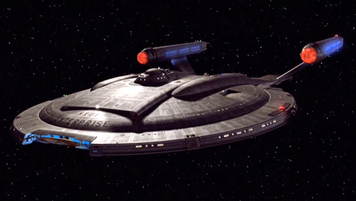
Here the saucer is metal with the pylons and engines in plastic but on first glance you would never be able to tell. This is a superb recreation of the Enterprise from, well, Enterprise. The detail is beyond anything we've seen so far and she looks like the "real" deal. I might be in model heaven here. The image above from the show gives you a good impression of the colouring of the hull but in the flesh it's a lot better than even HD could probably conjure.
 Being the smallest of the Enterprise models it benefits from a much more "up close" analysis than the D or the refit. The hull plating is very clearly marked out even in the plastic sections which, to date, haven't been the best. I'm a little puzzled by the gold painted pieces on the hull but I have to accept that these are accurate to the original models and materials that CBS have provided to the developers.
Turning to the magazine, Eaglemoss really have aced this edition in every way. The specs and a brief history and description of the ship layout cover the basics very well and introduce fans of all knowledge levels to Archer's starship but for me there's a gem hidden in these pages.
Homage Alert
Now our previous reviews had noted that there was a certain formulaic approach to the magazine but here there is something of a twist to that routine. In issue four we have the most complete journey (if you will) detailing the NX-01 from her creation and first voyage through service history and even to a conceptual design for her ultimate upgrade - the addition of a secondary hull. It's something that's been around for a while but I was certainly surprised to find that Eaglemoss had included something that isn't officially canon since this upgrade has never appeared on screen.
It's a great touch and reinforces the fact that it was intended for the NX-01 to gradually evolve through the series as "familiar" technologies were introduced to the ship. This ties in nicely with this edition's design section where the one of the original concepts had the secondary hull already attached. I also didn't appreciate (and it's fairly obvious once you've seen it) from which the design of the Enterprise was partially.
Add into this superb mix a classic scene that tips the hat to a great movie moment and you have the best issue yet. This really does flesh out the story of the NX-01 on and behind the screen - and the first main vehicle that we saw from her launch date and in CGI from Day One. I was never that impressed but Eaglemoss have definitely changed my opinion on this neglected starship.
My ONE gripe? The final section covering the key moments in the history of the ship is probably it. The inclusion of These Are the Voyages ... as a memorable episode is not something that will sit well with readers!
Green Giant
Coming off the heels of the Enterprise edition was going to be a difficult challenge. Issue 5 takes a breather from Starfleet ships once more with the monster D'Deridex Class Warbird. As Data once noted in regards to a beverage in Ten Forward, "It is green".
With a worn colouring this is another ship with which I've not been overly familiar but now this collection has given me the chance to see her in glorious 3D. Yep, she is a big beast and exceptionally well crafted with all the hull markings in plastic and metal clearly laid out. There's only the underside of the "head" which lacks detail but given that you're not going to be looking at it very often it might be easy to let that ride (although it's not the first time there have been omissions on this range).
 The design is stunning and it really betrays the bird-like design theme that has run through the Romulan fleet since the Bird-of-Prey in Balance of Terror and even "back" to the designs we saw in Enterprise (one of which is due in the not too distant future from Eaglemoss).
The illuminated portholes right across the metal structure of the Warbird highlight the size of this mammoth vessel and as a model it's a great addition to the range especially this early in. As with the NX-01 I was more Bird-of-Prey than Warbird but this I do like. One other thing - I would suggest gluing the ship to the stand or placing it on a shelf where no-one will ever touch it as the stand is not very secure and mine has ended up performing several death dives since its arrival.
The background on the Warbird covers that pesky quantum singularity that powers the ship as well as the ever-useful cloaking device, evidently referencing The Next Generation and Deep Space Nine episodes where Romulans have been the focus including The Neutral Zone, Face of the Enemy and a lot of the Dominion War arc.
 I also found myself getting more and more impressed with this series as I read through the magazine My initial concerns that the set contents would become repetitive are being laid aside as there are other facets being explored. Here we are "Introduced" to the Romulans from the behind the scenes perspective covering everything from Balance of Terror to Star Trek Nemesis (with a conspicuous absence of images from Deep Space Nine). Again this section seems like excellent value for newer fans and there will probably be the occasional line that the more knowledgeable Trekkie will find strikes a memory.
It seems though there isn't a foot being put wrong with the design sections of these magazines. Again, a brilliant section but I keep thinking there's so much more that could be explored within these pages. The content is great but I still feel like it's a glimpse of a bigger picture. Great choice here to turn this into an interview with Andy Probert who created her back for The Next Generation's The Neutral Zone. Have to say I prefer her horizontal to vertical though!
 It will be hard to fill out editions as more ships and races are covered but I'm beginning to believe that this will turn out to be an impossible-to-miss series. Even the issues featuring background starships or one-offs will be interesting because of their nature to see how these blink-and-miss craft have been realised.
So there you have it - two great issues and two excellent models to get your hands on. Already this collection has made the national papers as it sold super-quick to fans everywhere. It's been a lot better than I expected, even at such a high price. Go on, subscribe. You know you'll end up doing it anyway!
Now there is one problem with getting preview editions - we now have to wait over a month for the next issue which will be....USS Voyager. Oh, yes.... who ISN'T excited by that prospect?!
The third edition of the Star Trek: The Official Starships Collection is available now and you can find out more by visiting the official website. Issues four and five previewed here will be available on the 3rd October 2013 and 17th October 2013 respectively.
Thanks also to Eaglemoss for their assistance in the production of this special preview.