Showing posts with label NX-01. Show all posts

Thursday, 10 August 2023

NX XL: Enterprising Perfection


Even a decade later, the NX-01 model from the Eaglemoss Official Starships Collection remains one of its finest entries.

How would one even attempt to top it? After all, it exuded superb detail, brilliant build quality and, incredibly, it was less than a handful off issues into the 180 edition run.

The answer to that was fairly simple; make it bigger. While I was unable to get my hands on one of the NX-01 XLs back in the heyday of Eaglemoss, Master Replicas have given both myself and every Star Trek fan out there another bite at the apple so to speak. That's been true in this very case.

The Enterprise from, well, Enterprise is just as magnificent as it smaller counterpart which was also re-stickered up as the Mirror Universe version for the second of the bonus editions.

If you’re into collecting Enterprises then this one is a sure thing. The detailing on the hull is exquisite with the increased scale only adding to the package. Just on first glance there’s the shimmer of the aztec paintwork utilising that very slight tonal change to add real depth to the hull. 

But what makes this just so damn amazing? Well, initially that paint job works a little better with the contrasts not being so obvious and blocky. There's more definition around the RCS thrusters  at the edges of the saucer and significantly the golden elements including the bridge dome are brighter. The grille behind the bridge itself is now silver rather than gold and the "lined" detail on the shoulders has been removed with additional window detail dropped on.

Hull lines seem more precise and actually less prominent. Looking back on the original, the window details at the saucer edge are less blurred and there's a much cleaner curve and slope to the hull. On the smaller version the gradient is quite sharp and ugly but here there's a visual step to the lower rim. 

Out at the front the deflector isn't luminescent blue with the tones limited to the surround rather than bleeding out on to the silver edges of the surrounding metalwork. Same goes for the red and greens of the port and starboard lights which are much more exact in their finish, avoiding the slodgework of the regular issues.

Moving backwards there's little change apart from the upscaling and you can see that the XL is an enlargement of the original moulds. The pylon detail is much sharper with the larger bussard collectors and blue warp engine grilles allowed more space to add that pop of colour.

On the underside there are some noticeable updates. There are more windows and on the issue four version the black "dotting" was absent however some of it here has the standard misalignment we've come to love... or not. The lower sensor dome now has a full coat of paint replacing the worn/unfinished look of before. you might even be forgiven for thinking that the black decals to the front and on the port and aft registries has been darkened because it very evidently has.

Best upgrade has to go to the stand. The smaller one was prone to snapping and only formed a hairs-breadth fastening to the hull. In the XL box the clear holder now folds around the underside of the NX-01 rather than relying on a tiny piece of hull for support.

The magazine (hit and miss if you'll get one with the Master Replica releases) treads the territory of how Enterprise came to be as a prequel series and also the casting of the main crew of Earth's warp five starship.  As with a lot of the XL mags it feels hopelessly padded and really not one that will tempt you back for a reread anytime soon. To be honest when the model is as good as this one, why would you want to?!

This is another where there's not been a serious amount of reworking rather the scale up has allowed for more accuracy and touchups where required. If you've not managed to snag one by this point, time is running - or may have - run out. One of the best? Yes and even better that little bit bigger.

Enjoyed this article? Why not like and share to spread the word!

Like our page on Facebook 
Follow us on Twitter


Saturday, 13 August 2016

Version 1.5: The NX Refit Special from Eaglemoss

While I'm still waiting for the arrival of my (second) replacement NX-01 special, Chris Groves takes us into the realm of the ship that never was...


One of the great tragedies of Star Trek’s TV history was the abrupt cancellation of Enterprise in 2005 after just four seasons.


Over the years many have campaigned for the return of Enterprise, even a petition to Netflix to create a ‘Season Five’.


Sadly this was not to be, but the NX-Refit lived on in the Enterprise books albeit as a museum piece for some time. Now we have this amazing model as part of the Eaglemoss Star Trek Collection and it is indeed a most impressive article. The thing that is immediately noticeable upon opening the box is it’s size and sheer weight!


Compared to previous specials this one seems to be constructed of much more actual metal and in the hand it feels wonderfully substantial and hefty. Then there is the incredible detailing, the whole model is covered in the essential aztec markings (all accurate to the original NX screen model).

The additional line work and panelling patterns are so accurately interspersed with the aztec feature; this gives the model a breathtaking ‘realism’ if you will. But then the model keeps on giving, when you look at the underside there is the new engineering section that defines the ‘Refit’ description.

Every specific feature has again been attended to, detail, shape and colour are all impeccable.

There is a slight colour variation on the engineering section, a feature that was originally included to show a status of ‘upgrade’ an artistic touch to create that realism again.

The model even has this variation faithfully re-produced a copper type metallic sheen that defines the engineering section as a ‘new addition’. The only tiny shortcoming is the deflector dish; it stands out as a little dull coloured in just plain orange and no specific details. This is completely ignorable overall, as collectors will be too much in awe of the other features.

Ship registry and decals are perfect, defined and sharp and the nacelles are sturdy, constructed of plastic but solid and straight.

The display stand is a bit problematic, I found that the ship is very front heavy and the plastic ‘claw design’ is not secure enough and NX-01 escapes and falls very easily.

Included with the model is of course the magazine, and again this issue is also a genuine special.

The history of the NX class is featured with stunning art and pictures from Doug Drexler and Matt Jeffries early proposals for the ship design.

The Star Trek Official Starships Collection has been a rollercoaster of hits and misses, but this time it is a definite hit, in fact this model is so good that it leaves you hopeful that Eaglemoss will produce more specials to this standard.

All good things indeed, and this model was very much worth waiting for!


After a few months of will-it-won't-it-arrive, the fifth Eaglemoss Starships special beamed in rather unexpectedly.

As Chris has already said, this is an absolute dream of a model and its arrival just enhanced that experience for me.


As with all specials she's packed in polystyrene in her own fully enclosed box ensuring that she arrives in perfect condition.


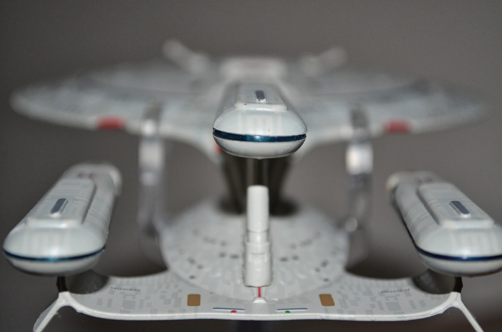
First impression on opening that box is that, well, she is just damn big and top heavy. We've had both the Enterprise and the ISS Enterprise NX-01 models (same ship let's be honest) and this SS Enterprise refit easily dwarfs that mould in every respect.


The hefty model has a huge metallic saucer that is exquisitely detailed at every millimetre with that underlying aztec paint scheme shimmers in the light playing out a glorious two tone silver coupled with a whole range of decals from cargo loading bay door markings right across to the bold ship registry adorning the front of the vessel. The detailing is blatantly superior to its smaller, original version with much more trim around the central bridge module in particular. Even the paint on the bridge dome and underside sensor module are more precisely finished than they were on the issue four NX-01.


The underneath of the saucer is every inch as good as the top with a full paint job and again that wonderful attention to the decal detail including the two "NX-01" registries on the port and starboard side. What becomes apparent even at this point is just how much there is to see and even on a couple of good scan overs there are still bits that I failed to catch or saw again in a different way. The only real error I can find here - or anywhere as will become apparent is a bit of an uneven paint job on the blue around the saucer's deflector dish. Seriously, that's it and just look at that end result.


Moving towards the rear you can see how this design has been altered from the original we saw in the show to this Version 1.5 evolved by Doug Drexler. Retaining the warp nacelles, the warp field regulator is dropped down into the new secondary hull which offers some familiar styling but more on that shortly.


With the warp engines the exterior vents are now encased and the Starfleet pennant adorns the exterior plating. Look at the tips of the bussard collectors too which now carry the antennae that were a feature of the USS Enterprise in the two pilot episodes. Both of the nacelles are plastic and on their inside edge the warp venting is fitted in translucent blue plastic which keeps this ship very much "alive".

Every space has something new to see as you traverse down the pylons to the new location of the warp field regulator. Again this has been enhanced with more red trim decals and marks the model's transition from the metal saucer. For note the stand positioning on this one has also changed. No longer does the clip fit to the rear of the primary hull and into the recess for the maintenance hatches rather it now slides, much more securely, around the edges of the saucer. Much better position and fit all round, Eaglemoss.
 
While everything about the saucer has been a change in finish, the new, tubby little secondary hull makes a huge difference to the NX-01. Echoing the lines of the engineering section of NCC-1701, the silver tube's most striking feature has to be the golden deflector dish sitting prominently at the front. It's a wondrous homage to the original 1960's starship design as is the SS Enterprise font that reflects the script used on The Original SeriesGalileo shuttlecraft. Just for note it would have been nice to see the new engineering section rendered with the same aztec paint scheme afforded for the saucer but given the overall effect it's one of those things I didn't actually notice until much later in writing this review.

Even down to the Starfleet pennant on the side of the hull you can see just how Drexler was retrospectively guiding the form of the NX Class towards what would become the Constitution Class of the Kirk era. It's a huge, huge shame that this was never able to be a part of the TV series and as the magazine notes, a real downer that it's probably the most canon non-canon starship that has come into existence as part of the extended Star Trek universe.

I for one have to say that the SS Enterprise NX-01 has to be among the absolute best, top class starships that the collection has produced either as a special or as a regular issue. Everything about it screams quality, care and attention to detail. It is the ultimate starship masterpiece without question and possibly contender (perhaps only Deep Space Nine for me). Every place you look there is detail, embossing, a greater level of precision than we've had before and certainly more than you will ever see on the smaller and less expensive regular issues.


Just being able to see and assimilate such a brilliant model reinforces how disappointing it is that she never got to take a proper flight. Maybe, just maybe, a certain Bryan Fuller might drop a fleeting glance at her in the future of the Discovery series just so this can be 100% canon.

Is this one of Eaglemoss' greatest Star Trek achievements? Did we miss out on a TV treat?


Live on YouTube
Like our page on Facebook 
Follow us on Twitter
+1 us on Google+
Add us on Tumblr
Join the conversation on Star Trek: Risa

Saturday, 6 August 2016

Polished Mirror: The ISS Enterprise NX-01 Special


As only their third web-shop starship exclusive, Eaglemoss have now brought us the Mirror Universe version of the Enterprise from In a Mirror, Darkly.


Fairly short-lived, this is, in essence, just a repaint of the issue four NX-01 model plus a brand new magazine dedicated to the two part Mirror Universe prequel and The Tholian Web sequel. I'm hoping this isn't a sign that all of the future web specials will be just slight reworkings of main issue craft since the only other larger craft in this "M" series was the ISS Enterprise from Mirror, Mirror. However, the fact that we've had the shuttles set (and potentially more of those to come) does negate that a little.


So to the Mirror Universe ship and the quality of the model is undeniable. So often do I refer back to issue four with a loyal fondness that every one since has to live up to that level of detail. It set the bar early on in the way in which the aztec paint job had been applied, the intricacy of the engine construction and the attention to the precision of the decal application. The stand attachment to the base is still unique to this craft and while a tight fit it does the job more than adequately.

The Mirror Universe NX-01 continues the fine tradition established by its Prime Universe counterpart. While the magazine notes that there are several differences internally, there are only a few changes that mark the two apart from the outside. The ship's name has been changed to reflect the ISS addition plus there are two smaller Terran Empire emblems to the rear of the saucer as well as the large sword and planet front and centre. Perhaps the biggest and most noticable change are the two bright yellow "pincers" that reach around the curves of the primary hull to the port and starboard.

The underside and the engines are unchanged from the Enterprise of issue four although the accompanying magazine does reveal that things could have been very different had Rob Bonchune and not Doug Drexler been responsible for the final design.

The ship is, of course, a damn fine model but the magazine is just as much a highlight. Based purely around In a Mirror, Darkly, we have in depth info on the differences between the Prime and ISS versions of the warp five starship in regards not just to the craft but also to her crew who are quite unlike the characters we came to know in the rest of the Enterprise series.

Designing the craft does offer a look at the NX-01 that might have been complete with teeth and a striking red paint job that extended beyond the saucer alterations that Drexler brought into sword markings on the engines and on the lower side of the primary hull. I actually think the Bonchune design is much more striking and interesting but I also get why they chose the Drexler adaptions since they would be easier to see on screen given the bright yellow contrast.

Rounding out the issue - which is standard length rather than the bigger "specials" magazines - is a feature with In a Mirror, Darkly writer Mike Sussman explaining the origins and desire to do a Mirror Universe story much earlier than season four. I'd also go back and read the article from the M1 edition to link the Shatner Mirror Universe story from the Reece-Stevens into the other potentials that never happened. 

Will we get any other "M" series ships? Who knows - I can only think that we might get something from Deep Space Nine but that Defiant was an absolute carbon copy of the original so that seems very unlikely. As for now this is a good addition from a solid early entry to the series that is still one of its best in every single way possible. Maybe one for the ultimate completest given the minimal changes but that takes nothing away from the quality of the final product.

What other ships should appear in the "M" line? Are there other online specials that should be done?


Live on YouTube
Like our page on Facebook 
Follow us on Twitter
+1 us on Google+

Add us on Tumblr
Join the conversation on Star Trek: Risa

Tuesday, 4 February 2014

There's Another Ship Coming In...It's the (Eaglemoss Subscribers) Enterprise!


For those unfamiliar, All Good Things is a poignant ending to The Next Generation, arguably the perfect beginning to what we call 'Modern Star Trek'. 

The episode introduced the audience to the futuristic Enterprise D, and with it one of many insights across the Star Trek universe, speculating on alternate future scenarios. That would have been of course, if Deanna hadn't slammed it into Veridian III...

Not dissimilar to the original Enterprise D, with a few... erm... additions. Before we begin our model review though, we have a problem. 

This has left +Hayley Atherton and I at loggerheads on opinion of this 'future variant'. Hayley in truth wasn't that impressed, as it showed limited imagination with the scope of the design. Lining the models up side by side, it was a carbon copy of the original. A quote comes to mind when looking at the variant: "Mr Paris, we are not designing a 'hot rod'".

Now whilst I agree with my esteemed colleague, my argument was that it is still the Enterprise D. If they were to completely redesign a ship from scratch, it would no longer be so - hence the Sovereign Class Enterprise E. Since neither of us are willing to back down on this, we'll let you be the judge of that...

So, what about Eaglemoss' latest special edition? Well, this is tough, with it being a subscribers only model, we were hoping for something that would sweep us off our feet in awe. No. Just, NO. In actual fact our feet are staying firmly on the ground with this one.

As a subscriber, we got onto discussing Hayley's first impressions when opening the package... her initial reaction was "I've already got the D". It wasn't until she looked closer did she realise it had a third nacelle. In my opinion, it's a poor show by Eaglemoss, sort of like sticking a few fingers up at all the loyal subscribers and saying "We could have done more, but the original Enterprise D mold was just sitting there, so we couldn't be bothered." 

There's plenty of evidence in the form of the NX-01 Enterprise and the Thunderchild, that Eaglemoss can produce very good model builds. Bear in mind we're talking about two 'stock' ships, not exclusives. Perhaps it would help to demonstrate our bugbear.

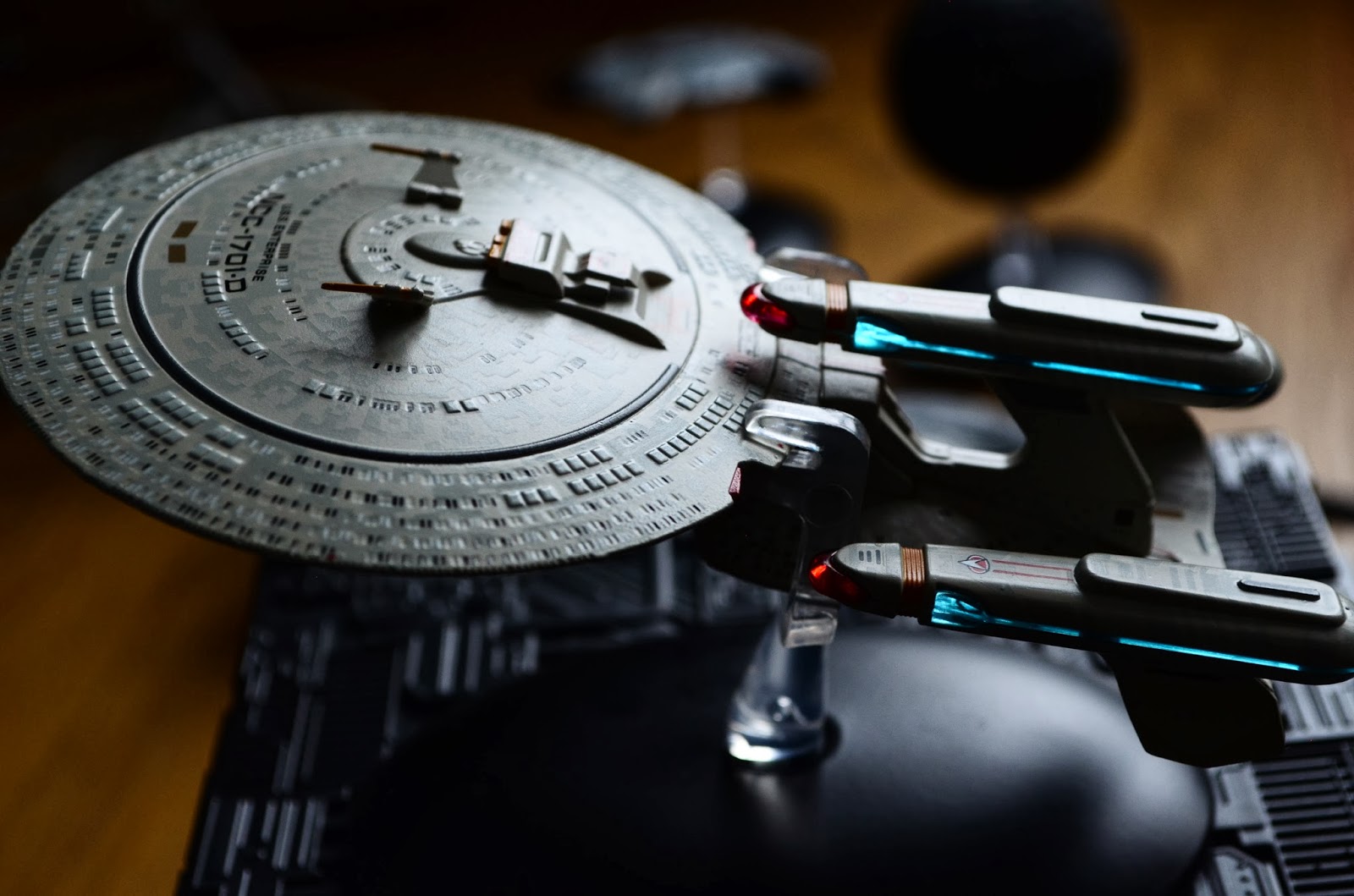
The stock Enterprise is mostly built in four parts: the saucer, neck, topside engineering hull (with nacelle pylons) and the underside engineering hull (with deflector). For the future variant, they have used the same saucer section with the phaser cannon stuck over the underside (this is clearly visible if you inspect the gap between the cannon and saucer). The same underside engineering hull has been used.

The other two sections have clearly been constructed using the same specifications as the original, just with additions such as the nacelle pylon 'fins', and the third nacelle mounting pylon.


What makes this that much worse is the build quality of the rear section. Incredibly, somehow, they have made the variant even more delicate on the nacelle pylons, than the original ever was! Oh and finally - what, in all things sane and rational, is Intiaparinu? I think they meant Enterprise (see opposite). This highlights our earlier point being that the saucer is from the same original mold, as the same alien word appears on the original, in the same location.

Okay, we are being brutally critical on what is a good looking 'free' ship. But to be honest, would it have cost that much more to construct it from the same materials as the Thunderchild or the NX-01???

The question that sticks in our mind now we have heard noises from Eaglemoss about forthcoming 'specials' is: "Are we to expect the same, so-called standards?" or: "Will the Enterprise A, just have an A at the end of the registry?". Speaking of such, we've had our gripes about the Constitution Refit from issue 2, the flimsy weak issues of it anyway. So are we again expecting the same structural integrity problems for the forthcoming Enterprise A and B?

... Magazine comments? No. Don't even start. We'd have to have actually been issued a magazine with this edition, in order to try and give this model some of it's dignity back.

Yes, we're being savage about this particular serving from Eaglemoss. That's not to say we hate the collection, or we're fed up with it's 'apparent' officiality with CBS/Paramount, OR we're revolting against the myriad of cons the series has been plagued by. We just expected a good thing, we just don't want 'All Good Things' to become the theme nor demise of this collection...

UPDATE 28/07/15

With the collection now being released in mainland Europe as a subscribers only publication, the USS Enterprise-D future edition has now been slightly updated with the correct wording behind shuttlebay one from Intiaparinu to Enterprise. We've dropped a video up with a mini-review and comparison to the issue one Enterprise-D. Catch it here on our updated YouTube channel.


All photographed model images from SKoST Image Archive courtesy of +Hayley Atherton 
 

Thursday, 26 September 2013

Twelve Years On

With the recent 47th anniversary of The Original Series you would be forgiven for forgetting that September was a busy month for Star Trek....


Happy twelfth birthday Enterprise. Short-lived but still one of the fold.

  • 98 episodes
  • Four seasons
  • Pilot aired with a viewing figure of 12.54 million on UPN
  • First series to see the launch of the main starship
  • Last episode aired May 13th 2005
  • Created by Rick Berman and Brannon Braga

Monday, 23 September 2013

Forward Thinking: Previewing the Starships Collection Issues 4 & 5


Issue Three is only just out but we've been granted access to Eaglemoss' drydock and the next two releases in The Official Starships Collection.

I'm going in with both feet here to say that Issue Four is the best to date and even better, the best of the first five hands down. I've never been the greatest admirer of the NX-01 Enterprise however this model has started to change my opinion. It's an absolute beauty and as a package this is all round excellent both on the page and in the ship herself.

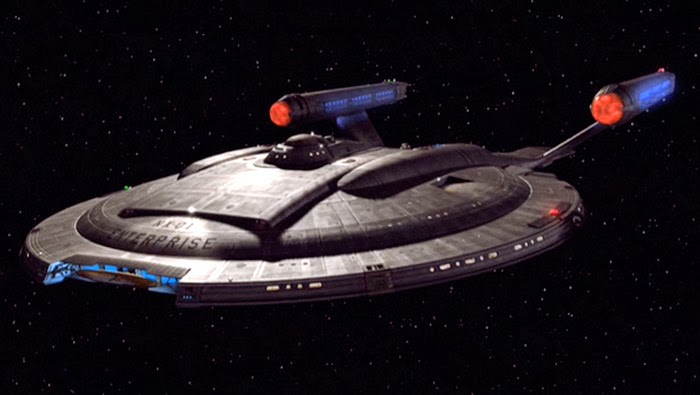
Here the saucer is metal with the pylons and engines in plastic but on first glance you would never be able to tell. This is a superb recreation of the Enterprise from, well, Enterprise. The detail is beyond anything we've seen so far and she looks like the "real" deal. I might be in model heaven here. The image above from the show gives you a good impression of the colouring of the hull but in the flesh it's a lot better than even HD could probably conjure. 

Being the smallest of the Enterprise models it benefits from a much more "up close" analysis than the D or the refit. The hull plating is very clearly marked out even in the plastic sections which, to date, haven't been the best. I'm a little puzzled by the gold painted pieces on the hull but I have to accept that these are accurate to the original models and materials that CBS have provided to the developers.

Turning to the magazine, Eaglemoss really have aced this edition in every way. The specs and a brief history and description of the ship layout cover the basics very well and introduce fans of all knowledge levels to Archer's starship but for me there's a gem hidden in these pages.

Homage Alert

Now our previous reviews had noted that there was a certain formulaic approach to the magazine but here there is something of a twist to that routine. In issue four we have the most complete journey (if you will) detailing the NX-01 from her creation and first voyage through service history and even to a conceptual design for her ultimate upgrade - the addition of a secondary hull. It's something that's been around for a while but I was certainly surprised to find that Eaglemoss had included something that isn't officially canon since this upgrade has never appeared on screen. 

It's a great touch and reinforces the fact that it was intended for the NX-01 to gradually evolve through the series as "familiar" technologies were introduced to the ship. This ties in nicely with this edition's design section where the one of the original concepts had the secondary hull already attached. I also didn't appreciate (and it's fairly obvious once you've seen it) from which the design of the Enterprise was partially.

Add into this superb mix a classic scene that tips the hat to a great movie moment and you have the best issue yet. This really does flesh out the story of the NX-01 on and behind the screen - and the first main vehicle that we saw from her launch date and in CGI from Day One. I was never that impressed but Eaglemoss have definitely changed my opinion on this neglected starship.

My ONE gripe? The final section covering the key moments in the history of the ship is probably it. The inclusion of These Are the Voyages ... as a memorable episode is not something that will sit well with readers!


Green Giant

Coming off the heels of the Enterprise edition was going to be a difficult challenge. Issue 5 takes a breather from Starfleet ships once more with the monster D'Deridex Class Warbird. As Data once noted in regards to a beverage in Ten Forward, "It is green".

With a worn colouring this is another ship with which I've not been overly familiar but now this collection has given me the chance to see her in glorious 3D. Yep, she is a big beast and exceptionally well crafted with all the hull markings in plastic and metal clearly laid out. There's only the underside of the "head" which lacks detail but given that you're not going to be looking at it very often it might be easy to let that ride (although it's not the first time there have been omissions on this range). 

The design is stunning and it really betrays the bird-like design theme that has run through the Romulan fleet since the Bird-of-Prey in Balance of Terror and even "back" to the designs we saw in Enterprise (one of which is due in the not too distant future from Eaglemoss).

The illuminated portholes right across the metal structure of the Warbird highlight the size of this mammoth vessel and as a model it's a great addition to the range especially this early in. As with the NX-01 I was more Bird-of-Prey than Warbird but this I do like. One other thing - I would suggest gluing the ship to the stand or placing it on a shelf where no-one will ever touch it as the stand is not very secure and mine has ended up performing several death dives since its arrival.

The background on the Warbird covers that pesky quantum singularity that powers the ship as well as the ever-useful cloaking device, evidently referencing The Next Generation and Deep Space Nine episodes where Romulans have been the focus including The Neutral Zone, Face of the Enemy and a lot of the Dominion War arc.

I also found myself  getting more and more impressed with this series as I read through the magazine  My initial concerns that the set contents would become repetitive are being laid aside as there are other facets being explored. Here we are "Introduced" to the Romulans from the behind the scenes perspective covering everything from Balance of Terror to Star Trek Nemesis (with a conspicuous absence of images from Deep Space Nine). Again this section seems like excellent value for newer fans and there will probably be the occasional line that the more knowledgeable Trekkie will find strikes a memory.

It seems though there isn't a foot being put wrong with the design sections of these magazines. Again, a brilliant section but I keep thinking there's so much more that could be explored within these pages. The content is great but I still feel like it's a glimpse of a bigger picture. Great choice here to turn this into an interview with Andy Probert who created her back for The Next Generation's The Neutral Zone. Have to say I prefer her horizontal to vertical though!

It will be hard to fill out editions as more ships and races are covered but I'm beginning to believe that this will turn out to be an impossible-to-miss series. Even the issues featuring background starships or one-offs will be interesting because of their nature to see how these blink-and-miss craft have been realised.

So there you have it - two great issues and two excellent models to get your hands on. Already this collection has made the national papers as it sold super-quick to fans everywhere. It's been a lot better than I expected, even at such a high price. Go on, subscribe. You know you'll end up doing it anyway!

Now there is one problem with getting preview editions - we now have to wait over a month for the next issue which will be....USS Voyager.  Oh, yes.... who ISN'T excited by that prospect?!

The third edition of the Star Trek: The Official Starships Collection is available now and you can find out more by visiting the official website. Issues four and five previewed here will be available on the 3rd October 2013 and 17th October 2013 respectively.

Thanks also to Eaglemoss for their assistance in the production of this special preview.

Thursday, 10 January 2013

Apps, Rings, Posters and Blu-Rays

It's been a good and bad week in Trekdom with quite a wide range of new additions announced.

On the positive side we have the brilliant and perhaps for some, including myself, unexpected news that Star Trek Into Darkness will be receiving it's very own app launching during the Superbowl.  Awesome.  Can't wait to see it and it does look like Paramount/Bad Robot/JJ Abrams have really pulled together one hell of an advertising campaign for a film that really stands a chance of being this year's summer smash.  

Big shame that the competition promoted by startrek.com as part of this hype is once again only open to US and Canada.  When are you going to learn that you have fans across the pond?!  What have we done wrong?  Can you not give us something to enter other than a forum debate on what was wrong with Riker's haircut in "Future Imperfect" or getting kudos for working out that it's Weyoun behind a pixellated image?  Just once?  Please?! Thank you.

Announced at the Consumer Electronics Show in Las Vegas by Paramount and Qualcomm it will allow users to be part of "real-life" missions using geographic, audio and image recognition technology which all sounds a tad exciting...as long as you're in the USA (you can see where I'm going with this...). The audio function means that the phone will reward users for watching Star Trek Into Darkness content while the geographic and image recognition features will mean that smartphone owners (for smartphone read iPhone) will be able to interact with STID in the real world - I would suspect this will be QR Tags and the like on billboards, shop signs etc.

Of course there will also be the usual plethora of images, wallpapers available to users as well as special offers and some untold extras that will kick in when the full TV trailer campaign juggernaut ignites during the Superbowl in February. Those lucky US and Canadian citizens who register will also be entered into the chance to win tickets to a VIP trip to the US premiere. Lucky, lucky, lucky.  Looks like I'll have to make do with the local Odeon or Vue. No chance of there being something for UK fans in May?  Or maybe opening up this app to Android users on both sides of the Atlantic? Here's hoping.

The beginning of each month is something I look forward to in many ways - payday, a step nearer Christmas, white rabbits and also the time when we get to see another four retro TOS posters.  January has been no exception to this with another superbly imaginative selection.  Why so happy?  Well this time we have "The Tholian Web" among the offerings.  If you've read Life of Trek previously you'll know it's my favourite TOS episode hands down. Great poster,  classy and space serial styled apparently around 1920's and 1930's Russian film posters.  Might just have to buy the t- shirt for a full indulgence in this one!

Two of the remaining three as just as good; "Mirror, Mirror" recreates the iconic mirror universe Spock with his Prime universe alternative in the style of a boxing match flyer; "Miri" recalls the controversial banning of its original broadcast in the UK with a teaser line included by artist Juan Ortiz. This is unusual for the posters created thus far and was brought about due to research into the show for this collection. As part of this 60's style design, the ship represents a tear and the black/white hair effect is supposed to represent water which was the way in which the pubescent virus was transmitted.


Finally we have "The Savage Curtain",  one of the final original series episodes and probably my least favourite of the January selection. While I don't mind the episode,  a red faced Lincoln isn't my cup of Earl Grey on the worst of days.  Bit of a misfire I think although I can see where the artist is coming from in using part of the extremely memorable image of the president appearing on the Enterprise viewscreen. The credits as a vapour trail is a nice effect but it doesn't save this from being a bit of a disappointment.

Talking of disappointment, what is THIS all about and I would love to know what kind of fan buys this stuff? It is of course the QMx Starfleet Academy Class ring (2009). Made using (and I quote from startrek.com) "a high strength, scratch-resistantmetal alloy that simulates the brilliance and sheen of polished sterling silver" it goes on sale later this year and faithfully recreates the prop used in the first reboot movie. Wonderful as this may sound, the only reason I can see to buy this would be to use it as a VERY faithful cosplay or to sit in a prime position on my Trek-themed mantelpiece.  Sorry all, but I think this is a bit excessive and I'm not going to go back and rewatch Star Trek to even find a frame where we see this. Totally pointless and a massive cash-in on a teeny tiny prop that got very little screen time. Now, if they made a replica of the Genesis Device control console....hmmmm....


Let's move on before I engage in a session of 1980's nostalgia here and talk Blu-ray. In their amazing wisdom, Paramount Home Media/CBS Home Entertainment will be releasing the four seasons of Star Trek: Enterprise next. As part of their idea for the sets, they invited fans to choose the cover design; the ship, the insignia or the captain - and then decided to go for something completely different based on fan comments because, apparently, there was no clear winner from the three concepts.

So what can we expect in regards to the release which is set for March 26th?
  • 25 episodes of Season One over six discs
  • New audio commentaries from Rick Berman, Brannon Braga, Connor Trinneer, Dominic Keating and more
  • To Boldly Go: Launching Enterprise
    • Part One: Countdown (creating the prequel)
    • Part Two: Boarding the NX-01 (casting and production of the pilot)
    • Part Three: First Flight (production and post-production of Season One
  • Outtakes
  • Deleted Scenes
  • Archival Mission Logs
Seems like a decent set of features in my opinion but will it be enough to draw back any fans that the prequel series lost over the course of four years?  TNG garnered an even better set of features for its re-release on Blu-ray including extra episode promos, origin documentaries and archive launch footage amongst other things. Why Deep Space Nine failed to get a 20th Anniversary re-master is questionnable but we can only hope this is due to Paramount and CBS wanting to wait until all seven seasons of TNG are released when Star Trek: Enterprise would only need a transfer onto Blu-ray and an addition of some features to make it worthwhile. Time will tell in this case but it'll be good to see what the set looks like when it does arrive on shelves in just over two months time (US date) and currently there's no announcement on when it will reach the UK shores. At the moment I also haven't seen any news on how much they will cost to purchase but making them significantly higher in price than TNG might just backfire against drawing in some new fans or just those wanting to take a second look at their own pace.