Saturday 29 June 2013

Sorry Ensign, Your First Assignment is...


The other week I talked about which ships in the history of Star Trek were the finest created, crewed and flown. All well and good, but as a newly commissioned officer would there be a ship or class you just wouldn't want to get sent to?

USS Saratoga
Unfortunately there appear to be a couple of very strong candidates for the title of "Starship I Would Not Want to Be Aboard" (long but adequate). 

First up - the Miranda Class. First seen in The Wrath of Khan initially commanded by Captain Terrell before being commandeered by a certain Khan Noonien Singh so that he could have a spot of vengeance on Admiral James T Kirk. Pretty much one of the legendary ships of the franchise because of the film, why does it get the first entry here?

Well, let's look at the facts - you're sending out survey ships to unexplored regions of space and what do you send? lightly armed science vessels especially here in relation to a top secret project! Absolute genius. While it might reinforce the Federation's desire to expand its scientific and exploratory missions through less "threatening" craft than the "battle cruiser" style of the Constitution Class (so described in The Search for Spock by the Klingons). It does stand up well in battle against the larger Enterprise but eventually it does end up blasted apart and its molecules included in the formation of the Genesis Planet.

USS Lantree
Also it's a horrible design with all the essential systems on show all over the place - warp reactor is out at the back seemingly undefended and there's that huge shopping trolley handle replete with photon torpedo launcher sitting proud of the hull. I would suspect a terrible ship to wage a firefight from as defensibly it would be a nightmare. But that's not the end of it. The Miranda Class itself seems to be dogged with tragically bad luck. Take in point the USS Lantree, USS Brattain and the USS Saratoga.

OK, so this indicates that there are a lot of these in service especially in The Next Generation universe and therefore must have been reliable, they tend to pop up in the worst situations.  The Lantree was blown up following an outbreak of an aging disease in Unnatural Selection and the Brattain's crew all go insane when trapped in the Tyken's Rift featured in Night Terrors. Whatever way you dress them up, things just seem to happen to the Miranda Class. Even worse, if it's called the Saratoga I would suggest staying well away. Not only was it disabled by an alien probe in The Voyage Home but Ben Sisko lost his wife on a newer version of the same ship at the battle of Wolf 359 as seen in Emissary
USS Majestic

Numerous ships of this class are seen in the battle sequences throughout the latter seasons of Deep Space Nine and their size would no doubt be an advantage against the larger Dominion vessels. As we can also see through their various appearances there are many changes to the basic structure showing them as fairly adaptable - alteration/removal of the rollbar, addition of sensor pods and even substantial changes which led to a new class as seen as the USS Bozeman and the Soyuz Class. Still, it's original formation and purpose don't help its case as a ship to avoid. and some exterior changes as well as the internal differences that would occur during each ship's lifetime wouldn't make me want to take the chance of being posted to one of them. 

This also makes me think that Starfleet should consider sending more heavily armed ships into such previously unexplored reaches or use more suitable vessels for experimental missions - or you could ignore all of that and send one of the Oberth Class.

USS Grissom
What Starfleet was thinking when they allowed this design into service is beyond comprehension. Now I don't have beef with the concept here. Science vessels would be essential to the whole seeking out new life and new civilisations goal of the Federation although they don't seem to be expected to have to look after themselves. At first glance it's a small, sleek science vessel useful for pottering about the universe but it's got to the dogged with the worst luck and design ever. 

Surely it could've done with some better shields, some more weapons and half a chance? Then there's the design. For starters, how do you get from the primary hull to the secondary hull apart from using the transporter or climbing down ladders in the warp nacelle pylons? Granted it's not very big, it would still give you a good workout a few times a day. 


USS Tsiolkovsky
These are great little ships but in uncharted territory you'd be absolutely stuffed and not stand a chance - case in point being The Search for Spock (above). I'm still not convinced of the logic of sending a tiny little science vessel to the most publicised and quarantined planet in the galaxy.

Nor are they suitable or powerful enough to go up against the Borg but still Starfleet managed to get at least one as part of the 40 ship armada at Wolf 359 as featured in Emissary.Of course it looks good that you're not going in heavily armed but these guys really are cannon fodder when it comes to facing an unstoppable cube.

But that's not what makes them a risk on your life insurance. As with the Miranda Class they made it into the 24th Century however even from the start of The Next Generation they're in trouble. The Tsiolkovsky gets the blunt end of an asteroid in The Naked Now after the crew of the Enterprise contract the Psi 200 virus from the ship. Surely these craft would be outfitted with more specialist science equipment than a Galaxy Class just in case something gets brought on board? 


SS Vico
The SS Vico and the USS Yosemite also encountered some seriously bad luck as featured in Hero Worship and Realm of Fear respectively. Both ended up adrift following mysterious circumstances. If I was on the Enterprise by this point you'd be concerned if one turned up as to what might happen. In fact surely when Admiral Pressman comes on board in The Pegasus, Picard's first question should have been "What class of ship are we dealing with here?" which would have promptly been followed either by a facepalm of galactic proportions or an about turn and back to base. It does go to show that these ships were seen as something of a test bed, probably due to their original scientific purpose.


USS Cochrane approaches DS9
There is however one redeeming gem of the Oberth Class - make sure you got posted to the USS Cochrane. While every Miranda Class ship we meet ends up worse off, the Cochrane gets four mentions at various points in The Next Generation and Deep Space Nine with two of those being physical onscreen appearances. That's good going but proves the exception to the rule!

So the lesson is pretty much reinforced - and science vessels in general aren't a good thing to be on in the Star Trek universe full stop. For further examples I would direct you towards (firstly) Voyager and the USS Raven that carried the Hansen family into the clutches of the Borg. Probably a good thing to get into command, engineering or security if you ask me and avoid the lure of a career in the sciences. Have I even managed to squeeze in a mention that families were also included on missions on all three of these classes of ship at some point  (Timothy in Hero Worship) and had them on board during the Borg attack at Wolf 359 (Jake Sisko)?


While we can say that the reason these ships show up so often is for budgetary reasons and the ease of reusing miniatures, I'm hoping that you can see my point here! After a while surely someone would comment about their safety record?!

So would you say that these are the two most fated classes of ship in Star Trek or are there some that have an even worse story to tell? Is it the Raven or something else?

Wednesday 26 June 2013

The Enterprise Project: Learning Curve


The first "trial by fire" moment of the project has arrived.

Painting large areas in a solid colour is not a precision task and while it can get monotonous after a while, it's not an exacting art. The time has come however where I must apply a degree of skill and accuracy and just the prep took a while.

Masking up the curve on the bottom of the Enterprise saucer section was a difficult and fiddly one. You can't simply whack a strip of tape around and be done. Straight pieces of tape don't bend well so it was a gradual process to mark out the grey stripe for painting.

It was a two-coat job to complete the painting but it did come out well in the end using the basic light grey silky matt 371 to cover. The only challenge being that there's been some edge feathering from the masking off which I now have to remove before I can proceed to the next detailing job on the primary hull. Inside the lower section I've now also installed the clear (and painted matt white) porthole sections - make sure you clip and file the edges on these as they are quite a squeeze to fit and need to be flush with the hull or they won't look right from the outside.

In keeping with the plan I've now also painted and masked up some of the sections which are attached to the top of the saucer as well as test fit and glue the upper and lower saucer modules in place as these are now finished aside from minor detailing. I've used a slightly darker grey matt 76 for these areas. 

One thing I left off the last Enterprise Project update was an interior shot of these two pieces just to give you a better idea of how they stack together so the edges of each are concealed (left). Again, before gluing anything always make sure it fits as movement corrections could get a bit tricky and sticky.

With my current supply of white matt 301 running a bit low and not a lot of work to do on the primary hull I've applied a first coat to the secondary hull. This will get a chance to dry overnight and be reviewed in the morning. Should be fine but with physical construction on the saucer coming to a close, it made sense to start making some headway on Phase Two so to speak. Also, due to work commitments I'll have to take an enforced model-making break for a week which should give the paint time to arrive!

But before I disappeared off for a while, I managed to get a few extra bits completed. Firstly that grey curve on the lower saucer was painted up. The only problem that's arisen from that is the edges have feathered so I'll need to just touch them up to get that razor-sharp circle. As a first attempt at some extreme masking it came out a lot better than I had expected. 

Next up the two sections pictured above were fitted into the saucer sections, test fit and glued. They are both very snug when in place so there doesn't seem to be any need to fill any gaps (upper section pictured top). That image does suggest a bit of a gap at the back but I'm blaming the angle I took the snap. I've also masked off the two "T" markings on the upper saucer as you will also see there in preparation for painting as I will be doing on the lower section once the circle of grey is finished correctly.

Nicely the lower section (above left) has three guiding pins which mean it can only sit in one position. I also fitted the window panels into the lower section and here I would recommend that each of these has its edges filed before gluing into the sides of the dish. Why? Because if you don't they sit slightly proud of the surface and this will look a bit odd from the outside. For note, I painted these white while on the clear plastic frame before fitting (left).As you can see the flash from the sprue is still present and is raising the right end of the panel (more shadow visible).

It seems like this is one big trawl on painting doesn't it? True because I also had a couple of sections for the upper saucer which needed painting firstly in white matt and then required sections masking off for a darker shade of grey (Revell 76) than was required for the lower saucer circle. While the masking is not simple squares or rectangles they aren't curves. These will need some touching up and also some additional masking for smaller areas on each that require either a different shade or further painting. Both pieces will sit behind the bridge module on the upper saucer section pictured at the top of this piece. You can see the gap where the segment on the right of this image (right) will be placed when painted up.The longer piece came away from the sprue during painting as it was only held at two points but given that I had managed to complete painting the outer edges matt white it wasn't an issue.

To finish off I managed to get a coat of white matt onto the port side of the secondary hull (pictured left) just to see how it would cover. It's gone on very similar to the first coat on the upper saucer section so this shouldn't need more than a good second covering to plug all the gaps and streaking. It has a lot more nooks and bends than anything else so far but the result is looking favourable. I should be able to get started on the next step this weekend and complete the structures on the top of the saucer. This might mean that we can fix the two larger dishes together and tick off one third of the construction process.

To follow the progress of The Enterprise Project just click on the label below and you'll be able to catch up on this week's updates!


Sunday 23 June 2013

Star Trek VHS: A Trekollections Curveball (Part II)


CIC Video was the bastion of all things new, visual and Star Trek until 1999.

As we saw in Part 1, CIC held court over The Original Series, The Next Generation and Deep Space Nine until volume 7.13 of the space station saga which was actually overseen by Paramount Home Entertainment (which had swallowed up CIC). Star Trek: Voyager likewise shifted across to Paramount Home Entertainment for seasons six and seven. By this time it was getting hit and miss with SKY as to whether you could catch a new episode on VHS or TV first, purely down to which series was airing first on the satellite channels. For the majority it was still a case of hitting the shops for a fix (internet shopping was only just starting out) but on the outside the effort was a distinctive departure from anything before.

Let's travel back ever so slightly to the first season of Voyager. While the video covers of the previous two series had been, on the whole, pretty standard with a firm concept across the range from beginning to end, Voyager couldn't settle on a single theme for even two seasons in sequence. In contrast to The Next Generation and Deep Space Nine there was very little consistency from one cover to the next even from the start. Only the title and the placement of episode info, titles and legal panels would remain the same. Also remaining in place for the whole of the run was the tagline Charting the New Frontier below the series title. Until season four it was also accompanied by the legend that Voyager was from the makers of The Next Generation - whether they pulled this through a radical redesign or embarrassment is open for debate(!). Nor was there any connection between volumes as with Deep Space Nine's galaxy spanning spine picture. 

All you got here was a smaller image of the whole sleeve clean of any promo script and the episode titles. Aside from that there were only fleeting glimpses of what could have been or concepts that failed after a volume or two. In fact it would be fair to say the whole series was a mishmash from a packaging sense with no consistency at all. What was the consistent factor across every volume was the numbering system. When Voyager started, Deep Space Nine also changed to the same season/volume numeration.


Take season one for instance - 10 covers (episodes were released in production order for seasons one and two in the UK) featuring the ship from various angles - flying, in space, by a nebula, grounded...all very exciting (sarcasm). Season two was only a slight improvement with artist impression images featuring the ship as well as shuttlecraft, the Dreadnought missle, Kazon warships and Vidiian cruisers  Each image related to one of the stories on the cassettes as had the first season Voyager closeups.


The third year went off at a completely different tangent and considering the quality of the volume images before, it was more of a downturn as artistic images made way for photoshopped images of cast members/scenes from episodes on the tapes. Volume 3.6 featured here was one of the worst offenders - how big is Janeway supposed to be in that Jeffries Tube?! Common sense and giving a toss seemed to have left the building during this season. You thought they might have at least made some effort and in fact it just looked rushed. While I was more of a DS9er at heart I did own a few Voyager volumes although admittedly at the time, none from season three. The last cover for Scorpion was OK but I always felt they missed the boat on impact with this show. 

Now remember the rumour mill and hype that built up around the expected arrival of the Borg in season three? It's all about the buildup to that final shot at the end of Blood Fever if you recall and the note that Voyager is heading into dangerous territory. So a good move would be, what? I know - stick that on the cover of the cassette and ruin the surprise (although you suspect marketing came up with that to shift a few more copies). 

It made for a good cover nevertheless but that shot of the drone corpse was in the dying seconds of the episode as a moment of suspense which this obliterated before you got out of the shop. If we expected improvement for season four it was almost as iffy with 4.1 and 4.2 opting for "cast member of the week" shots (Seven of Nine on 4.1 and Chakotay on 4.2) before diving into a full range of "Janeway + crew/guest" right up to 4.13. In the bottom right hand corner this cast shot pairing was also accompanied by some kind of spaceborne image relevant to the cassette and only on one occasion did it feature characters (the Hirogen) on 4.9 for The Killing Game (Part I).

The quality of the images did improve for seasons five through seven which also introduced the generic cast image at the bottom and moved the episode numbering and titles into a set format near the bottom of the cover. Likewise this happened with the final season of Deep Space Nine as I noted last time although with Voyager we had five crew (Tuvok, The Doctor, Janeway, Seven of Nine and Chakotay) to three (Worf, Sisko, Kira) on the sister series. Already with season four the episodic stardates had been removed - another feature which was implemented on Deep Space Nine in the same year. The penultimate season probably had the most interesting and well-designed artwork with more action shots and interpretations of sequences from the episodes based around the ship rather than the characters. 


But that's just the front of the cases - what about the whole package? While it didn't fade back into the simple designs of The Original Series or The Next Generation, the take on the packaging was different again. It gave the feel of technology and Starfleet by design and was one more thing that made a visit to the shops on release day a little more interesting. 

On the outside rear of each case was, as with previous shows, a brief six line synopsis for each of the episodes with a fairly respectable image for each also printed. These were less grainy than the screenshots on The Next Generation and were one of the better things about the cases. On the inside of each volume could be found some information about the ship, a new alien race, technology and also a character biography. While not as "in depth" as the Deep Space Nine volumes it kept with the theme of the case and the LCARS display style that was echoed across the box. Stupidly I have failed to scan in any images from the interior box art and if anyone has some, please send me a copy!

Now last time I waxed on about how good the covers were and the special edition versions of a few that existed. With Voyager it only made it as far as three alterations to the standard design over the course of seven seasons. These were Dark Frontier, Flesh and Blood and Endgame. The latter two featured reversible covers so that casual collectors could ditch the series/volume numbering system and have a "movie" cover instead. This meant that the interior info was ditched for these two cassettes. With Dark Frontier not only was there a reversible sleeve version but Paramount also released a card-boxed special edition in black and green as a one off. This didn't have the numbering or reversible sleeve and was, I think, an HMV exclusive in the UK. 


Just dropped back to a previous comment, there were some good covers along the way although most were from the later years. The cover for Timeless in season five was always something that stuck in my mind as it's probably one of the show's biggest moments. Equally the picture for Dragon's Teeth in season six was unusual with Voyager taking evasive action within the atmosphere of a planet. Little different but I always felt Voyager never really had room for maneuver on the covers leaving it with a limited range to explore.

Now before I move over to Enterprise, this would also be the last series to offer two part episodes in a TV movie format. The Next Generation did this with all of its double episode stories including Encounter at Farpoint and All Good Things... Over on Deep Space Nine, only the pilot, Emissary and What You Leave Behind got the special treatment. However, they would be placed onto a single video while each The Next Generation movie got its own volume. Voyager's two-parters suffered as well with two movies being slapped onto a single VHS tape. A bit of a marketing gimmick all round but again, great if you weren't collecting the full set and even better if you get disgruntled with CIC/Paramount's constant ability to schedule two part stories over two cassettes as happened on more occasions than not. 

Image quality on the front wasn't amazing but they did their job. I can probably name a handful of instances across The Next Generation, Deep Space Nine and Voyager where that didn't happen at best. For reference (above left) I've included one from each of these series. There were no interior info panels and the rear cover managed to offer plot details and credits. Definitely a budget run!

I think in my video buying era I managed only the Redemption TV movie and the Basics & Future's End and Scorpion & Year of Hell editions due to financial restraints. They were good but I always preferred that cliffhanger moment because that's how they were designed to be seen in the first place. From memory the only other special edition that I laid my hands on as part of the VHS collection I had was the awesome Borg box set from The Next Generation. Three cassettes in a cardboard Borg ship. When you took the lid off the sides folded flat with each volume seated in one of the sides and the fourth carrying a bit of blurb on the Star Trek villains. Placing all three cassette cases in a row spelt out the word "Borg". It was very cool although the case itself was quite flimsy. It was released around the same time as the Q box set which seemed a bit of a rip off as Q Who was in both cases. Apart from that I managed to avoid specials but the good ones managed to creep in if I let them! Also for the sake of this piece I'm avoiding heading into special editions territory.


HOWEVER (yeah, you saw that coming), I did have the Seven of Nine Collection Part One from Voyager. While the The Next Generation went overboard on box sets after it finished, Deep Space Nine missed the boat and all we got from Voyager aside from the two part tapes was a split collection featuring Seven's "Greatest Hits". Each contained three cassettes and eight episodes across them. Part One featured Revulsion, Retrospect, One, Hope and Fear, Night, Drone, Infinite Regress and Bliss while Part Two included Scorpion, Scientific Method, Dark Frontier, Think Tank, Survival Instinct and The Voyager Conspiracy. The three cassettes in each all bore the same artwork and when the two sets were pushed together there was a full image of Seven's face. They also came with a set of stills from the episodes included. I only bought set one as I had most of two from original release. Oddly there was an 11 month gap between the release of these two sets which I suspect was due to the episodes on the second release only just being out on their own with the full Voyager range at the time.


By the time Enterprise came onto VHS in 2002, DVD was on the rise and I recall that even I had started switching across to this newer format. Only one season of Enterprise actually made it onto cassette and I purchased the whole lot for my sins, making it only one of two seasons along with Deep Space Nine's final year that I had complete. I even had the cardboard collectors case to hold them all in. The budget on the packaging had certainly been reduced with no internal info and minimal detail on the box. You could collect tokens for themed Enterprise items and I ended up with a metallic organiser (lost to the mists of time). If you collected all the volumes together the spines made an image of the NX-01 crossing the galaxy and mini-screenshots from the historical title sequence at the bottom of the spine (see 1.4 left). There would be only one more VHS release from Paramount after the first season of Enterprise and post 2003 - Star Trek Nemesis; which in turn was the first Star Trek movie I bought on DVD! 


Now here's one thing that I noticed about the first season releases from the final Star Trek series - all the Starfleet uniformed crew have yellow piping in their uniforms where Malcolm and Trip should have red but yet Hoshi is still in blue? Most odd. For the remainder of the first season of Enterprise, the covers would also get a picture made up of images from one of the two featured stories (right). In fact the style was quite similar to that which adorned the covers of The Next Generation for seven years. The other irony being that while this would be the last Star Trek episodes to be released on video, the franchise name would be the one thing that wasn't on the boxes...

Overall the design was quite striking with background colour changes on each volume. Enterprise was at least consistent in its VHS design concept which made it a step up from the randomness incurred by Voyager but still wasn't (in my opinion) as exciting to see in the shelves as the Deep Space Nine editions. To the rear there were, as with The Next Generation and Voyager, images (usually four in a row) from the two episodes plus the usual episodic synopsis and credits. Interestingly the covers would also be the first to include a web address for you to see more Paramount info on the videos.

When Paramount took over the video releases for Deep Space Nine and Voyager they also started producing regular newsletters which you could subscribe to. The information was variable and sometimes it would arrive after the videos previewed (ironically) had been released. They were not exactly the most reliable form of information but in light of the fact that the internet was clunky as hell in the late 1990's and early 2000's it was better quality. I managed to find this edition from July 2001 when Flesh and Blood was released on VHS as well as the rereleased The Next Generation episodes Devil's Due, Clues and First Contact.


The thing that probably caught your eye will have been the announcement of Enterprise on the second page. Odd to think that this was before the series had aired and we were looking forward to a Star Trek prequel! The www.startrekuk.co.uk website is now a very underused fan page and has nothing to do with Paramount or CIC. A shame but I guess that's just the passage of time!

Also I talked about some of the promotions that were run with your purchases. The later ones were called the Latinum Perspective and there were some great items (they were at the time) which you could collect points from across the VHS cassettes from Deep Space Nine and Voyager. While I've lost a Star Trek VI  magazine these have survived. Explain that one.


Looking back I'm not sure if I would get any of these now and to get any of the better items you needed to get every single VHS volume from any series that was being released. Tough on the wallet for a pair of logo embossed boxer shorts or a lead crystal dome paperweight but at least there was something for customer loyalty after purchasing a lot of Star Trek!


And that's it. Two parts, five series and a lot of pictures. In the end I chose to focus on the series rather than diverting into the multiple different sets and covers that pervaded the movies across the years. I always found the VHS styling a wonderful side piece to the episodes themselves. It's a shame this isn't something carried on today however the advent of DVD and special features killed the need to make the boxes more exciting when you can navigate a menu and be provided with the same information in a much more interactive form. Basically the cover here was that special feature menu. 

Now on the blu-rays and DVDs you can get character profiles, cast memories, effects documentaries, outtakes, previews and much more than you could ever fit onto a sheet of glossy A4 and insert into a VHS plastic case. The tragic loss with this more compact technology is the "sameness" which crosses the box sets. Each disc case is the same, there is minimal variety and the visual, digital content becomes the total focus and how it is presented becomes secondary or even tertiary. It belays, sadly, just how much we are now consumed by digital media and tragically tend to want to spend less time reading related information when we can watch and listen. Not only that but the art of browsing itself is dying and the need to grab people's attention in a shop is diminishing. Artwork is a minimal requirement when you are purchasing online for the content alone. Instead of scanning your eyes over a shelf, the search box becomes your eyes and the exterior box becomes just a way to transport the item and nothing more. It's sad to think how our consumption by the internet has taken away one of the unique selling points of the Star Trek story and consigned it to, ironically, a series of pictures on a search engine.

Friday 21 June 2013

The Enterprise Project: Test Fit on the Kit


No major movement as we passed into Days Four and Five of The Enterprise Project.

My only real concern is the paintwork on the lower saucer section which might need some more touchup work to give it a smooth and even finish. The upper panel has come out a treat but its partner is providing the first bit of trouble.

As you can see from the photo of the finished kit above, you can go into a lot of detail and there's still a lot for me to do just on this section of the ship alone but we are getting there!

So while the paint set, I clipped out the various sections of upper and lower hull from the sprues and did a quick test fit. The lower sections are very snug and with guiding pins for the clear plastic dome, the molding and assembly are excellent. I'd definitely recommend testing the parts before gluing them even if it just settles your mind as to what it will look like. The upper sections aren't as tight fitting but there don't appear to be any worrying gaps to fill as noted yesterday.

I also realised that before we assemble the saucer sections there are some interior porthole segments that need a coat of our old favourite white matt 301. I'm going through this stuff like a wildfire so again, make sure you stock up!

These segments for the interior of the saucer are all clear and I've chosen to paint them on the inside for effect. There is also a clear "o" ring which fits inside the lower section again for the portholes (third piece down here, left) and was painted on the inner surface.

Each of the hull segments had their edges sanded and paint touched up although it's worth noting that the fit means that each piece fits inside a larger one and as such the points where it was joined to the frame are invisible - I'm just doing it for peace of mind!

Seeing as how I failed to update yesterday I've actually now done the next stage and assembled the two saucer structures ready to be set into the primary hull. They fitted like a dream and without any gaps (bottom)


A third coat of matt white was essential to the lower saucer and now this is streak and patch free. While coating that I also applied a coat of white to the clear porthole panels that will sit inside both the primary and secondary hulls (seen here, left, attached to the sprue). While I'm not looking at building anything below the saucer at the moment it seemed like the logical move! I also applied a coat to the impulse engine block and rear saucer structures which will be fitted once the two sections are mated.

The debate now is whether to add the detailing to the saucer before full assembly or wait until it's into one circular slab. At the moment I'm more inclined to do the former as it will be easier to rest the hull and paint rather than having to balance it not unlike a spinning top.


Now looking at the basic paints required/suggested and the painting guide on the instructions there doesn't seem to be a match on some of the colours suggested and those indicated on the Revell website (numbers indicated at the bottom of the page). It might now be a case of deduction to work out what will be needed in the stages and steps beyond.

To follow the progress of The Enterprise Project just click on the label below and you'll be able to catch up on this week's updates!

Wednesday 19 June 2013

The Enterprise Project: Some Assembly (Soon) Required


Day Three and we've finished painting the sections that make up the saucer.

That means that (unless I've missed something obvious) we'll be ready for gluing tonight. A second coat of the white matt was needed on the lower saucer section and I'm still considering adding a third as it's not come out as well as I might have wished. The patchiness I was experiencing on the finish isn't anywhere near as bad as yesterday but I'll make a final call later

The second coat applied to the bridge and lower saucer structures (on sprue circled in red) went well and now I'm wondering if any of this is going to need filler to smooth out gaps at assembly. Fingers crossed that won't be the case. 

One note - make sure you have a lot of Revell white matt 301 to use. A 14ml tub won't go far so stock up! I reckon at least three of these small tubs will do the trick but I'll confirm after I've painted the secondary hull, the nacelles...and everything else which is white.

I've also dropped a couple of images of the two saucer sections (below) to show the difference in how the paint has finished. The upper section seems a lot smoother and less streaky while the lower section remains a bit glossy. I have zero idea why they are slightly different given it's the same paint, same application and same time. Again, I'll update as I continue the project.


To follow the progress of The Enterprise Project just click on the label below and you'll be able to catch up on this week's (very slow) updates!

Cue Your Angry Face Please, Admiral Kirk!


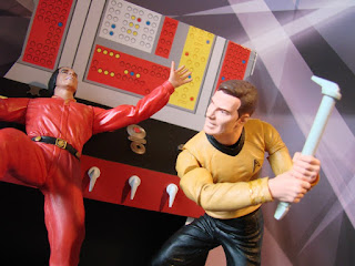
The first wave of Legacy Minimates Series 1 is out this week!

We've previously covered these eight twin packs on Some Kind of Star Trek so we'll skip the detail and just say it's time to get yourself down to the shops to get your fill. Costing around $9.99 (£6.39) per pair, these little (literally) beauties stand 2 inches tall with 14 points of articulation and an array of interchangeable accessories appropriate to the character point in Star Trek history. 

It was also a damn good excuse to stick the above picture on the blog because I just love it! (Thanks for the pic, Diamond Select - made my day) and just having the chance to get a mini-Kirk into the legendary Khaaaaaaaaaan pose is sure to get a lot of people reaching for their wallets or PayPal account log in details. Just check out the coat detail including the emergency beacon and the roll-neck sweater beneath - great detailing.

Kirk and Khan seem to be having a good week actually as we also get the release of the Space Seed diorama featuring the two legendary characters in action. Priced in around $24.99 (£15.98) you'll be able to spend hours recreating the Enterprise captain beating up the 1990's genetic superman.  Not only that, but it also includes the ability to place Kirk into a leaping position with support to pose the figure. Including a to-scale engineering wall panel this is a great addition to any collection - from the looks of it, this is one pipe dream Khan might wish to forget!

Tuesday 18 June 2013

The Enterprise Project: All White There, Captain?


Day Two of The Enterprise Project. Quick update.

Having cast a cursory glance over the blue yesterday morning post-breakfast I added a second coat last night which has done a lot to clean up the patchiness and give the clear plastic a lot better depth of colour. I don't think you can get a good sense of the difference from the pics but it is a lot cleaner than it was yesterday.

Second coat of Revell 752 applied
This also meant that I could enter the next step of the job - painting white matt onto white plastic. Not only is this massively time consuming it's also a difficult little task because of the matching colours so you need to be very careful and observant all the way through painting. 

I've decided to tackle the ship in three sections for construction and painting; saucer, secondary hull and nacelles. Small amounts of paint and steady work are best especially when hand-painting the saucer section. I'm not fortunate enough to be able to own a spray gun so this really is 100% hands on and a labour of love. Already I'm a lot more patient and not rushing to get the next piece complete which shows at least a level of personal progress!

Saucer painted - first coat of Revell 301
spot nacelle covers and deflector dish!
In fact this second hour of the project only saw me complete the second blue coat and then add a first coat of the white matt (301 in Revell terms) to the two saucer sections and the sections which make up the raised sections top and bottom (ie the bridge and the sensor platform below). I had a look at them this morning and the coat seems to have gone well. Tonight's plan is second coat on these pieces.

As with the clear sections I've tried to paint the saucer pieces while still attached to the frame - picture-wise this is nigh on impossible to show as it's white paint on white plastic. Anyway, I would get a stand or something to rest the saucer section on which does not come on a sprue and will need painting all the way round. I found a suitable tub to sit it on as pictured!

That's all for now. More painting awaits this evening, namely a lot of second coats of matt white.

You can keep track of my work by clicking on The Enterprise Project label below. This will give you the full list of blogs associated with her construction from box to shelf!

Monday 17 June 2013

The Enterprise Project: Revell in the Progress (warning - there's not a lot)


She's out of the box, plastic has been debagged and I've started!

I'm hoping that this won't be a five year mission in itself but I've managed to make a mark on the building of the Revell USS Enterprise from Star Trek Into Darkness.

Nor is it a massive step forward but I'll be giving a proper (and videoed) update at the end of the week chronicling my venture into the world of plastic model construction.

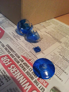
So far I've only tackled the Revell 752 colour (or "G" as it's labelled on the instructions). While it's a great colour on pictures it goes on like water and starts setting like sticky glue in about five seconds. A second coat on all these parts is definitely required. Just wanted to assure everyone that I'm not avoiding it - I received all the paint on Father's Day!

Apologies for the use of Sunday tabloid newspaper here (left) but you might be able to see that I've painted the blue onto the inside of the nacelles and deflector dish rather than on the outside - there is method to this madness and I'll explain in the update video.

This week I'm hoping to have a lot of the white painted with at least one coat. I'm painting most of the parts while still on the sprues to avoid fingermarks although a couple of the bits (above) have come off of their own accord. I've also decided that not being the world class modeller that I would wish to be I will be painting the basic scheme which is probably what a lot of Star Trek fans who want the kit but haven't done something like this before will be intending to do. It did take a bit of time to find out which clear sections were to be painted in this electric blue shade. Just be careful as it can bubble if it goes on too thick or quick.

I doubt that during the painting phase there will be much drama however those are likely to be famous last words. I won't be rushing so don't expect huge leaps in progress. I want to get this right and give you a good story of the work as I assemble her!