Showing posts with label Star Trek II: The Wrath of Khan. Show all posts

Wednesday, 26 October 2022

Lights, Camera, ACTION FIGURES!


Y'know what... thank god Playmates came along to drain my wallet now Eaglemoss has disappeared. I mean, what other Star Trek stuff would I have ended up buying? I dread to think.

The first wave of figures includes Saru and Burnham as seen in season one of Discovery as well as Picard, Riker and Data as seen from season three of TNG. Rounding out the eight arrivals we have a trio from The Wrath of Khan. There's Khan himself and, as we'll dive into here, Admiral Kirk and Captain Spock.

Now, while the TNG characters come in suitably retro '90's packaging, Kirk and Spock arrive in new styled boxes bearing the visage of each as well as the Star Trek Universe logo.

The boxes are nice to look at and well presented with each bearing a side tab to indicate who is in the box plus the usual blurb on the back insisting you purchase the other options available.

But these are never going to stay in the packaging in my house so don't expect this to be a hands off review in any respect. Let's take a look at Admiral James T Kirk for starters.

As with the TOS phaser, this is not going to give you Diamond Select levels of accuracy. For one the scale is significantly smaller but this in no way detracts from what is actually a decent reproduction of Kirk in his monster maroon uniform. 

Packaged up with a phaser, 23rd Century PADD and tricorder, Kirk is certainly ready for an away mission. The accessories themselves are just grey, unpainted moulded plastic although they do have a good level of detail so that is a positive.

The figure itself is really what we're here for. With 14 points of articulation there's not a lot you can't get him to pose for - that is if you can manage to keep the accessories from falling out of his hands.

The uniform is very well presented, including the rank pins on shoulder and sleeve as well as the service length pips and bars. There's the gold admiral trim along the front flap, the gold Com badge and belt buckle too for good measure. On the back we have the flap catch attached but missing the black centre of the xxxx. Again there's some minor painting issues around the black of the belt where it's been marked in over the base maroon colour. UPDATE: Thanks to the keen eyes of Marcelo Carvahlo though I am pointed towards one inconsistency - the flap should not extend around from above the delta - only from the centre line of the collar. WHOOPS Playmates!!!

Ok, some of the painting on these small details isn't exhibition level but let's just bear in mind that these are toys at their heart and are designed more of rough and tumble play than standing on display in a vacuum sealed case.

Everything is very posable - feet, hands, elbows and even the head can be moved fairly flexibly. Kirk's eyes do give me the creeps though as he's permanently giving a side stare. What I have noticed as well is that the physical features here are a lot less shiny and also much more in proportion to the bodies. One of the lasting memories I have of the original Playmates line is the oversized hands (bear with me on that one when we come to Spock) and larger than necessary heads. 

Likelihood was that they were larger to add in the needed refinements to distinguish Neelix from Chekov (extreme example) facially. Technology has certainly moved on with the figures now scaled more to their respective sizes so Picard for instance isn't as tall as Riker.

But back to Kirk before I digress once again. He also comes with a display stand which is a huge let down. The older stands had at least some detail and looked the part. This one is, in keeping with the accessories, just a moulded piece of grey plastic. However, if you're not using Kirk to battle Khan you'll want him attached to it or he'll be constantly falling over.

Then there's Spock. This is, unbelievably, the first Spock I've ever had as a figure and he infuriates me.
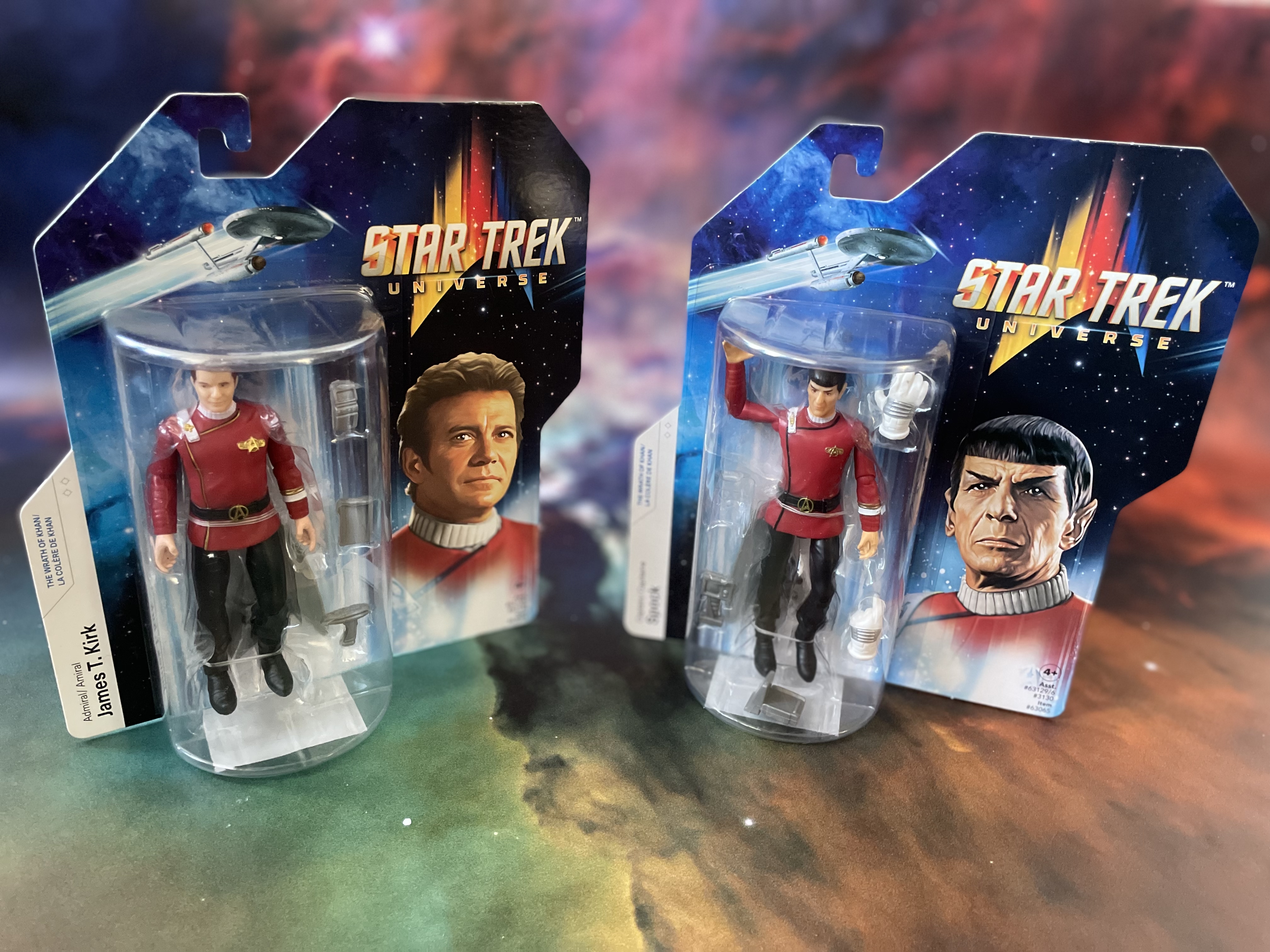
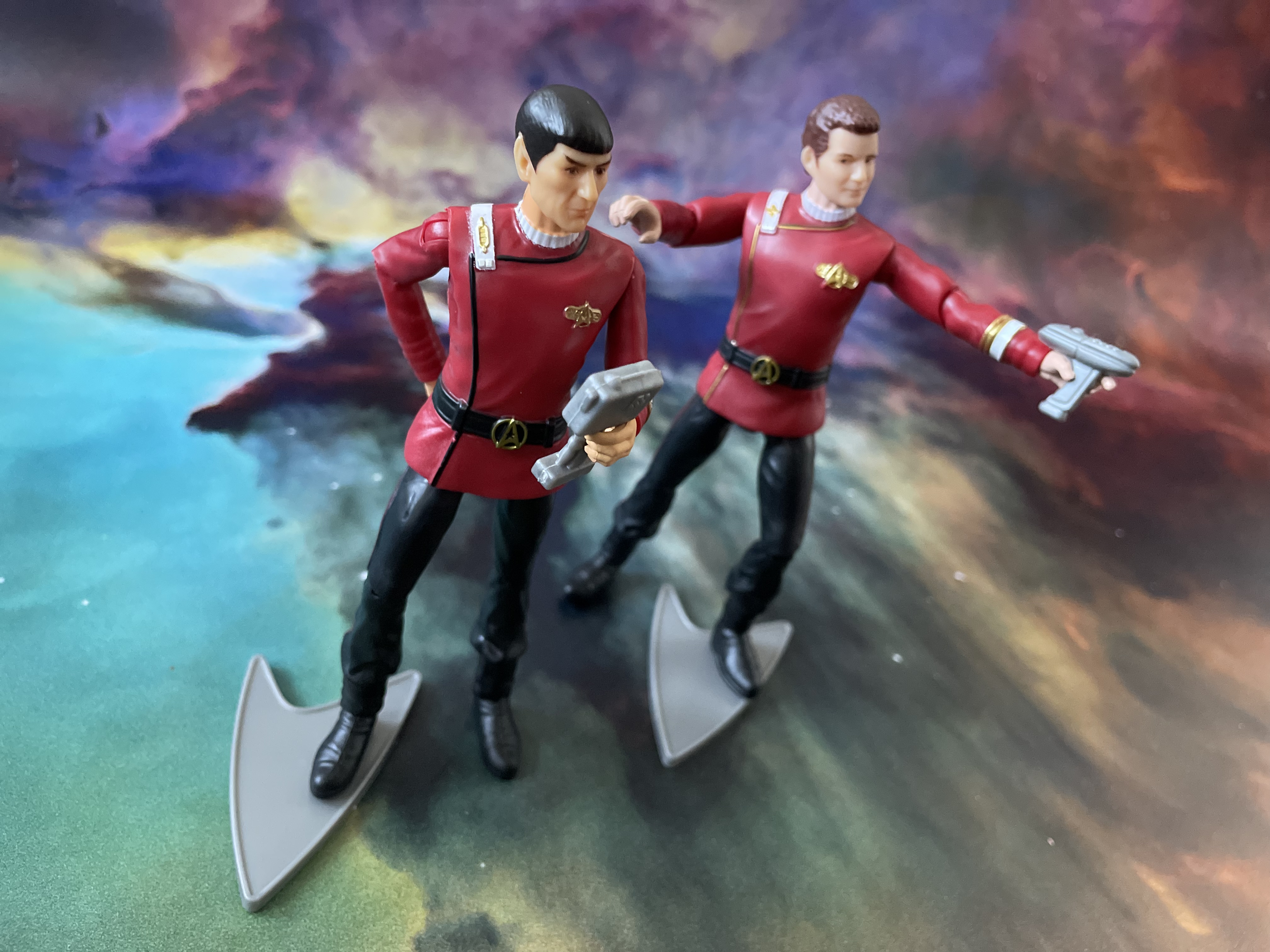
That's not logical I'm sure you'll be saying but for what reason did he have to be giving the Vulcan salute permanently?

Now I think this is a great reproduction and in the scale it's a marvellous recreation of Leonard Nimoy's features but that hand bugs me. The bodies (thanks again to Marcelo for pulling me up on this one) are also slightly different. Spock noticeably thinner while Kirk is more season three TOS than early season one!

Again there's some colour bleed where the base red is still visible on the rank and Starfleet emblem but I really do think they're as near as dammit when it comes to making this recognisably Spock. The eyebrows, the haircut and even the lines of the face are spot on. Thank goodness too that Playmates chose to go with a more focused gaze on the Vulcan than his superior.

Given that one hand is fixed into the Vulcan salute (which looks damn awkward when positioned), this means that only his left is available for accessory duty. With Spock there's a handheld scanning device and a clunky The Motion Picture/The Wrath of Khan tricorder but that's not the big draw.

In keeping with the theme of the figure Spock forgoes a phaser and receives the radiation suit gloves as seen towards the end of the second Star Trek movie as he valiantly tries to repair the Enterprise

Partially split towards the cuffs, the gloves do slide particularly well onto the figures hands and does, thankfully, cover that salute. One problem. However I look at it I'm thinking they're just a little too big, making Spock look like he's wearing two novelty foam hands. Worse, as one of my friends noted, he looks like he borrowed them from Sonic the Hedgehog.

It does force you to end up placing one of his hands behind his back if you're not a fan but it does also exude a certain Spock-ishness once you do. For note, the arm joints do seem to be a lot stiffer than the leg ones. When I was posing both of these the legs tended to try and head off in their own directions from hip, knee and ankle while it felt like trying to prize a Ferengi off latinum to move the elbows.

Ok, so it covers the hand and is a nice nod to the movie. It's also different because these are a lot softer plastic and  (shocker) in white with sliver highlights so they're fairly accurate to the movie. All you need now is a piece of plastic and you can recreate one of Trek's greatest scenes in miniature.

Reflecting on the more chunky 90's editions, these new Playmates figures are fair better proportioned and much more malleable than ever before. I'm not totally convinced if it's been 100% successful given the smaller heads but overall it looks to be an improvement and I'm keen to see how the line progresses. Surely the DS9 figures will be in the later uniforms? Will we get numerous Kirk variants? What about Enterprise? So many things to come as long as these first releases are a success... how could they not be? 

More Playmates reviews to come soon!
Enjoyed this article? Why not like and share to spread the word!

Like our page on Facebook 
Follow us on Twitter


Sunday, 12 June 2022

The Wrath of Khan at 40: The Classic Lives On


I was far, far too young to watch The Wrath of Khan when I first saw it.

My first experience of the movie doesn't come from 1982 when I was *cough* just two *cough* but from about three years later on a videotaped version from one of the (at the time) four terrestrial channels we could enjoy in the UK. 

It was the first Star Trek movie I ever saw and for a six year old it blew my mind. Honestly, I didn't realise that I was probably far too young for this movie as I just lapped up every scene with relentless excitement and awe. It was incredible, proper space battle stuff, phasers and explosions; Amazing! What more could you want from a sci-fi film? Apart from being slightly terrified by those ceti eels in a very much edited-for-Saturday-afternoon version.


This video was watched and re-watched with frightening regularity because it was and still probably is my favourite film of all time. If I'm right I wore the tape out because it was viewed that often and now I know the film, as many, many fans do, line by line. Each word is subconsciously pre-empted, every nuance and action anticipated but loved all the same.

I mean, The Wrath of Khan's brilliance has endured for four decades and - in fact when I originally started drafting this - I even introduced it to my wife who took it a lot more positively than I expected.

Melissa is in no way (read: any way at all) a Star Trek fan and would be happy if the s**t was removed from the house this instant and burned. But she has allowed it for many years and knows it's a part of who I am. Anyway, cutting back to the point, she watched it and enjoyed it. I might have even heard the comment of 'good film' in there somewhere. Mel has been more akin to the general movie-goer friendly JJ reboots and after watching those she dropped in during my in-sequence movie watch with The Search for Spock coming to realise that the more recent blockbusters merely touch the surface and offer a line into the wider franchise.

Going back and watching The Wrath of Khan was a great experience to see her drawn in by the story, the action, the subtle undertones and admit that it was easily the best of the movies. It was pretty much as I did back in the mid-80's watching Ricardo Montalban chew the scenery for the umpteenth time and eye roll at the recognition of Chekov which is the stuff of Star Trek legend.

Khan
is in no way a hard movie to say why it's so good and even the franchise itself has attempted to copy its brilliance with varying levels of success - First Contact and Into Darkness being those polar opposite examples. Indeed it's influence reaches into the writing of The Voyage Home, the writing and directing of The Undiscovered Country and ultimately to the direction of Discovery with the inclusion of Nicholas Meyer into the show's writers room. Heck, there's still that rumour that a Khan mini-series will happen and even in the last episode of Picard's second season there was an ominous reference to Project Khan in the hands of Adam Soong. It's influence cannot be underestimated which isn't bad for a movie that had a fraction of the budget of its predecessor. Think about it for a moment and just how much is reused. The Klingon K'tingas, Enterprise in spacedock, the crew uniforms are dyed rehashes of the ones from The Motion Picture and the two main sets - the bridges of the Reliant and the Enterprise are the same set

Even just with those you would be laughing and mocking a movie if it were made now and rehacked a substantial amount of its forebear but in that respect The Wrath of Khan is unique. The story is a huge upgrade, the stakes are unequivocally raised and slot in one of the most gut-punching final acts in cinema history and the sedentary plod through V'Ger is easily banished from the mind. 

People ask if you can single out moments from the movie which are classics but I find it hard to pull apart what is the perfect Star Trek movie. There is true heart, character and loss in every cell of the film from the opening "In the 22nd Century" right to Nimoy's one and only time recital of "Space; the final frontier...". No other Star Trek movie packs so much into its running time and effortlessly feels like every minute is finely balanced, every line just necessary; no more no less (more on that in a sec).

The legendary six day Meyer rewrite may have given The Wrath of Khan the kick that the franchise needed after the pedestrian nature of The Motion Picture it was a vibrant visual spectacular with those monster maroon uniforms, phaser battles, a submarine-like hunt in the Mutara Nebula and the Kirk/Khaaaaaaaaan exchanges but how come it's endured for so long and how come I still find it my go-to Star Trek movie more than any other?

It has matured exceptionally well with my younger self enwrapped in the action, the explosions and the burning starships but as I've grown older each viewing has brought something new to light and a new angle to view it from; life and death, winning and losing; vengeance and perhaps interestingly, growing older itself.  Like Kirk, I tried the desk job and it wasn't for me and I went back to something that I enjoyed before it was too late (!) and still after all that it still resonates. I might not be watching it with the regularity I managed in the late 80's but there are at least a couple of re-watches a year, even if it's just to enjoy the adventurous James Horner soundtrack.

Each scene delivers and provides almost a mini-cliffhanger as we bounce between the Enterprise, Reliant and Regula One with themes explored at the beginning re-emerging later in the movie without feeling forced. It's an action adventure that carries more weight than you think and barely has the two main protagonists speaking to each other let alone ever physically meet.


The Wrath of Khan really affected my views on Star Trek from something that I watched on a Wednesday night into something that I absolutely loved. I can remember recreating the final battle with my Ertl USS Enterprise which had been adorned with phaser and torpedo damage just as the ship had been in the Mutara Nebula - it was on the TV version of the ship however but my young mind could easily make the jump as the Enterprise rose up behind the Reliant/over the bedside.

Believe it or not this is actually going somewhere because June 4th 2018 marked 36 years since the movie was originally released and it still looks great in every frame and with every spoken line. It has everything you could possibly want from Star Trek and I firmly believe that without the success of this movie there would be no franchise today. The Wrath of Khan is one of those moments where Star Trek actually got it right in the right way at the right time. All the elements needed were where they needed to be and it pounced on the move to the cinema with veracity and energy rather than treading a similar line to The Motion Picture. 

Without the renewed vigour and dynamism of The Wrath of Khan, Star Trek may well have become a sci-fi footnote of 79 episodes and two so so movies whereas instead it breathes life into the show which still exists today. If you were to encapsulate the effect of this story in one word it would have to be ‘monumental’. A moment that is off-referred to, imitated both outside and within the franchise and still as fresh today as it was in June 1982.

Indeed, just think how many references to Augments, Ceti Eels, Ceti Alpha V, Khan himself,
great fictional works, the needs of the many or even the Kobayashi Maru have pervaded the franchise since this point - how many times has it perhaps attempted to regain that moment of "perfection"? Maybe the other way of looking at it is that The Wrath of Khan spawned the greatest period of Star Trek's history but was it also the most polluting factor at the same time with everything being rated against the second movie in every sense meaning that future writers and directors were consciously or unconsciously using it as a base?


Now in 2022 I can add another few paragraphs to my love of this movie because I've finally watched the Director's Cut. The differences are subtle; the nod to Scotty's nephew, slight extensions to a few of the scenes that add a little more depth to the narrative (and an odd one or to that actually remove a touch of the dynamic) but as a whole it still proves that this is a classic. Polished up and with some great extras it's a must to any collection and will more than likely be pressed up against the inevitable 4k Blu-Ray render of The Motion Picture that's recently arrived.

Perhaps back in 1982 there was even more riding on the success of a sequel than there was from The Motion Picture. That had proved the franchise could work on the big screen and attract a good size audience and takings but The Wrath of Khan had to do more for less. This one had to prove that there was longevity to this direction and it did that in spades. Even today there is no other film I have watched or quote more than this one, there is no other movie I have seen more times than this nor one that I enjoy as much on each viewing.

Star Trek II The Wrath of Khan has been revered and imitated within its own franchise walls for 40 years and that love does not look set to dissipate any time soon. Maybe though there is one more thing for me to do with it and that's to see it up on the cinema screen itself as along with The Motion Picture and The Search for Spock it's one of only three Star Trek features I've not experienced in that environment. Fingers crossed it doesn't take another 40 years for me to make that happen. 

Enjoyed this article? Why not like and share to spread the word!

Like our page on Facebook 
Follow us on Twitter

Thursday, 6 January 2022

To The Last: USS Reliant NCC-1864 XL


Aaaaaaah Kirk my old friend, do y-

Sorry, getting all reminiscent for the most revered of Star Trek films by just being in the same room as the HeroCollector XL USS Reliant NCC-1864.

Now you're likely to be getting tired of these by now so I'll try not to repeat too many lyrical waxings while we cover off this classic.

The big thing to recall here is that the original issue 11 Reliant was already an upgrade when it arrived on shelves back in 2014. Eaglemoss had made some steps to resolve the painting issues, thinned the paint out, tidied up the decals and even got that key aztec detailing right.

Move forward to today and the larger Miranda Class which is a brilliant celebration of everything great in the collection. It's frikkin' gorgeous from head to not-so-far-away tail and manages to avoid a lot of the criminal issues that the collection hit - bar one. 

The aztecing is just stunning and with a larger hull canvas to display it, the Reliant blows away the competition with this precise and engrossing paint job. The phaser banks are painted in however the beam points are noticeably missing. Ship registry is particularly loud and proud but god, what the hell happened to the name? The lettering almost disappears into the paintwork and the pics here make it look better (slightly) than it actually is. Special mention here as well because the inner black characters sit bang in the middle of the red bordering. Got to be a rarity!

Eaglemoss have marked in the customary RCS thrusters and navigation lights plus they've avoided recessing the windows and instead have opted to paint them on the edges of the rear section. Even on the bridge module have Eaglemoss chosen to take this approach meaning the windows sit within the grey banding. Note too that the grey banding at the top of the bridge module present on the regular edition has now been removed.

The hull panelling on the XL has much tighter lines between each section and the new paintwork has the added benefit of taking the shine off the whiter finish of the issue 11 version. 

The larger hull also allows for the more precise painting of the exposed technical elements behind the bridge and behind each of the sensor units that are decalled with the Starfleet delta (either side of the bridge). Those latter recesses are much deeper here with the darker grey paint not blotting out the details.

The larger technical elements to the rear of the hull again benefit from the scale and thinner grey coating but for me one of the bigger forward steps is in the work on the sensor bar. Phaser points and photon torpedo tubes are far more recognisable as elements seen on the model in the second Trek movie with the panel work and raised elements looking far, far better and closer to their actual appearance. 

Taking the shine off the paint really has made a massive difference and this is not the first time we've mentioned the paint updates - Enterprise-D and Equinox being two recent ships we've examined from the XLs. 

Onto the underside and the curved striping decals have been thinned (as was done on the dorsal side) and the registry has much better, more screen accurate definition. On the smaller version the coloured borders are absent while here it's back in place as it should be. The RCS thruster detailing has been reined back in while there's been a lot of paintwork updating around the rear, darker grey sections. 

These have been more precisely coloured with the warp field generator getting a good deal of attention. This is now clearly segmented and painted in individually rather than the blanket blue. Nor does the dark grey seem to extend as much around the rear of the ship which does provide some more hull detailing to breath.

A huge reworking comes in the form of the warp engines. The thin oblong drive units feature translucent warp grilles as well as the standard aztec paint scheme. The fitting of the warp nacelles is much more exact. No horrid gaps or flaky edges on this version which has the units tipped off with the ship registry. Their fit into the pylons is seamless with the horizontal join line barely visible.

Construction on the XL USS Reliant has been altered with the whole of the underside of the saucer now a single plastic insert rather than there being an untidy seam halfway along the underside of the ship. This leaves the upper hull, front to back, as the only metal section with the engines, rollbar and already mentioned underside being plastic parts. 

That's not a bad thing because as the Reliant learned from earlier issues in the series, this XL has learnt again and shows the development forward for Eaglemoss. Different construction methods, refreshed decals, updated elements and more reflect that this, unlike the Enterprise-D, is not just a scale up of an existing model. The ship name front and centre does bug the cack out of me because of how it fades into the hull but all said and done that's the biggest gripe I have with the XL starship.

Honest. It's a work of art with the joins all perfectly in sync. From every angle it looks finished and with a lot more care to boot. For anyone who is a fan of The Wrath of Khan or the Miranda Class in one of its many iterations, this is a high class replica and one of the finest that Eaglemoss have produced within the XL line. USS Reliant is a must for anyone and I kick myself for having waited this long to get hold of her. 

Reliant's magazine sticks with Star Trek II and examines the return to the big screen of the classic crew following The Motion Picture as well as the creation of the unique and groundbreaking CG Genesis Device sequence. There's also a dive into the making of the plot-driving Ceti eels and how they were brought to life for The Wrath of Khan.

Easily one of the best all-round packages produced in the XL line and maybe in the collection as a whole. Definitely one for your shelf and one that is destined never to find herself back in a box. Keep an eye out for a price reduction or a sale because this is one you'll need to have in the basket.

Check out all our Online Starships posts HERE

You can find out more on the Star Trek Online Official Starships Collection by visiting the Hero Collector website HERE

Enjoyed this article? Why not like and share to spread the word!

Like our page on Facebook 
Follow us on Twitter

Tuesday, 20 July 2021

Shuttles 5: Movie Dominance


It's a bit of a shuttle bonanza this month from SKoST with sets two, five and six all getting featured over the next week.

While there was a more TV themed selection in set two which we looked at recently, set five turns much more towards the big screen.

Classed as instalment 17, the Air Tram is a product of The Motion Picture, delivering Admiral Kirk to Starfleet Command. While that introduction is impressive, the model less so.

A combined two pieces of plastic form the shape of this oblong transport. The aztec paint job, the blacked out windows and the decaled registry and UFP logos do help it stand out but tragically its 1970's design is the ultimate let down. OK, it's better it turned up in this set than as a standalone (or is it?) but this is probably the most uninspiring shuttle from the whole seven sets produced to this point in time (still sets four and seven to add to the collection but we'll get to them I'm sure...). 

Its onscreen likeness is captured perfectly well with the resultant model showing off the sleek shape and bisected with that red horizontal stripe also concealing the join. The red edging on the numerical decals too isn't very precise when it's sitting next to the Starfleet Tug and the Galileo. It's just ok if truth be told and yes, the nav lights and thruster points are all in the right place but the Air Tram is totally outclassed by the other three craft contained in the pack.

In contrast the Starfleet Tug is a weathered, slightly battered affair that immediately indicates its working nature. There's a bit of a sheen to the curved viewscreen at the front but the rest of this little craft is modelling excellence. It also shows up all the problems that face the 100% plastic Air Tram. Once more combining metal and plastic, the Tug paintwork has a mottled and uneven effect all the way across its distinct panelling. The "5" decals on top and sides also have a near perfect red edging effect that's evenly spaced to the central number PLUS the cross hatch pattern lies precisely along that rear edge. 

Even to the rear, the worn paint work comes through and on closer inspection of the hatch tape you'll spot that even that is showing slight signs of wear and tear. The black decals to the top are a little too clean as are the darker grey curve sections at the back but Eaglemoss have achieved a good recreation of such an often (in the movies) seen piece of Starfleet tech.

Applauding the Tug is one thing however the Voyager Type-8 shuttle is a mixed bag of all that is good and bad with this set. The recreation of the physical item is pretty decent. The panelling isn't perhaps defined enough for me but there's a good balance on the colours and attention to detail when it comes to the placement of the decals and the choice to go with the translucent blue plastic for the warp engines. Some of the venting detail on the sides and the RCS thrusters are marked in well BUT...

The paint and quality of the decals on this one is almost shocking. The window black is chipped in places and doesn't completely fill the frames, the red of the impulse engine intakes has bled out of its shape and most disappointing is the legibility of the decals. Ok, the Starfleet pennants are in the right place and crisp but everywhere else the markings are horrid. Borders are misaligned, blurred  and in the case of the blue script under the side windows it's even impossible to make out the letters. Yuk. 

To a degree even the paintwork feels a slight bit dirty and rushed on this one. I like the design here but its the finishing touches which don't add up to something better than the individual parts. Second dip of the pack - can we at least draw a 50/50 result with the final one of the set?

Keep everything crossed because this one's a favourite of mine; the Galileo from The Final Frontier. Let's get the jokes out of the way first. The film isn't Trek's finest hour but the shuttles (Galileo and Copernicus) are among some of its sprinkled highlights. Indeed, these shuttles would have an impact that can be seen in both TNG and in Generations where the original full-sized versions were hacked about to be used for other ships.

The horrid bit of the Galileo is that central, horizontal join line that screams at you every time you turn her sideways. On the port side it's also wider than starboard but that's my biggest criticism of a ship we haven't seen in model form other than as part of the AMT USS Enterprise refit for The Final Frontier and The Undiscovered Country. There's also a sprue point that's not been sanded out enough but I only spotted that in a super closeup check. This scale work better for the shuttle too with a decent single colour paint job providing that matte finish. The blacked window is properly coloured in and the RCS thruster ports are also painted in perfectly along the central lip of the ship.

The decals themselves from the pennant along the side to the "5" numbering is also spot on and evenly printed so you can actually read it. What I also do love are those blocky movie style engines hanging out to the sides. The support struts are a lot stronger than on the original TV Galileo model from set one although the painting of the grilles to the front and sides is patchy. 

The Galileo here has a distinct shape to her and one we would, of course, see again in several chopped up forms so it's good to get up close with the original version. I'm a little saddened that the lights underneath aren't painted in but it's a step up from the quality of the Air Tram and the rushed nature of the Type-8's paintwork. This one does have a super smooth finish that's not tarnished with lumps and bumps. It's also annoying that the Tug probably trounces this one for top dog in the set if only down to its build quality which doesn't give too much away.

As with all previous sets, each shuttle comes with its own lithograph LCARS print to display with it and a small mini (MINI) magazine. Each details purely the in universe appearance of the craft in question with some nice images from screen appearances and new CG created specially for this release. As with all of the sets I'll again note that some form of designing articles wouldn't have gone amiss with these!

Check out all our Starships (and shuttles!) posts HERE

You can find out more on the Star Trek: The Official Starships Collection by visiting the Hero Collector website HERE

Enjoyed this article? Why not like and share to spread the word!

Like our page on Facebook 
Follow us on Twitter

Thursday, 19 November 2020

On the Edge of the Nebula: The Official Starships Collection: Regula One


Incredible to think that turning a model upside down can create one of the most memorable places in Star Trek.

The Regula One space lab was at the very heart of The Wrath of Khan and throw in your Eaglemoss refit Enterprise and Reliant and you're got yourself a recreation of the film's last 30 minutes.

When you do a ship collection review there's always the temptation to use the words "long awaited" and the phrase "should have been done years ago" but hey, I'll avoid both of those and say this is a great replica and done on the right scale....that's been long awaited and should have been done ages ago(!).

Items such as concept designs, weapons platforms and satellites are perfect for the bonus line but Spacedock, K-7 and this deserved to be done in Big Scale - they are iconic and indelibly etched on the mind of Trek fans of all ages. Think about The Wrath of Khan and Regula One is always going to be up there as an essential piece of the tale.

The Eaglemoss Special Edition utilises the same stand design we saw with the Spacedock model some time back, allowing for a more "suspenseful" display and shows off all the parts of the station unhindered.

Probably the most crushing disappointment is that piece on the top of the station. A plastic segment which should be painted up in bronze and be more of a tetrapod structure with the aerial above. However, and I'm guessing it's down to the usual cost and trickiness of manufacturing, we have what looks like something you'd use to sit in the middle of a pizza box to stop it collapsing. 

The colours on the magazine cover totally throw a curve ball too and while they correctly display that aerial structure, the colour of the main hub section on which it sits is a lot darker than both the model and what you can see in The Wrath of Khan. The metal hangar section is well decorated with venting as well as some form of nodes around the upper edge. Again the window positioning is slightly off the raised markings but generally it looks pretty good. Some of the panel painting is sketchy around the edges (dark grey doesn't get into some corners) but the mid, recessed piece has some nice darker greebling BUT AGAIN suffers from some inconsistent painting.

The hangar doors and the sunken entrance to them are a prominent feature of Regula One and here they carry that distinct "X" and the lines to indicate the separation points. Yes, AGAIN there are paint blemishes and even as we get further down it seems to be limited solely to anything in this dark grey.

Connecting into the plastic base is a spoked wheel-type piece which sort of goes against my argument as to why they didn't get the aerial piece correct at the top of the lab because that cutaway kind of effect is done perfectly here and is even combined with some panelled paintwork. There is a nasty and somewhat obvious mould line around the edge of this bike wheel and, frustratingly, some of the patches aren't even matching.

The structure below this offers expansion arms plus two already in place structures to either side which have been established as habitat modules with one of the larger four circular elements also housing what appears to be a space telescope of sorts. The fact this isn't all blobbed into one piece isn't lost on me and the detail, although subtle, is definitely the right move and with that piece being open it helps create a better look for the station plus it provides a sense of depth. 

This level also benefits from a few dabs of red paint and towards the centre of the station you can also see some decals for the airlocks - one of the only markings visible on the lab. Then further below that we have another hollow ring with an edge that sweeps back towards the central structure and is covered in windows.These are also recessed and are painted perfectly and seeks only to draw increasing attention to what now becomes a very out of place aerial. Look at it too much and you might notice that it's also a shade off the paint colour of the rest of the station!

The tan tubes to the bottom operate as storage tanks for the space lab and what this screams out for is a bit of weathering. Overall the station looks great but as with a few in the main collection it might look a little too great and needs to be dirtied up for that additional layer of realism. The tanks are conspicuous because of their unnatural cleanliness and just a bit of dry brushing might work enough "dirt" into a few crevices.

That lighter paint finish does play with my mind a little since on screen it's a lot darker and more in keeping with some of the feature parts; but then it was in deep space...in the dark so that might explain a few things plus you can finally get a good look around the curves and corners that weren't as easy to see.

The magazine is a bumper wet dream for The Wrath of Khan fans filled to near bursting with details on the background of what is generally considered the best movie produced. Giving a sprinkle of backstory from the big screen we do get to see how the office complex from The Motion Picture took a 180 degree turn and lost a few parts to morph into its more recognisable shape plus there's a very interesting section on how the miniatures were filmed and some of the classic sequences were put together thanks to ILM.

The package as a whole for this one is spot on. The model itself has one glaring, crushing issue right at the top but look beyond that and both the magazine and the model have a ton of redeeming features which lessen the impact of that design choice. It's rare to see this iconic piece of hardware anywhere and to have Eaglemoss recreate it on such a scale and as part of their specials series is more than we really deserved. You might not be a fan of the gold but this is one that you'll be hard-pressed not to add to your shelves in double-quick time.

Read all our other reviews of The Official Starships Collection from issue ONE here.

Enjoyed this article? Why not like and share to spread the word!

Like our page on Facebook 
Follow us on Twitter
Find us on Tumblr 

Saturday, 14 November 2020

Mr Spock's Little Book of Mindfulness


What with The Wisdom of Picard from Simon and Schuster, HeroCollector have also gone for something quirky in Mr Spock's Little Book of Mindfulness.

But don't go all out thinking this is some sort of in depth self-help manual because it's taken with a light-hearted approach right across from the words to the free-style illustrations which provide a very individual look to this new publication.

Running to just over 100 pages (116) and nine chapters, Glenn Dakin - recently involved with the brilliant Quibbles with Tribbles - has returned with a book to help us all be that little bit more Vulcan in our lives. 

Offering up advice and direction from the universe's most famed pointy-earred hobgoblin (just quoting McCoy peeps!), Spock's experiences in life are right at your finger tips should it come to Self-Acceptance, Truth (Vulcans always tell the truth nor do they bluff...honest), Family, Love, Change and more. But don't be taking this all too seriously because there is without question a very tongue-in-cheek approach to the writing and certainly the Quentin Blake-esque illustrations placing Spock in some less than logical and emotion-free positions. Every one has real life to it and doesn't fail to raise a smile - the enjoyment is turning the page to see what he'll be up to next. 

The research from Dakin is once more excellent with the author diving into not just The Original Series but probing into the furthest corners of The Voyage Home and The Undiscovered Country and past that into the realms of Discovery to uncover just the right words of wisdom and guidance from Spock. Nothing in here from the Kelvin Timeline which does make you wonder if anything from that path made any sense...!!!

Anyway, I digress slightly because not only does Dakin relate these quotes and sections to our everyday lives (Vulcans don't have social media...) but flips it all around to demonstrate that sometimes the logic isn't always perfect or works out as planned (the needs of the many...or the one) and cleverly weaves in a bit of a deep dive into Vulcan philosophy and their own background as a race including The Animated Series because hell, 

This is one of those books that seems to give in different ways each time I come back to it. I'd err on the side of reading a bit a day rather than piling through and taking in each section at a time as you will end up thinking back to particular episodes, instances and phrases - but don't worry if anything eludes you as Glenn Dakin has also included a handy quote reference section at the end which will align you to the right episode or movie for further details. 

Mr Spock's Little Book of Mindfulness is one of those volumes that sticks in your mind and not
just for the title. It can be a little whimsical in its narrative at times but the whole is such an engaging read with real love for the franchise permeating every page and word because Dakin manages to balance the line of keeping it tonally light while both honouring the legacy and poking that little bit of fun at the franchise with the twists and turns woven into Spock's story - for continuity fans you'll have a whale of a time I have no doubt. 

Being a Brit too means that, for me, the humour in here works that much more successfully than a good chunk of the jokes did in Lower Decks and for that, I can guarantee I'll be diving into this Little Book for many occasions in the future and hope to see more of Glenn Dakin's work be it the written word or cartoon very soon!

Mr Spock's Little Book of Mindfulness is available now from HeroCollector HERE priced £11.99

Enjoyed this article? Why not like and share to spread the word!

Like our page on Facebook 
Follow us on Twitter
Find us on Tumblr

Sunday, 18 October 2020

The Blagger's Guide to...The Classic Movies


You've done it - blagged your way through your first Star Trek conversation you total legend you, but now your peers have pushed the boundary and mentioned something called The Wrath of Khan

You'd previously thought this was some sort of euphemism for stomach ache but after taking our extensive Lesson One on The Original Series (aka Star Trek), you're aware that this might be a reference to that guy with the ponytail and corny chat up lines.

Oh heck, they're moving into a new field - but what do you do? Never fear my friend because it's time to take a quick spin into the years between 1979 and 1991 - we're taking Kirk to the cinema!  

It's a real rollercoaster of excellence, missed opportunity and Shatner ego contained in just over a decade. At the centre we still have that familiar crew we discussed in The Original Series - but they're older, wiser and in some cases, wider.  Observations that Kirk seems to be wearing a hairpiece or that Spock's ears seem to change shape every movie are expected standard fayre as you go through the six movies. Scotty's newfound love of facial hair is another change that Trekkies can be guaranteed to notice when in packs...that and Shatner’s fondness for hairpieces...

Star Trek: The Motion Picture (1978)

Key Villain: None except for a giant space cloud. Klingons get a cameo. Could include Roddenberry if you want a fight.

We know you're not a fan yet, but if you're going to tackle this one, drink some Red Bull. Legend has it entire millennia have passed unnoticed during the journey through V'Ger and you could watch the entirety of The Original Series just in the bit where Kirk tours the Enterprise in a shuttlepod. Don't worry about looking for your LCD TV's warranty either, that beige look you get isn't a fault, it's what it's supposed to look like for the full two hours

Key suggestion - say "oooh" and "aahhh" every time the Enterprise comes on screen and openly initiate a note on whether or not this is a totally new ship given the extensive overhaul. Avoid mentioning how great you think Decker and Ilia are as characters and that you look forward to seeing how they are developed in the next five films.  If you really want to open up the fandom can of worms, start a sentence with, "I mean, why the heck did they need to redesign the Klingons...?" and watch the sparks fly between fans of Discovery and everyone else - bring snacks because it's gonna be a right bunfight. Don't worry about discussing the actual plot of this apart from the last ten minutes because no-one else will really remember either and will already be thinking ahead to the next one.


Star Trek II: The Wrath of Khan (1982)

Key Villain: Khaaaaaaaaaaaaaaaaaaaaaaaaaaaaaaaaaaan (say it now, scream it later)

Put the disc cleaner through the blu-ray player because colour is back in town and this is hallowed territory. The guy with the ponytail from The Original Series is back and this time he has pecs and a set of muscled dancers as his posse!!! Now, it may be difficult to blag this one without watching it and memorising the script but here goes our attempt to have your back.  

Standard comments expected will include note of how in the world Chekov knew Khan when he wasn't on the ship during the original episode (Space Seed) plus just how much of The Motion Picture was reused to save a few quid. That said, you'll have to mention the USS Reliant which was originally designed to be the other way up and how tragic the story of Kirk's son is. I would memorise the following quotes; "I have been and always shall be your friend", "Have you ever heard of the Klingon proverb that says revenge is a dish best served cold...?" and "Kobayashi Maru". 

The last of these you can drop into any conversation with Trek friends where the topic is something extremely difficult to accomplish, nay impossible. Your "...you know what..." comment can be that it was neat to reference Ceti Alpha V in Enterprise when they showed the alternative future in season three. Remember friend, you cannot in any way diss this movie or you will be cast out of the Trekhood for all eternity. Additional: it is mandatory to show emotion when the last fifteen minutes are discussed as this is a zenith for fandom. No need for words, just a bowing of the head and a solemn silence for five minutes will do.


Star Trek III: The Search for Spock (1984)

Key Villain: Kruge, Chekov's wardrobe

Title says it all and directed by the guy who played Spock. That's a lot of Spock for your money. Cleverly point out that the guy playing the Klingon Kruge (there's that K thing we talked about in lesson one) was in Taxi and Back to the Future but do it as a compare (was he better in "X" or "Y") rather than a straight fact.  Also drop a comment in about how the Excelsior is much better later on when Sulu is captain (plus points for the cross reference to The Undiscovered Country). 

Yes, I know this is a spoiler for the uninitiated but it will at least make it look like you have some idea of what's coming. You should at no point act surprised that Spock is back nor that he conveniently looks like Leonard Nimoy again by the end, you just have to accept it. It's also one of those pieces of Star Trek that fans like to quote; "If my grandmother had wheels then she'd be a wagon..." (Scotty about Excelsior) and "Zero...zero....zero...destruct...zero" being another. 

Important to state how amazing the destruction of the Enterprise is in comparison to every other ship obliteration ever - including the saucer crash in Generations (lesson four). 


Star Trek IV: The Voyage Home (1986)

Key Villain: None. Giant Space Probe sapping Earth dry but not in an evil way. It just wants to talk to the whales.

Maxing out the 1980's, this fourth film was a big box office winner. Closing a trilogy of films, you can lighten up while watching this one, laugh at the fairly on form Star Trek humour and marvel at the fish out of water story. When this comes into conversation you should immediately choose to comment one of the following; "Double dumbass on you", "Where are the nuclear wessels?" (emphasize the "w") or "What does it mean 'Exact change'?", all of which will continue to cloak your lack of Star Trek knowledge as successfully as a Klingon Bird of Prey and raise a knowing laugh from your peers.

Triple fan points for dropping in background notes that Eddie Murphy was nearly in this playing a scientist and that part of the reason it did so well at the box office was because frankly, who the f**k was going to watch Superman IV?!


Star Trek V: The Final Frontier (1989)

Key Villain: Sybok, the writers, the director, the producers

The first rule of The Final Frontier is that you do not voluntarily speak about The Final Frontier It's one of the few occasions Trekkies have every right to launch a verbal tirade at their own beloved property so take this opportunity by the proverbial horns and dig in for a wild ride.  Complain bitterly (but don't over-Shatner it) that The Final Frontier is dross and not worth the screentime, moan about the cut budget, that the special effects weren't done by ILM, that Scotty banging his head is NOT funny and that the true vision that Shatner had is lost. 

Do say how nice the Enterprise-A bridge set looks and that the shuttles are cool but that's IT. Set your expectations low for this one to avoid disappointment and it's more than acceptable to scoff at the inability to correctly sequence deck numbers when rocket-booting up the liftshaft. 

Cool points in this one for cross-referencing the use of sets from The Next Generation (don't worry, that's in our next lesson) and that at no time ever has Sybok been mentioned in Star Trek before or after this point in time. You are most welcome to add in for a gold star on your chart that (do this sarcastically) it's not like Spock has any other family we've never heard of (scoff, scoff, wink).


Star Trek VI: The Undiscovered Country (1991)

Key Villain: General Chang and assembled conspirators, the one time Klingon blood is purple - and they make a MASSIVE thing of it...

Kirk and McCoy arrested! Sulu captaining the Excelsior! That guy who guest-starred in the last one is back as a Klingon and that one from Sex and the City is a Vulcan (make a crude reference about photo shoots on the bridge with a knowing wink).

Someone rammed this movie full to overflowing so much Christian Slater pops by - it's even got the head of the Von Trapp family spouting Hamlet while he shoots at the Enterprise but manages to avoid going into full song mode.

To be fair, these guys finally realised it was time to call it a day with their sixth outing and it's a good one. If you've hacked The Final Frontier without considering therapy then this will be a breeze and is as varied as The Wrath of Khan. You are permitted to say this is your second favourite but all must come after that sacred second movie. Lots of action, give nods to the story (even if it is showing the Federation negatively regarding the future of the Klingon Empire).

Once you have completed Lesson Three on The Next Generation you'll be able to link this one back in some of the sets plus a cameo from Michael Dorn as Colonel Worf (just go on about how cool it is that Worf's grandad is the defence lawyer in the court scene for now).  To step up a notch there's a chance to discuss why Voltaine is on the bridge when he "apparently" died as part of the flashback Flashback in Voyager (lesson six). Also spontaneously shout, "So where's Tuvok?"

There you have it, you're two lessons into becoming the ultimate Star Trek blagger with a set of knowing facts. The movies are ground that is trodden many a time and fans will have watched all of these six at least ten times a year so be very careful how deep into conversation you get around them.

For lesson three we will be steering towards the final frontier and where no ONE has gone before...get ready for The Next Generation!