Tuesday 25 December 2018

Saru Shines: Short Trek's The Brightest Star


After a leap forward of 1000 years for Calypso we turn the clocks back slightly for 15 minutes to highlight the early life of Discovery's science officer.

For the first time here we get a real insight into the Kelpien way of life and while the first season set them up as a "prey" species I have to disagree that this instalment makes them seem more as a race farmed for another.

There is no hunt, no fight for survival more a willingness to accept that they will be called away from their lives at some point by another, controlling force.

It is in some ways a classic story with Saru watching the events unfold on his homeworld but opening his mind to more than the closed existence of a Kelpien caught in a never ending cycle of servitude to an unseen force.

The Brightest Star takes us not just away from Discovery for the first time but also opens up a much larger cast with Kelpien background characters, Saru's immediate family and a rather special guest appearance all crammed into a quarter of an hour tale.

The homeworld appears idyllic during the day with expanses of wilderness but the night time is a different matter with the ominous monolithic element from the overseer race always in the background as if monitoring the Kelpiens. It's quite 1984 with its Big Brother suggestion and Saru using a piece of acquired technology to make contact outside of his closed circle.

It's a key scene-setting tale with a pivotal ending that I won't ruin but it nicely ties this story directly into the Discovery narrative and may well tweak how you view the first season of the show on subsequent rewatches. I'm really thrilled with the way that Doug Jones carries off this younger and more innocent version of his Star Trek character embodying a naivety that leads to, perhaps cliched, a self-discovery and awareness of a bigger picture.

Ultimately Saru makes a grand sacrifice that takes him away from his father and sister which unquestionably extends his life and offers a great adventure. Like Runaway and Calypso I will be a little gutted if some of the themes and story-points are never referenced again or built upon because the shorts have offered something unique and exciting to the Discovery lineup. 

These quirky, sharp tales have refined their narratives, removed anything unnecessary and laid their central characters more open than ever before and I can't wait to see how they tackle the Discovery version of Mudd just before the arrival of the second season in January.

How did The Brightest Star compare to Runaway and Calypso? Improvement?

Live on YouTube
Like our page on Facebook 
Follow us on Twitter
Add us on Tumblr
Monday 24 December 2018

Variation on a Theme: The Official Starships Collection Issues 138 and 139


Just when you think you’ve had enough Miranda Class variants another one turns up.

Yep, the most recent editions of the Official Starships Collection from Eaglemoss have brought fans a fourth iteration of the USS Reliant design with the USS Lantree from The Next Generation’s Unnatural Selection

The observant Trekkie will know that the only visual difference between the Reliant and the Lantree is the missing weapons rollbar from the 1988 appearance due to faulty electrics. For those collecting the series of ship replicas there’s a bit more to it.

The Lantree for one has gone with the slightly larger scale established with the Saratoga and used again on the Bozeman. Now the Reliant set the bar for Federation aztec paintwork back in issue 11 and since then there have been improvements. Given the larger surface area to play with here, the paint job gets more space to work in and avoids cluttering the ship; much cleaner to appreciate if you will!

The top of the saucer is ornamented with two reaction control thrusters in yellow plus the port and starboard running lights. Eaglemoss have also managed to pick out the three paired phaser banks which sit between the name and ship number which is also a significant improvement thanks to the ever so slightly larger scale. 

Worth a mention is the decalling on this upper surface with the red striping curving

almost perfectly with the hull panel lines and also to the very evenly printed registry with a clear red outer border - however that too is a little out of kilter with the text.

Eaglemoss have installed the Starfleet pennant on top of each of the photon torpedo launchers with mechanical detail visible behind the exit points. That darker grey recessed feature is repeated on the two larger sensor-like platforms that stretch to the rear of the Lantree. There's not significant tech here but enough to give a good impression with the larger elements on screen replicated onto the model. It's ok but the paint does seem a tad heavy and is overriding some of the less prominent components in these parts of the hull.

Rear and centre is the top of the warp core painted up in grey and blue tones. There is some fine fanned detail on this element of the craft which is carried over onto the underside.

I'm quite impressed with the bridge module on this one too with the Lantree carrying the dark grey stripe around the piece plus window detail and even a very small "Lantree" across the back of it.

The upper section of the ship is metal cast and around the lip of the saucer we have a series of white porthole "lights" which extend back to the sides of the engineering block. To the rear there are also the "1" and "2" shuttle bays as well as a rather poorly detailed impulse engine unit between the two auxiliary craft hatches. The hull panelling is just evident around the two painted red exhausts but in comparison to the rest of the ship it's missing the aztec patterning and certainly a degree of definition.

Flipping over, the plastic underside insert does a great job of continuing the aztec paint pattern right across the bottom surface of the Lantree. The striping detail around the middle is notably better lined up to the hull panel lines although the ship registry is still a little off in regards to the placement of the red bordering on the black numbers and letters. The definition on the panel lines is as good as on the top if not slightly better in my opinion. The grooves seem deeper and there's more going on down there for another thing. 

The triple phaser banks are painted up yellow and the windows near to the senor dome are painted up perfectly even though they are raised against the flat surface of the hull. The mechanics to the rear do show more detail than those on the metallic upper section and are painted in the same dark grey colour suggesting it might be the material used to make each half which is causing the different levels of quality in the finishing details. Indeed, both within the dark grey section and to either side on the ventral portion of the Lantree there are more hull tech pieces than anywhere else on the ship's surface.

Finally we come to the engines and unfortunately they're not quite parallel on the one I received. The plastic support struts start from the top of the hull, betraying that the rollbar from the Reliant has been unceremoniously cut off. It almost makes the ship look structurally unsound however the pylons are quite firm and marked up with the Starfleet pennant on both sides. The warp engines themselves are flimsy especially right at the back with finishing ship details again on either side of the fin shaped back section.

What isn't obvious straight away is that the warp field grilles here are translucent because the colouring is the darkest it's been on any Starfleet vessel. The fit together of the plastic nacelles and their coloured interior sections is well executed and there no glaring gaps or sprue joins marking the surface - it's a pretty seamless job in fact.

Stand sit for the Lantree is identical to its forebears in the series with the stand sliding over the rear and across the darker grey hull sections. It's a lot more secure fit than the Reliant but would still give me slight cause for concern if the unit it was standing on was knocked.

The issue 138 magazine recounts the extended lifespan of the Miranda Class into the 24th Century as well as the Lantree's mission as viewed in Unnatural Selection from The Next Generation. Creating the USS Lantree skips back to the design and build for the Reliant before divulging the reasons for the changes in the ship for its first appearance alongside the Enterprise-D before spending the remaining pages discussing the ups and more numerous downs from season two of The Next Generation. Lots of bits covered in here such as the infamous writers' strike, the replacement of Doctor Crusher and the arrival of the Borg. A good overview and introduction to the year but there are more substantial sources to go to after this.

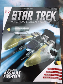
Ok. On to issue 139 and what at first I nearly mistook for a 1980's GI Joe toy given the grey, green and black colour scheme. This one's the Vaadwaur Fighter from Voyager's sixth season highlight Dragon's Teeth.

The design of the fighter is somewhat blocky with the feel of a catamaran from the apparent twin-hull look. With two sections of the hull jutting out ahead of the cockpit, the single seat ship has an aggressive stance but with a very basic finish to it.

The paintwork of green, dark grey and light grey is very bold and flat with three basic elements covering the whole craft. The metal upper hull does carry some grille work and service details yet the definition of panelling is left to the way in which the hull is coloured. Eaglemoss have done some weathering on these grated sections and also on the back around the triple engine set up however it looks more forced and fake because it is limited to tiny areas of the craft leaving the remainder looking absolutely showroom perfect. If this was going to receive some aging then the whole ship needed it not just specific pieces as it looks like a toy more than a Star Trek vessel.

The big engine detail in the centre is again very clean with some smaller detailing indicating power channels of some kind.  It's one piece that does draw the eye to it and the look on the outside even goes to show how it links to the three engine exhausts to the back.What you can say is that this fighter has very well defined panelling and colouring with every panel almost having its own colour block. It's a striking paint scheme and not something we see employed on many ships from the franchise. 

At the front Eaglemoss have blacked out the cockpit and slung two plastic cannons onto the underside. Again there's a little bit of surface detail on the barrels of these weapons but it's nothing exceptional suggesting this really was a one off craft that was barely going to be seen. 

To the back we have the three engine exhausts with that off-putting blackened weathering effect. It looks terribly fake and out of place and lining it up against the weathering on something like the USS Kelvin would really show how scrappy a job this has been. The exhausts themselves are spotted out very precisely in orange and keep the colour here within the centre circles of the engines. Plus point on the engines too is that the central one isn't a straight mirror left/right with an individual set of markings on the port. Nice touch.

The underside of plastic continues the uninspiring block colouring along both sides of the hull with some deeper grilled action just ahead of the lighter grey engine units. Not much to go on here again aside from the fact that the Vaadwaur fighter looks far newer than it has any right to be.

Connected into the plastic underside insert are two pairs of pylons to support the warp engines protruding from either side of the craft.Once more there's an overly blackened weathering effect at the leading edge before opening out into the rather unusual warp engine design.

These three-quarter circumference tubes continue the blocky paint pattern from the main hull but also allow full view of the centre of the engines which in this case are translucent orange "torpedoes". It's a bold design move and likely a mare to recreate on the model especially since you can see the fixing points through the orange plastic which does ruin the effect a little.

The whole base plate of the Vaadwaur Fighter might be in plastic but it is virtually identical in detailing to the upper side. The green stripe mirrors the dorsal pattern, enclosed with a series of the darker grey panelling. The alignment of these segments on the whole ship is, for Eaglemoss, surprisingly accurate. I'm not knocking them but their attempts to line panels to colours - or windows - has left something to the imagination but on larger pieces we seem to have it nailed to perfection, the fighter being a great example.

Bizarrely the colours on the magazine cover are totally different to the model with the green stripes more yellow and the greys about five shades lighter than they appear on the accompanying fighter.

Problem is that the magazine images don't help decide what the correct colour scheme is with only new CG and one shot of the hangar from Dragon's Teeth as evidence. This actually does show how little these ships were utilised since the available source material you would hope to see alongside the craft is AWOL. The magazine also betrays a sense of the over-weathering on certain points plus the lack of "gap" under the engine arms that stretch out from the central unit. Probably impossible to include due to the scale but one for note nevertheless.

I loved reading through the mag with this one because of my love for the episode itself and Eaglemoss have delivered on that front. Giving a full overview of the ship capabilities plus a brief summary of the episode and Vaadwaur history, it's a good comprehensive take on the sixth season story.

Designing the Vaadwaur City and Fighter is brilliant, giving a full 360 view on the episode from story to the visual concepts. The city is one of Voyager's great shots as is the destruction sequence of the buildings at the very start. This gives a good look into how this became quite an expensive show given the scope of the narrative.

Six pages of visual effects talks through the advances of the sixth year of Voyager with notable highlights of course including Dragon's Teeth and One Small Step which included creating the Ares IV capsule. 

This month's arrivals are slightly underwhelming. We have a redress of a classic and then a one-ep blink and miss. Of the two I'd prefer to say I love the Vaadwaur Fighter but the detailing on the Lantree comes to another level and is a nice one to complete the Miranda variant mini-collection.

Next month's pairing sees the Starfleet Tug featured in Deep Space Nine take on the Vulcan T'Pau ship from The Next Generation's Unification.

Vaadwaur or Lantree for this month's stronger arrival? Have these two been done too late or should they have been included at all?


Live on YouTube
Like our page on Facebook 
Follow us on Twitter

Add us on Tumblr

Monday 17 December 2018

Final Tease for Season Two?


Another adrenaline-filled trailer has arrived for Discovery's second season making it look even more filled with action and adventure than ever before.

There is a great responsibility at hand

But is that a good thing and should we be getting excited over a season of Star Trek that has the potential to rock out more action, explosions and fast-frame cuts than ever before?

I'm torn between a rock and a hard place on this one because I really want to give Discovery the chance to impress but all we seem to be receiving is something akin to that infamous first Star Trek Beyond trailer that had us all questioning just what direction the Kelvin Timeline was heading. Luckily there were other teasers after that which reassured us it wasn't all Beastie Boys and big bangs but we're now awfully close to that January 2019 premiere date and these previews seem to be horribly devoid of any good, solid character moments - ironically something that the three (soon to be four) Short Treks have actually excelled at on every occasion.

The major additions in here are the discussions around the Red Angel and the appearance of the eight red lights at points in the galaxy which signify some sort of major event which can only be a Bad Thing if ever there was one. Is this the Borg returning? Absolutely not and I would like to think the Powers That Be are intelligent enough behind the scenes not to have to pull something like that - although I would believe that there will be a twist in here somewhere.

What do I have against this trailer? It's full of short quippy lines, soundbytes and pumped action sequences that make it look visually amazing but gives very little idea to the depth or quality of the story. Will this season betray the loss of Nicholas Meyer, Aaron Harberts and Gretchen Berg and even Bryan Fuller to the nth degree? Will it be clear who was guiding the boat towards the Star Trek philosophy? Will I be proved completely wrong and actually this is all just a damn fine piece of marketing to appeal to (yawn) the masses once again?

Surely Discovery isn't doing too badly with the announcement that season two is extended to 14 episodes plus all these new shows that keep appearing out of the woodwork to expand the catalogue.

So to this Red Angel and rather than analysing every frame yet again I want to pic up on a few pointers that come out of this latest set of sequences. I'm suspecting that the mention of canon and that the second year will answer a lot of questions intimates to me at least that the Red Angel has to be linked into the larger Star Trek universe in some way. Is this a creature from canon that we have already met and if so what is it? Rejac for instance?


Cue too shots of the season one interpretation of the Klingons (including L'Rell) engaged in either combat or a training regime but without any real context in this tease. Spot as well that we have both Admiral Cornwell and Lieutenant Ash Tyler reappearing for season two with the latter ending up back on the Discovery bridge in Starfleet combat gear.

So this Red Angel's appearance means that, so says Chilled Spock, "someone or something is going to end all sentient life in the universe." Now that's a tall order and clearly doesn't happen since everything is still around and lovely for The Original Series ten years later. Now I know this should be about the journey but that's a big ask to make the viewer wonder if the ultimate fate is going to happen or not - and you kind of know it won't. Is it Spock that we see at the beginning of the new trailer scribbling away on the floor of what might be an asylum?

This angel showed me an apocalyptic vision...someone or something is going to end all sentient life in the galaxy.

Also another line in there is Burnham's "looking glass" quip which suggests more universe-hopping for the Discovery but to where? Mirror Universe again or another spur in the Star Trek multiverse?

Also there's some shots hinting at a new enemy for the crew but if you flash back to previous trailers you'll quickly realise that this is Georgiou in full body and head armour. What does intrigue me with all this is how they've resurrected the Section 31 links that were hinted at right back at the beginning of season one and then seemingly left to dangle. What is the covert organisation's interest in the Red Angel and the prophecy that Spock unveils?

Captain; ten sentry ships on an intercept course!

What do these ships have to do with the Red Angel? The Klingons? Anything? What we do know is that they've turned up in every trailer so far is there must be some key point to their inclusion in the show - or maybe they're just in the first few eps...

Again the trailer ends with the smiling Spock but only after we see that there will be conflict between him and Burnham which will only be escalated due to his heightened emotional state which is spotlighted by Pike's closing remarks.

Is that a smile I see on your face?....Welcome to Discovery.

Sunk into the trailer we also have Saru out of uniform in several shots which could suggest more links back to his origins or some away mission that sees him in great peril plus there's a lot more of Tilly and Stamets dealing with a blob-like airborne mass that has appeared in all the trailers to date. At a point this substance seems to be inhabiting the newly promoted Ensign Tilly; might this be a link back to the mysterious blue glowing material that disappeared through her uniform at the end of the first season? Could there be some seasonal continuity going on here and might that have something to do with the micellial network.

Just to close out perhaps the weirdest elements do link into this arc of the narrative with the Discovery appearing through a wall or on some sort of three dimensional viewer in a blink and miss it sequence.

Season two comes across as being a lot more random and "out there" than we received with the first 15 episodes. It seems more experimental relying less on the established Klingons for its setup and this time exploring more intricate lore and characters (still no Sarek...?) from the franchise in a new and I would hope, fascinating storyline.

We have just a month to go until Discovery returns and I'm loving the fact that we have very little substance to what is coming. There are the bones of the story but I like the fact a lot is being left to interpretation to hype the anticipation for the new year.

What do you think season two holds for Discovery? Comment below, like and share!


Live on YouTube
Like our page on Facebook 
Follow us on Twitter
Add us on Tumblr

Saturday 1 December 2018

Firm Footing: The Official Starships Collection Bonus Edition


After the flight and attack versions of the Klingon Bird of Prey, the third and final - Landed - option was inevitable.    

For all intents and purposes it's exactly the same mould that was used for issue 3 and then altered with wings swept down for the later attack edition and both were featured in the run of regular issues. However collectors wishing to complete their trio of Birds of Prey will now need to invest outside of the standard collection as the final Klingon variant has been released as a bonus edition.   

Truly there's very little to say about this one that hasn't already been said on the reviews of the previous two editions so this might be rocking in as the shortest starships review of all time. What i can say about the service with this one is that while it arrived merely 24 hours after ordering it did arrive damaged but was replaced within 48 hours by Eaglemoss, no questions asked (although I did send some pics through as proof).   

The swept up wings and landed position is something we've only experienced on this craft twice in The Search for Spock and the subsequent The Voyage Home movies. The detail on the ship body and the upswept wings is absolutely the same as the previous editions and the only new addition is the pair of landing feet added to the bottom of the hull.   

The tragedy here is that both on the cover of the magazine and on the ship itself there is no indication of where the feet retract into meaning that in both instances it looks like they have been roughly slapped on to the Bird of Prey as a bit of an after thought.

Maybe they have but the weighting in the craft is absolutely perfect which means that you can do away with the black base and clear plastic clip and display this model as it was meant to be - on its own two feet. All that's missing is a landing pad at the foot of Mount Seleya.

The detail on the Bird of Prey itself is faultless on the upper side with the same weathering effects in full bloom but the bottom does leave a little to answer for and not just because of the "add-on" landing gear. It's still a bit too clean and empty of features that goes right against how the rest of this classic ship looks. If you do compare you might be able to tell there's a bit more dirt on the bottom of this one but not by much.

It's 100% a completist ship with only the wing positions of the three variants being different and as of time of writing you can now buy all three options in one handy box. This is one that fan demand...demanded...and got and rightly has ended up as a special rather than a regular issue because subscribers might have been a little narked to pay for this one again after the cruise and attack position variants dropped in.

Note too that the issues with the detail on the folding front plates of the wings have still not been resolved either even after several email conversations with Eaglemoss directly.

The magazine is actually a really good piece of reading even if you do think the Bird of Prey cash cow has been milked dry. Giving a skant overview of the already extensively covered ship, we move into The Great Bird of the Galaxy which covers the design and creation of the craft for The Search for Spock and includes some early storyboard and sketches of what could have been. Also in here we have photos from the original build and photography work that was done of the Bird of Prey for the third Star Trek movie.

Inside the Bird of Prey talks about - and shows - what the interior of the ship might have looked like as well as explaining why the bridge ended up looking the way it did plus some background to Lord Kruge's snarling pet. There's a brief - but good - segment on the creatures created for the Genesis Planet as well as how Kruge's death was filmed  before closing out the bonus magazine with the imagining of landing the Bird of Prey in The Promised Land.

It's a magazine well packed with information about the well-used Star Trek ship and how it made it to the screen. Definitely one of the best and most impressively illustrated volumes to date in the collection as a whole.

Live on YouTube
Like our page on Facebook 
Follow us on Twitter
+1 us on Google+
Add us on Tumblr