Tuesday 22 May 2018

Title Contender: Issue Two of The Official Discovery Starships Collection


It is both a joy and with sadness that I write this piece because while the USS Discovery has finally arrived, news is also out there that the Discovery Starships Collection has been suspended until later in the year (nb probably June...!)

But hey, at least we have the Shenzhou and the Discovery herself to drool over while we wait for any further releases so every cloud an' all that...

So here she is, the newest addition to the franchise’s ever-lengthening line of hero starships, the Crossfield Class, spore drive powered, USS Discovery and I have to admit, it is one of Eaglemoss’ best efforts to date.

Really?! Yes, absolutely. I mean I was blown away by the quality of the Shenzhou with Issue One but the Discovery dials it up to warp 9.9. For one thing, this ship is bloody long. In fact having seen pictures and the ship on the TV I still didn’t appreciate just how long she was until the box arrived and I popped her out of the polystyrene packaging.

Proportionately the Discovery is very different from what you might expect with a small, segmented saucer, stumpy neck section, wedge-shaped body and those striking, long, pointed warp nacelles - it’s like she’s been squashed and pulled in all sorts of new directions and of course there's the echoes back to the Planet of the Titans USS Enterprise concept that are more than evident in the craft.

Once more the starship is a masterful combination of metal and plastic and unusually for a Starfleet ship this one is bronzed, brown and a shade of silver rather than grey or white. Definitely a different vibe on this ship to anything else that's graced any point of the collection.

The split concentric circles of the primary hull are themselves plastic moulded with a beautifully subtle and underplayed aztec paint scheme on both inner and outer rings. There's noticeably no panel scoring and the inside edges of both rings are painted up in a dark brown which turns up to highlight sections of the Discovery. On both these edges Eaglemoss have managed to etch in rows of tiny windows but have not avoided the usual misalignment to the recesses. Tiny detail to make out but they're not in the right places. Oh, one thing - they don't spin so you won't have to worry about your model suddenly disappearing into the Mirror Universe anytime soon.
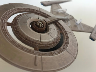
The windows on the underside edge of the inner circular section suffer from the same issue although there is a bit less surface greebling which is offset with a slightly higher level of panelling. The paint variations are incredibly fractional and you have to get the right light to make out the changes - that and you need a good bit of sunshine to show where the USS Discovery name is curved around the hull surface of the inner ring. 

To the front of the primary hull and almost indistinguishable from the paintwork is the NCC-1031 registry and ship name just above it. At the centre and in metal is the distinct bridge dome successfully highlighted - in the right sections - in white. 

The underside of the saucer Now one of the clever bits of construction here is that the saucer is "clipped" into the neck of the ship by a section of dark brown hull which runs back down to the Engineering Section. This whole neck piece is finished with printed-on windows but Eaglemoss have avoided recessing the window ports first which means that these aren't misaligned to anything and are flush to the surface. Definitely a good choice to just mark straight onto the hull.

The neck itself is actually two pieces with the rear plastic and the bronze front section in metal. The two pieces reach around the saucer section(s) and meet at that bridge module with the underside and the piece surrounding the bridge dome also being in the heavier material.

Drop down again and we find ourselves at the metal secondary hull. Once more there's the aztec paint scheme and what you come to realise is that whatever angle you view her from, there's always a hint of the slight pattern that covers the whole surface. It's not as obvious as the two-tone on the Enterprise-D but it's there.

The large metal delta shape of the secondary hull carries a lot of weight but look again and you'll see that the leading edges of the hull are actually plastic with sensor and window detail from the front to back. Both the upper and lower pieces are mainly bronzed with striped highlights in silver which are raised from the main surface and add much needed depth to the ship. It doesn't seem like overkill either with the colours striking a visually exciting balance.

Along the back of the secondary hull we also have the shuttlebay framed by the red glow of the impulse engines. This is actually a single translucent red strip right across the back painted up for the bay, the engines and then the brown of the bodywork at the ends. It's a clever use of the single piece of plastic to edge the hull and the metal.

Underneath there are again the simple panel lines on the delta-shaped body but there is another inset piece to the hull. It's an almost triangular section that stretches from the midpoint of the underside and encompasses the tiny deflector dish at the front. The deflector is one of the few translucent (blue) elements of the Discovery and even bears a small protruding sensor point. The choice to put it in plastic and translucent is brilliant. It works very well and again the combination of building materials is genius.

The metalwork extends under into the base of the warp engines. These are the most spectacular piece of the Discovery shape, tapering almost to a point and extending far further back than any warp engine has ever gone before. The design is gorgeous with Eaglemoss setting a blue translucent bussard collector at the front and thin warp field grilles along the sides. The detail on the surface of the engines is as minimalist as the rest of the ship with only a few panel markings and some darker brown highlights along the top and just visible at the back.

They're very solid as well and first impression out of the box was that they would be a nightmare and bend like anything. Luckily the metal gives a lot of support and they don't taper to too thin an end. 

Not only do you get the ship in the box but also the mini-scale magazine covering some of the ship's more notable details and specs plus a section detailing exactly how the design came about as well as evolving from those first early CG shots that teased us well before the show launched. John Eaves has produced a real winner and Eaglemoss have done it justice on page as well as in 3D with a host of design sketches and stories behind the difficulties in finalising the shape of the warp engines. What the magazine does contrast to the model is the colour scheme with a more distinct bronze/silver paint job on the page. One grumble is that there are no screenshots from the series to see the ship in action and the only pic we do get from the show is a promo one of Lorca in the captain's chair. Luckily all those sketches more than make up for it.

The shape and form of the Discovery is destined to become iconic and Eaglemoss have produced a replica of it that is absolutely goddamn stunning from every angle. It's one of my all-time favourites that hey have produced from regular, special and bonus issues. Love it and I'm shocked it's not already sold out - but that might be down to the £29.99 price point.

What did you think to the USS Discovery model?


Live on YouTube
Like our page on Facebook 
Follow us on Twitter
+1 us on Google+
Add us on Tumblr

Thursday 17 May 2018

Living Next Door to... The Official Starship Collection Issues 124 and 125


A month has flown by like the Enterprise at maximum warp and for the first time in a LONG time we have two arrivals that are 100% fresh.

Well...that’s not totally accurate but we will come to that point shortly. 

Now, issue 124 steps into new territory by using a ship seen initially in the Enterprise title sequence (and later in the Mirror Universe) in the sweet form of the SS Emmette. Followers of the collection and the show will spot the similarities between this and the Warp Delta right away and whether through requirement or design it’s no coincidence.

Unusually though I’m going to start this review at the back end of the Emmette. Why? Because it might be the Kardashian of the starship world with one of the most recognisable arse-ends ever - well, it graced the opening sequence of every episode of Enterprise for one!

That back end is also where all the design work for this one seems to have gone. The engine block, recessed exhausts and deep grey surface detail really stand out. Why? Because the rest of it is a rehash of the Warp Delta.

If truth be told and you can see this from the magazine, designer John Eaves was tasked with making the back end for that title sequence with (and no offence to the man himself) no real need or intent to have the rest of the Emmette realised. 

When it did become a more 3D craft it’s made as a precursor to the Delta which means Eaglemoss have a bit of a squib to deal with in some respects. For instance the already released (earlier in the timeline) Delta has something to it - a bridge module, exquisite surface detail - but here on the Emmette its a plain finish.

Now I do need to distinguish here. While I’m not a big fan of the overall design, Eaglemoss have produced a cracking model of what was envisaged and the simplicity of the Emmette has probably played right to their strengths allowing for a rather wonderful two tone silver paint job across the whole of the craft. It glistens and gleams and really gives a solid impression of a metallic hull in all its glory. It’s unevenly toned which gives a much more man-made feel to the smooth surface.

That chiselled nose sweeps back to open out to the Warp engine pylons and here there’s some superb, grubby panel lining that’s an out of the ordinary touch for these ships as we don’t get to see much dirt and that ‘used’ feel very often (more on that with issue 125...). The panelling is distinctly scored onto the plastic with the greys and the grooves intermingling to give the Emmette surface depth as well as visual texture.

At the rear of the dorsal section of the hull we have the continuation of the instantly recognisable rocket section that fills the back end. Not overly painted up, there’s light detail to complement the propulsion system and if you’re comparing to the Warp Delta you’ll see just how big a difference there is between the two at the rear.

Flip this one over and you can see that the underside is a plastic insert section into the metal top and pylon piece. What’s also notable is that it’s absolutely 100% identical to the top. There is no difference in surface finish whatsoever on this one even down to the placement of the two tone sections and the panel lines. The only way you can really tell that it’s the bottom is because of the insert and which way the engine pylons face. However kudos to Eaglemoss for replicating the metallic detail onto the plastic (or vice verse) so accurately.

Out to those warp nacelles now and the design is totally parallel to the Warp Delta with Eaglemoss slapping translucent crimson bussard collectors on the front and further detailing in the Warp field grilles along the sides. Being so small it’s welcome to see that the level of finishing touch does not diminish on these plastic sections.

Stand fitting too is solid with the clip sliding around the whole of the back end of the hull reducing slip risk to a factor of zero. 

The magazine is a good read, blitzing some very brief class history (and I do mean brief) followed by some great development pics of the design from John Eaves as well as how it evolved out of a set of rocket engines into a much more tangible craft.

Finally there’s an overdue breakdown of the elements which made up the distinct Enterprise titles - and don’t be afraid there’s not a hint of Russell Watson anywhere. Eaglemoss separates the titles out into its various elements and explores the relevance in each shot albeit in brief.

Next - Alice

Now I recall Ben saying that they worked really hard on the Romulan Bird of Prey from The Original Series to avoid making it look like a toy yet this one seems to go against the grain, being a blocky and very vividly coloured craft.

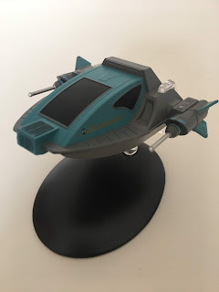
One of the smallest ships converted into a regular issue, Alice is a real oddment from the collection with its garish colour scheme, big windows and very basic structure. This is one of those that could have done with a bit of weathering around the edges to add a sense of realism to the model as the very fresh look is a sharp contrast to a lot of the other entries in the series.

Some of the bits might also look familiar since part of the Alice shuttle is carved up from the remnants of the Galileo/Copernicus shuttlecraft from Star Trek V - when are we going to get it in a shuttle set by the way, Eaglemoss?!

The big scale means that the detail is well marked out and that starts right at the front with the vented box feature which rises out of the curved cockpit structure.Leading back to that very cockpit you can see the echoes from the movie shuttle with a lovely sweeping curve from the front to the top of the craft that then frames the blacked out window. Understandably it removes the necessity to show the internals of the craft however by its very inclusion the finish of the shuttle does feel a little cheapened with the blacked out windows on three sides and especially with the front one being so large.


The actual surface of the Alice is fairly plain and the scale emphasises the lack of smaller detail. Along the sides of cockpit there are a couple of decals and on the side skirt just below the grille detail is precisely painted in, again a benefit of the larger scale. Heading to the back the grey shoulders of the Alice sweep up into what appear to be engine intakes but have very little depth to them versus the images on the cover and within the magazine.

That chunky bodywork looks very cumbersome but the lines and painting are very precise so while the ship itself isn't the most exciting to grace the franchise, Eaglemoss have produced something that is more than respectable. There's a lot of angles in this back end of the craft and what is notable is the almost invisible seams between the metal and plastic. I had to get very close up to see the lines and check which was which because they are so well hidden within the design.

At the back we have the entry hatch grooved top to bottom again with a blacked out hatch this time slightly recessed into the frame and as with the rest of the craft, expertly painted. Either side of the hatch and also at the back end of the sidepods we have a series of engine exhausts. At first look they just seem to be hollow tubes with coloured interiors but close inspection also reveals that each has a translucent green inset disc to represent the engine "colour". Given that they are quite far down and shadowed by the small circular ports, it does make it quite difficult to see the internal detail.

Out to the sides is the first hint you have of the two materials joining with the seam running through the middle of the primary energy weapons. In all fairness this is where most of the detail on the Alice sits with each of the fins bearing that circular logo that's present on either side of the cockpit. The larger sections of the sidepods have some minor surface detailing with blue markings toward the front before they strike out in silver barrels. Now for note these aren't at all flimsy because Eaglemoss have made them with a decent thickness. One other point is that the navigation lights that sit on the block sections of these side-mounted weapons are only very slightly painted white. Its almost a glance over with a brush and the magazine makes them look a lot more defined.


On the underside of the Alice the design is very plain and simple. There's not much to talk about here as the detail is just the blue/grey colour scheme. It's hella basic with only four slightly raised sections at the outer edges and that front blue grilled section seeming to wrap around the nose.

The stand itself wraps around the back of the ship, gripping it top to bottom. It doesn't reach too far forward although it does sit firmly around the "shoulder" sections either side of the cockpit and gives a secure display pose.

Overall the construction of this teeny ship is spot on with some of the cleverest joins and curves in the collection. The whole of the upper hull to and including that grey skirt line as well as everything to the back bar the exhausts is metal cast and this feels solid in every sense. Alice is definitely well built if not visually underwhelming and the finished article is an impressive build at least topside. Perhaps there could have been a bit more texturing to the grey sections of the ship and some wear and tear as suggested but not bad, not bad at all.

Issue 125 covers off the basics of the Voyager episode featuring the craft, making note of its size as well as the unique selling point - it's neurogenic interface that gets Tom Paris all obsessed. The CG images and the shots from the show do highlight that some of the finer details in the blue segments around the weapons pods were missed out as well as further emphasising the lack of gritty texture on the grey bodywork.

The work of Tim Earls comes under the microscope when we come to the design of the Alice shuttle. This was unusually a one-scale model that was built and placed on the soundstage for use in the episode. This section also explains to some extent why the exterior of the shuttle is as plain as it is.

Last segment for issue 125 covers the visual effects of the sixth season of Voyager. Now this is a cracker, discussing everything from the ship junkyard in Alice to the final moments of the USS Equinox in the season opener through to the cityscapes of Dragon's Teeth and the Starfleet Research Centre for Pathfinder. It's a fascinating look into the creations that helped mould the look of the Delta Quadrant digitally towards the end of Voyager's run and there are a lot of memorable items that are nodded to. Good read again here and it's forming a recent trend to give us more techie info from behind the scenes of the franchise.

Of the pair from this delivery I've actually found Alice to be the more interesting and memorable of the two most likely because of the Emmette's distinct similarity to the Warp Delta. Let's be honest, if I was flicking through the magazine binders I think I'd be more shocked to recall the Emmette was in here than the Alice

There's a certain wonder that goes with the little shuttle because of its more basic finish and while I might have had a bit of a moan about the paint job it's probably the better realised of the pair. To be fair the colour scheme is nigh on perfect even down to the turquoise and grey.  

Righty, next up we have one more entry to the Wolf 359 fleet with the Niagara Class and then we zip back to Spock's Brain (yes...yes we do) with the remastered Eymorg Starship from the "classic" segment of The Original Series

Was Alice a basic success? Is the Emmette just an "easy" rework of the Warp Delta? Did it need a model?


Live on YouTube
Like our page on Facebook 
Follow us on Twitter
+1 us on Google+
Add us on Tumblr

Thursday 10 May 2018

Second Discovery - First Trailer


The latest shots from the first days of production on the current Star Trek expansion have surfaced thanks to CBS’ teaser trailer for season two.

The amount of information contained in these 58 seconds of footage are spectacular to say the least so let’s take a casual glance over the nuggets of Trek gold contained within.

Stage Seven looks set to contain some amazing new sets for the year including the obvious Discovery but we would surmise from this footage, the USS Enterprise too.

The first hints of what’s to come are pretty much from the get go with our first glimpse at a command yellow uniform with captain’s braiding being put together while in the background we have audio clips from The Cage of Pike and Spock adding more than subtle suggestions at the presence of these two characters in season two.

Moving swiftly through we have shots of the Discovery bridge and one of some form of construction which could be the Enterprise but the next one to really pique interest has to be the floor plans which note the presence of a THIRD ship or prominent location with the title of ‘Section 31 - Bridge/Lab’. Is this a swing set that will act as two locations instead of a third starship? Is that starship (if that is the case) perhaps the USS Hiawatha which was noted in the guest announcement of Tig Notaro.

That’s the only hint of Section 31 as the teaser piles us back into the shots we really, really want to know about - the Enterprise. But - talking of plans - did you see the ‘L’Rell’s Garden’ plan (included at bottom of article)? Yep - definitely looks like season two will be bringing back the new leader of the Klingon Empire and you would think that Tyler will be alongside her as well causing more heartache for Burnham.

Now, following the shot of the command uniform we get production sketches of the red Support Services attire. Now, if we adhere to canon proper then these shouldn’t appear at all in Discovery since they are included in neither The Cage nor Where No Man Has Gone Before between which stories we must assume Discovery is set. Even if it is set before The Cage then the red uniforms are a no no. Of course, who is to say that these were only being introduced at the time Discovery meets Enterprise and therefore just might not have been seen onscreen. It’s a stretch but not that unreasonable.

Now amongst the other shots of set builds, the Discovery bridge and Saru green screened in the captain’s chair of the Discovery (holo-communicator shot or promo shot perhaps?) we have another look at the command yellow uniform from the back showing some big upgrades in the creation of this classic garment particularly in the way that the back is segmented and also in what appears to be more hard-wearing elbow pads. Now, if you’re very eagle-eyed look to the right of the shot and you can see a first glimpse of the blue sciences uniform although the wearer is a mystery. Burnham is just visible above the camera to the left and then appears in the subsequent shot of her entering the Enterprise bridge as can be surmised from the decal on the left of the door - and check out that view screen (both images below)!!!!

The stage is - literally - set for new adventures of the Discovery. Can't wait for some more cast announcements!

What did you spot in the trailer? What did we miss?


Live on YouTube
Like our page on Facebook 
Follow us on Twitter
+1 us on Google+
Add us on Tumblr

Thursday 3 May 2018

The Laziest Kitbashes? The Official Starships Collection Issues 122 and 123


It is the stuff of Star Trek starship legend. A tale whispered in the corners of convention centres and on the deep dark hidden threads of chat rooms long forgotten...the Yeager Class.

For almost as long as the collection has been in existence fans have been highly interested in the kitbashes - the background fillers, the ships remastered for budget and time constraints etc etc but one such Starfleet ship has always been a pit of controversy with its apparent half-arsed slapdash construction for use in Deep Space Nine.

Indeed, Ben Robinson teased us that it was coming a matter of months ago with a screenshot from his computer of two folders one entitled ‘Voyager’ and one ‘Maquis Raider’ which cemented the belief that it was on the way.

I didn’t quite know what to expect from the Yeager Class to be honest however the resultant model has - believe it or not - a lot of good points which make it worthy of the collection and as a standalone issue too.

First up there’s the spoon-shaped Voyager primary hull bunged on top of the Maquis Raider hull. Line this up with the issue six replica of the Intrepid Class and you can see the difference in quality in a split second which seems a bit odd since it's smaller than the original.

The metal saucer is a much lighter shade to Voyager, almost a creamy white rather than the duck egg blue. The markings are very distinctive too with rows of windows painted up on the exterior. Both the forward sensor platform and exposed mechanics just above it are much more detailed and seem to have a much thinner paint finish which shows up all the elements more effectively. The hull panel lines are just as distinct splaying out from the central bridge cluster to the edges of the saucer. 

The bridge module itself is the only part of the ship that retains the duck egg blue from Voyager and only then at select points. The recessed windows around the saucer have much more depth here than Voyager. Perhaps the only finer detail missing is the red curves from around the ends of the raised phaser strips arcing around the bridge module. Also some of the block detailing around the bridge contrasts to the rest of the saucer detail and has much less definition. Some of the panelling towards the neck area as it drops down to the Maquis Raider section also seems more washed out than on the majority of the primary hull.

The underside of the Intrepid Class saucer also has the lighter paint scheme that allows the hull detail to shine through. The RCS thrusters at the edge as well as the phaser strips are tightly painted on and there's a ship registry to match the one topside but without the name. This underside is a very close and flush fit plastic section into the metal upper half and feeds back into the cut down Raider.

The rear of the saucer that would have connected to the Intrepid Class engineering hull cuts off very abruptly as it meets the Raider. Here there are some very strong colour changes in comparison to the original design. On screen the multiple shades aren’t too discernible because of the Yeager’s placement in the background but now this model emphasises just how much has been altered from the original two models that have been slapped together. Take the upper panelling here. While the Raider was a singular metallic coat, the reworking into the Yeager Class also means that the panelling has a bright finish with orange panelling to indicate the vents and brown to highlight some of the raised hull sections, 

The Maquis Raider section doesn't work as well however. The rear also carries the ship registry on the port and starboard sides as well as on either of the fins. The Yeager is one of the brightest starships in the fleet with that multi-coloured paint scheme especially with the tanned shoulder sections leading out to the warp nacelles. The brushed metal of the Maquis Raider gave much more depth to the craft but here a lot of that surface intricacy is lost under the oranges and browns. You can also spot where the engine blocks on either side of the hull have been removed. 

The stand position is identical to the Raider gripping between the upright fins and providing that "flying" effect which leaves the rest of the hull free and easy to view. The underside of the Raider is fairly bland with the new overcoat taking out a lot of the detail we saw previously. Eaglemoss does seem to have an issue with some of their paints in that they thicken up and do sap all the detail out of the ships meaning you can't appreciate the work that went into the original mould.

The requisitioned Intrepid Class warp nacelles hang angled towards the front of the kitbash and mine actually arrived with one rattling around in the box. They're just pegged onto the wings of the Raider hull but Eaglemoss have managed to include translucent warp field grilles even though they are fairly small. The bussard collectors however are just painted on and the triangular segments are well finished. That said, the whole paint job on the Yeager is free of bleeds or errors and congratulations are certainly in order since this has one of the more complex finishes of the collection, Usually there are only one or two colours but this has a lot more to it.

The joint lines right across this model are very impressive with a lot of different sections all nicely slotted together. I might go as far as saying that this has one of the highest number of parts in the collection and definitely the largest number of variations from the norm.

To the magazine which covers the reasons behind the creation of the Yeager after the Dominion obliterated a good portion of Starflleet both this ship and the Curry Class became part of the "Frankenfleet"; assembled to replenish the ranks quickly from whatever parts were available. Great CGI pics in here that, when you compare them to the filming model that turned up on several occasions in Deep Space Nine, is of a sensationally higher quality than the original. 

Then we tackle the making of the model itself at the hands of the late Gary Hutzel. A combination of the USS Voyager and the Maquis Raider Revel model kits, the Yeager might have been an odd construction but its existence is burned into the memory of every fan; it's literally had that kind of impact.

Finishing off this edition we have an interview with writer Hans Beimler. Although Beimler worked on The Next Generation I'm happy to say we get a piece dedicated to his work on Deep Space Nine and just how different and challenging the environment was from the world of Picard and the Enterprise-D. 

Now issue 123 pains me greatly. The Romulan Scout Ship was a great edition, nicely detailed and has a prime spot on my Romulan shelf (what else would you expect???). The problem is here that 1) is there a right way up for the Romulan Science Vessel and 2) was it actually that great a refit of the original model?

The answers to those questions are; not a clue and no. Y'see the biggest differences between the Scout and Science vessels are the removal of the original and very obviously Romulan nosecone and the addition of a semi-circular tail piece. The result is in no way Eaglemoss' fault and we were due it at some point but what this issue makes you come to terms with is just how much the production team got away with when it came to repurposing ships. 

We've seen it with the Bajoran Freighter/Smugglers' Ship, the Jenolan/Spacedock Shuttle and without doubt the Reliant/Saratoga/Bozeman triumvirate. Indeed, here we have another two issues in a row which are - if you think about it - just reworkings of ships we have already received through the collection.

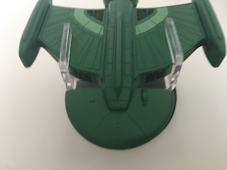
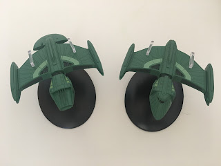
Seen once and only once in The Next Phase from the back end of The Next Generation's fifth season, the Science Vessel is, for the first time a ship that is the same both ways up. Now not only could I just reprint a big chunk of the review from the Scout Ship but I could copy and paste the review of the top to cover all the features of the bottom as well...!!!

Back to the point - the front of the ship is much more angular than anything Romulan we've seen before with grates and fins protruding forward. Eaglemoss have replicated the design perfectly and the dips between are well painted but not over painted as can happen with recesses on these models.

It's a really odd piece that was added to the front of the ship with no visible command section or markings. The central piece is etched out with the more familiar Romulan feathered bird effect that represents the style of their craft more than the angular forward section. It is absolutely panel for panel the same mould as the one used for the Scout Ship (not a surprise since they ARE the same!) with the central piece also being the metallic element of this ship just as before. 

It's same again with the nacelles too. They are a great design and do include the lighter shade of green warp field grilles which are also translucent insets. The finish of the nacelles and the central block is spot on and identical to the original in every way.

The only further significant difference is the semicircular/fan shape attached to the rear. Again it gives no sign of which way is really up on the Science Vessel since the only detail on its surface is mirrored on the flip side. Admittedly the joining of all the sections here is exemplary and the conversion from the original model into this version has been completed perfectly by Eaglemoss. Tragically it’s one of the least inspiring of the series, even though it’s a Romulan design, mainly because of the updates. 

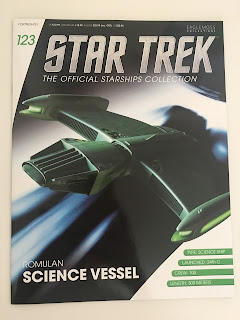
The magazine for the Science Vessel touches on the events of The Next Phase as well as including some minor stats on the craft. Much of the information relates to its singular appearance accompanied by shots from the episode and a few new CG shots.

Greg Jein's workshop were responsible for the changes to the Romulan ship and the double page article on its creation. This also mentions some of Rick Sternbach's original concepts for the Scout Ship and how that influenced the alterations. There's also the shocker that the Science Vessel later turned up in Voyager flying the other way round in Favourite Son in a different colour...well I never!

The third article in here is one of the more interesting and technical we've seen for many an issue with Rick Sternbach talking us through the history of the Romulan fleet from their split with the Vulcans right up to the latest iteration of the Warbird and the Reman Scimitar. Sternbach's piece doesn't limit itself to ship types with diversions into warp technology as well as several pointers on Romulan upgrades and innovations through the centuries. It's not a subject that gets much attention and this is a great read all the way paired up with some wonderful tech images to help you understand the material.

Issues 122 and 123 are something of a placeholder for Eaglemoss with a much better selection due over the next few months. May's first arrivals will be the SS Emmette from Enterprise's opening credits and secondly the Alice shuttle craft from Voyager. New builds and more than welcome after the huge slew of kitbashes we've been handling for the last four months.

Is the Yeager a revelation? Is it better than we might have expected?

Live on YouTube
Like our page on Facebook 
Follow us on Twitter
+1 us on Google+
Add us on Tumblr