Showing posts with label Eaglemoss. Show all posts

Saturday, 4 October 2025

No F'in Space: The Return of the XLs


A title like that needs perhaps a little explanation alongside it!

With the demise of Eaglemoss, the halfway house that was Master Replicas and their "found" stock we have now come to a point where FanHome have picked up the gauntlet and taken on the Star Trek Starships Collection.

Focusing exclusively on the Kurtzman era (apparently with the exception of Discovery), the model series has chosen to skip the small scale vessels that marked out Eaglemoss' 180 edition series and instead focus on the mid-scale replicas that, ironically, were showcased by the Discovery collection. 

Due to size, storage, cost and the chances that my family will disown me if any more space is taken up by undisplayed, boxed spaceships I've had to be a bit more picky when it's come to the new FanHome line.

Rather than collect everything I've taken the decision to focus only on the XL ships meaning that the next review after this one is likely to be the Enterprise-G Constitution III. 

But for now let us crack open the box on the USS Enterprise NCC-1701-F. A veteran of Star Trek Online, the F has already received three regular sized editions thanks to Eaglemoss. First there were the two different paint schemes of the original giving collectors the chance to display their Odyssey Class ship in the STO colours or the more "realistic" greys of the TV and movies. As part of the later 20 issue STO line there was also the Yorktown Class upgrade players would be familiar with.

Picard's third season chose, wisely, to remain faithful to the original set up when it debuted the Enterprise-F as it was about to be retired effectively making the Yorktown subclass upgrade a "What If". It also played more to the "realistic" paintjob rather than the striking whites and blacks of the online craft.

It's a solid and logical choice to follow and gives collectors a truly stunning model that ticks all the boxes and makes these XL editions a must.

Heavily detailed, the Enterprise-F displays one impressive hallmark that sets FanHome above Eaglemoss - they can line things up.

The hull itself is covered with white and black window markings, RCS thruster emplacements and lifeboat hatches as well as the distinct charcoal grey striping along the centre line. All of these points are perfectly aligned to the hull features whereas previously some of these might have been off by a fraction. It easily outdoes the smaller original given the increase in scale and therefore ability to emphasise the surface features of the Odyssey Class.

Comprising of a metal upper primary hull and upper secondary hull as a single piece, the lower primary and the remainder of the Enterprise-F are moulded in plastic and there is no distinction in detail between the two sections. Back in the earlier Eaglemoss days the metalwork would have less precision in some of the finer shapes but here the intricacies of the model traverse both mediums. It feels complete with the best examples of where the painting alignment has nailed it being found on the underside.

Certainly around the charcoal segments of the saucer and on the lighter grey underbelly of the secondary hull the marking out of the lifeboat hatches is spot on and I don't think there's been a finer example to date. Around the lower sensor dome this is also evident with the light and dark edging perfectly in place.

Trailing right to the back, the F even has a decent level of detailing around the support craft which is docked in the tail end. Known as the Aquarius, this looks almost as if you could lift it right out of its dock. The recessing on it works perfectly and even highlights the hull features of this small vehicle.

While we're back here, the warp engines are nicely finished. Retaining the hallmark translucent bussard collectors and warp field grilles of the original collection, there's a definite sleek finish to the warp engines on the Enterprise-F. There is a little "give" in the thin engines so be cautious however they are meticulously completed with Starfleet pennants, RCS thrusters and the ship registry right on their end points. 

It would be amiss not to mention the unique "double neck" feature that makes the Odyssey Class really stand out. While the deflector dish is rather striking in its bronze paint. your eye is easily drawn to the negative space just above it. You can just make out the detailing on the top of the secondary hull even if it is shadowed by the overhanging primary hull and FanHome have certainly ticked an important box in not lazily ignoring this part given that it's almost hidden away.

The effect of the two connecting arms between the hulls is very satisfyingly created here and the larger scale emphasises how magnificent the effect is.

What I really, really appreciate with the Enterprise-F is the precision in the painting and marking up. It's a grand step above the sometimes haphazard finish of the Eaglemoss line and cements that the new holder of the licence is keen to manage quality control a bit more astutely. They got it right and it shows. Solid ship and one you've got to get.


Saturday, 11 November 2023

Clandestine to the Core: Section 31 Starbase; Eaglemoss Official Discovery Starships Collection


The home of the secretive Section 31, the former penal facility's origins fitted right in with its use in Discovery.

A little more squat than the spired Starbase One, this was another of the structures featured in Discovery's heralded second season and featured heavily in the conflict with Control.

Following a similar construction trend to the Starbase the lower base and the underside of the landing platforms are metal in construction adding a good bit of weight and stability to the model.

That said, it's actually a much more intricate piece than the Starbase. The lower section has an open area as a docking bay with a substantial weathering effect, rising up through a scaffold-esque structure into the main body of the station. The wear and tear effect on the model surface is even better than that on Starbase 1 hammering home that this is a really old piece of technology left out in space. The unevenness of the finish on that lower connecting stump is impressive too given how it forms around the supporting framework. You can see the rust and degradation almost as if its real.

The stand actually holds the station on the underneath of the two asymmetrical landing pads (which, as is noted in the magazine don't actually make much sense!). They do add an element of functionality to the tower and are just as weathered and battered as the pieces that lie directly beneath them.

The rib cage elements that then encase the central core seem to be slotted as a single piece down onto the body and there's a certain fragility to their form even though there's never a doubt to their sturdiness. These are again beautifully rendered with a fantastic ridged detail and markings which were almost indistinguishable onscreen but help bring this piece to life immediately. 

The central core continues the worn grid pattern that defined the lower support section rising up to another, smaller rib cage that circles the top, seeming to protect what you would assume is the command unit. There's also a piping element that sits to the rear and runs vertically almost mirroring a spine holding the ribs of the Section 31 base in place. 

It's a most unusual structure, emanating feelings of brutalism and a stark contrast to the more impressive and perhaps positive showmanship of the Starbase 1 spire. If I'm absolutely honest I'm not a huge fan of these two as starbase models and the designs leave me a little cold when compared to the classic nature of Spacedock or Regula One for example. 

However this is a striking, well presented and superbly finished replica that does just about Feverything right from the colours and subdued three tone hues that add to its ominous nature right to the way in which it is finely balanced both in terms of weight and plastic/metal ratio. 

I also love that asymmetrical nature which is almost never present in starbase design. There are lumps and bumps, structures that dominate to one side and give it a real one-off look. Its repurposed nature is something only seen here and this also marks a rare opportunity to look at what the Federation's prison system may have looked like. 

The magazine covers a very brief review of Control's actions in the season including its takeover of this very station before we embark on a good run of diagrams and drawings about its concept. This was a strangely long process but one that seems to have been very satisfying by its end even if the station would eventually be destroyed.

A completists model if ever and definitely one that will appeal to Discovery fans because of its utter uniqueness. Not one I would choose to stick out on display but one that would create a few talking points in a Star Trek conversation if nothing else.

Enjoyed this article? Why not like and share to spread the word!

Like our page on Facebook 
Follow us on Twitter

Friday, 10 November 2023

All About the Base - Starbase 1; Eaglemoss Official Discovery Starships Collection


An absolute behemoth of a model, Starbase One needs a tall shelf.

A stunning construction, the circular base and spire mark a truly amazing piece of design work that, even in this very small scale, is conveyed exceptionally. 

Perfectly docked in the cup-like stand, this is impressively stable and at every point the detail is just extraordinary. The whole structure is covered in white dots denoting windows and providing that essential concept of scale. In-universe this dwarfs just about everything and was featured in Discovery's superb second season before it made the 1000 year jump.

Every piece has a layered feel to it with the lower elements jutting out past the hold of the stand. There's some lovely weathered/hatched effect work on the hull detail here which only appears at this lower point. Above this, the structure widens out into the larger docking ring marked with a series of eight arms to welcome ships. Again the edges of the ring are dotted with clusters of windows and an excellent, textured upper surface that not only provides a three-dimensional feel to the ring but also has some very well created weathering. This worn effect adds to the aging on the towering station.

The docking ring and lower section add even more stability to the structure here as the large metal elements to which the plastic buttresses and tower are then attached. That choice makes the model atouch better since the ring section has that ridged effect in play.

Visually it's one of the most striking of all the starbase/station products that Eaglemoss made. That huge spire section, which dominates two thirds of the model, is just as well weathered as the upper portion of the docking ring and fortunately it's not just a simple copy and repeat pattern as you take a look around the structure.

The striking tower leads up to what can only be described as a mast marking its highest point. The pictures and images of the base from Discovery don't really allow for an indepth look at the structure although it does give an idea of the scale thanks to the array of docked starships we see there. Even then the size of this as a model is pretty overwhelming and there are only a few other pieces in the collection that come anywhere near. Those are probably the Sarcophagus Ship and the Section 31 starbase. Potentially the Jupiter Station creeps into this "supersize" category but nothing seems to do it quite so eye-catchingly as Starbase One.

Build quality is also pretty decent. There are some evident seams around the edges of the docking ring but those are fairly minor. The central core of the station appears almost one single element although on a closer inspection you can make out the odd joint line and in some places a touch of digital decal sticking.

It really is an impressive piece that might actually be too big to sit on some shelves due to its radius and height. At best this has to be about a foot from mast top to the bottom and then there's the additional height of the stand to contend with. 

In the box we also have the standard Discovery magazine which, in this case, directs readers attention to the design of Starbase One as well as its role within the second season of the show. The magazine contains a series of excellent concept work on what the exterior and interior could have looked like including the multiple environments that would have been contained given its gigantic proportions.


Thursday, 10 August 2023

NX XL: Enterprising Perfection


Even a decade later, the NX-01 model from the Eaglemoss Official Starships Collection remains one of its finest entries.

How would one even attempt to top it? After all, it exuded superb detail, brilliant build quality and, incredibly, it was less than a handful off issues into the 180 edition run.

The answer to that was fairly simple; make it bigger. While I was unable to get my hands on one of the NX-01 XLs back in the heyday of Eaglemoss, Master Replicas have given both myself and every Star Trek fan out there another bite at the apple so to speak. That's been true in this very case.

The Enterprise from, well, Enterprise is just as magnificent as it smaller counterpart which was also re-stickered up as the Mirror Universe version for the second of the bonus editions.

If you’re into collecting Enterprises then this one is a sure thing. The detailing on the hull is exquisite with the increased scale only adding to the package. Just on first glance there’s the shimmer of the aztec paintwork utilising that very slight tonal change to add real depth to the hull. 

But what makes this just so damn amazing? Well, initially that paint job works a little better with the contrasts not being so obvious and blocky. There's more definition around the RCS thrusters  at the edges of the saucer and significantly the golden elements including the bridge dome are brighter. The grille behind the bridge itself is now silver rather than gold and the "lined" detail on the shoulders has been removed with additional window detail dropped on.

Hull lines seem more precise and actually less prominent. Looking back on the original, the window details at the saucer edge are less blurred and there's a much cleaner curve and slope to the hull. On the smaller version the gradient is quite sharp and ugly but here there's a visual step to the lower rim. 

Out at the front the deflector isn't luminescent blue with the tones limited to the surround rather than bleeding out on to the silver edges of the surrounding metalwork. Same goes for the red and greens of the port and starboard lights which are much more exact in their finish, avoiding the slodgework of the regular issues.

Moving backwards there's little change apart from the upscaling and you can see that the XL is an enlargement of the original moulds. The pylon detail is much sharper with the larger bussard collectors and blue warp engine grilles allowed more space to add that pop of colour.

On the underside there are some noticeable updates. There are more windows and on the issue four version the black "dotting" was absent however some of it here has the standard misalignment we've come to love... or not. The lower sensor dome now has a full coat of paint replacing the worn/unfinished look of before. you might even be forgiven for thinking that the black decals to the front and on the port and aft registries has been darkened because it very evidently has.

Best upgrade has to go to the stand. The smaller one was prone to snapping and only formed a hairs-breadth fastening to the hull. In the XL box the clear holder now folds around the underside of the NX-01 rather than relying on a tiny piece of hull for support.

The magazine (hit and miss if you'll get one with the Master Replica releases) treads the territory of how Enterprise came to be as a prequel series and also the casting of the main crew of Earth's warp five starship.  As with a lot of the XL mags it feels hopelessly padded and really not one that will tempt you back for a reread anytime soon. To be honest when the model is as good as this one, why would you want to?!

This is another where there's not been a serious amount of reworking rather the scale up has allowed for more accuracy and touchups where required. If you've not managed to snag one by this point, time is running - or may have - run out. One of the best? Yes and even better that little bit bigger.

Enjoyed this article? Why not like and share to spread the word!

Like our page on Facebook 
Follow us on Twitter


Sunday, 25 June 2023

Taken Care: That Final Eaglemoss Special

First of all... this is a bit weird... but this will be the 1000th published post on this site. It feels somewhat crazy that after 10 and a half years I'm still here and still writing about Star Trek. Thank you to anyone who has followed since the beginning, to all those who read and comment along the way. You've helped keep me going and I've loved meeting and talking to every single one of you.  Here's to the next 1000....!!!!


We were excited, giddy even at the thought that Eaglemoss would be producing the Caretaker Array from Voyager’s pilot episode. 

Hurrah! Prepare the pre-orders! Donate that final irrelevant lung and stand by the post box!

A year later and the landscape is quite different yet somehow, models find a way. That Caretaker Array did finally ship but via Master Replicas who have bought a considerable chunk of Eaglemoss' remaining catalogue including several of their unreleased models (see also XL USS Stargazer).

What is perhaps most surprising is the size of this special. Certainly the smallest space station in the series, the Array is only just twice the length of the familiar black base. It’s virtually all plastic with the two central rings acting as metal ballast. To be honest I’m not entirely sure what I was expecting here nor am I sure what I actually got.

The detailing is pretty minimal and comparing what we have in the box to the item on screen is not the easiest of jobs. I’d even go as far as saying that this gives an air of being unfinished although it’s actually comparable to the station on screen.

Those antennae/sensor arrays are indeed skeletal if you watch the episode back so there is a decent level of accuracy when it comes to the station's extremities.  In fact they're fairly well detailed too in terms of surface greebling if not that strong. There's a fair bit of give in the larger ones in particular yet it is as screen accurate as you would hope.

Both the outer arms and that central core do have a level of grubbiness to them indicating the grand old age of the array. Problem is, it's just not that exciting as a station or as a product.

The top and bottom assemblies aren't that intricate but do at least bear some resemblance to their vaguely seen "real" versions in Caretaker. I guess this one is a bit of a kicker though thanks to its size and the mix of well detailed elements to that rather plain central core. Yes, there is hull panelling but the single tone colour scheme lies a bit flat and the station feels somewhat lifeless.

As to the stand fit, this one's pretty good, clipping right around the lower elements of the central core and holding the whole station very firmly in place. Nicely constructed and provides a stable base.

Ok, it is just a model but Eaglemoss managed to successfully convey signs of life on many of their other products however it falls a little flat here. The lack of an accompanying magazine is conspicuous too and would probably have helped answer a lot of questions about the resulting build however that's one thing that concretely never saw the light of day.

For now the Caretaker Array rests as a tantilising glimpse at some of the possibilities that might have emerged in 2023 but also represents that final crumbling moment in what was once a huge part of the merchandising market. 

Is it a "must have"? Yes if you're a completist or a Voyager fan but no in every other sense. It's only really gained notoriety because it's Eaglemoss' unreleased special. For me it might even rank below the stick that is Relay Station 47 and maybe as the weakest of the space station/stationary structures. Functional - absolutely but just super, super dull and a disappointing way to have closed down the specials series of models. Who knows what could have been next...

Enjoyed this article? Why not like and share to spread the word!

Like our page on Facebook 
Follow us on Twitter

Monday, 15 May 2023

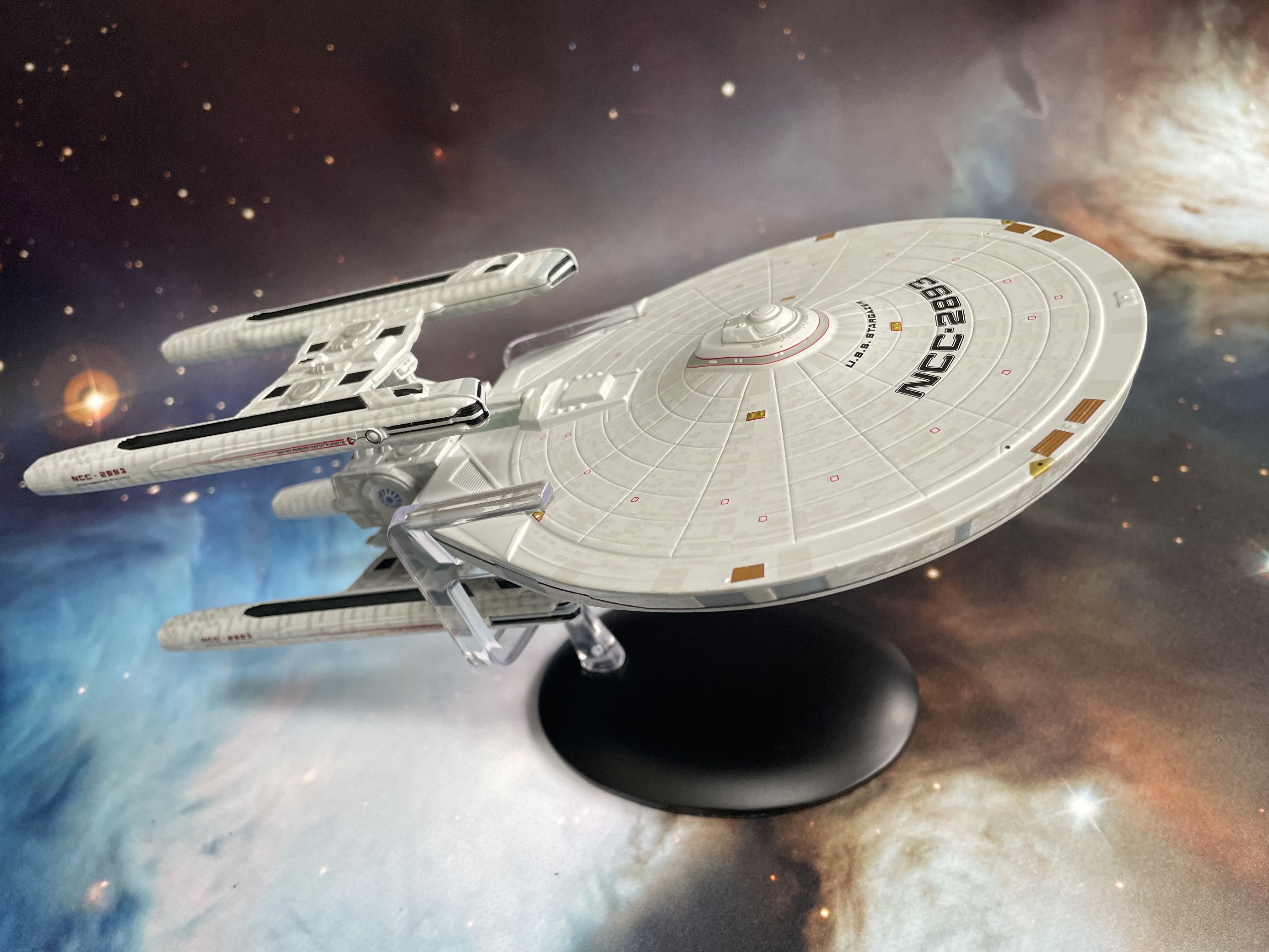
Previously Unreleased: XL USS Stargazer


Gone and in an instant several long awaited models just didn’t arrive. 

It’s the oft repeated story of Eaglemoss and now, many months on we’re starting to see some of the ones that got away. 

Master Replicas secured a good chunk of the Eaglemoss back catalogue plus items that never made it to sale. The first of this bunch is the last XL model which was announced, the Constellation Class USS Stargazer NCC-2893.

Intended to be a Constitution Class a la the refit/1701-A USS Enterprise, the Stargazer morphed into a new class of ship for the TNG first season episode The Battle as well as a few other appearances later in the show under various different guises. She would also turn up at the Fleet Museum amongst other iconic vessels in Picard’s third season. 

The Stargazer was also one of the first 20 issues announced for the regular sized Starships Collection back in 2012 and certainly caused a few rumblings back then. Eaglemoss were notorious for producing screen accurate vessels which translated into ‘We Didn’t Check What We Made’ since errors fans couldn’t make out on screen were often copied straight to the ships. 

In many instances this was quite quirky as for example with the Stargazer the bottom registry was applied the wrong way round and was duplicated into its miniature version.

Not so it seems with the XLs. With the Equinox the grating spelling mistake (EQUINDX) was updated and in the quad-engined Stargazer we have the registry not updated but removed completely. 

In fact this ship, while actually pretty impressive, is something of a conundrum. Is it accurate because it certainly isn’t screen accurate so what is this final piece actually based on? Given it’s production history and lack of accompanying magazine you might have to wonder if it was actually completely finished before they boxed it up and shipped.

Yet Jean-Luc Picard’s first command and the first starship to complete the Picard Maneuver is a worthy purchase for any ship collector (if you can find one now).

From the top there have certainly been improvements to the finish. The RCS thrusters feature that little more detail (and relevant placing) with the grille work on the surface is far more prominent in a larger scale (and completely recoloured from the grey). The hull benefits from much stronger grid lines that aren't swallowed into the paintwork with the striping around the bridge also being a much crisper alignment and colour. Indeed, the whole bridge module itself has more finesse to its finish with the dome and levels much more recognisable. Even the striping is more in line with the classic movie style of grey edged in red rather than blotchy blue.

The issue for me comes in the alignment of the registry decals which tend to slip into the valleys of the surface and aren't that well aligned to the hull itself, following their own path rather than the curve of the saucer. Randomly this was something that the original version actually got right however the more screen accurate font and edging.

Moving towards the rear, the structure in front of the engine mount has received a total rehash with the recessed elements now raised above the hull and leading more naturally into the propulsion units. In fact this is where a lot of the visual upgrades really start to kick in. Detailing here makes it much clearer how these two strut leading to the engine platforms are reused necks from Constitution Class vessels due to their angles and also the inclusion of the photon torpedo launchers. Eaglemoss even managed to add more decal striping in here and window detail adding to the feel of scale.

While they have also updated the painting of the circular vents (four on this ship!!!), they're only in grey blocks rather than having a blue inset to really make it kick. But that's not to take away from the greater level of surface greebling and painting. Nor from the excellent paintwork on the two side located warp field generators where the lining is particularly ramrod straight.

Other XLs were known for just being upscaled versions of the originals with simply bigger parts using the same construction techniques. Noticeably on the engines of the Stargazer instead of having the cross-pylon as a piece and then the engines themselves being two halves with that all glued together, the model designers have simply adapted it into an "upper" and "lower" engine assembly. By virtue this adds a lot of strength and stability to the core of the model and reduces six parts for each engine pair down to just two.

Whether as a benefit from this or another detailing upgrade, the warp engines have much more small level touches with the tips split in grey and white rather than just a grey paint mess and again a smoother application of the Starfleet pennant along the exterior edge (in most cases!!!). To the rear the impulse engines are now painted in red rather than being just plain and simple base grey.

The forward shuttlebay door too is disappointing. There's no definition to its surface, only recessed and then painted grey, missing out on the horizontally ridged version that should be there and the same goes for the rest of the cargo doors around that saucer edge. Indeed the two which butt onto the warp field generators aren't even painted up.

Now here's a thing. I couldn't work out if this was an amalgamation of the original studio model and the one built for the Picard Archive in Remembrance for Picard itself. Looking at the shots of that ship there are certain similarities although it doesn't have some of the surface grille work present and has some very distinct painting differences. However, it actual in-line surface details do line up for the most part.

But then we flip her over and take a look at the work on the ventral side. Immediately that lack of registry (even the wrong way round) hits you straight in the face. As does the point that the forward two surface lump have been massively downsized and the greeble surface work in front of the pylon support is now gone. What DID confuse me and led to some heavy internet research is the placement of the sensor probe/aerial structure that sits next to that engine support. Again the platform that it its on has had some subtle revisions however the aerial itself (at least on mine) has switched sides. Now, on the Picard model and pretty much everything I could find it's on the starboard side if you're viewing from the front so why it's moved is absolutely inexplicable.

Stand fitting is pretty decent too with the clips sliding neatly around the rear of the primary hull and providing a decent mid-point balance that won't have it suffering from Warbird Syndrome.

There's something still brilliantly satisfying in just seeing this ship actually make it out of the warehouse and into the hands of collectors after such a long time. Bizarrely its arrival after the end of Picard seems equally fitting since that show included (at a distance) the Stargazer docked at the Fleet Museum. Indeed, this could be the last unreleased starship XL ever if not for a long time so definitely one to enjoy. But then, who knows? Maybe the licence will see a revival...one day.

Enjoyed this article? Why not like and share to spread the word!

Like our page on Facebook 
Follow us on Twitter

Tuesday, 12 July 2022

The End of the Eaglemoss Dream?


Drafts in process, pics taken and then today's news finally broke.

After a storming run of collectible items, the world of Eaglemoss came plummeting down when news finally broke that the business was going into administration.

My thoughts go out to all the people who will be directly affected possibly with the loss of jobs and also to those collectors and fans out there who may now not be able to complete their collections or even worse, their part-works including the USS Enterprise NCC-1701-D. 

Existing in some form or another since 1975, Eaglemoss in recent years has been synonymous with Star Trek replica ships, plaques, graphic novels and more as well as further licenced collections in properties such as Doctor Who, Battlestar Galactica and Marvel. 

My association with the brand has been since the arrival of the almost legendary The Official Star Trek Starships Collection that began back in 2013. I still remember getting that very first issue and then acquiring the whole series plus the XLs, specials, bonuses and a lot of other bits besides. We've had our gripes about the quality at times but the quantity delivered over the years has been second to none with some of the latest additions being among their best ever.

I've loved opening those brown boxes and discovering the intricacies of another ship from Star Trek and then sharing my thoughts through this site over the last nine years but for the time being I will be putting any further reviews on hold. Talking about products you can't actually get would seem, in my opinion, in extremely bad taste. In fact it's rare I post without some form of picture to accompany but this just isn't the time to show "what you could have won" if you pardon the expression.

The last couple of years have been very hard on a lot of businesses and examination of the financial records via Companies House up to 2021 do not make for fantastic reading. Piles of debt, reductions in repeat business, loss of customers; all of which make for some pretty torrid reading and signs of a company that's not having the best of times.

As you might expect, there's a lot of anger out there from customers waiting on pre-orders, those with unfinished part works and those even just waiting for some of the models that have been announced and delayed.

In some respects we should have seen this coming. The XL Stargazer was pushed back from September to November, the Expanse range went cold after not even a handful of issues, there were almost no new product announcements for several months. The last sale which ended on Sunday had some of the most mind-boggling discounts I have ever seen on the site and most certainly took advantage of. For me a red flag dropped when everything I ordered which was due for arrival on Monday turned up less than 18 hours after ordering on the Saturday morning.

Even worse was Monday when the shop went into "maintenance" right across the group and the customer services team went completely silent. If you check out the HeroCollector site their last article was published on the 6th June with Facebook and Twitter accounts equally falling silent.

I mused with friends that it might be some technical issue, maybe streamlining or a complete revamp but hours turned into a day and then two before the imminent administration was announced. The optimistic approach it became clear was not the one to go with.

I for one will be sad to see them go. At times the customer service was atrocious, the quality of the items barrel-scraping to hilarious but somehow they always managed to pull it back - apart from now. For many collectors this will leave a horrible hole in the heart and the wallet because there really was nothing much like it especially when it came to Star Trek replicas. 

We can but hope that there will be a buyer and that Eaglemoss will rise from this horrendous low to fulfil those items it has promised to its customers and in many cases taken money for. Rumour suggests that IF anyone did take over then all these part work series would have to be restarted from issue one leaving many with half built Enterprise-D's that will never be finished. Even more kicking is that those building ECTO-1 were but two months off finishing the whole thing.

There may be a future for the business, we may see those models and there could well be the mother of all clearance sales but at the moment there's certainly a bitter taste in anyone's mouth who has spent money with Eaglemoss on whatever franchise they love. 

For now though my thoughts genuinely go out to those people who will have lost out in some way - any way - by today's news. I do hope that there is a decent end to your final interactions with Eaglemoss in its current form. Could this be the writing on the all for such businesses given today's financial climate? People after all do not have the same disposable income they had five years ago when the collections were at their height. Maybe Eaglemoss will come back but a big part of me suspects that this won't be the Spock-like resurrection we all would desire.

Where are you at with the news? How have you been affected? What does the future hold for this type of business?

Like our page on Facebook 
Follow us on Twitter

Monday, 18 October 2021

Galactic Proportions: USS Enterprise NCC-1701-J XL


 The largest Enterprise never to grace the screen works to a degree as an XL replica.

As with all the preceeding XLs, this started life in the regular size collection but is well known for its fragile nacelles and pylons. As a gigantic starship - that only appeared on a background display - the USS Enterprise NCC-1701-J could do with being an XXL to allow some of the details on the hull to really breath.

The largest ship to date to be sized up, the Enterprise-J model is beautiful but just seems to hit the mark because even this scale doesn't really suit it.

Formed almost entirely in metal, the J looks great and Eaglemoss have tried to push the envelope further with it, raising the window blockings and adding much more surface aztec detailing on the base layer of the elliptical primary hull. The centre marking does look like a sticker and perhaps cheapens the finish over all. Nor do all of the window markings line up with

One issue I have faced with mine is that the hammerhead piece that sweeps out to the front and carries the ship registry is loose ad wobbles a bit. I'm hoping this is limited to just this model and not the whole production run. There are also a couple of surface blemishes on that piece which are noticeable only because it's such a smooth section of the ship.

It's also really hard to properly judge the model versus the "actual" ship since it's only on a LCARS display but it feels as good a reproduction to Doug Drexler's concept as it could be. The usual images of the J do suggest it's darker but that's space for you, after all, it's black.

Tracing back along the hull, the J has a distinct spine that leads back to the warp field generator (blue dot) and then forks out to the warp engines. While the front of this model is sold and metal as indicated, the rear still looks incredibly fragile. The central supporting structure is fully connected into the primary hull but the pylons are still almost non-existent.

Their attachment to the equally threadbare engines is better than on the regular sized edition but the scale again doesn't seem to be super strong. But - the upper sections of the engines are actually a moulded part of the metal frame with translucent warp grilles and bussard collectors attached into them. 

This works 100 times better but it still all looks scarily haphazard. Yes, I know if it was scaled up more we would see that it's probably the chunkiest and most well constructed Enterprise ever but when you shrink it, not everything works perfectly.

However, frustrations of scale aside, this is decently finished aside from the piece of loose bodywork. I can live with that and a blob of glue will no doubt erase the problem completely. The design is revolutionary, very forward thinking although not enough to have detached nacelles (that's not a point to debate here!!!). Lined up with her predecessors you do lose something because of the variances in scale. 

Yes, there are inherent design similarities most directly between the NX-01 and the J and this is a canon Enterprise yet it still feels oddly - and perhaps should - out of place. I kind of like the design and Eaglemoss have done the ship a lot more justice and respect for choosing to upscale her. Maybe the only issue is that at full price there isn't a lot of ship there for your money as you would expect from a C or a D but that's the nature of the game I guess.

There's a good chunk in the magazine covering the design of the Universe Class starship. From initial sketches through to unused concepts, it's followed with a decent write up on Doug Drexler's ship designs. Drexler' work covered here but isn't limited to, the NX-01, Voyager, the Romulan Shuttle and Borg Tactical Cube. The interesting part here is the mix of sketches and early CG work plus some final images from Drexler's work that has been used in the Ships of the Line calendar.

The NCC-1701-J Special Issue is ok at best. Suitably bigger but for a design that was never actually onscreen it's  not one I would have said was a necessity. Aside from one slight build issue this is however a well-constructed replica yet not one of the finest in the XLs.

Check out all our Starships posts HERE

You can find out more on the Star Trek: The Official Starships Collection by visiting the Hero Collector website HERE

Enjoyed this article? Why not like and share to spread the word!

Like our page on Facebook 
Follow us on Twitter

Monday, 16 August 2021

Shuttles 4: Small Time Kelvin


Although it's taken a while to get to them, I've been bowled over at some of the wonders contained within Eaglemoss' Shuttles sets. 

Perhaps with the exception of Set Four. This is what you might call the odd one out, comprising of support craft featured in the three Kelvin Timeline movies. In a bizarre twist, while the hero ships from that trilogy were all large Special Editions, the shuttles have gone the opposite way. Inexplicably they're smaller than the Prime Universe ones.

Each does once again come complete with a stand (three of the four here don't need it) as well as a lithograph print of each vessel which is also included on the back two inner pages of the accompanying mini magazines.

Featuring in the 2009 reboot, the Transport shuttle is one you need to keep an eye on. If you sneeze there’s a good chance it’ll vanish. The smallest of the small quartet, it still carries a good level of detail but could have done with being ever so slightly bigger. It’s not as if the box is filled out and it’s also very off scale with the other three more conventional craft. 

With the standard blacked out windows, the Transport Shuttle has a fantastic weathered finish with worn paint, scuffs and colour variance. Given it should have been afforded a slightly bigger scale, the finish is impressively carried off. There’s also a fair amount of decals applied to the ship with warning arrows, the registry and hatches wing panels all added. 

The weathered look manages to cover up some of the less defined panelling as well as the loss of size versus its peers but what you do feel is that the more realistic finish contrasting to the more sci-fi (and cheaper) elements of the TV shows actually doesn't weigh into its favour.

The second up is the Passenger Shuttle seen in both the 2009 reboot and also Into Darkness, the craft is on a much better scale. Once more featuring the weathered finish, the Passenger Shuttle is more recognisable thanks to its underslung engines.

Assigned to the USS Enterprise, this craft has brushed up well with the same worn effect as the Transport Shuttle. It also benefits when it comes to the registry decals which are much easier to read due to the letter spacing and can even afford to add in the black edging. On the Transport Shuttle all that finery just becomes a bit of a blob. 

The panelling too is more defined with distinct ridges on the shuttle surface rather than a series of undulations that gave the smaller Transport vessel a little of its character. It does have a much more industrious look to it as well as that more blocky shuttle silhouette that is distinctive in the Prime Universe sets. Where the Passenger Shuttle does excel is in the retro nacelles which include recessed buzzard collectors and also exhaust points that are a distinct homage to the back end of either/both the original 1960's Enterprise and/or the Galileo shuttle.

It’s a lovely design and well executed. Possibly a tad on the small size but packing a lot of good finishing detail and a more realistic, used appearance than we’ve seen in other sets.

Famed birthplace of one Kelvin Timeline James Tiberius Kirk, the Medical Shuttle from NCC-514 is another little gen in this box. With a similar form to the Passenger Shuttle, the boxy Medical variant has a lot more in common to a classic shuttle than any others especially with that wide pointed nose. 

I love the surface detail on this one even more than the Passenger Shuttle because of the speckled, patchy effect that gives a spectacular uneven and realistic finish. Featuring three distinct entry points, the Medical Shuttle is also the most visual attractive of the four thanks to the boatload of red markings that scream out loud it’s role. 

Along with the medics markings striped across the hill, the shuttle also has some general use warnings around there being No Step to the side door off the nacelles. These little touches, which are evident right across the pack, might not seem significant thanks to the scale disappointment yet they make the Kelvin Quartet a more tangible group with warnings and labels that you would hope for and expect to be used on such a craft if it were real.

The Warrant shuttle from Into Darkness got double duty both involved with the initial Nibiru mission and then used when McCoy and Carol Marcus need to access one of Admiral Marcus’ top secret torpedoes. 

Of the four, it’s the only one that doesn’t sit flat hence all of the pictures include the stand. It also seems to bear a strong resemblance to the Kelvin Medical Shuttle with some minor body modifications including the repositioning of he warp engines. Again there's a lot of strong and crisp decaling on this one set against that angled, weather bodywork with the name, starship registry and pennants all crystal clear. A little more rugged than the Medical Shuttle, the Warrant's detailing is potentially the best of the four but that's not a gold star in any book. The panel lines are prominent and the black window blocking sits perfectly into its assigned recesses but you still feel it's (yawn) undersized and missing an opportunity. 

I can't emphasise how good the weathering on all four is and it really does make all of them look a lot more solid as replicas. The retro engine design too, which is present in the cowlings and collectors of the Warrant are equally impressive but Eaglemoss seem to have really let themselves down with this group especially when compared to those Kelvin Timeline specials we received many moons ago.

Each of the magazines is an incredibly brief resume of the shuttles' appearances in each of the Kelvin trilogy just to jog your memory as well as screencaps and new CG to fill out the background but don't expect too much as each will take you moments to flick through. The best bit is probably the tech spec at the back.

Comparing directly against the other six sets available, this one falls far short of the standard that fans have come to expect from Eaglemoss. Yes, all the elements are here and work but that size issue has really ground my gears this time since that disappointment has seeped in since I opened the box on its arrival.

Check out all our Starships (and shuttles!) posts HERE

You can find out more on the Star Trek: The Official Starships Collection by visiting the Hero Collector website HERE

Enjoyed this article? Why not like and share to spread the word!

Like our page on Facebook 
Follow us on Twitter

Wednesday, 11 August 2021

L-Z: Back End of the Delta Quadrant


Hero Collector’s newest volume completes your Voyager ship spotting with the back half of the alphabet.

As with the first book there’s a good mix of existing material that’s appeared as part of the main Starships Collection line and additional ships not seen in print before.

All of this is accompanied by new CG and episode background information so readers can link it altogether. If you’ve already purchased A-K then adding this substantial volume to the library is a no-brainer yet even more casual fans may gain something from it.

Notably the larger sections are copy and paste lifted from the Starships Collection so readers and followers of that series will easily identify the Vaadwaur fighter, a Malon Export Vessel or the Species 8472 bioship. But there’s still more in there, making this an almost essential purchase for any Voyager fan. Take a good look at new images of the Think Tank for example or the Nubari ships; it makes you appreciate how much there was in the background in some episodes.

What is fascinating is just how many reuses some of the existing models got across seven seasons. You’ll find yourself engrossed in spotting a redressed Bajoran freighter, a modified Vidiian ship or a not at all altered Romulan Science Vessel across the pages. Even the Merchantman from Star Trek III makes another appearance with very few changes to mask its original appearance.

Not only is this a great book as a reference for ships versus episodes but also a solid record of the creativity that went into the series particularly in the early seasons before the ships went to CG. The only real downfall to this book is that a good chunk has already been published as is typical with the Shipyards books and also the Designing Starships series from the publisher. Yes, it does highlight - as volume one did - the glaring missed issues but coincidentally also shows just how many didn't need producing since they were alterations on an already used craft.

In some instances I even found that there were ships I didn't recognise or even realise I'd seen in Voyager but that's where the additional information comes into play - most notable in that category are those included in the motley fleet from Year of Hell, Part II. 

It's a good read though and will keep you entertained throughout and also acts as that cool reference point in any good starship discussion. What is additional here alongside the L-Z indexes by ship and by episode is the inclusion of a full A-Z which covers both volumes and neatly ties everything together.

A good read perhaps only let down by the amount of ships that you generally go "Who?" at kin comparison to the first volume which maxed out on Borg, Hirogen and Kazon to name but a few. If you do like your more extreme alien races then this will definitely be a good stop over. Also for anyone in the know, there's a glaring error on the cover with the Vidiian ship effectively flying backwards...

Star Trek Shipyards: Delta Quadrant L - Z is available now from Hero Collector HERE

Enjoyed this article? Why not like and share to spread the word!

Like our page on Facebook 
Follow us on Twitter