
Originally surfacing as part of the first wave of the regular Starships Collection, the USS Prometheus was a highlight of those early issues.

Size might be the blatant difference here but there is more when you scratch the surface (metaphorically please!).
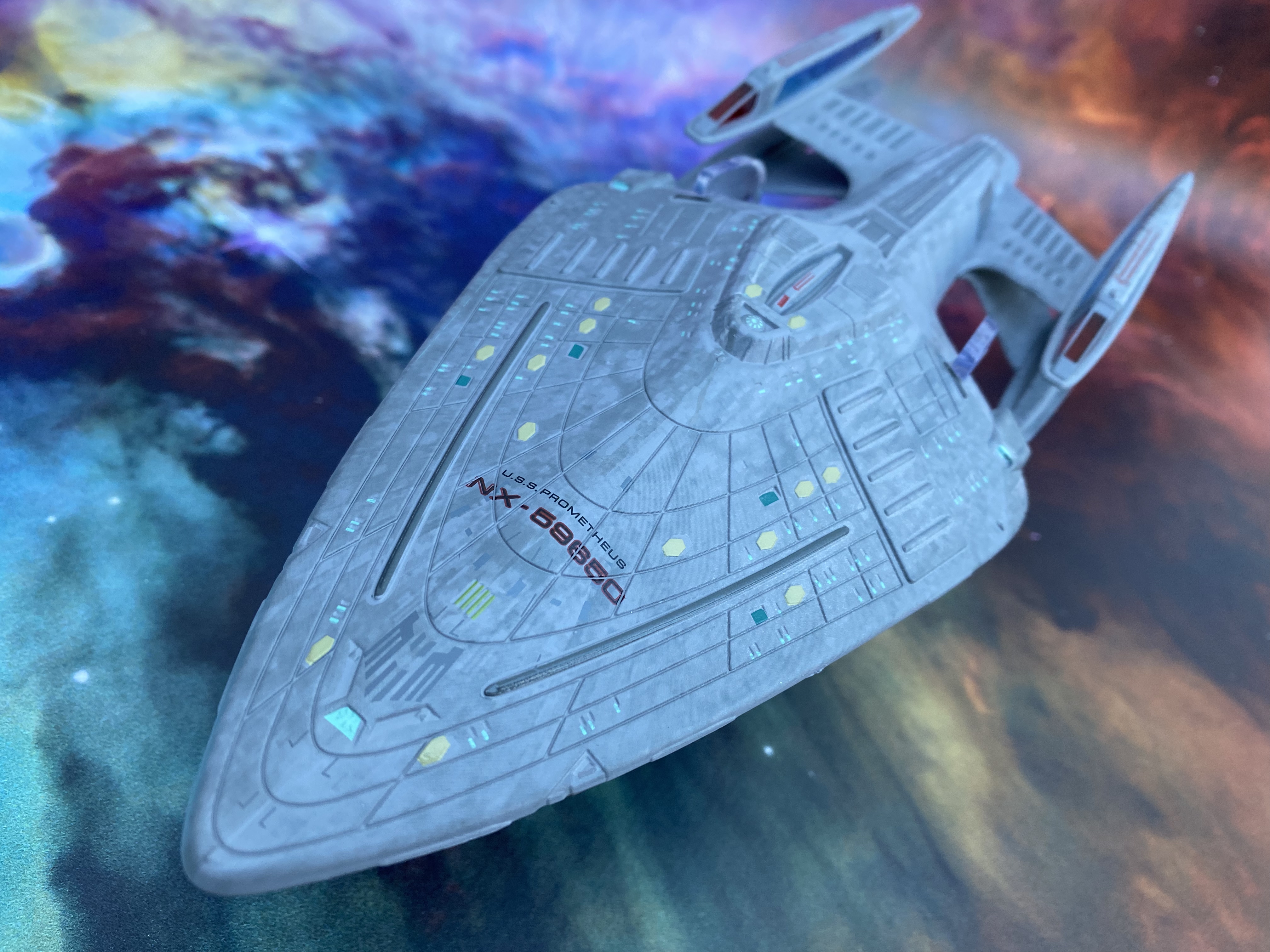
Just from a cursory glance it's more than apparent that Eaglemoss have completely reworked the paint scheme. Toned down from the dark grey with even darker highlights, the new Prometheus slips between a grey and a duck egg blue. The emboldened sections of the hull, most prominently the phaser strips and also some panelling towards the nose almost seem to have been tone shifted down to the colour of the smaller original edition's hull colour. On the nose we also have a blue-coloured deflector dish that was previously omitted. Another small detail picked up and corrected!
This is a huge improvement that means all of the highlight, differentiated panels, hull lines and aztec paint are more subtly worked in. The lifeboat hatches too have a more distinctive hexagonal shape which was unique to the Prometheus and on the XL they do stand out a lot more. On the smaller edition these hatches blended in with the darker paint job far too easily.

Talking of changes, to the sides of the top hull section there are four horizontal "road bumps" and on the new edition these have been matched into the hull colour rather than lightened. Again, great touch and it makes the XL feel much less of a patchy, blocky experiment and more as a single craft.
Tonally you can see that there have been some reductions in tones, around the bridge for one, but also an increase with the spine of the Prometheus receiving a lot more attention both in colouring and detail. The registry too is much more legible with a sharper border and slimmer black centres.

Only a couple of darker panels on either side of Engineering and also the shuttlebay door itself remain and its at this rear point that you can spot that this isn't just a copy and size-up but a new mould. Running under the front edge of the door is a new seam that shows the landing strip to be part of the plastic underside rather than the metal upper piece.

Comparing the underside of the primary hull is a bit of a revelation. On this larger edition the subtle aztecing does stand out a lot more and it doesn't feel like an afterthought. Even those chiselled ends to the phaser bank just add to the enhancements here and are alluded to in the pocket size magazine also included in the box.
One huge, stupidly annoying gripe though to complete this one, the stand is terrible. Using the same fit as the original, the weight of the front of the Prometheus here is significantly more and it spends all of its time with the nose dipping to the floor. I suspect the stand was just scaled up with no real problems considered but I wish it had been redesigned.

This is a brilliant and deserved XL edition with a good weight to it and fantastic upgrades to the small first version. Cleaner, sleeker, better decalled and with a much more screen accurate finish, even down to the min-nacelle on the top, I'm a big fan. This one's going next to the Equinox right now.
No comments:
Post a Comment