Showing posts with label Kelvin Timeline. Show all posts

Saturday, 16 April 2022

XL USS Enterprise NCC-1701 (2009)


Of all the XLs this is the one where we see the least upgrades from the original. 

Not only that but it's a rare XL where the original was already larger than the regular editions. This was, if you recall, the second special edition and as such there's not a lot that's been achieved by making this ship slightly bigger.

Comparing this back to both the special edition and its screen ancestor, the Kelvin Timeline USS Enterprise, this version is pretty close to the original. The paint scheme picks out the aztec patterning and the grey panel highlights mirror the smaller version. One thing to notice immediately is that these grey elements are slightly lighter on the XL and the white a shade more crisp too. Admittedly my photography skills back in the day weren't the best but this newer edition does feel at least cleaned up.

Most significant are the joint lines on the engine and between the neck and saucer section. On the former the two halves meet much more cleanly at the top and along the length of the two warp nacelles. The grey detailing is now more prominent on the warp engines with even the rear exhaust ports gaining some much needed detailing. 

The secondary hull is now cleverly sectioned up with the sectioning changed from two hull left and right halves into a top and bottom section with an addition double section forming the neck. It is more complex but adds a great deal of structure to the ship and strength to the finish. Plus the horrid join line across the top of the secondary hull is now erased providing a cleaner curve. Underneath you can see how the new combination works with the bottom element extending front to back and slotting in to the upper piece.

Around the base of the pylons there's also been a tweak to the thickness of the grey striping which now goes all the way round rather than just underneath. Also just under the strikingly blue bussard collectors there are new grey cutouts adding to the colouring of the starship. Onde thing that is still missing however is the striping around the sides of the saucer but here that curve is just too tight to mark up. The collectors themselves also gain the white lining omitted before and look ten times better just with this screen accurate touch.

As for the secondary hull; on the special edition the joint line was gaping with the saucer only loosely fitting onto the secondary hull. The line from that point along the front of the neck is now a lot better aligned with the torpedo tube and element just below it now coloured - something that the slight size increase does afford. 

Docking ports on the side of the Engineering hull and also on the neck are now more prominent as are the RCS thrusters on the edge of the saucer. Ok, so this isn't a big rework but rather a refining of the first version released just under eight years ago and it does work. However I would be pushed to justify getting this if you've already forked out for the special edition. There isn't a huge amount different. Yes, the windows are slightly better aligned but the decals are just as good - except this version does now have the registry on the underside of the hull that was missing previously.

The upgrades of structure, painting and formerly omitted decals are the biggest things here and do add to the overall feel that this is more complete but anyone who already has a version will be disappointed. I am looking forward to lining this up with both the TOS version and DSC editions as a mini trio.

As for the magazine, the content barely touches the USS Enterprise and instead swings off on another direction linked to the 2009 Kelvin Timeline movie. Focusing heavily on the design and build of both the Enterprise and Nero's mammoth Narada, Eaglemoss makes it even more conspicuous that the antagonist's ship will never see its arrival in the collection. Lots of concept drawings and the standard array of background info is packed in here to cover the Romulans' mining starship from every angle.

Check out all our Online Starships posts HERE

You can find out more on the Star Trek Online Official Starships Collection by visiting the Hero Collector website HERE

Enjoyed this article? Why not like and share to spread the word!

Like our page on Facebook 
Follow us on Twitter

Thursday, 14 October 2021

The Kelvin Associates: USS Armstrong, USS Newton and USS Mayflower


Destroyed only minute after they appeared, the Kelvin fleet has made a first appearance in diecast form.

For fans of the 2009 film will recall that the Enterprise was not alone on its mission to evacuate Vulcan but was the only surviving craft.

Over the next few months Eaglemoss will be releasing three Kelvin Timeline starships. The USS Newton and the USS Mayflower will be following with the USS Armstrong hitting the online shop this week. 

Delayed for a month, the Armstrong has a lot of familiar features in place. There's the saucer connected to two nacelles at either edge, no secondary hull and that rollbar carrying weapons or whatever might be needed for the mission. In essence this is a beefed up Miranda Class with a third, longer nacelle planted in the middle of the ship's underside.

As you become aware from the magazine, the metallic finish is to age the ship and ensure that the Enterprise stood out against the rest of the fleet. If the Armstrong is older though, how come its registry number is NCC-1769? Anyhow, numerals aside, this is a decent little model with a fantastic paint finish that reflects a more industrial perception of the universe in the Kelvin Timeline.

The weathered effect on the metal works as well as it has on Shuttles 4 (which we discussed recently) and what I like there is the continued theme across this range of ships. You know where they're from and they all physically and visually link together. Oddly the Enterprise stands out like a sore thumb being shiny white!

But let's stick with the Armstrong here. The registry on the saucer is super legible namely because it's huge. Both the name and number are edged red but overall the detailing on the hull is basic to say the least. You can make out possible phaser emplacements and the RCS thrusters are just about visible but that's it. The bridge module is recognisable but you can see how far they modellers needed to go when they were making the Kelvin fleet since there's not a lot of very intricate detail anywhere. In fact, we know from the magazine that the fleet itself was a mix of bits reworked for the few craft we got to see.

The top of the saucer is rendered in metal with the engines, the ventral saucer section and the rollbar all plastic addons. The engines do have a familiar feel to them as well since they are almost identical to the one found on the USS Kelvin. The third is longer and just a stretched version of the other two. Detail again is sketchy at best but you can make out the exhaust points and the bustard collectors. Sadly the latter are just moulded parts of the ship due to their scale. 

In all honesty though, the Armstrong leaves me a little cold and has also let a tiny bit of concern in as to the quality of the upcoming Newton and Mayflower. It’s an OK model but there have been many far superior replicas done on this scale since day one of the original collection. Even the multiple Miranda variants have been more impressive and this, while it’s a rare chance to see the Kelvin universe fleet, just doesn’t match the Prime Universe quality in any way. I’d be as bold as to say that it shows up just how much of a cut and paste job the other ships in Starfleet were.

The magazine didn’t fair too well with me either. There’s some glossy CG of the Armstrong but under that it’s a recap of the disastrous mission to Vulcan and an extensive (and decent) look through the design process of the Kelvin Starfleet vessels. Reading this does make you look back at the model and perhaps be more harsh towards it but, strangely, my biggest gripe was the use of dark blue font on a black background. With the shrinking of the magazines, the text was already microscopic but now it’s verging on illegible especially the picture captions. Sort it out Eaglemoss!!!

To conclude - a steady and average model backed with an interesting magazine. Not the stuff dreams are made of but an interesting aside if nothing else.

Second in this Kelvin trio is the USS Newton NCC-1727. This is the most diverse of the three ships when it comes to design however the news that they were all effectively variations on one design makes these a bit disappointing upon arrival.

Anyway, the Newton continues the same blotched stained steel paintjob from the Armstrong but you have to look deeper than a couple of shades of grey here. First up she has a semi-circular primary hull connected to both a pair of warp engines on the top and twin secondary hulls below. 

The main hull is cast in metal and carries adequate bridge detail and also phaser emplacements. Everything beyond that primary piece though is in plastic but the painting helps draw all the elements together. The hull colouring really suits these ships and accentuates the already quite deep deflector grid lines curving round the ship. 

On the two warp engines above the primary hull the bussard collectors are a dulled yellow/grey in translucent plastic with the exhaust tips at the other ends recessed in blue, mirroring their onscreen appearance. The joint lines on the tops of the nacelles are strangely raised with the rear tips not quite fully closed. Not the best bit of model work to date by any stretch. The connecting rollbar arm is fairly bland with only the blip of gold paint to help isolate the warp field regulator.

The bottom two attached tubes are a bit more interesting with twin shuttle bay doors at the back and deflector dishes to the front. From memory this is the only ship with such a configuration especially with the double blue dishes facing forward. The joins on these shorter tube sections aren't as noticeable and the "caps" that are provided by the shuttle bay doors certainly help. It's only on a closer look that you realise the split for them is horizontal beneath the doors rather than top to bottom.

To the rear of the structure connecting them back to the main hull you can just make out the red of the impulse drive. It's a narrow slip of paint but nicely touched in.

The USS Newton is a sturdy build with no flex or movement in those rear outslung hulls and engines. The look of it easily makes it the most interesting of the three Kelvin fleet starships.

The 18 page magazine still doesn't clarify what class of ship the Newton is but does revisit the events of Vulcan's destruction and the ship's fleeting involvement before its destruction by the Narada. For anyone who loves John Eaves' work, the second second focuses on concept art for the 2009 movie and ties in well with Shuttle set 4 as well as exploring the aesthetics of such things as the police bike and the Enterprise's dry dock.

Last up in this sequence of bonus editions is the impressively bland USS Mayflower NCC-1621. The easiest way to explain this one would be to remove the rollbar and the middle nacelle, Hey presto, it's the Mayflower.  

There is, sadly, very little to say about it. It is for all intents and purposes the basis for the Armstrong but does benefit from a slightly larger finish. Notable points are that the registry is located in the same place as the USS Kelvin, just behind the bridge and the nacelle design is identical to the other two ships featured here. That said, it's not just a straight reuse on at least one of them since the Newton's engines are longer by a few centimetres. The front and rear caps are the same colours with the engines and the lower saucer insert all in plastic. 

Apart from the thin impulse engine to the rear and some minor greebling on the underside - also identical on the other two ships so you see a pattern - the Mayflower has the distinction of being totally indistinct. Even the Reliant had a rollbar yet this may well class as the dullest Starfleet ship to ever grace a HeroCollector box. I can't even raise an eyebrow in excitement here. 

Its included magazine is a familiar story since it glosses over the details of the fateful rescue mission to Vulcan. The Designing the Mayflower section is, ironically, short and to the point. They needed ships designed, there wasn't a lot of time; hey presto in four paragraphs.

Last up and taking a good chunk of the issue we have an article on the design of Nero's Narada. Given that this will never ever get produced in the collection its a good choice to add in but also fair confirmation that Eaglemoss won't try and replicate the upgraded Romulan mining ship. 

OK. Let's be straight on this trio. The Newton is the outright best of the three because of the variations but overall these are pretty uninspiring and very very completist. The magazines are almost too apologetic in mentioning the speed at which these ships were CG'd for the 2009 reboot and building them for collectors highlights how much CG kitbashing went on to get them ready for the big screen. Even worse? The damn numbering. It makes no sense when it comes to sequence and starship class which was set up Back In the Day. I can't imagine that logical numbering would have gone the way of the dodo in the Kelvin Timeline - 1727 commissioned before 1701? Really?

Check out all our Starships posts HERE

You can find out more on the Star Trek: The Official Starships Collection by visiting the Hero Collector website HERE

Enjoyed this article? Why not like and share to spread the word!
Like our page on Facebook 

Follow us on Twitter


Monday, 16 August 2021

Shuttles 4: Small Time Kelvin


Although it's taken a while to get to them, I've been bowled over at some of the wonders contained within Eaglemoss' Shuttles sets. 

Perhaps with the exception of Set Four. This is what you might call the odd one out, comprising of support craft featured in the three Kelvin Timeline movies. In a bizarre twist, while the hero ships from that trilogy were all large Special Editions, the shuttles have gone the opposite way. Inexplicably they're smaller than the Prime Universe ones.

Each does once again come complete with a stand (three of the four here don't need it) as well as a lithograph print of each vessel which is also included on the back two inner pages of the accompanying mini magazines.

Featuring in the 2009 reboot, the Transport shuttle is one you need to keep an eye on. If you sneeze there’s a good chance it’ll vanish. The smallest of the small quartet, it still carries a good level of detail but could have done with being ever so slightly bigger. It’s not as if the box is filled out and it’s also very off scale with the other three more conventional craft. 

With the standard blacked out windows, the Transport Shuttle has a fantastic weathered finish with worn paint, scuffs and colour variance. Given it should have been afforded a slightly bigger scale, the finish is impressively carried off. There’s also a fair amount of decals applied to the ship with warning arrows, the registry and hatches wing panels all added. 

The weathered look manages to cover up some of the less defined panelling as well as the loss of size versus its peers but what you do feel is that the more realistic finish contrasting to the more sci-fi (and cheaper) elements of the TV shows actually doesn't weigh into its favour.

The second up is the Passenger Shuttle seen in both the 2009 reboot and also Into Darkness, the craft is on a much better scale. Once more featuring the weathered finish, the Passenger Shuttle is more recognisable thanks to its underslung engines.

Assigned to the USS Enterprise, this craft has brushed up well with the same worn effect as the Transport Shuttle. It also benefits when it comes to the registry decals which are much easier to read due to the letter spacing and can even afford to add in the black edging. On the Transport Shuttle all that finery just becomes a bit of a blob. 

The panelling too is more defined with distinct ridges on the shuttle surface rather than a series of undulations that gave the smaller Transport vessel a little of its character. It does have a much more industrious look to it as well as that more blocky shuttle silhouette that is distinctive in the Prime Universe sets. Where the Passenger Shuttle does excel is in the retro nacelles which include recessed buzzard collectors and also exhaust points that are a distinct homage to the back end of either/both the original 1960's Enterprise and/or the Galileo shuttle.

It’s a lovely design and well executed. Possibly a tad on the small size but packing a lot of good finishing detail and a more realistic, used appearance than we’ve seen in other sets.

Famed birthplace of one Kelvin Timeline James Tiberius Kirk, the Medical Shuttle from NCC-514 is another little gen in this box. With a similar form to the Passenger Shuttle, the boxy Medical variant has a lot more in common to a classic shuttle than any others especially with that wide pointed nose. 

I love the surface detail on this one even more than the Passenger Shuttle because of the speckled, patchy effect that gives a spectacular uneven and realistic finish. Featuring three distinct entry points, the Medical Shuttle is also the most visual attractive of the four thanks to the boatload of red markings that scream out loud it’s role. 

Along with the medics markings striped across the hill, the shuttle also has some general use warnings around there being No Step to the side door off the nacelles. These little touches, which are evident right across the pack, might not seem significant thanks to the scale disappointment yet they make the Kelvin Quartet a more tangible group with warnings and labels that you would hope for and expect to be used on such a craft if it were real.

The Warrant shuttle from Into Darkness got double duty both involved with the initial Nibiru mission and then used when McCoy and Carol Marcus need to access one of Admiral Marcus’ top secret torpedoes. 

Of the four, it’s the only one that doesn’t sit flat hence all of the pictures include the stand. It also seems to bear a strong resemblance to the Kelvin Medical Shuttle with some minor body modifications including the repositioning of he warp engines. Again there's a lot of strong and crisp decaling on this one set against that angled, weather bodywork with the name, starship registry and pennants all crystal clear. A little more rugged than the Medical Shuttle, the Warrant's detailing is potentially the best of the four but that's not a gold star in any book. The panel lines are prominent and the black window blocking sits perfectly into its assigned recesses but you still feel it's (yawn) undersized and missing an opportunity. 

I can't emphasise how good the weathering on all four is and it really does make all of them look a lot more solid as replicas. The retro engine design too, which is present in the cowlings and collectors of the Warrant are equally impressive but Eaglemoss seem to have really let themselves down with this group especially when compared to those Kelvin Timeline specials we received many moons ago.

Each of the magazines is an incredibly brief resume of the shuttles' appearances in each of the Kelvin trilogy just to jog your memory as well as screencaps and new CG to fill out the background but don't expect too much as each will take you moments to flick through. The best bit is probably the tech spec at the back.

Comparing directly against the other six sets available, this one falls far short of the standard that fans have come to expect from Eaglemoss. Yes, all the elements are here and work but that size issue has really ground my gears this time since that disappointment has seeped in since I opened the box on its arrival.

Check out all our Starships (and shuttles!) posts HERE

You can find out more on the Star Trek: The Official Starships Collection by visiting the Hero Collector website HERE

Enjoyed this article? Why not like and share to spread the word!

Like our page on Facebook 
Follow us on Twitter

Thursday, 13 June 2019

Kelvin Counterparts: Attack Wing Mirror Universe Faction Pack: The Kelvin Timeline


Utilising elements from previous Wizkids games, Attack Wing has added a further piece to its repertoire.

Note: This is PART ONE of a two-part review...

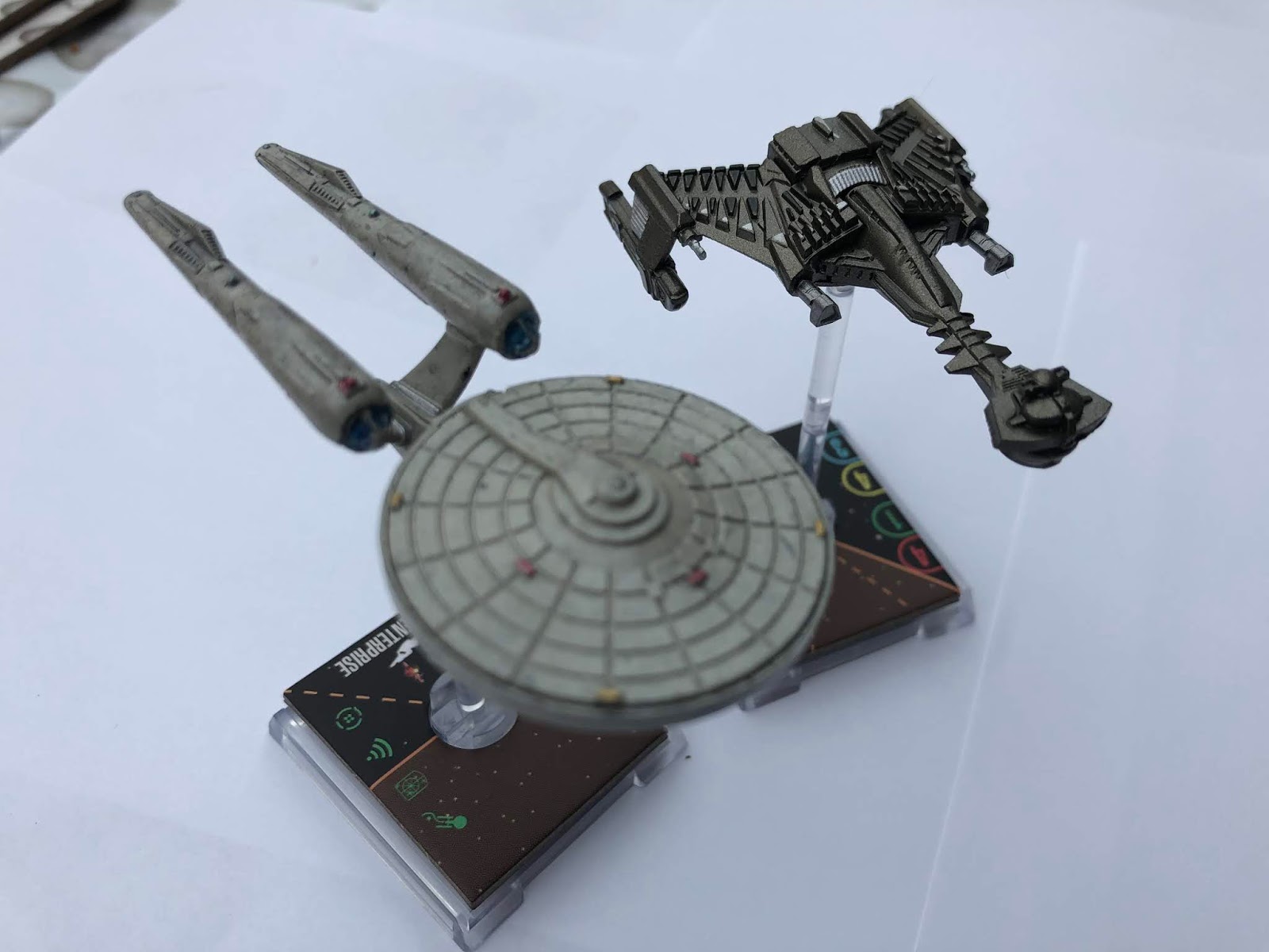
Including two Constitution Class and two Klingon Battle Cruisers from the Kelvin Timeline, the Faction Pack provides not just the one Mirror fleet but two opposing forces if you want to go for a full on war.

The Constitution Class models actually have a decent amount of hull detail with panelling, phaser banks and even reaction control thrusters visible on the saucer.

Both the Enterprise and the Enterprise-A cards carry the same four attack, one defence, six hull and four shield points as well as one Tech, two Weapon and two Crew upgrade slots. They also both cost 28 points as well as the Evade, Target Lock, Scan and Battle Station actions slotted in. They do differ when it comes to the aptly titled Unique Action. With the "original" Enterprise you can flip over a Specialisation Card (more on this shortly) and flip a damage card face down as a result.

On the Enterprise-A a Specialisation Card can be flipped to restore a shield point. Both of the Enterprises move identically with a maximum forward speed of six (does incur an Auxiliary Power Token) with Green forward and bank maneuvers at speeds one and two. Speed two also offers 90 degree turns and finally there's a speed of two for reverse that will incur an Auxiliary Power Token.

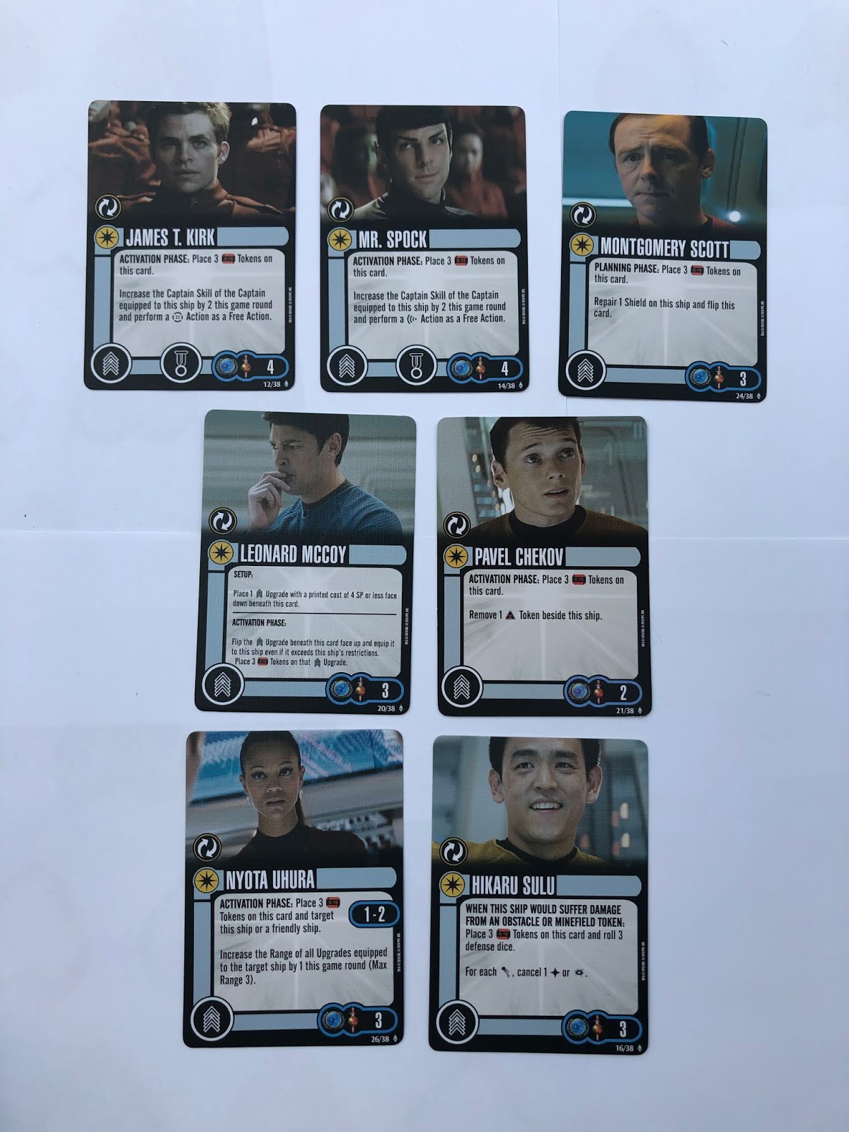
The Starfleet ships come with four captain options in Pike, Kirk, Spock and Sulu. Now, before we get into those you might think there are a heck of a lot of cards in this box but what we have here is a whole set of double-sided crew options. All of the Federation/Mirror cards here with the exception of Pike carry the "switch" Specialisation emblem. These will start on one side and then flip as and when directed within the game. There is, fortunately, a Specialisation card which explains all the benefits of these new possibilities plus their restrictions.

Unusually for this game pack I'm going to review per character for crew starting with the Kelvin Christopher Pike. An eight on Captain's Skill, Pike costs five points with the option to pack an Elite Action onto the ship as well. He allows an additional Crew slot plus can flip two Specialisation Cards equipped to the ship. Pike's a good card with strong stats that will allow you to change the flow of the game by altering your specialties in bulk per round to suit the situation.

Kirk has a Captain skill of seven for a cost of four points plus the chance to add an Elite Action. Kirk can be disabled during the Activation Phase and as a result you can remove a Time Token from any Crew assigned to your starship. Again a good skill level but reactivating this Kirk will take an Action to complete. Flip him onto Cadet Kirk, the cost is still four points and the Elite Action remains active. This version however is Crew rather than Captain and again he comes into play during the Activation Phase. This time three Time Tokens get set on the card so that you can increase your Captain skill by two for a round and also perform a Battle Station action as a freebie.

Cadet Kirk is certainly more flexible than the decently powered Captain option so I'd be more tempted to load him as this version with Pike in the command slot.

Science-shirted Mr Spock comes as the third command option for the Enterprise and provides a damn useful option alongside his skill of six and option for an Elite Action. During attack Spock allows your ship to add a Battle Station action/token to your ship or, if you have Scan already active. It adds a Damage to your attack roll. This highly effective card really has no downside nor does it require any Time Tokens to reactivate the feature. 

On the other side the Academy Tutor Spock works similarly to Cadet Kirk, increasing the captain skill by two points and letting you perform a Scan as a free action. All for the cost of three Tmie Tokens however it gives you the chance to move first and then potentially attack first with benefits. Spock costs a respectable four points and either side will allow the addition of an Elite Action.

Captain cards now out of the way, there are a further five Crew cards which are also double-sided.  Scott, Leonard McCoy Hikaru Sulu and Nyota Uhura cost three points with Pavel Chekov costing two. Montgomery Scott is temporarily disabled by Time Tokens should you wish to give yourself a better chance and repair a hull point or on the other side he will again result in a disabled card but for the option of repairing a Shield point. Once each Action is used the card is flipped meaning you can alternate which repair is completed. 


Cadet side McCoy offers an option to combat an Action that would lead to your Captain being discarded or disabled effectively "sacrificing" this card for that piece. Three time Tokens prvent it from being disabled while two will stop it from being thrown out of the game. On the Doctor McCoy side the process is two-step. Before the game starts you choose a Crew upgrade costing four points under the card. During Activation that Crew card is equipped to the ship and is temporarily disabled with three Time Tokens. I quote like the chance to add something new to the game with a delay. This can be played to great effect at a critical time to seal the deal.

Sulu can also be graded as a Captain with a skill of five and will gain an Evade Token should you perform a banking move at speed one to the left or right. Defensively it adds another chance to get away from an attack more effectively and the alternative also provides additional defence but only against minefields with three dice rolled to see if you can Evade the onslaught of this killer laid weapon. His stronger Action is definitely his Captain side but given the strength of the other contenders I would probably never use it.

Uhura also functions to extend your time in the game with her Cadet side allowing you to discard any Communication Failure damage cards and her Communications Officer side offers help to an ally with it increasing the range of any Upgrades by one. This Activation Phase action comes at the cost of three Time Tokens but could help a smaller support ship give you an extra boost or provide an unexpected attack from another craft.

Two point Chekov works against opponents during combat to remove a Scan token in play on another ship or you can utilise his ability to cancel off an Auxiliary Power Token from your own craft dependant on which version you choose. Either incur the standard three Time Token penalty before being reactivated. For a couple of points Pavel does provide something different and I would probably go with the Auxiliary Power assistance to mean I can perform some tighter manoeuvres. Definitely suggest coupling him with something that will reduce your Time Token penalty.


You also have two Weapon choices to implement taking their cues from the 2009 and Into Darkness movies. Full Spread Phasers either adds an attack die to your primary weapon (thus making this Enterprise attack with five dice) or allos you to fire from your Secondary Weapon arc using one less die (three in this example). This is a magic card to equip for just a four point cost and removes the possible need for Photon Torpedoes since there's no Time Token requirement to reactivate. Costing three points is Advanced Long Range Torpedo. Adding one more die to the attack (five in the case of the Enterprise), the Torpedo can be used at ranges two and three and does require two Time Tokens to be used up before it can be reactivated. However, the benefit is worth it with any ship within range one of the target incurring one point of damage. A great move that increases the abilities and effectiveness of the weapons in the pack and one which you would have to seriously consider on a Federation or Mirror Universe fleet.

Rounding out the Federation half of the pack there are two Tech upgrades included (but no Federation Elite Actions???). Integrated Future Technology is a nod to the arrival of Nero and Spock to the past. This one stops you from incurring Faction Penalties when you want to bolt on Romulan or Bajoran Tech or Weapon upgrades to the ship. But that's not all and for three points there's a lot of value here since the card asks you to place a Tech upgrade costing four or less under it during Setup then flip it over and equip it during Planning even if it goes over your points budget. 


Finally, Portable Transwarp Beaming Device works at all ranges and stops you losing an essential crew member from your ship if such an enemy Action was to do so.  If this was to happen then this card comes right into play with a light one Time Token penalty and a cost of two points which is well worth the price to keep your ship fully stocked for the duration.

The Federation half of this pack gives some strong contenders and a lot of things to consider. A few of these upgrades are downright outrageous and the double-sided cards provide a new twist on a game that's been around for a while. What I would have liked to have seen was some functionality linked to Beyond but the bulk of the crew features seem based firmly in the 2009 movie with the tech coming more from the Into Darkness sequel. Certainly a Saucer Separation option would have played well maybe offering two firing arcs and maybe we could have had a Vengeance or a Franklin instead of the second Enterprise which, of course, suggests that this was devised during or after the third movie. 

The models are decent and yes, we know they are recycled from other Wizkids releases which is likely the reason we haven't got either of the other two Starfleet ships I've suggested since their miniatures don't exist. That said, this is a great addition to the fleet and a whole new angle with the dual ability cards. Potentially one of the strongest fleets available in one place.

You can read the second half and the Klingons right here...

What's your impressions of the Kelvin Timeline faction pack? Will you be adding it to your collection?


Live on YouTube
Like our page on Facebook 
Follow us on Twitter
Add us on Tumblr

Monday, 18 March 2019

Rounding Up: The Graphic Novel Collection Issues 44 - 47


Once more diving into the Eaglemoss Graphic Novel Collection, Ian Kimmins opens the pages of another four issues...

Volume 44 Burden of Knowledge is written by well known Trek comic book writers Scott & David Tipton. The brothers are well known in the Star Trek universe for such classics as The City on the Edge of Forever, TNG/Dr Who crossover and the recent Mirror Broken among others, so you know you are going to get a well written tale.

In this volume we actually get four stories that all take place within the initial five year mission. Up first is Uncertain Prescriptions in which the  is heading to Mygadlus 3 for a routine mission(is there such a thing in Star Trek?). A new world wishes to join the United Federation of Planets however it doesn’t turn out to be all that it seem!

Up next is A Failure to Communicate and it’s another planet in the middle of a rebellion story albeit one with a difference-all the citizens are joined together by a thought network. As things escalate it’s up to Kirk to decide if he can interfere as they discover an underground group who have opted out of the shared mind.They resolve the issue in a typical Star Trek way and the planet realizes they are not ready to join the Federation just yet.

The third story is A Matter of Perspective which starts off with an Andorian engineering team coming aboard the Enterprise to perform some maintenance and display some un- Federation-like qualities. Once completed the Enterprise is sent to find the Lavota wind which they find destroyed and seemingly the Tellerites are at fault. As they sail into what looks like another interstellar incident the crew realise the Enterprise computer is giving them an Andorian point of view. As Kirk uses his charm to get them out of their latest predicament they receive a distress call from Lt Thompson who is looking for them to rescue him except Thompson is currently sitting at the Conn!!

The final story Burden of Knowledge continues the story of Thompson. Naturally the Thompson they rescue has short term memory loss. As the crew head back to Mygdalus 3(from the first tale) to investigate they discover a lot of Klingons & Gorn & even more Thompson’s! They are transporter replicants and
and how the Mygdalians were able to attract the interest of the Federation in the first place. The story does end a bit abruptly without any great resolution. Kirk just takes all the Thompson’s and leaves!!

We have our usual Gold Key Issue as-well The Evictors/The War that Captain Kirk Made. Overall this volume is another winner for DW/Eaglemoss although the ending of the main story is a little jarring.

Issue 45 covers Manifest Destiny which we have previously reviewed and has myself and Clive split on whether it's a good story or not. We'll let you refresh yourselves on our review before you make a call!

Issue 46 takes us into Year Four of The Original Series spinning right out of the closing moments of Turnabout Intruder. Continuing the epic adventures of the Starship Enterprise we have a very varied chain of events through this volume.  Drawing together a couple of visual styles across six issues, the narrative from David Tischman remains firm to the visions of Gene Roddenberry with the crew encountering new and exotic races (perhaps more exotic than the TV budget of 1966 might have allowed for) and even pushes the boundaries further than you might anticipate with the rather weird and wonderful trip to Phi-11 and it's TV-centric populace.

Each of the stories neatly dovetails into the next with one adventure leading to an encounter on the way to a second, a diversion on the way to a third world which ends up with the good captain tackling a robot nanny. Yes, a robot nanny.

Year Four certainly carries on some of the more outlandish moments of the third season of the show, adding in some wry humour from Tischman and a wonderful pallette if colours and pencils that brings the stories to life. It's not the most memorable of mini-series and I had to flick back to remind myself of the content of this issue but on reflection it looks great and reads OK.

At the back we have the ever-entertaining Gold Key with The World Beneath the Waves. Now, oddly, this isn't one of the weirdest adventures to have been packed into a volume however given the nature of some of the stories in the preceding pages of Issue 46 you might be forgiven for thinking that Kirk and Spock fighting sub-aquatic mutants is a bit tame...

Issue 47 Deep Space Nine: Requiem offers up a more gritty style from the halls of Malibu Comics. Seven stories beam in to the pages here returning us to the earlier and less Dominion heavy years of the station. Entering the fray through a story led by Jake and Nog, these are fast moving tales from writers including Trek novelist John Vornholt and franchise historian Mark A Altman.

This set touches on the events of Wolf 359 allowing fans to "see" the battle like never before since the page provides less restriction graphically. It opens up a chink in the armour of Sisko which was rarely approached the more that the Dominion took hold of the Alpha Quadrant.

Kira gets to go on vacation and gets involved with something not too unlike mini-Pacific Rim robot wars before - and not without want - the Cardassians turn up to add more dirt to the already raw comic strip.

Malibu's issues were much more grainy and "real" perhaps than the clean and crisp lines of, say, the Kelvin timeline but there's a more personal feel to the writing and a closer understanding of the nuances of the characters with Sisko for one being treated a lot better than he was on the screen at the time with some fairly decent material. Kira is almost spot on in her disdain for taking time off which would actually come up again in Defiant before having something of a change of heart towards the end of the story.

I would have liked to see a Deep Space Nine tale in the style of those Kelvin Timeline volumes from the later IDW years but this is a real sign of the times and telling of the era in which they were written. The short, fast-paced and rough edges here make the issue memorable and distinctive with only the Voyager stories - which would have been around the same time - showing any similarities in visual styling. As for the tales, they are very much defined by the more standalone nature of the first couple of years of the spin-off show and that's laid out in the way that each is unrelated to the next or previous. Worth a look and a read but potentially only accessible to more hardened Niners.

Gold Key's Prince Traitor reads like a 1930's epic swordfighting movie but once more a potential straight line of a story is expanded into the most campy of sci-fi concepts with senior staff riding ostriches and a reveal that wouldn't have been out of place in Errol Flynn's Robin Hood with only a few "forsooth's" missing just to get a full house. There;s lots of cheesy hokum to get your teeth into but I tend to find it's best in small bites to avoid sickness...

Issue 48 returns us to the Kelvin Timeline and we get the origin story of popular crewman 0718 and also to visit a newly discovered planet. It covers issues 31-34 of IDWs ongoing series. The first tale kicks off with a flashback and we get the story behind crewman 0718 who appeared in Star Trek Into Darkness.There are some story parallels that run similar to the motion picture This story highlights what the comics and Mike Johnson have done well and that’s give a bit more life and meaning to the Kelvin universe. The next tale finds the Enterprise on an undiscovered planet Naturally they discover some human DNA and a child’s NASA drawing. This is a good Trek tale that interweaves a few different Trek stories to produce another great read from IDW.

The less said about the Gold Key Issue The Oracle the better! It reads like Spock’s Brain crossed with a Spock bobblehead and gets even crazier than that!

Tuesday, 15 January 2019

Kelvin Out/31 In


SJ Clarkson is now assigned to the upcoming Game of Thrones prequel and with no resolution to the Pine/Hemsworth contract dispute (probably) among other things, Star Trek 4 is now officially shelved. 

I'm not hugely shocked by this news as it seems none of the puzzle pieces were fitting together well and there was zero sign of a script.

It means that the Kelvin Timeline may well become known as the Kelvin Trilogy and remain one of Star Trek's more unique spin off elements. 

But the influence of those films, or at least a key part of them will live on in the Kurtzman Era as the destruction of Romulus is set to have had a profound effect on Picard in his as yet unnamed series which will, along with the transference of Prime Spock over to that timeline, cement the three movies firmly as part of canon.

While it seems like the behind the scenes dilemmas are the reason for the seeming end to the adventures of alt-Kirk and co, it's been a pretty good run. While I openly admit that Into Darkness isn't a masterpiece and borrows chunks from another Star Trek movie you have to admit that the visual quality, the acting and the very feel of these three stories has been exceptional. 


The 2009 movie is one of the best Star Trek movies to have ever been made. Doing something that was a possibility back in the days of The Undiscovered Country, it took the crew back to the Academy and their first meetings. It reset our expectations of Star Trek while simultaneously and subconsciously updating it for a new generation of fans. In fact this would be a generation of fans that would have never seen The Original Series or heard of Deep Space Nine. At its heart it was just a damn good sci-fi movie that happened to be Star Trek at the same time. 

Beyond rounded out the three with the destruction of the Enterprise which kind of means these three films become the story of that singular ship but of the trilogy its probably the one closest to the feel of The Original Series in its look and feel. 

However as one door appears to have closed, another one has sprung open with the official announcement that we've all been expecting for a little while; that Michelle Yeoh is getting her own series as Mirror Georgiou in a new Section 31 show.


Hardly surprising which means there must be some meat on the bones that we'll be getting a second animated series plus something to do with Starfleet Academy in the (very close) years to come. Due to be produced by Discovery writers Yeon Kim and Erica Lippoldt who were responsible for the Saru episode Into the Forest I Go in season one. 

That now brings the confirmed series total to four including Discovery, Picard and Lower Decks. plus there are supposed to be seven in play by 2020. So...we're just over half the planned amount of shows which will definitely solidify Star Trek's place back on the small screen.

From chatrooms/boards it's clear that fans are naturally concerned about the number of shows online and are having flashbacks to the mid-'90's "Golden Age". If managed well then there shouldn't be a problem - but look at the diversity too.

In the '90's the style of the shows and movies were all very similar visually, in the way they told their stories and most notably in their focus on Starfleet. What we seem to be getting from the Kurtzman era is a galactic sandbox in which we are going to see different aspects of every corner of the Alpha Quadrant (and maybe more) with neither Picard nor Georgiou part of Starfleet directly. This new Section 31 show will certainly be exploring the darker corners of the galactic landscape away from the sharp, duty bound lines of the Federation.

But does this mean that our Star Trek is going to be less Star Trek? Will this massive expansion dilute the brand and the strength of the storytelling? If they are going to branch out I believe this will be a bold and brilliant step to offer something refreshing to the franchise. If every series was, as you might recall from 20 years ago, a Starfleet crew out exploring the galaxy then yes, we'd be in some serious trouble but this new approach has chosen to give each new show a completely fresh identity and path to travel. Wise move and a very sensible one to boot.

Which of the new shows are you looking forward to? Are you lamenting the potential end to the Kelvin Universe?


Live on YouTube
Like our page on Facebook 
Follow us on Twitter
Add us on Tumblr

Thursday, 23 August 2018

Cameo Klingon: The Official Starships Collection Special 13


A new Big Green Machine is on the block courtesy of Eaglemoss but this isn’t one with which you’ll be overly familiar.

It’s only made (so far) one, solitary appearance in the Star Trek universe and even then it was barely glimpsed on screen on a screen.

The 2009 reboot movie features a Kobayashi Maru sequence and within that infamous scenario we have the opposing Klingons using the Kelvin Timeline equivalent to the D7 Battlecruiser.

To be fair it probably appears on screen longer than any of the ships from the equally infamous Wolf 359 graveyard and it’s absolutely in keeping with the Prime Klingon design ethos that wasn’t necessarily followed when it came to the Bird of Prey from the subsequent Into Darkness.

Coming in at xxcm long, the Klingon Battlecruiser is one heavy muthafucker. Painted up in two-tone green, the design heritage - or homage perhaps more accurately - is there for all to see with the basic command section, connecting neck and body plus nacelles formation firmly in place.  

Let's - unusually - start from the back. The twin warp nacelles sit at their slightly jaunty angle and carry a nice bit of tech detail on their surface. There’s the usual assortment of lumps and bumps indicating that more function-over-form approach you might expect from the Klingons but what is missing are the translucent inserts for the warp field grilles. On something of this scale I would have expected this almost as a standard instead of painting in the paired grille slats. 

These two chunky engines then lead back into the short green pylons and then onto the main engineering hull section. The origin of the form is clearly planted in the D7 Class from The Original Series and get there are a ton of nuances and tweaks that make it distinctly Kelvin. Take the hull plating for example. At first glance it’s very similar to the K’T’inga upgrade but the pattern of the bird feathers feels more aggressive thanks to the addition of a couple of fins here and there and extra firepower. 

Mind those two additional leading edge guns though because they are fairly bendy and thin - certainly bits to be cautious with. At the rear edge there are two yellow protruding impulse engines that seem oddly stuck on and out of place, flanking a rather basically detailed docking port - definitely the area of the cruiser that's been neglected in the design process. For note, only this hull upper and the warp engines are in plastic with the majority of the ship produced in metal and on the bottom this really works well as we will see shortly.

Just adding on top of a great design has added to the visual spectacle of the Battlecruiser and Eaglemoss have managed to produce a piece of kit that shows off all its assets far better than they were in 2009 in the blink of an eye. Look closely and you’ll see the echoes of the triangular pattern from the K’T’inga towards the centre of the hull while out towards the nacelles there is a more unique interpretation more mechanical in form than bird. Placing the ship alongside its two regular Collection cousins emphasises both these similarities and differences which Eaglemoss have captured so well.

Down the centre line of the Battlecruiser there’s a lot more chunky Klingon hardware to pour over with the main engine compartment to the back and more armour plating stacked up down the more vulnerable neck section resembling vertebrae - literally a neck!

Now interestingly on that section, the finish mirrors the effect that was designed for the Klingon armour which was cut from the Rura Penthe scene in the 2009 movie It even goes a step further with the plating around the main command section imitating the shape of the Klingon helmets from the same film with the side pieces arcing around the torpedo launcher opening.

What you can see getting towards the front end is that the mix of colours comes to a very abrupt end with everything from the vertebrae forward in the singular green. This is the case on the underside too where the forward sections are in one colour and the more ornate designs are left to the sole benefit of the body piece. In fact the finish on the underside is a little more tightly packed than the topside with the triangulated pattern emphasising the "bird" effect along the wing edges. It's very striking and Eaglemoss have managed it without any hiccups right across the hull. 

The bridge section is lightly detailed but with that solo paint scheme remaining constant. The mixed finishing pieces to the top give it a more individual feel and avoid that mass-produced left/right mirror effect and adds more to that Klingon "personality" conveyed through their architecture. The similarities to the K'T'Inga are strong again with the central superstructure a clear descendant of the movie original.


The stand grip clips around the rear central housing that sits proud of the engineering hull and then under the belly of the beast as per the other Klingon cruisers. Steady posture on this one and certain to look particularly menacing as part of any Klingon display.

The magazine poorly disguises just how little background material there is on a ship purely created as a piece of the background with almost half the pages dominated by big sketches and CG renderings. There is very little to go on here aside from the point that the Battlecruiser was 90% a copy and paste job and 10% adding some fins and flicks to the established design before sticking it into the simulation. A lot of the concept for the finished product actually came from a scene in the 2009 reboot that never made it to the final cut.

Closing out the printed piece of this edition we do get to enjoy the evolution of the Klingon cruiser through its various forms from The Original Series' D7, through to the Vor'Cha and the Negh'Var before spinning back in time to the D5's and such like from Enterprise. Lots of good old model shots from 90's Star Trek in there to drool over!

Is this one to add to the fleet? Great special?


Live on YouTube
Like our page on Facebook 
Follow us on Twitter
+1 us on Google+
Add us on Tumblr