Showing posts with label STO. Show all posts

Saturday, 4 October 2025

No F'in Space: The Return of the XLs


A title like that needs perhaps a little explanation alongside it!

With the demise of Eaglemoss, the halfway house that was Master Replicas and their "found" stock we have now come to a point where FanHome have picked up the gauntlet and taken on the Star Trek Starships Collection.

Focusing exclusively on the Kurtzman era (apparently with the exception of Discovery), the model series has chosen to skip the small scale vessels that marked out Eaglemoss' 180 edition series and instead focus on the mid-scale replicas that, ironically, were showcased by the Discovery collection. 

Due to size, storage, cost and the chances that my family will disown me if any more space is taken up by undisplayed, boxed spaceships I've had to be a bit more picky when it's come to the new FanHome line.

Rather than collect everything I've taken the decision to focus only on the XL ships meaning that the next review after this one is likely to be the Enterprise-G Constitution III

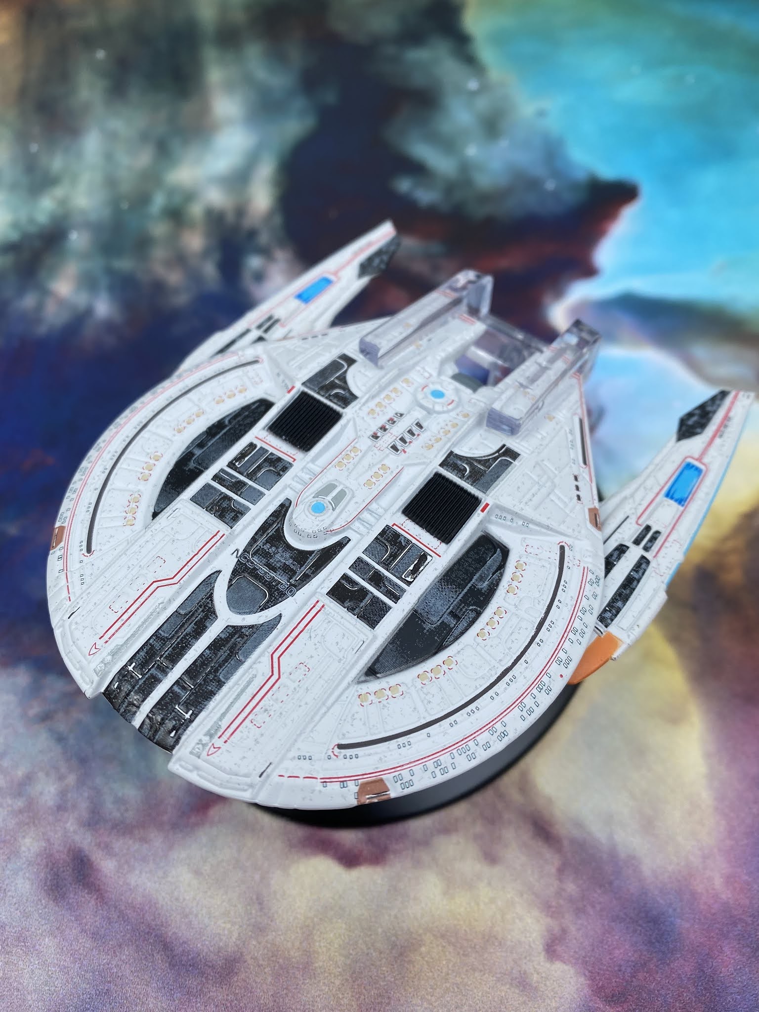
But for now let us crack open the box on the USS Enterprise NCC-1701-F. A veteran of Star Trek Online, the F has already received three regular sized editions thanks to Eaglemoss. First there were the two different paint schemes of the original giving collectors the chance to display their Odyssey Class ship in the STO colours or the more "realistic" greys of the TV and movies. As part of the later 20 issue STO line there was also the Yorktown Class upgrade players would be familiar with.

Picard's third season chose, wisely, to remain faithful to the original set up when it debuted the Enterprise-F as it was about to be retired effectively making the Yorktown subclass upgrade a "What If". It also played more to the "realistic" paintjob rather than the striking whites and blacks of the online craft.

It's a solid and logical choice to follow and gives collectors a truly stunning model that ticks all the boxes and makes these XL editions a must.

Heavily detailed, the Enterprise-F displays one impressive hallmark that sets FanHome above Eaglemoss - they can line things up.

The hull itself is covered with white and black window markings, RCS thruster emplacements and lifeboat hatches as well as the distinct charcoal grey striping along the centre line. All of these points are perfectly aligned to the hull features whereas previously some of these might have been off by a fraction. It easily outdoes the smaller original given the increase in scale and therefore ability to emphasise the surface features of the Odyssey Class.

Comprising of a metal upper primary hull and upper secondary hull as a single piece, the lower primary and the remainder of the Enterprise-F are moulded in plastic and there is no distinction in detail between the two sections. Back in the earlier Eaglemoss days the metalwork would have less precision in some of the finer shapes but here the intricacies of the model traverse both mediums. It feels complete with the best examples of where the painting alignment has nailed it being found on the underside.

Certainly around the charcoal segments of the saucer and on the lighter grey underbelly of the secondary hull the marking out of the lifeboat hatches is spot on and I don't think there's been a finer example to date. Around the lower sensor dome this is also evident with the light and dark edging perfectly in place.

Trailing right to the back, the F even has a decent level of detailing around the support craft which is docked in the tail end. Known as the Aquarius, this looks almost as if you could lift it right out of its dock. The recessing on it works perfectly and even highlights the hull features of this small vehicle.

While we're back here, the warp engines are nicely finished. Retaining the hallmark translucent bussard collectors and warp field grilles of the original collection, there's a definite sleek finish to the warp engines on the Enterprise-F. There is a little "give" in the thin engines so be cautious however they are meticulously completed with Starfleet pennants, RCS thrusters and the ship registry right on their end points. 

It would be amiss not to mention the unique "double neck" feature that makes the Odyssey Class really stand out. While the deflector dish is rather striking in its bronze paint. your eye is easily drawn to the negative space just above it. You can just make out the detailing on the top of the secondary hull even if it is shadowed by the overhanging primary hull and FanHome have certainly ticked an important box in not lazily ignoring this part given that it's almost hidden away.

The effect of the two connecting arms between the hulls is very satisfyingly created here and the larger scale emphasises how magnificent the effect is.

What I really, really appreciate with the Enterprise-F is the precision in the painting and marking up. It's a grand step above the sometimes haphazard finish of the Eaglemoss line and cements that the new holder of the licence is keen to manage quality control a bit more astutely. They got it right and it shows. Solid ship and one you've got to get.


Tuesday, 4 April 2023

Attack Wing: Ships of the Line


New year and new start for the gaming line here on Some Kind of Star Trek.

Rather than the standard "this card does this..." etc etc that I've come to produce, it's time to stir it up a bit and look at the latest faction packs with a bit of a different perspective.

Yes, there's still photos of all the cards and ships but for 2023 I want to try and think about these releases more in line with what they bring to the game and their impact on play. Undoubtedly there will be an element referring to the stats and some abilities but hopefully this will be a bit more subjective on content.

SO...!

Long awaited in the UK, the Federation Ships of the Line faction pack might initially be seen as a follow up to the 2022 To Boldly Go set and comprises of three completely different ships.

That set offered up Galaxy, Defiant and Miranda Classes while Ships of the Line includes Sovereign, Saber and Prometheus while both packs share the Akira Class.

But what makes this pack worth the wait and also worth forking out £40 plus? Well for one, it'll certainly appeal to computer gamers with its firm links to Star Trek Online and even includes a code for players to pick up some extra ships and packs. All four of the ship models have been given an Online makeover with some of the best detailing and paintwork that Wizkids has produced since the inception of Attack Wing. Impulse engines are clear, the metallic coat allows for all the surface markings to stand out and it doesn't look like these were hurriedly painted for once. Even the stand tubes are in the right place and at the right angle so I've not ended up with a ship that looks like it's making a suicide dive.

But even this is just a fraction of the faction(!) because this is one of the most stuffed packs to date. One noticeable upgrade is the use of double-sided ship cards meaning that each named vessel has a reverse side that shows as its generic version. In this way, Ships of the Line offers up two named Sovereign, Saber and Prometheus class ships and one Akira Class to choose from. The significance here is that each of the classes is represented by the Class name ship and this becomes more important as you dig into the bones of the set.

Over the course of these faction packs Wizkids have made a series of alterations to their product. On the cards there are more specific directions given in a symbolic manner to represent how the cards can be used as well as a dramatic update to the way in which ships and upgrades are costed.

Back in The Day the USS Enterprise-E was priced up at 32 points but here the Sovereign and Mushashi are a more reasonable 29 points. Likewise the Saber, Prometheus and Akira have also been cut down to allow players a greater range of upgrades within the point boundaries played at events and suggested within the structure of the game.

Even if you just take the Sovereign, that's four points to use elsewhere with a ship that can still hit with a standard five attack dice.

Further into the pack there are a range of new Crew, Weapon and Tech upgrades to outfit your ship. For the Prometheus is a more reasonably priced Multi-Vector Assault mode that doesn't suck up all your points.

Captain options range in skill from seven for Sanders with Necheyev available as both Captain and Admiral alongside Strickler and Patterson.

As you dig into the pack, Strickler is the first card to really hint at the hidden potential here with his ability designed to work more effectively with the Federation Prototype feature. This is the big draw for the pack which includes four of that card. Able to be equipped only to a ship that has the same name as its class (USS Sovereign for Sovereign Class). That ship can then add an additional upgrade slot of its choice and can re-roll a blank or Battle Station result when defending. 

On top of that, the pack includes a series of upgrades that have one ability but then add an
additional feature should you have that Federation Prototype card in play. For instance both Harry Kim and Lasca allow your ship to repair a hull point as well as their base feature. Sisko removes Time or Disabled tokens but also adds a Battle Station token thanks to that Prototype feature. 

In the Weapons selection there’s a decent shuffle up too with Type 10 phasers now available but taking up two slots. It's a more realistic flavour since this powerful offensive weapon adds an attack die to your ship's firepower and allows two blank results to be rerolled. Dorsal Phasers also make a return providing a solid 360 degree firing arc that is also present with Dorsal Torpedo Pod although this can only be equipped on the Akira Class. 

A 3 cost for Quantum Torpedoes (but only if on certain classes) adds even more firepower to the party with reroll abilities included.  Wizkids also making a big change to the way in which the Prometheus Class activates Multi-Vector Assault Mode. Not only is the cost reduced to make it actually usable but it creates two further points from which to launch attacks wth four attack dice, simulating the splitting of the ship. 

In fact the Prometheus Class gets a damn good deal in this pack with both Ablative Hull Armour and Regenerative Shields only able to be used by them. 

Multi-Spectrum Shielding helps add some weight to your (surprise) Shields by a point and the EMH 1 will offer the chance to remove Time Tokens as an Action and return your ship to full active status in a blink.

The Federation Prototype card (of which there are four included) acts as a new Starship Construction feature. It makes utilising the class-named starship almost a no-brainer, adding either a Weapon, Tech or Crew slot to the vessel and allowing one blank or Battle Station result in defence to be rerolled every time. 

As said, this is a pack which really plays to the possibilities and options with the sense that you could build a fully operational fleet straight from this selection of cards alone and stand a decent chance of coming out on top.

But that's not all because also included with all the usual tokens (aside from even more shields thank goodness!!!!) is a mission booklet. Usually these are confined to a set of cards but with Ships of the Line, Wizkids have stepped up and created a mini-campaign. 

As a spot of genius at work, the campaign booklet even goes as far as to suggest Escort and Prototype combos of ships. The aim here is to develop the Prototype while you have another ship to protect it. Across the four missions laid out, players can upgrade their shiny new NX-registry starship as long as they can keep hold of it!

This is certainly a new spin for the game with a self-contained and exciting story to play through not too dissimilar to the way in which ships are developed in Alliance.

In conclusion, this is probably one of if not the best faction packs released for the game. Offering better costings, more varied upgrades and some stupidly powerful abilities, Ships of the Line really is playable from the box and lets players take command of a great ship and its more unique abilities without having to trade off too much in terms of defences or crew for example. I would definitely recommend this to Attack Wing players old or new and I can only hope that the Romulan pack is just as cracking when we open her up.

Enjoyed this article? Why not like and share to spread the word!

Like our page on Facebook 
Follow us on Twitter


Thursday, 25 November 2021

STO Issues 17 & 18: USS Edison and Tholian Recluse


The Discovery era Hoover Class gets a shiny update in STO with the USS Edison.

One of the ships featured in the Battle at the Binary Stars, the class was hidden from view with many others when the repair base was lost in a dangerous region of space only to be relocated once the radiation had died down in the 25th Century.

Tech'ed up to the levels of "modern" Starfleet in STO, the reimagined USS Edison model is a stunningly compact vessel packed out with a load of crisp details for fans of the franchise to pour over.

Continuing the theme of Starfleet ships, HeroCollector have base-coated the Edison with that pixelated white then layered her up with a series of greys through to black which accentuate the stepped hull levels and panels. There is a whole range of colours going off across the hull here and the windows are added as a decal rather than being painted in or recessed and marked up. As always, this coy move makes a huge difference since the decals for the lifeboat hatches and the "brackets" for the phaser strip ends don't line up quite correctly. Nor do the black marks for the RCS thrusters which means that, tragically a lot of this ship seems to have decal shifted about 3mm to the left.

Yet all of the painted sections are spot on. The domes for the warp field coil and the bridge are aligned, for the most part so are the darker hull patches but what is frikkin' terrible is the ship registry.

Slapped on the front of the hull, the NCC-95160 is almost unreadable due to the clash of colours - only legible if you flip the Edison over and read it from the underside. Carrying on the inspection, the pennant stripes across the forward hull and also at the sides seem perfectly in alignment with the curve of the hull right to the tapered rear end.

While the engines don't contain translucent bussard collectors, they do have blue warp field grilles set into the plastic and again carry that pixelated paint job and dark grey feature panels. The painting here is much better and the decals are far straighter than elsewhere on the Edison

But turning her over reveals a ton more. The ship might be one of the slimmest designs to have made its way into the game and onscreen in Discovery, but those wonderful people have maxed out on the visual upgrades when it comes to the underside. For one you can get a much better look at the engines and a second set of translucent warp grilles and even more of that rather excellent dark panel finish. 

Bizarrely the decals on the bottom around the phaser strip ends and the thin red stripes on the pylon edges are all straight as a dye and perfectly in place. The colouring for both the bussard collectors on the underside plus the central sensor dome are also great and you have to kick yourself a little bit to realise that this is just the ventral section. How the finish on two sides of the same thing can be this different eludes me but I do love the work that's gone into the build underneath.

Even at the front we have those legible registry details and there's a much more finished and uniform feel about the whole setup here. 

The magazine for issue 17 offers up a good level of depth to the in-game starship class and not just in reference to the Yard 39 spin that came off the back of Discovery airing. aligned with that is an article detailing the upgrades to that original 22nd Century design as well as images showing the changes made. Interestingly and actually in line with my own thoughts, the secondary/Engineering hull was the main piece that attracted the most design work. Flick back to the ship and review here and it's clear that the effort was a success.

Finally the STO Lore section expands on the Allied Cooperative Starship Development Board which saw the combined efforts of the Federation, Klingons, Romulans and Jem'Hadar to take the next steps in their navies. Resulting in some instantly recognisable designs (such as the Enterprise-C concept, Narendra Class), the ACSDB article covers how the big powers in the quadrant came together and the progress they are making to utilise the technology of each.

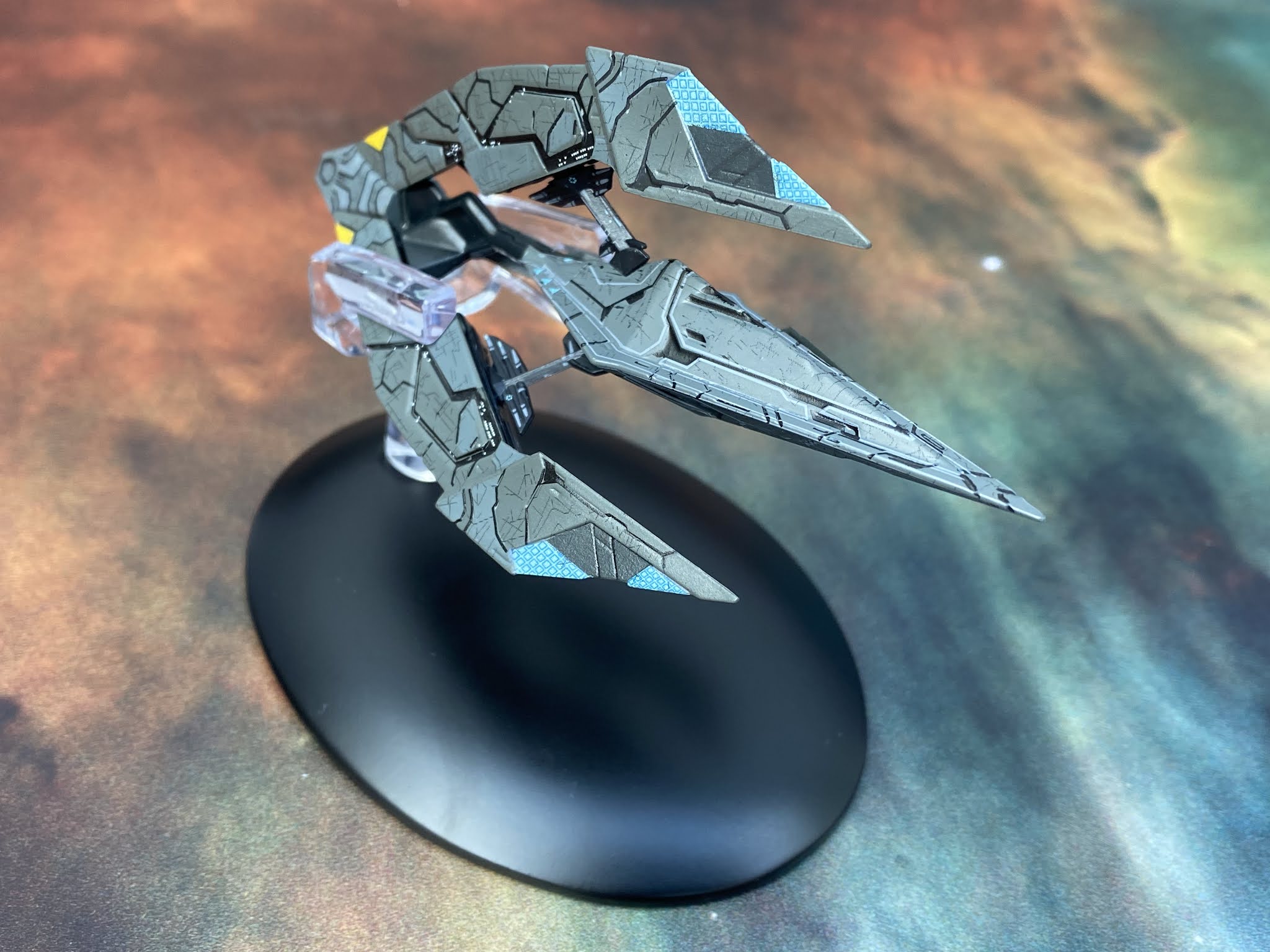
Issue 18 takes us into Tholian realms with their Recluse battlecruiser. Something completely different here that evokes the angular design of the classic from TOS as well as the tweaks from Enterprise and the remastered original episode. 

The Recluse is a Tholian webspinner on drugs. Pumped up and taken to another level, this makes for a terrifying adversary. Arched forward with a triple-pronged formation, the ship oozes aggression and is one of the most impressive craft to be included in this limited run.

The build work on the Recluse is amazing. The central section is held in place with struts running from the three outer forks and seem to gel back into that larger piece of the ship. The struts themselves have small window detailing and markings which was unexpected. The black blends smoothly into the rest of the hull, adding a valleyed effect to the surface and breaking up the grey overcoat. There's a lot of surface changes on the Recluse and it genuinely looks and feels unique amongst the 20 issues. 

Even the recessed sections carry minor detailing and brings a sense of life to the craft. What I also really like on this one is the "scarred" effect on the grey panels. It adds more depth to the model and makes it seem used and somehow imperfect. The fact that these lines do seem fairly random assists in taking the expected uniformity away and creates a much more realistic effect.

Check out that there are some further lighter sections on the ship and how nicely the engines to the rear are painted up. With all the differences in hull levels I was thinking there would be a ton of paint errors on this one but it's quite the opposite with one of HeroCollector's most impeccable finishes for several years. This does look the part, right down to the lighter blue weapon emitters at the tips of the arms. 

Acting as a carrier for the smaller Widow Class fighters, the Recluse magazine covers a bit on the Tholian Assembly as well as how the large vessel lines up with the web-spinning vessels of the fleet in quite substantial detail. This is excellent, expanded background on what are a scarcely explored race within Star Trek. That's one major plus point with Online in that it has worked to tell much more about some of those lesser known aliens.

This issue is a cracking read because the section covering the designing of the Recluse also includes the work done to update the Tholians themselves as an Online adversary. It explains how the levels of the Assembly were devised and ultimately how the ships and Tholians themselves aligned. As you would hope, issue 17 rounds out with a more in depth look at the Tholians themselves with more CG images and concept work to flesh out their story from their rare episodic appearances.

These are two great issues of the Online Collection with the Recluse being a particular highlight. The rendering, recreation and detail on it is beautiful and in keeping with the "reclusive" race. The Edision is only let down with those decal issues but remains a strong redesign and model maybe only because the secondary hull is such an impressive section. No big complaints with these two and certainly worth adding to your ship set up any day of the week.

Check out all our Online Starships posts HERE

You can find out more on the Star Trek Online Official Starships Collection by visiting the Hero Collector website HERE

Enjoyed this article? Why not like and share to spread the word!

Like our page on Facebook 
Follow us on Twitter

Tuesday, 1 June 2021

More from the Yard: The Official Online Starships Collection Issues 13 and 14


Time for a second Romulan starship in the STO Collection with the RRW Aelahl

A more striking design than the Vastam, the Aelahl displays the speed, grace and agility that you would expect from the Romulans.

In their signature green, this advanced design is the first to come from the Republic following its formation after the destruction of Romulus. Most prominent is the fact that it resembles a squat and stretched D'Deridex Warbird with the continuation of the use of negative space around the elliptical hull shape and the distinctive beak at the nose.

The Aelahl does also have a distinct physical comparison to the White Star from Babylon 5 but that's probably more of a coincidence than anything else!

This is one of the most slender Romulan ships out there, almost streamlined from nose to tail. Eaglemoss have once more recreated the complex bodywork patterning to a tee on this vessel. The two tone scheme almost looks like dirty panels against clean from one angle while simultaneously highlighting the meticulous panel lines across the hull. 

The surface levels on the Aelahl are just as impressive to behold with sunken segments on the nose most prominent. Wisely again around that section the windows have been spot painted on after rather than any attempt to align then with recesses on the metal body. The forward section and the main structural spine here are metal with the surrounding wings in plastic. The joint lines are more noticable than on previous entries as is the discernible weight prominence towards the front. 

That said, the wings are solid as anything and there's no movement even from the lower, thinner strip that arcs into the underneath of the central ship body. On the underside of the upper arcing piece we do have two weapons pods symmetrically placed either side of the spine denoting the aggressive nature of this front line craft. If anything, the warp engines are the most flexible piece of the model puzzle here and they're not especially bendable. What the design size does mean is that some smaller and perhaps translucent engine detailing is lost but that's negligible given the clean reproduction of this starship.

Clearly a Romulan design, the Aelahl keeps a lot of the crumbled Empire's physical hallmarks in its design but has stepped a little into a new age. Flatter, more defendable and sized for effectiveness not for the dominant presence that the immense D'Deridex Class would have provided. These are lighter, faster and a strong signal that the Republic is prepared to defend itself and look damn good while doing it. 

The mini-mag in the box for issue 13 ticks your expectations with the in-universe history of the Aelahl Class and its evolution as part of the Republic Navy before heading into depth about the establishment of New Romulus which was a key part to the early set up and success of the game. Indeed there's a significant episode that sees you running around the colony a lot - and repeatedly from memory.

Another of the STO revamps brought back from Yard 22 is the Shran. Originally a Discovery design from the 22nd Century, STO has retooled and polished up the flying saucer homage into a 25th Century craft complete with all the Online whistles and bells.

I'm not one for the circular craft-of-all-trades because it looks like either it's missing pieces or it's a cast off Xindi design but once more Eaglemoss have done a cracking job of translating pixels into plastic and metal. Sporting the distinctive black and white STO Starfleet paintjob, the USS Shran NCC-91413 has to be the most compact design to leave a drawing board. Even the oversized warp nacelles are tucked into the saucer shape to maximise power in a small space.

The compact Shran does manage a few things within its circular impression. Notable straight off are the translucent bussard collectors to the front and  warp grilles at the back. The scale has doen a lot of favours and that's one of them. 

It also continues the standard light and dark/white and black trademark paint scheme of Federation ships from the game. Rather than going for the classic aztec though, the white hull has a finely speckled effect that adds a bit of grain and depth to the hull. To the front there's a patch of well executed black hull panelling which is continued right across both dorsal and ventral. 

Actually this is a pretty decent model to give it its dues. The decalling especially is crisply applied with the Starfleet pennants prominently striped down the inboard nacelles. There's also red trim around the bridge as well as more on the underside. 

As a full model all of the parts work really well on the Shran with the ventral portions of the ship looking as good if not better than the top. What you do see on the flipside (so to speak) are the warp field generators to the rear as well as some more inset panels for the warp engine. It is incredibly detailed in its execution and looking back over the pictures as well as the model itself there seems to be more and more I'm picking up on. Just goes to prove that a starship doesn't have to have pylons, two hulls and stringy engines to be a great looking piece of kit.

The lower hull is filled out with grilles, inset vents, phaser strips along with their bookend red decals, a rather psychedelic sensor array in the centre and more of that segmented black hull plating. Also well worth a good look around the edge of the saucer which not only has some reaction control thrusters marked out but manages to have a series of windows painted in (along with a black encircling stripe) to add to the sense of scale. 

I admit this is a class starship. The model perhaps is let down a fraction by the baby blue painted deflector dish but the smaller details that can be amplified on this ship because of its scale work wonders to enhance the product. Even the stand is a good fit into the base and holds the Shran steady from the back. 

Issue 14's magazine treads the standard waters of in-game use and design features of the Shran with the usual unprecedented array of photos and first hand info on bringing the ship to life for STO. Interestingly the in-game topic of this magazine is squadron tactics. This is a step away from the usual history lesson but does provide more of the explanations behind STO which ship fans (but not regular players) may benefit from in the long run.

Check out all our Online Starships posts HERE

You can find out more on the Star Trek Online Official Starships Collection by visiting the Hero Collector website HERE

Enjoyed this article? Why not like and share to spread the word!

Like our page on Facebook 
Follow us on Twitter