

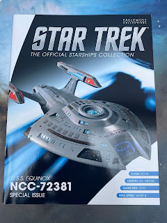
First released back in early 2014, the USS Equinox has now made it into a larger scale in the Official Starships Collection.

First up, the hull base colour is completely different and far lighter giving you the immediate notice that this has seen some MAJOR reworking in the last eight years. The lighter shade allows much more of the natural panel work detail to stand out as well as the darker grey printed panel etching to contrast the base coat. In a bit of a twist though, the panels here are not as glaring at their edges as they were and blend more into the model than being overly distinct.

Window alignment is nigh on perfect thanks to the larger openings on the hull although the partition lines on the square groups of four on either side of the saucer are flat painted out blue. This should be a minor issue to resolve with a dab of grey paint.
I've been made aware that the font for the ship registry is still incorrect and does seem to be squashed into a small space with only just bearable definition between the black and red. Add in that Eaglemoss have numbered each individual escape pod hatch and the model keeps on giving. On the smaller edition these were, shockingly, GREY!

Moving down the spine, the upgraded details are fantastic with many of the features highlighted through black edging decals. Again, reflect back on the smaller original and there's a dark grey stripe along the spine and none of that finer detail. IN fact there's zero black edging on the collection issue 15 ship.
The impulse engine and the vertical section just behind it are now coloured although the former could have done with being in a different colour. However, this is still a massive improvement. Checking the joint lines by the engines it's clear that some construction has been scaled up but the engine build this time is a light year better.
Instead of the horrible joint lines across the top, the nacelles are joined along the horizontal centre line avoiding trashing the registry and pennant as they were on the original. It has retained the painted on bussard collectors with the wrap grilles in translucent blue. But what's a step up here is the patterning on the engines which was absent previously. There's an added depth to the Equinox XL which trumps both the original and, personal opinion, the "upgraded" USS Rhode Island completely.

The selective panelling across that version is most evident when you're looking at the underside while the XL has full and corrected gridding as well as better positioned decals (check the alignment around the warp core ejection hatch). It's better in every single way (maybe with the exception of that main registry font) and a fantastic XL version. Changing up the colours has made a heck of a difference and brought out a lot of elements previously hidden or painted up in the limited selection that was used back in the day. Truthfully it just feels better, more solid and with a few minor adjustments to the build, has resulted in a more accurate depiction of the onscreen Nova Class from Voyager. Small is absolutely best whe it comes to the XLs as we've seen with the Runabout, Defiant and the Delta Flyer so you'll know how excited I am for the USS Pegasus which will be up on here shorty.
Check out all our Starships posts HERE
You can find out more on the Star Trek: The Official Starships Collection by visiting the Hero Collector website HERE
No comments:
Post a Comment