We knew this was coming but good grief did it take a long time to get hold of the final two issues from Eaglemoss' 20 edition run of the Online Starships Collection.
Just to say before we start here that this has actually been a really, really good selection of ships from day one with a good spread across the main fleets with a couple of curveballs thrown in and, of course, an Enterprise for all those completists out there.The end of the collection so early was a surprise - at least it was then - however in hindsight it sort of told us collectors and fans that the writing may well have been on the wall for some time.
But let's not go down that rabbit hole another time and instead focus on the two great ships that finish off the set.
With issue 19 we have the Cardassian CUV Damar starship and bookending the series with a Federation vessel we have the impressive Concorde Class.
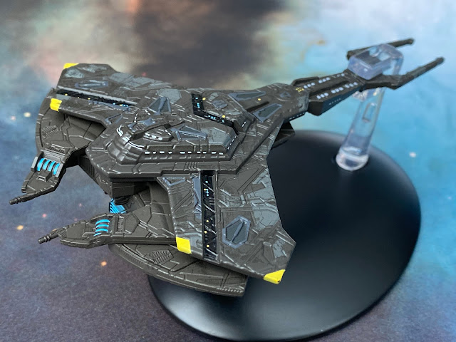
Carrying a lot of the hallmarks of the Galor/Keldon Class ships commonly seen throughout seven years of DS9, the Damar Class/CUV Damar vessel dons a darker overcoat and actually seems to devolve to some degree. The very form of the ship takes it back even more closely to that of a scorpion. For example right at the front the ship carries two elements which suggest pincers as well as retaining the long forked tongue of a tail to the rear. Deadly at both ends!
While it also does away with the standard sandy Cardassian paint scheme of its forebears, the Damar model is actually...class. The paintwork on this one is fantastic. There's a god contrast and a whole ton of panel detail on just about every surface. Even better is the choice not to emboss the window points onto the hull and just paint them on. This look a lot more accurate and aligned than previous editions.What also impresses with this Online Cardassian ship are the sharp RCS thruster points and blue grilles which stand out very effectively. The CUV Damar really is one of the best and most visually impressive from the collection. Multiple colourings, accurate window placement and perhaps the pinnacle, the layered hull.
From the front this is much clearer with the segments of the ship stacked up and enhanced with the use of negative space between the two main pieces. These are securely fixed together with the joints all hidden away within the depths of the layered hull.What I did spot as well is the slight colour shift between the upper and lower hulls when the ship is flipped over. There's a more matt finish to the ventral side of the Damar as well as a direct continuation of the fine detail that marks out the upper levels of the ship.
The Damar is a real gem. Well constructed, well replicated from the game and one of the more expertly finished vessels that Eaglemoss produced over nine years. It's just a surprise to find one that's so impressive this late in the day. Clearly its assisted in a large part by the design itself but for once the collection has a model that looks solidly built, finely turned out and well painted especially when it comes to the highlights and features.
Issue 19 remains solid and true to the Damar with details of its in-universe development, nature and role as well as a discriminating examination of the ship's design for STO. There's a ton of graphics and in-game images of the ship as you would expect but I would jump to say that the model easily blitzes every single image of the Damar on these pages; it's that nice a model.
Rounding out the issue alongside its in-game stats is a section broadly covering The True Way (a Cardassian revolutionary group) and the Union itself after the climax of the Dominion War and the years to the 25th Century. Well worth a read and very comprehensive in a surprisingly small amount of space.The USS Concorde NCC-94500 looks like a mash up of several different ship classes. The main chunk of it does appear to take inspiration from the Excelsior with its dipped hull and thinned rear section. Yet, this design tweaks even that classic with the quad warp engines and a more "eye" shaped deflector dish.
Now, I'm not a huge fan of this ship but personal opinion on the design has never been a factor in determining if the model itself is any good.
The thing with the STO ships is that the Federation ones tend to have this light/dark, black/white contrast going on which I can't quite accept on most occasions. I get that it's more striking when you see them in the game and makes them more easily recognisable but I'm more used to the flatter colours from the show and movies. Yet the Concorde cuts quite a mark as the final edition in the 20 issue series. The contrast of the two opposite shades works well and there's little to no colour bleed between the segments. The speckled finish we've so often seen in the series also returns to break up what would otherwise be a very stark white base coat. What I also love about the finish to this one is the alignment of the lifeboat hatches which hang right across the black/white border but are absolutely spot on in their placement and colouring.
The alignment of the red striping towards the rear of the primary hull is a little off when you compare starboard to port. Neither is crimped or marked but the two aren't quite aligned if you dropped a mirror down the front to back centre line. It also clashes in with the black arc around the middle of the saucer if you look even more closely and from memory it's unusual for the lining decals to be this out of whack with the hull.Also the red hatch markings are way off and worse since they adorn the very front and centre of the primary hull. That said, the windows are nicely applied because they aren't relying on specific hull dips or rises.
But the Concorde gets much more interesting the further back you go. Once past the registry (very basic) and the bridge, the rear of the primary hull expands out with an array of mechanics, sensor platforms and more. This effectively acts as both the rear of the saucer but also as the very rigid and secure pylons that hold the four warp engines. The detail along that spinal section is pretty good, mixing in greys and blues to draw out the elements however the finish does look chipped in places and the decals once again (on very close inspection) just don't quite line up in all aspects. The chips in the paint are a real disappointment as once you see one, there's a second and then you're scouring the whole thing to spot any more - which sadly there are.
But onto the engines where we have two larger warp nacelles slung tightly underneath a shorter pair. The wise folks at Eaglemoss did mange to incorporate translucent bussard collectors but chose to paint in the warp field grilles since they are very, very slim elements here. The paintwork for those grilles is ok at best with some feathered edges and again some paint "chipping" where the engines have black segments. The bussard collectors fairly hefty in size which does mean you can clearly see the peg elements which are holding it all together.Across the whole of the 20 issues this seems to have been a constant factor. This black mask always seems to be worn in some form be it at the edges or frayed within the striping and it's detracted from the visual brilliance of more than one Federation starship, present company included.
The underside of the Concorde continues the speckles over white paintwork but once more features a lot of misaligned decals marking out key pieces of the starship whether cargo hatches or lifeboat ports. The real issue has always been the scale and application, something that the XLs have managed to walk a fine line with on most occasions.

It's a decent model to finish this short-lived series though and throughout, the unusual Federation ships have been well presented and well-represented. In a sense the Concorde fittingly demonstrates the best and worst of Eaglemoss. Great base colours, a learning that we as fans want to actually see the panel linings and surface undulations but god forbid you want decal or window accuracy at this scale.
Issue 20's magazine offers up similar material to all of its 19 predecessors with details of the battlecruiser's in-game existence and reasons for development as well as some rather nice plan views of the class. These do illuminate that the speckled paint finish is a design choice rather than an element that is seen in the game.
Some of the CG images in here are spectacular especially the one which opens the issue. There's more from the real world as we are taken into the design process for the Concorde Class before, fittingly, the final article of the whole line - and also Eaglemoss' smaller starships collections - covers Starship Design within the STO universe.So that was indeed that and this marks the final review from this collections and as noted, the final review from a starship (numbered edition) collection of this scale. We still have some review of older Discovery lines and bits to wedge in but for now, this is really how it comes to an end. The STO Collection was tragically underrated and clearly undersubscribed but 20 issues have covered Klingons, Romulans, Tholians, the Dominion and a ton of Starfleet vessels of all shapes and sizes.
In no way a let down, the collection has replicated the game's starships as best it could and in some respects (Damar) actually produced something that may well be superior to the original source piece.
I've been lucky to review this series and I hope for anyone who is a fan of starship design and never got the chance that these will be back online to purchase not too far in the future. While you might not go for all of them there are definite must haves in here on the brilliance of their original design and also some that work better as a model than on screen.
Eaglemoss - it was great while it lasted and thanks for these great additions for any fan collection.
Check out all our Online Starships posts HERE
You can find out more on the Star Trek Online Official Starships Collection by visiting the Hero Collector website HERE
Enjoyed this article? Why not like and share to spread the word!


