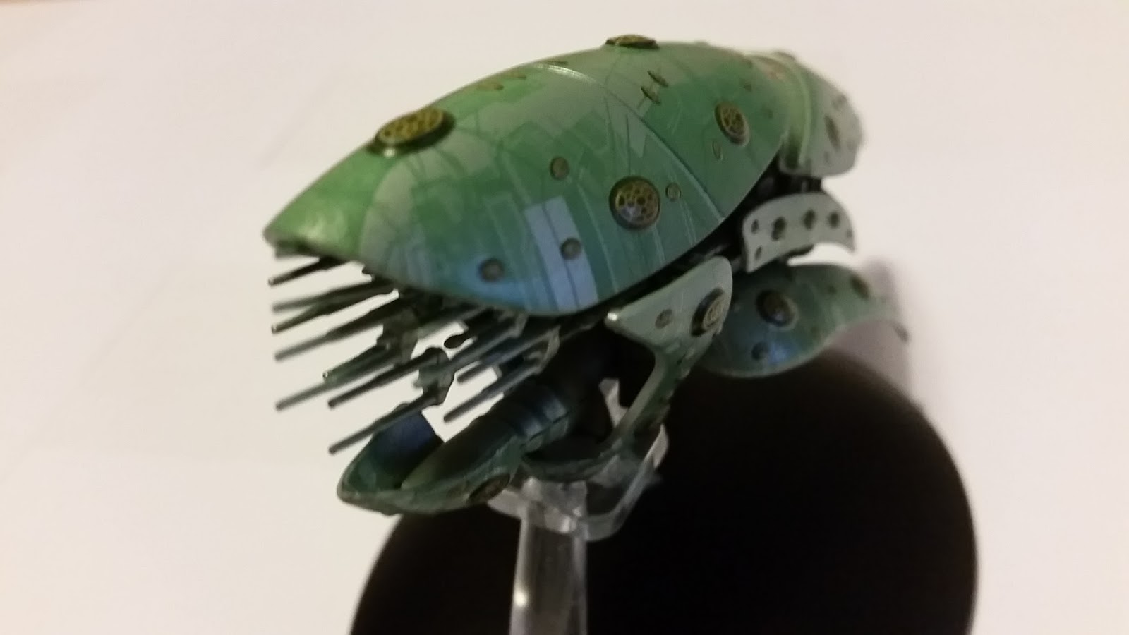

I have waited for almost two years to get a chance to chat with the man behind the Starships Collection and it has been well worth the wait.

So where do you start and what do you ask the man who holds the answers to thousands of fans dreams? Certainly not 'What is issue 71' because there still need to be things we need to look forward to!!!
Looking at this as more of a retrospective, why not kick off with 'Did you expect the collection to make 50 issues?'
"Yes" was the simple answer but Ben elaborated, providing a much better understanding of a collection which was bubbling under for many years before it hit the newsagent shelves. They looked at doing a collection many years ago when the Fact Files and the DVD collections were released. A figurine collection was worked on and the team realised that ships had a greater appeal so it was always "the next thing".
With a successful James Bond car collection and a competitor running the Star Wars ships collection, it seemed like the right time - and that was five years ago. Then the company which Ben was working for was bought out and other projects took priority. Which brings us closer to the present.
"I was very nervous about the initial five," remembered Ben, "Star Trek was at that time in a very becalmed place. We'd had the JJ movie by that point but I didn't feel it had added any new active fans."
Add in another delay when the original factory was taken over by the Chinese Government meaning which pushed the collection back from January to later in the year so you can see it's not been all plain sailing.
 "The way things like this work is that we test things and once I knew it would reach six I knew it would reach 60. You can predict a pretty good line how many we'll sell further on and the thing that gets interesting is how slow the decline is. We know that less people will buy the next issue than the last one published. What matters is how fast it declines but I was always confident we would hit 60 to 70 issues which was the original aim. Then it gets interesting to see if it goes further than that.
"It's great to think at the beginning there will be 60 or 70 but what you don't imagine is what they will look like altogether or how different they will be to one another or exactly where they will come from."
"If you just do the popular stuff which everyone else has already done then you have a dozen ships but then there are a few which you look at and think 'I can't believe this hasn't been done' - things like the Akira Class. But then you have to justify the collection and the more there are, the better. There are fans who want just Federation ships and if we did all of those first we'd already be finished!
 "There has been a very positive response to some of the unusual stuff such as the Fortunate which no-one would have put on a list of ships they really want but there are things about it which were very pleasing. What we're seeing from this 65 to 70 issues is that people are asking why we've done X before we've done Y. For instance I know that the Federation fighter is one that a lot of online players really love that ship. There are ships that people want which we haven't done because they are extraordinarily difficult. Sometimes that's to do with the technical side and sometimes it's down to the reference. Sometimes the CG models which are the best reference just don't exist."
Immediately my thoughts went to the Narada and the Scimitar but there was more to it than that. "Those two probably do exist somewhere," continued Ben, "but its things like the Insurrection ships which I eventually came to the conclusion do not exist anywhere in CG. They were created, I've talked to the people who built them but because the company that made them got bought and then got closed. They may be out there somewhere but they were never archived."
 When we're talking Insurrection ships that covers the holoship, the Sona craft, the Captain's Yacht and the scoutship - everything apart from the Enterprise-E. "We can do them but it'll take a bit more time."
Ben always knew that the original USS Enterprise NCC-1701 would be a significant issue and that initially there would be an Enterprise roughly every ten issues across the original 70 release plan, "I had concerns over the simplicity of The Original Series models," explained the series producer, "these are being borne out now."
Through the social media world, fans have been very passionate about their expectations for the collection and about what they want from the ships that helped build the franchise n the 1960's, "The ships that have garnered the best responses have been those with a lot of detail," said Ben, "those with lot of panelling again such as the Fortunate. In that case we had the CG model so we could lift all the decals directly from that on a tiny, tiny scale. The problem then is that with things such as the Klingon D-7 I want to be purist about it and there are some details on it that people may not know about and that you can't see on screen but it is a plain ship painted one colour.
 "The Romulan Bird-of-Prey is a very plain ship with a very big bird painted on the underside and the biggest problem was that when it first came in it looked like a toy. The decal was too bright, too colourful and we went through a lot of interesting experiments to get that to look right. You have to explain to the factory that you want some film grain in the artwork and we learned a lot from that one because it was so simple."
The team have held off producing models from The Original Series because of the concerns over how these more plain creations would look and be received. However, that's not been the biggest challenge Ben and the team have faced. "There have been various ones which have been difficult," he continued, "Sometimes it's down to making it look like it appeared on screen and sometimes it's because of the way it does look on screen."
The Maquis Raider was a challenge because what it needed was something the factory found very difficult to reproduce; "When you look at a CG or practical model it throws shadows into all the panel lines and when you scale it down to the size we're at, there is no way you'll get any shadow in the panel lines so in order to make it look really right you need to find a way to get some form of darkness into the panel lines. It's an almost impossible thing for the factory to do in mass production."
 As an example, Ben pointed to the Delta Flyer and if you take a propelling pencil and run it around all the panel lines it will look a lot better - and not something that the can do in paint in mass production.
"There are things that have been a pleasant surprise which I thought were going to be really difficult," said Ben, "such as the Romulan Drone. I thought 'Am I really going to do this?' and gave it a go. It turned out fine from the beginning which was really nice and I thought it was going to be a nightmare.
"The Enterprise's as well because in every film they're so inconsistent. For instance the E changes a lot and you end up compromising on which one to go with. You have really good reference for one part from one movie and another part from another movie so you end up with something that works for most people but there will always be some who spot that half of it might be from Insurrection and half of it's from First Contact -that's terrible!"
 In fact on The Original Series USS Enterprise, which Ben has gone to a lot of trouble over I can assure you, it's not all been plain sailing, "Because we're on a fortnightly schedule we just have to leave it and it's as good as we're going to get it."
The factory actually hated doing the Borg Sphere. While being a ball, a simple geometric shape, it was little bit more fiddly than expected; "Anything that appears random is a challenge," continued Ben, "There was lots and lots of little detail on the texture map and they had nothing to follow."
In contrast the Valdore might have had a lot of fine detail but it was very visible and easier to recreate on the model. The Species 8472 bioship, one which I found not to be as "organic" as I would have liked, was indeed another unusual issue for the team; "It was very difficult to explain how we wanted soft lines and it's actually in the wrong material given that it is organic."
 The Enterprise-C was certainly one issue which set fans alight. Ben explained that they were working with references for the Yamaguchi as well as the C and that there are certain things that the factory just can't replicate, "The impulse engine they simply couldn't do. On the Enterprise for issue 50 there is a similar thing in that the cab over the shuttlebay is so small they just can't reproduce it in this scale. I don't think it will spoil collectors' enjoyment of the model but it's interesting to discover that some things just can't be done."
I asked Ben if there was one model that he would love to have a go at again, was there one? A very easy answer and I think a lot of readers will know immediately; the movie refit Enterprise from issue two. "We will get to do it again because we will do the A," said Ben who also revealed that it the second USS Enterprise will appear in "the early 70's", "It was developed really early on and the paint job on that ship is incredibly complicated and the nature of the aztec is much more sophisticated than the aztecs on subsequent paintings. I was trying to be very purist about it and wanted it to look the way it did in The Motion Picture which was slightly pink. It has this lavender cast which comes off it. I was also thinking about how the ship should look. Should it look right when you put a light on it? If you don't shine a light on it? There were a lot of things I hadn't quite worked out and it was a big learning."
 "The ship that we did around the same time which was actually really easy to do was the NX-01 where we had this fantastic reference. It's the most detailed CG model that was ever built for Star Trek probably moreso than the JJ-Enterprise. It's got an amazing amount of detail on it most of which we were able to recreate. We were able to give the factory this fantastic reference and tell them exactly how to make it. Although there's a lot of detail they were able to do it. There were some issues with getting the aztec right and trying to explain that I wanted a colour so close you couldn't tell the difference. It turned out really well and set a standard. It is a different kind of ship though. It has more to it."
Surprisingly, Ben also singled out the Reliant as a second example which turned out well; "It showed all the lessons that I'd learned on The Motion Picture Enterprise. The issues we'd had were then solved on that ship. The A will be like the Reliant with the right registry!"
 It seems that a lot of the more interesting quirks of the series have been down to the paintwork. The Jem'Hadar fighter on-screen looks pretty grey and Ben went a long way to try and replicate those colours with an awareness that people knew about the studio model and wanted the hues. "I knew those colours were there but when you saw it on screen they were barely visible," recalled Ben, "Finding a palette that reflected that was not easy. Gary Hutzler said that they would control the colours and paint the ship a lot stronger than you would intend to see it on screen and then when they composited it they were dialled right down so they would use 50% of the strength of the colour in the effect. The other factor is that the basic colour of the ship is only half the story because then you have the environment it's in. Most of the ships have internal lights, external lights, lens on the camera - so it's not as straight forward as one might think. There's not just one colour that's correct."
There's also that interactive light from the nacelles which pass a hue of magenta which Ben also tried to work into the paint.
Ben then made reference to some of the more screen-illegible details such as "Federaion" on the Akira Class and the point that the ship doesn't have a name on the hull even though she's Starfleet; "There are typos on the models in the show as I discovered. We actually copied the model exactly and I hadn't realised they had put text in that small. I thought it was just a black line!
 "Sometimes screen accurate does cause problems. The CG model they supplied me with for the Nebula Class had four different registry numbers on. That was how it appeared on screen but as it was going fast in the background no-one was taking notice!"
As the series runs there is a certain logic to the order in which the issues run, pairing a Federation ship (not necessarily a Starfleet ship) with an alien vessel each month. Ben noted that in the mid-20's this didn't quite go to plan but it seems to be pretty consistent now. "I try to keep a balance between the series," explained Ben in overview of the collection, "but there are a lot more ships in Voyager and Enterprise than there are in the other shows. If I'd had access to 100% perfect CG models from the beginning I would probably have come up with a different order. As with the Insurrection and Nemesis ships I've kept looking for the reference materials but they are postponed until I hope I can find the CG models."
However this is still some good reference available so don't get too disheartened as there was material produced for the Fact Files back in the day.
Ben has given us a real insight here into the first 50 issues, but what about the future? What might we expect?
 "I think I can get hold of the reference material for the smuggler ship from Unification," revealed Ben, "I know pretty much what it looks like but I'd like to get more detail. There are more obscure Federation ships out there such as stuff in the shipyard at Qualor II or the debris field at Wolf 359 and sometimes there are good reference for them. I haven't completely finished my efforts to find reference for them. Some of them are kit-bashed and there are certain clues. There are so few alien ships which were big and important that we've dealt with most of the major ones people would put on their list. There are still some interesting ones out there but we've covered the obvious ones!"
OK - I may have pushed a little bit more; "You can be confident that we'll be doing was on air in The Original Series as we've now got hold of all the CG models from the remastered episodes. If not all then most.
"Then there's space stations. I don't think they will work at the size of the ships and I'm not sure how compelling they are as specials compared to a big bad ship or Federation ship. There are nice things to do and some nice unexpected Deep Space Nine things coming up that no-one is talking about but I was pleased with them."
 Ben is a big Niner and has a few ships on his list which he's not seen any interest in. I guessed at the Bajoran transport (seen recently in Attack Wing's Wave 15 and on screen in The Circle trilogy) and the Interceptor - plus some others! He believes that he's in a place now where they can give more coverage to The Original Series and Deep Space Nine which have had less coverage than the other shows.
"If people carry on buying and we go past 90 there's even more obscure stuff." said Ben, "I would love to do Matt Jeffries design for the Phase II Enterprise which is breaking the rules but it's as close as you can get. There was stuff at Qualor II that was built for other reasons and have a lot of stories behind them. Those are the things I want to get into and am keen to do. Of course we'll keep alternating with alien ships - a surprising amount of which have to come from Enterprise.
"When you get to this point and you know we're going to 90, I have another 10 or 15 to plan and you start wondering if you'll get to certain ships. I'd love to do some others from the original movies which we do have good reference but would need to build CG models to aid the factory."
 For that I would suggest the Merchantman from The Search for Spock - and we'd probably better leave it right there. We may also get some news on the seventh special and pictures of the Kelvin very soon for special five. There will be more plaques with Voyager is out very soon.
For those of you wondering about missing back issues, Ben explained that they do need to order each in large quantities because otherwise the cost of just a single model would be tens of thousands of dollars. Good news is that the whole series will be getting restocked as the issues are resupplied for the European subscription-only release. Issue one kicks off in France this month so if you're waiting for Defiant it's just a few months off.
Finally Ben also wanted to thank everybody who has helped produce the ships, the magazines (which we didn't cover here in enough detail!) and who he's been back in contact with after a few years. You know it's a good week when you get to talk to John Eaves and Ira Steven Behr!
MANY MANY thanks to Ben Robinson for his time in producing this article! Congratulations on the 50th! You can follow Ben on Twitter HERE and catch some of the latest snippets on the collection.
You can now see our short review of the USS Enterprise 50th issue model on our YouTube channel.
Our blog review of Issues 50 and 51 can be found HERE or you can peruse our complete review catalogue HERE. We also have a fan picked top ten to celebrate 50 issues.
With a successful James Bond car collection and a competitor running the Star Wars ships collection, it seemed like the right time - and that was five years ago. Then the company which Ben was working for was bought out and other projects took priority. Which brings us closer to the present.
"I was very nervous about the initial five," remembered Ben, "Star Trek was at that time in a very becalmed place. We'd had the JJ movie by that point but I didn't feel it had added any new active fans."
Add in another delay when the original factory was taken over by the Chinese Government meaning which pushed the collection back from January to later in the year so you can see it's not been all plain sailing.
 "The way things like this work is that we test things and once I knew it would reach six I knew it would reach 60. You can predict a pretty good line how many we'll sell further on and the thing that gets interesting is how slow the decline is. We know that less people will buy the next issue than the last one published. What matters is how fast it declines but I was always confident we would hit 60 to 70 issues which was the original aim. Then it gets interesting to see if it goes further than that.
"It's great to think at the beginning there will be 60 or 70 but what you don't imagine is what they will look like altogether or how different they will be to one another or exactly where they will come from."
"If you just do the popular stuff which everyone else has already done then you have a dozen ships but then there are a few which you look at and think 'I can't believe this hasn't been done' - things like the Akira Class. But then you have to justify the collection and the more there are, the better. There are fans who want just Federation ships and if we did all of those first we'd already be finished!

Immediately my thoughts went to the Narada and the Scimitar but there was more to it than that. "Those two probably do exist somewhere," continued Ben, "but its things like the Insurrection ships which I eventually came to the conclusion do not exist anywhere in CG. They were created, I've talked to the people who built them but because the company that made them got bought and then got closed. They may be out there somewhere but they were never archived."
 When we're talking Insurrection ships that covers the holoship, the Sona craft, the Captain's Yacht and the scoutship - everything apart from the Enterprise-E. "We can do them but it'll take a bit more time."
Ben always knew that the original USS Enterprise NCC-1701 would be a significant issue and that initially there would be an Enterprise roughly every ten issues across the original 70 release plan, "I had concerns over the simplicity of The Original Series models," explained the series producer, "these are being borne out now."
Through the social media world, fans have been very passionate about their expectations for the collection and about what they want from the ships that helped build the franchise n the 1960's, "The ships that have garnered the best responses have been those with a lot of detail," said Ben, "those with lot of panelling again such as the Fortunate. In that case we had the CG model so we could lift all the decals directly from that on a tiny, tiny scale. The problem then is that with things such as the Klingon D-7 I want to be purist about it and there are some details on it that people may not know about and that you can't see on screen but it is a plain ship painted one colour.

The team have held off producing models from The Original Series because of the concerns over how these more plain creations would look and be received. However, that's not been the biggest challenge Ben and the team have faced. "There have been various ones which have been difficult," he continued, "Sometimes it's down to making it look like it appeared on screen and sometimes it's because of the way it does look on screen."
The Maquis Raider was a challenge because what it needed was something the factory found very difficult to reproduce; "When you look at a CG or practical model it throws shadows into all the panel lines and when you scale it down to the size we're at, there is no way you'll get any shadow in the panel lines so in order to make it look really right you need to find a way to get some form of darkness into the panel lines. It's an almost impossible thing for the factory to do in mass production."

"There are things that have been a pleasant surprise which I thought were going to be really difficult," said Ben, "such as the Romulan Drone. I thought 'Am I really going to do this?' and gave it a go. It turned out fine from the beginning which was really nice and I thought it was going to be a nightmare.
"The Enterprise's as well because in every film they're so inconsistent. For instance the E changes a lot and you end up compromising on which one to go with. You have really good reference for one part from one movie and another part from another movie so you end up with something that works for most people but there will always be some who spot that half of it might be from Insurrection and half of it's from First Contact -that's terrible!"

The factory actually hated doing the Borg Sphere. While being a ball, a simple geometric shape, it was little bit more fiddly than expected; "Anything that appears random is a challenge," continued Ben, "There was lots and lots of little detail on the texture map and they had nothing to follow."
In contrast the Valdore might have had a lot of fine detail but it was very visible and easier to recreate on the model. The Species 8472 bioship, one which I found not to be as "organic" as I would have liked, was indeed another unusual issue for the team; "It was very difficult to explain how we wanted soft lines and it's actually in the wrong material given that it is organic."
 The Enterprise-C was certainly one issue which set fans alight. Ben explained that they were working with references for the Yamaguchi as well as the C and that there are certain things that the factory just can't replicate, "The impulse engine they simply couldn't do. On the Enterprise for issue 50 there is a similar thing in that the cab over the shuttlebay is so small they just can't reproduce it in this scale. I don't think it will spoil collectors' enjoyment of the model but it's interesting to discover that some things just can't be done."
I asked Ben if there was one model that he would love to have a go at again, was there one? A very easy answer and I think a lot of readers will know immediately; the movie refit Enterprise from issue two. "We will get to do it again because we will do the A," said Ben who also revealed that it the second USS Enterprise will appear in "the early 70's", "It was developed really early on and the paint job on that ship is incredibly complicated and the nature of the aztec is much more sophisticated than the aztecs on subsequent paintings. I was trying to be very purist about it and wanted it to look the way it did in The Motion Picture which was slightly pink. It has this lavender cast which comes off it. I was also thinking about how the ship should look. Should it look right when you put a light on it? If you don't shine a light on it? There were a lot of things I hadn't quite worked out and it was a big learning."
 "The ship that we did around the same time which was actually really easy to do was the NX-01 where we had this fantastic reference. It's the most detailed CG model that was ever built for Star Trek probably moreso than the JJ-Enterprise. It's got an amazing amount of detail on it most of which we were able to recreate. We were able to give the factory this fantastic reference and tell them exactly how to make it. Although there's a lot of detail they were able to do it. There were some issues with getting the aztec right and trying to explain that I wanted a colour so close you couldn't tell the difference. It turned out really well and set a standard. It is a different kind of ship though. It has more to it."
Surprisingly, Ben also singled out the Reliant as a second example which turned out well; "It showed all the lessons that I'd learned on The Motion Picture Enterprise. The issues we'd had were then solved on that ship. The A will be like the Reliant with the right registry!"
 It seems that a lot of the more interesting quirks of the series have been down to the paintwork. The Jem'Hadar fighter on-screen looks pretty grey and Ben went a long way to try and replicate those colours with an awareness that people knew about the studio model and wanted the hues. "I knew those colours were there but when you saw it on screen they were barely visible," recalled Ben, "Finding a palette that reflected that was not easy. Gary Hutzler said that they would control the colours and paint the ship a lot stronger than you would intend to see it on screen and then when they composited it they were dialled right down so they would use 50% of the strength of the colour in the effect. The other factor is that the basic colour of the ship is only half the story because then you have the environment it's in. Most of the ships have internal lights, external lights, lens on the camera - so it's not as straight forward as one might think. There's not just one colour that's correct."
There's also that interactive light from the nacelles which pass a hue of magenta which Ben also tried to work into the paint.
Ben then made reference to some of the more screen-illegible details such as "Federaion" on the Akira Class and the point that the ship doesn't have a name on the hull even though she's Starfleet; "There are typos on the models in the show as I discovered. We actually copied the model exactly and I hadn't realised they had put text in that small. I thought it was just a black line!
 "Sometimes screen accurate does cause problems. The CG model they supplied me with for the Nebula Class had four different registry numbers on. That was how it appeared on screen but as it was going fast in the background no-one was taking notice!"
As the series runs there is a certain logic to the order in which the issues run, pairing a Federation ship (not necessarily a Starfleet ship) with an alien vessel each month. Ben noted that in the mid-20's this didn't quite go to plan but it seems to be pretty consistent now. "I try to keep a balance between the series," explained Ben in overview of the collection, "but there are a lot more ships in Voyager and Enterprise than there are in the other shows. If I'd had access to 100% perfect CG models from the beginning I would probably have come up with a different order. As with the Insurrection and Nemesis ships I've kept looking for the reference materials but they are postponed until I hope I can find the CG models."
However this is still some good reference available so don't get too disheartened as there was material produced for the Fact Files back in the day.
Ben has given us a real insight here into the first 50 issues, but what about the future? What might we expect?
 "I think I can get hold of the reference material for the smuggler ship from Unification," revealed Ben, "I know pretty much what it looks like but I'd like to get more detail. There are more obscure Federation ships out there such as stuff in the shipyard at Qualor II or the debris field at Wolf 359 and sometimes there are good reference for them. I haven't completely finished my efforts to find reference for them. Some of them are kit-bashed and there are certain clues. There are so few alien ships which were big and important that we've dealt with most of the major ones people would put on their list. There are still some interesting ones out there but we've covered the obvious ones!"
OK - I may have pushed a little bit more; "You can be confident that we'll be doing was on air in The Original Series as we've now got hold of all the CG models from the remastered episodes. If not all then most.
"Then there's space stations. I don't think they will work at the size of the ships and I'm not sure how compelling they are as specials compared to a big bad ship or Federation ship. There are nice things to do and some nice unexpected Deep Space Nine things coming up that no-one is talking about but I was pleased with them."
Ben is a big Niner and has a few ships on his list which he's not seen any interest in. I guessed at the Bajoran transport (seen recently in Attack Wing's Wave 15 and on screen in The Circle trilogy) and the Interceptor - plus some others! He believes that he's in a place now where they can give more coverage to The Original Series and Deep Space Nine which have had less coverage than the other shows."If people carry on buying and we go past 90 there's even more obscure stuff." said Ben, "I would love to do Matt Jeffries design for the Phase II Enterprise which is breaking the rules but it's as close as you can get. There was stuff at Qualor II that was built for other reasons and have a lot of stories behind them. Those are the things I want to get into and am keen to do. Of course we'll keep alternating with alien ships - a surprising amount of which have to come from Enterprise.
"When you get to this point and you know we're going to 90, I have another 10 or 15 to plan and you start wondering if you'll get to certain ships. I'd love to do some others from the original movies which we do have good reference but would need to build CG models to aid the factory."
 For that I would suggest the Merchantman from The Search for Spock - and we'd probably better leave it right there. We may also get some news on the seventh special and pictures of the Kelvin very soon for special five. There will be more plaques with Voyager is out very soon.
For those of you wondering about missing back issues, Ben explained that they do need to order each in large quantities because otherwise the cost of just a single model would be tens of thousands of dollars. Good news is that the whole series will be getting restocked as the issues are resupplied for the European subscription-only release. Issue one kicks off in France this month so if you're waiting for Defiant it's just a few months off.
Finally Ben also wanted to thank everybody who has helped produce the ships, the magazines (which we didn't cover here in enough detail!) and who he's been back in contact with after a few years. You know it's a good week when you get to talk to John Eaves and Ira Steven Behr!
MANY MANY thanks to Ben Robinson for his time in producing this article! Congratulations on the 50th! You can follow Ben on Twitter HERE and catch some of the latest snippets on the collection.
You can now see our short review of the USS Enterprise 50th issue model on our YouTube channel.
Our blog review of Issues 50 and 51 can be found HERE or you can peruse our complete review catalogue HERE. We also have a fan picked top ten to celebrate 50 issues.
Like our page on Facebook
Follow us on Twitter
+1 us on Google+
Add us on Tumblr