

Now here's a thing.

As with the Antares, it would only become a recognisable shape when it came to remastering those 1960's stories. The Aeroshuttle is a biggie to be sure in the realms of the Starships Collection. Long rumoured to have existed and as rare as some of those damn Pokemon everyone is obsessed with finding at the moment, collectors have been clamouring for its inclusion in the series since the docking process was highlighted in issue six oh so many moons ago. Funnily I couldn't help but make a parallel that we've now had two "docking" vessels in very close succession with the Enterprise-E Captain's Yacht only three issues ago. Those in the UK might understand this as "London Bus Syndrome". You wait years for one to come along and then two do in a short period of time.
 For something that was never used and was actually a side hobby project for Adam "Mojo" Lebowitz and Rob Bonchune, the result is quite eye catching. The only bit we've ever actually seen is that flat and very plain underbelly which here is just as flat and plain as you would expect. The only real features to note are the raised landing gear which sits proud of the hull and the mothership registry simply decalled at the rear and nose tip. While you might wish for something a bit more wow, there really isn't any reason for it and the underside merely presents the functionality required for when it's not locked into the primary hull of Voyager.
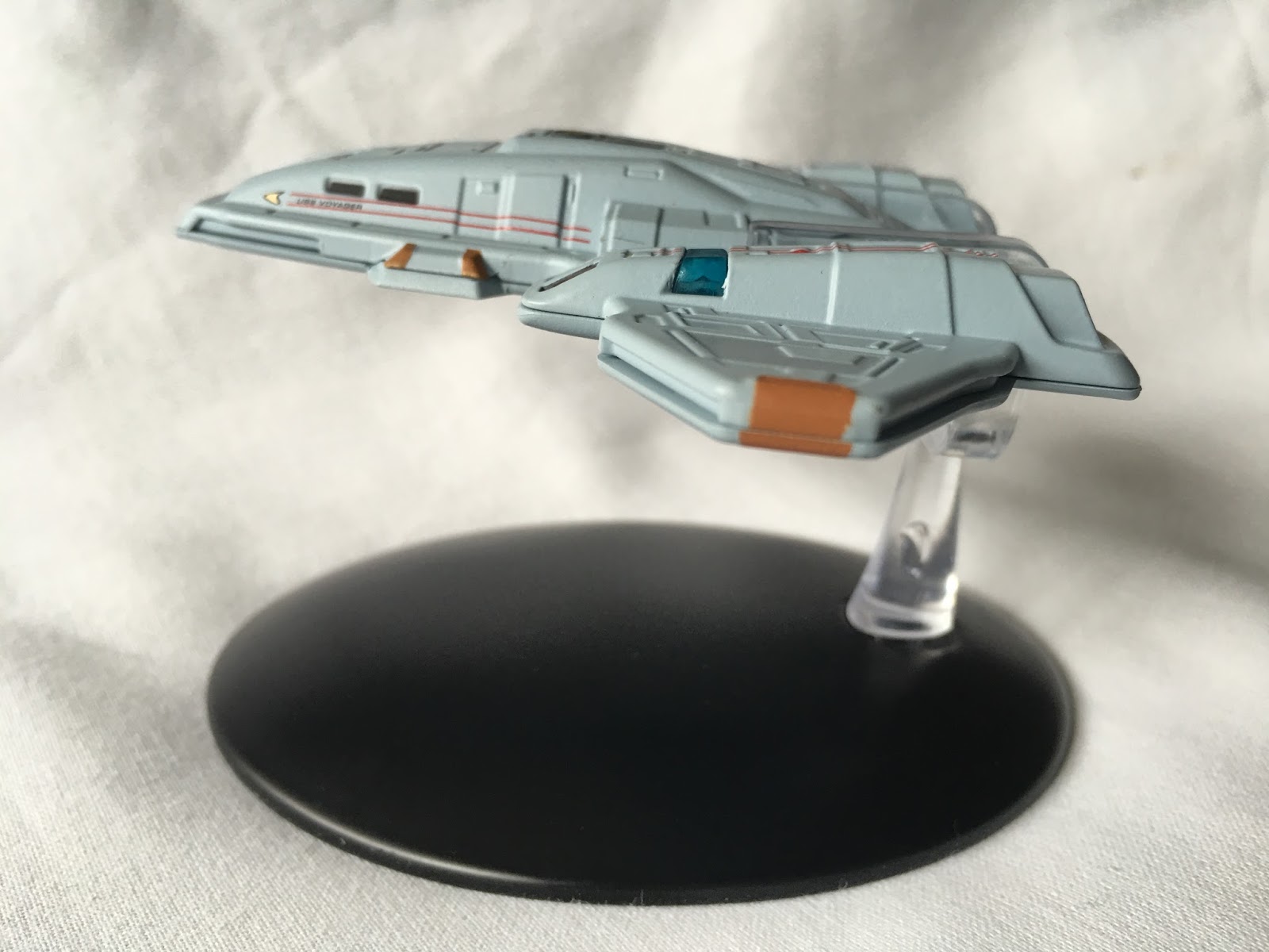 Flipping her over there's a lot more to take in in the metal topside. Every surface has some form of raised or sunk panel right across the surface. She is incredibly slim from all angles with a distinct blocky and very recognisably Runabout-cloned central pod latched between the two angular wings. Your eye is immediately pulled towards the golden warp core at the centre with its dark grey surround contrasting to the Starfleet standard light grey that covers 90% of the hull. As with the smaller ships we've seen before the cockpit windows are blacked out and again, distinctly Runabout in their shape (because they could use the sets for the interiors and save some cash). To the rear there are also four windows which parallel the lounge windows on the once-seen rear section of the Deep Space Nine workhorses.
The overall grey tone does tend to wash out features on these Starfleet vessels and here is no exception. You can make them out but the paint job does seem heavy in a few patches. The alignment of the windows and the decals is perfect as is the colouring around that golden warp core. The orange thrusters and phaser ports do break up that monotone colouring and are well defined and precisely applied. Some of the smaller paint features such as those black triangles in the side pods attached to the hull by the war engines are missing but that's going to be a hard one to apply in such a tiny gap. Nor do we have the darker colouring around the very edge of the ship as per the magazine pictures but given that's the join line I guess it was another sacrifice needed to be taken.
 Only the impulse engines to the rear of the warp engine pods have a teeny tiny misalignment on the painting but it's so minor it barely classes. However, after those annoying deltas, you start seeing all the "cracks" so to speak. As for the build quality though, it's a good clean slot together and clearly just two pieces with the metal top and plastic flat base.
Given the scale, Eaglemoss have done a splendid job of finishing the Aeroshuttle. The paint work is 99% perfect and it is a faithful reproduction of the CG imagining from Lebowitz and Bonchune even down to those damn deltas. I think fans will be very excited to get hold of this rarity even if, technically, she never actually appeared in the show.
To the pages of the accompanying tome now and we get a decent level of information for the Ship Profile section from its design history through testing, its abilities and a full breakdown of its expected lifetime and defences to boot. As we never saw it, all this is fascinating to read and makes this one of the most invaluable resources to date in the series because of how little this craft was actually seen.

Finally and keeping with the Voyager theme we get to walk the set designs with Richard James including a load of pics I've personally never seen and give impressions of the series that could have been. Some great notes in here how bits of other starships made their way into the production, some of the changes that were made and how sets were made to mirror the exterior of Voyager because of its much smaller size than the Galaxy Class Enterprise-D. Together this magazine and model make a good solid package and definitely one I would recommend for all collectors. The unusual and not-often seen nature of the ship will probably be enough for most to head to their local newsagents!
Aaaaaand to Stella. Hmmm.

Plain and simple, it's a lump, an 18 metre long blob. There's nothing flashy here, it's a grey slug-like lump with warp engines. I could just end the review there but I do owe it to anyone reading to give you some more information. Old even by the time of The Original Series, the Class-J ship is an oddment in every possible way.
The surface is in keeping with the classic style of the 60's but given a bit of life with a distinctive metallic two tone aztec paint job that covers every surface from the nose to the rear of the nacelles (but not the inside edge of the lower pylon sections). It needs this finish purely because of the basic nature of the craft with only a slim amount of features breaking up the monotony. There's a distinct lip around the centre edge of the hull marked in blue which co-ordinates against the translucent sensor dome on the top and the blue domes to the front and rear of the stubby warp engines.

OK, I'm being a little over-harsh with the Stella - which does have its name emblazoned on the sides of the hull - because the pictures we saw in preview are not as good as the finished article. That was a much darker colour scheme while this model has a much clearer and sketchy metal coating. Do I like it? It's unusual, 100% unique and never to be repeated but I think there will only be a fraction of the collector audience who will be heading out to the shops to snap this one up.
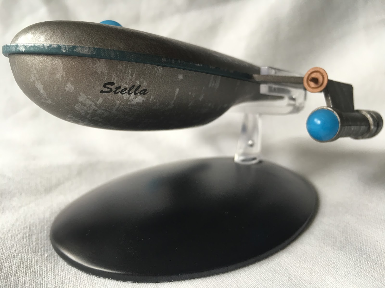 Issue 79 recounts the opening third of Mudd's Women plus it provides some details on the specs of the Class-J starship as seen in the remastered version of the episode. The new CG images of the Stella are really good and while it is one of the most simplistic craft yet, you have to admire the look that has been achieved here. The magazine also covers further references to the Class-J in The Menagerie plus Operation: Annihilate! and The Way to Eden. Note as well that the ship in the episode - the screen-used CG - was not actually labelled as the Stella because it was so small on the Enterprise viewer.
The Designing Mudd's Starship two-pager does explain a lot more about the craft. It actually makes it more understandable as to why the ship looks like it does and the homage it pays to not only the original "screen blob" but also to the legendary Matt Jefferies and his unused shuttle sketches.

The On Screen moment is fairly obviously Mudd's Women to end the magazine and we also get the preview of next time's Federation Scout Ship from Insurrection.
The Aeroshuttle is the unquestionable "winner" this month, offering the greater detail and aesthetic however the Class-J starship is not without its merits. It is a simple design, a plain craft but it is one that effectively homages a past era and keeps in line with what was originally seen in the episode back in 1966. Sometimes going back to basics can work very well although I'm not certain if this makes that cut.
How did the new ships go down with you? Is the Class-J growing on you?
Follow us on Twitter
+1 us on Google+
Add us on Tumblr
Join the conversation on Star Trek: Risa
No comments:
Post a Comment