

The second in the expanding XL line, the Enterprise-D needs a good sitting down and talking to.
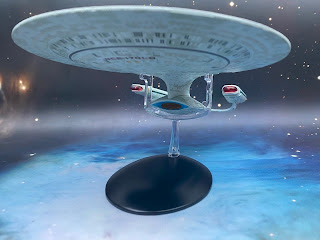
The criticisms that were laid at this XL's door were that, for all intents and purposes, it was just a copy and pate job up to a larger scale. Problem is, in most respects that's absolutely correct. One common theme on the XLs though is to change the base colour of the ship and here we have exactly that. The Issue One version carried a dour grey/beige finish with Eaglemoss upgrading the XL to the duck egg scheme as it should be. The aztec pattern is identical to it smaller predecessor and the slightly out of alignment registry is of a better quality but that's where it starts to fall apart a bit.

Also the paintwork on the saucer's wraparound phaser bank is dreadful with a horrid feathered edge right the way round which should have been nailed off by now.

The warp engines bear the expected translucent bussard collectors and warp grilles. These are much less plasticky with running lights marked in and those red striped Starfleet pennants finishing the job.
On the first issue edition the Enterprise-D suffered from scale when it came to the main deflector. The orange and blue elements really mixed together with the XL allowing them both a bit more room and therefore the chance to see the dish detail as well as the surrounding shroud ridges. It's a lot clearer here and one of the things that does succeed when it comes to the sizing up of the Galaxy Class vessel.

Into the magazine with the Enterprise-D and we have some more quite repetitive material around the origins of The Next Generation and casting of the main crew. It's decent reference work but the trouble once more is that these kind of articles are over repeated and have been since 1987. Good content here but nothing spectacularly revelatory for experienced fans.
This is a great ship, period. The problem with its arrival in this line is that the bigger errors of the collection have not been addressed, leaving this one missing the mark and its potential straight away. This could have done the XLs a lot of damage and still needs working.
Check out all our Starships posts HERE
You can find out more on the Star Trek: The Official Starships Collection by visiting the Hero Collector website HERE
Yup, that XL model really is bad. The aztecing is too strong, the window misalignment is awful, the shuttlebays are the wrong size, the seams to obvious and the deflector dish is a travesty.
ReplyDeleteThe Battlestar Galactica line is so much better than the Star Trek line. What gives?
Not a clue. OK, this was an early XL but it learnt nothing from the original issue one and in fact compounded existing problems while adding some more in for good measure. Very confusing....!!! And yeah - why are the BSG models better?!?!?
Delete